Good shopify swatch design is one of those things that looks invisible when it works and screams at you when it does not. Swatches are the smallest UI element on a product page, and they carry one of the heaviest jobs: letting the shopper pick a variant fast, with confidence, on any device, without second guessing.
Many Shopify themes come with swatches already enabled, but with very basic defaults. Small hit areas, no focus, poor color contrast for light colors, and no indicator when you have selected an item. As a result, half your users may not even know that your swatches are clickable.
This guide explores the swatch’s form, size, spacing, hover and focus states, mobile-friendly UX considerations, the use of color over image swatches, and accessibility guidelines that cannot be ignored. Use the free Swatch Preview tool to quickly preview swatch combinations and the color palette generator tool to build matching color palettes.
In this post
- Swatch shapes
- Sizes and spacing
- Hover, focus, selected states
- Mobile UX rules
- Color vs image swatches
- Accessibility checklist
- FAQ
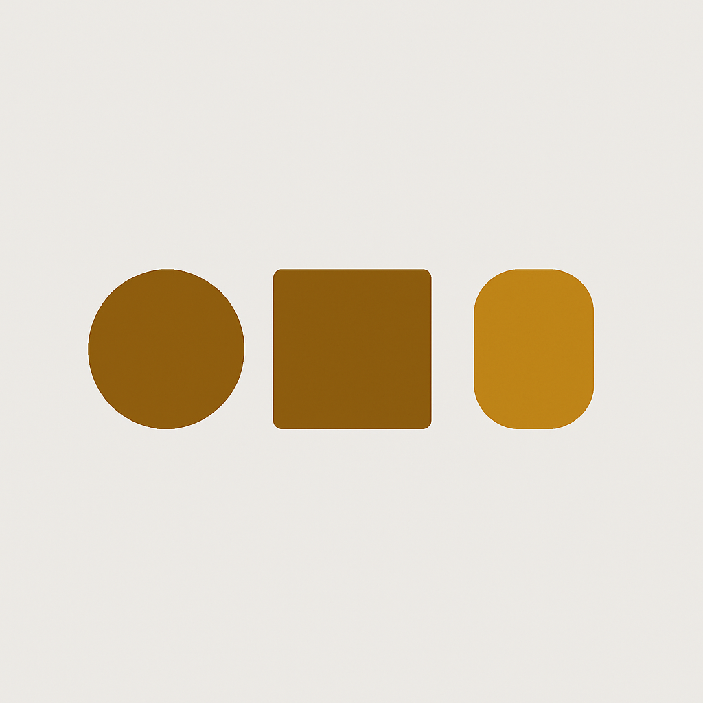
Swatch shapes
| Shape | Best for | Watch out for |
|---|---|---|
| Circle | Pure color swatches, apparel, accessories | Hard to read text labels inside |
| Square | Pattern and fabric swatches | Looks dated on minimal themes |
| Rounded square | General purpose, works everywhere | Bland if all you use |
| Pill | Size swatches with short labels (S, M, L, XL) | Not for color only |
Use the same shape for each attribute. Examples: Circles for color, pills for size, and rounded squares for material. Don’t mix and match shapes within one row (Three circles and a square looks broken). Test out options in the swatch preview tool.
Sizes and spacing
- Desktop swatch size: 32px to 44px diameter. Below 32 the hit target is too small.
- Mobile swatch size: 44px minimum. Apple’s HIG and WCAG both agree on 44 as the lower bound for touch targets.
- Gap between swatches: 8px to 12px. Too tight and thumbs mis tap, too loose and the row stretches past the fold.
- Row wrapping: let them wrap naturally. Never force a horizontal scroller.
Fun fact nobody talks about: 44px target size applies only to click area, not actual width that is visible on theme. You can render a 32px circle and still be within WP Theme Rule limits. That’s why most themes like Dawn do it.
Hover, focus, selected states
Every color gets to be seen 4 different ways. Miss one and the experience breaks for someone.
- Default: the resting look
- Hover: a subtle ring or slight scale, to confirm interactivity on desktop
- Focus: a visible outline for keyboard users. Do not
outline: none. - Selected: a clear indicator that survives color blindness. A solid ring or checkmark is better than changing the swatch tint.
The selected state is where most color pickers screw up. In ColorNail, the thin underline under the selected swatch is next to impossible to see on a light background. A solid 2px wide, highly visible ring would help here. A black ring on a white background, for example, is perfectly visible. A white ring on a dark background is just as good.
Mobile UX rules
- 44px minimum touch target
- Label above the swatch row (“Color: Cognac”) updating live when a swatch is tapped
- Sticky add to cart so the product page does not demand a scroll after swatch selection
- No hover only interactions. Hover does not exist on touch.
We’ve found that the Mobile Swatch UX is a losing battle for many Shopify stores. The ideal behavior would be for the main product image to update as you selected different swatches, but currently that isn’t possible. Fix this behavior with the Rubik Variant Images app, which will then filter your product gallery to the currently selected variant.
Color vs image swatches
Flat colors (solid colors) are best represented as color swatches. Patterns, textures and prints are best represented as image swatches. A flat red circle is a fine representation of “Red”. A red circle for “Red Tartan” would be a lie to the shopper, and would hurt the trust that you have worked so hard to establish.
Some themes force you to choose between stores, but you should be able to mix and match if allowed. Build the swatch values into the color palette generator, then add them to the preview swatches for any wovens that have pattern variants.
For stores that need swatches across separate products on collection pages *AND* where each product has only one color (i.e. not a multiple of colors), you’d also need Rubik Combined Listings to connect the individual products and generate the combined swatches on the product pages as well.
Accessibility checklist
- Keyboard navigable with Tab and Enter
- Visible focus ring (never disabled)
- Selected state that does not rely on color alone (use a ring or checkmark)
- ARIA label on each swatch naming the value (“Select color: Cognac”)
- 3:1 minimum contrast between swatch border and background for pale swatches (white, cream, beige)
- Screen reader announcement on selection change
The European Accessibility Act has come into force and many Shopify stores are unknowingly inaccessible. What does the EAA require and how can you make sure your Shopify store is compliant? Check out our WCAG swatch guide and our EAA guide to find out.
Design and preview
Wire swatches straight into your production workflow. Iterate on your color palette within the Stencil design tool. Test and confirm keyboard and touch interactions. Here’s how to get started. First, take a look at our Demo Store. Then, check out our Tutorial Video or Getting Started Guide.
FAQ
What is the best shape for Shopify swatches?
Circles for colors, Pill-Small for sizes, Rounded Rectangles for materials or patterns. Shapes from different attributes mixed in the same row look broken.
How big should a swatch be on mobile?
Make sure the touch target is large enough (at least 44px) – if you are showing a visible swatch, the visible area can be smaller than the total touch area as long as you add padding to make the total touch area 44px.
Should I use color swatches or image swatches?
Color swatches for solid colors and image swatches for patterns, textures, and prints. Mixing both in one row when the attribute values mix solid and patterned.
What gap should I use between swatches?
8 to 12 pixels. It’s tight enough for not making the row look ugly, but loose enough that you wont over tap on a mobile device.
How do I make the selected swatch obvious?
Make the focus ring a plain 2px solid width, in a colour that starkly contrasts with the swatch and the page background. No, a slightly opaque gradient or faint underline is not acceptable here.
Do swatches need a focus state for keyboard users?
You can see the keyboard focus on the demo. This is always necessary to see on your site, and you should never set outline: none on a swatch element. It is a violation of WCAG and the European Accessibility Act.
Can I preview swatch designs before building?
Yes. We include a free swatch preview tool which renders the shapes, sizes and spacing for swatches so you can preview a bunch of combinations before even opening up the theme.