Open up your Shopify store on your phone and browse the product you would sell with 10 colour options. How many taps does it take to view the 2nd image of the colour they want? On a lot of stores this would be 6 taps before they see the photo that is going to actually sell them the product. This is why mobile conversion for stores with lots of variant options is where it currently is.
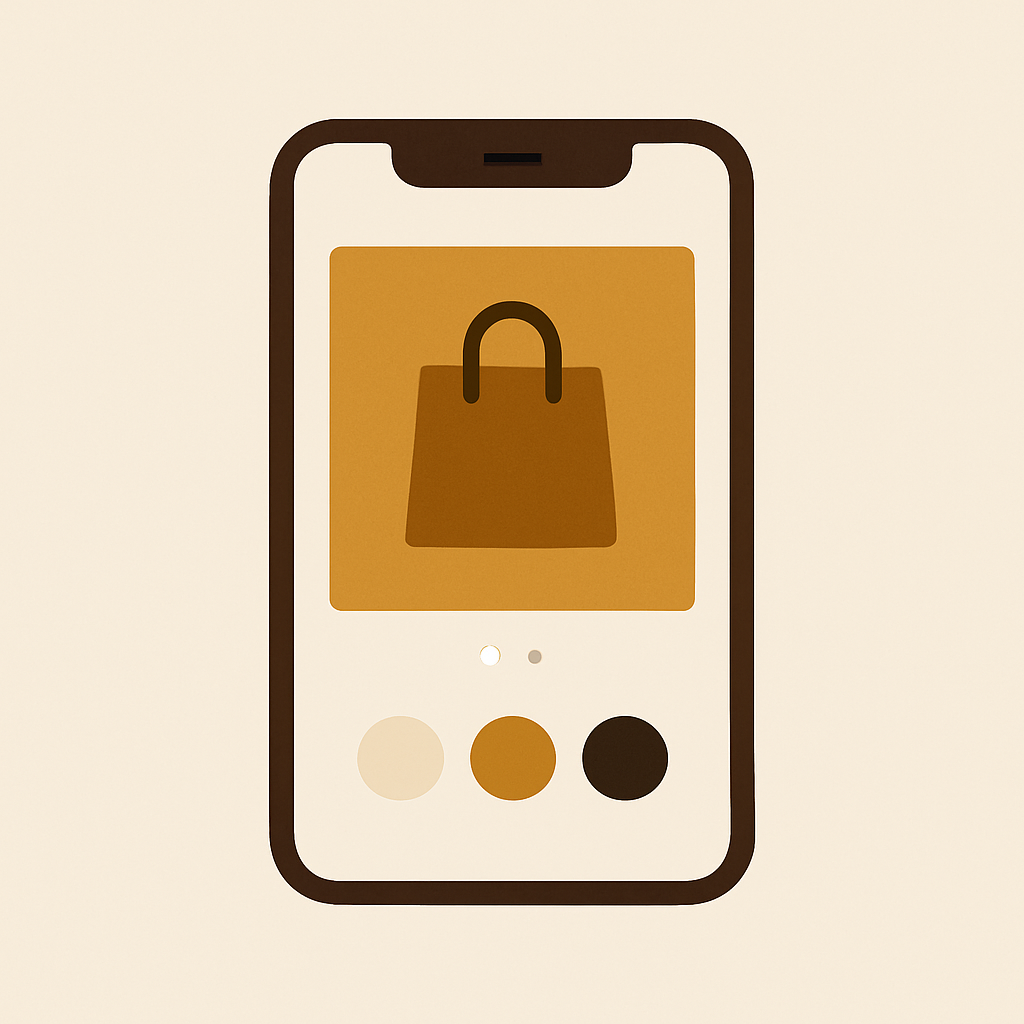
Mobile is not desktop. The gallery IS the hero. The variant picker is thumb-height. The swipe gesture is the entire browsing motion. See below for design decisions based on the assumption that the user has one thumb, 400 pixel wide display, and will bounce in 3 seconds if the page loads too slowly. These rules actually work.
In this post
- Why mobile needs its own rules
- Touch target sizes that actually work
- Swipe gallery patterns
- Performance rules
- Common pitfalls
- FAQ
Why mobile needs its own rules
We viewed the product gallery and color variant picker side by side on desktop. It was easy to compare the options. Online shopper scrolling from top to bottom to check out a product on mobile, compared to from left to right on mobile, is exhausting. If a product gallery has 40 images spanning 8 different colours, a mobile checkout will fail.
Three things break on phones that do not break on desktop.
- Thumbnails shrink to unreadable sizes.
- Swatch taps and swipe gestures conflict (the shopper tries to pick a color and accidentally swipes the gallery).
- Image weight adds up. Twenty photos times two megabytes each is a forty megabyte page. Good luck on 4G.
Variants for your mobile device don’t just need to be filtered and grouped, you also want to see only the relevant variant photos in the gallery. This is the whole argument for variant image apps on mobile.
Touch target sizes
Both Apple and Google publish requirements for touch targets on mobile devices. Apple specifies a minimum of 44 points for both width and height. Google says 48 x 48 for density-independent pixels (dips). This means individual colour swatches on the product page need to be around 44 pixels of clickable space – not just the visible circle. That means the entire swatch, including the margins around it, need to occupy roughly 44 pixels of space.
Most default themes have swatches that are too small on mobile, being around 32px. People miss and click the wrong colour. Sometimes they try to scroll the gallery when they mean to select the variant image with the blue swatch. This plugin adjusts the swatch sizes to make the variants easier to tap, and can be adjusted by overriding the default values available in the plugin’s CSS variables in the documentation found at rubikvariantimages.com.
For the reason mentioned above, it’s also important for accessibility. WCAG guide for legibility discusses both contrast and font size. This is a good tool to use to check the contrast on your store.
Swipe gallery patterns
Mobile galleries should be swipeable. Yeah, I know some would say this is obvious already. Unfortunately a lot of themes I use still ship with galleries designed for the desktop layout that require tapping a thumbnail to view it. Newsflash: mobile users expect to be able to swipe from right to left on a large image to browse through a collection of images. If they cannot do this, they think your gallery only has one image and will abandon your site.
The rules.
- Always swipeable. Horizontal swipe on the main image changes slides. Do not require tapping thumbnails.
- Pagination dots. Show dots below the gallery so shoppers know how many photos there are. Five dots, they keep swiping. No dots, they stop after the first swipe.
- Filter on variant pick. When the shopper taps a color, the gallery rebuilds to only that color’s photos. Dot count updates. Current position resets to slide one.
- Pinch to zoom. At least on the main image. Shoppers want to see fabric texture and stitch detail.
- No auto-advance. Ever. Auto-carousels are the number one mobile UX mistake.
Most page builders handle the interaction portion just fine. Beae, EComposer, Foxify, GemPages, Instant, PageFly, and Replo all natively support swipe ready galleries. The harder question is whether or not the gallery will filter by variant, and that’s something you likely need an app for. See our guide on product gallery variant selection for more information.
Performance rules
The mobile performance of a retailer’s website is a big contributor to their failure to complete a sale online. Pages with 40 variants loaded on a product page, such as shoes, that haven’t been optimised for lazy loading on 4G are dying loads. Shoppers will simply see the loader and move on to a competitor.
- Lazy load everything below the fold. Only the first image should be eager. The rest load as the shopper swipes.
- Serve WebP or AVIF. Shopify CDN does this automatically if you upload clean JPEGs. Do not upload TIFFs.
- Cap image dimensions at 2048 pixels. Anything bigger is waste on a phone screen. Run images through the image compressor first.
- Prefetch adjacent slides. When the shopper swipes to slide 2, slide 3 should already be loading.
- Minimize external calls. Every app that calls an external API on page load adds latency. Rubik loads from metafields and makes zero external calls per page view.
Slow product pages are a killer. This means ~ than 3 seconds on mid-tier Android phone over 4G. Test. Now.
Common pitfalls
A short list of things we see go wrong on mobile.
- Swatches stacked two rows deep with no wrap, so the right column gets cut off.
- Pinch-zoom disabled by the theme (user-scalable=no in the viewport meta). This breaks accessibility.
- Heavy sticky headers eating gallery space. If the gallery is below a 120 pixel header, shoppers see half the image.
- Videos autoplaying with sound. Just do not.
- Variant picker below the fold. The shopper scrolls for the price, then has to scroll again for the color picker.
For collection-page swatches on mobile go here. Collection-level swatches are a different product category and are handled on the collection level by the Rubik Combined Listings app (https://www.rubikify.com) but we have a workaround for variant level swatches on mobile that is discussed below.
FAQ
What is the minimum touch target size for swatches?
44x 44 pixels is standard per Apple guidelines for the clickable area of buttons. 48×48 is typical according to Google, 44 is the safe minimum.
Should mobile galleries auto-advance?
Auto-advance carousels are a documented UX anti-pattern. Let the shopper navigate, not just view, the products on the carousel.
Do I need a separate gallery for mobile?
No. A responsive gallery that allows for swiping on mobile and thumbnail browsing on desktop is fine. Ideally the number of slides would be constrained by having mobile filters by variant.
How many images per variant is too many on mobile?
If content is 5-8 views long, it’s better to display it above the fold. Content that is 10 views or longer is not swiped by shoppers. Place best views first, then the detail views.
Does Rubik Variant Images work on mobile?
The gallery filter client-side, so whenever you click on a swatch, the filtered slides are generated on the fly. No page reload required.
What about Core Web Vitals on variant-heavy pages?
LCP: This is typically the first gallery image that a user sees on a website. Make sure it paints within 2.5 seconds max. Read more in our image optimization guide.
Can I test my mobile product page without a real phone?
I use Chrome DevTools device emulation for layout checks. For performance I use PageSpeed Insights mobile profile to load the page, or actually check on a real phone over 4G.
Related reading
- Product gallery and variant selection
- Color swatches and WCAG accessibility
- Image optimization for faster load times
- How to show multiple images per variant
- Rubik Variant Images documentation
Try Rubik Variant Images
Mobile-first gallery filtering, metafield-based meta-image loading with extra large tap zones included. Get a free plan to list one product. Install in the Shopify App Store.