You have a product that comes in 3 options. Maybe 3 colors of the same handbag, or 3 scents of the same candle, or 3 fabrics of the same sofa cushion. Each option has its own Shopify product page because you wanted separate photos, separate descriptions, and separate URLs for each one.
Now you want something specific: on each product page, you want a row of image buttons showing the other options. Not plain text links. Not a dropdown menu. Actual product images as selectable buttons, with the option name displayed underneath. When a customer clicks one, it takes them to that product’s own page.
This comes up constantly in the Shopify community. Merchants describe it in different ways: “variant buttons that link to other product pages,” “image swatches that redirect to a different product,” “clickable variant images that open a new product.” The request is always the same. Connect separate products visually so customers can switch between them like they would switch between variants.
Shopify does not do this out of the box. Its variant selector only works within a single product. If your options are separate products, there is no native way to show image buttons that link between them. You either need custom Liquid code or an app that handles the linking for you.
This guide shows you how to set it up without code, using image swatches that connect your separate products together.
Why Shopify’s variant selector does not work for this
Shopify’s built-in variant selector is designed for one product with multiple options. When you add Color as an option to a product and create variants for Red, Blue, and Green, the selector lets customers switch between them on the same page. The URL stays the same (with a variant parameter appended). The product page stays the same. Only the selected variant changes.
This works fine when all your options are truly variants of a single product. But it breaks down when each option is its own product.
Here is why merchants end up with separate products instead of variants:
Each option needs its own photo gallery. With variants under one product, all images pile into a single gallery. A customer looking at the blue version scrolls past photos of red and green. Separate products let each option have a clean, focused gallery.
Each option needs its own SEO. “Blue leather handbag” and “red leather handbag” are different search queries. Separate products mean separate URLs, separate titles, and separate meta descriptions. Each one can rank in Google independently.
Each option has a unique description. The blue version is made with Italian leather. The red version uses a different supplier. When options have meaningfully different details, separate product pages let you tell each story properly.
The supplier created them that way. Print-on-demand services like Printify, Printful, and Gooten generate one Shopify product per colorway. You get separate products whether you want them or not.
All valid reasons. The problem is that once you have separate products, Shopify gives you no way to connect them visually. They sit in your store as completely unrelated listings. A customer on the blue handbag page has no idea you sell the same bag in red and green.
What image swatches between products actually look like
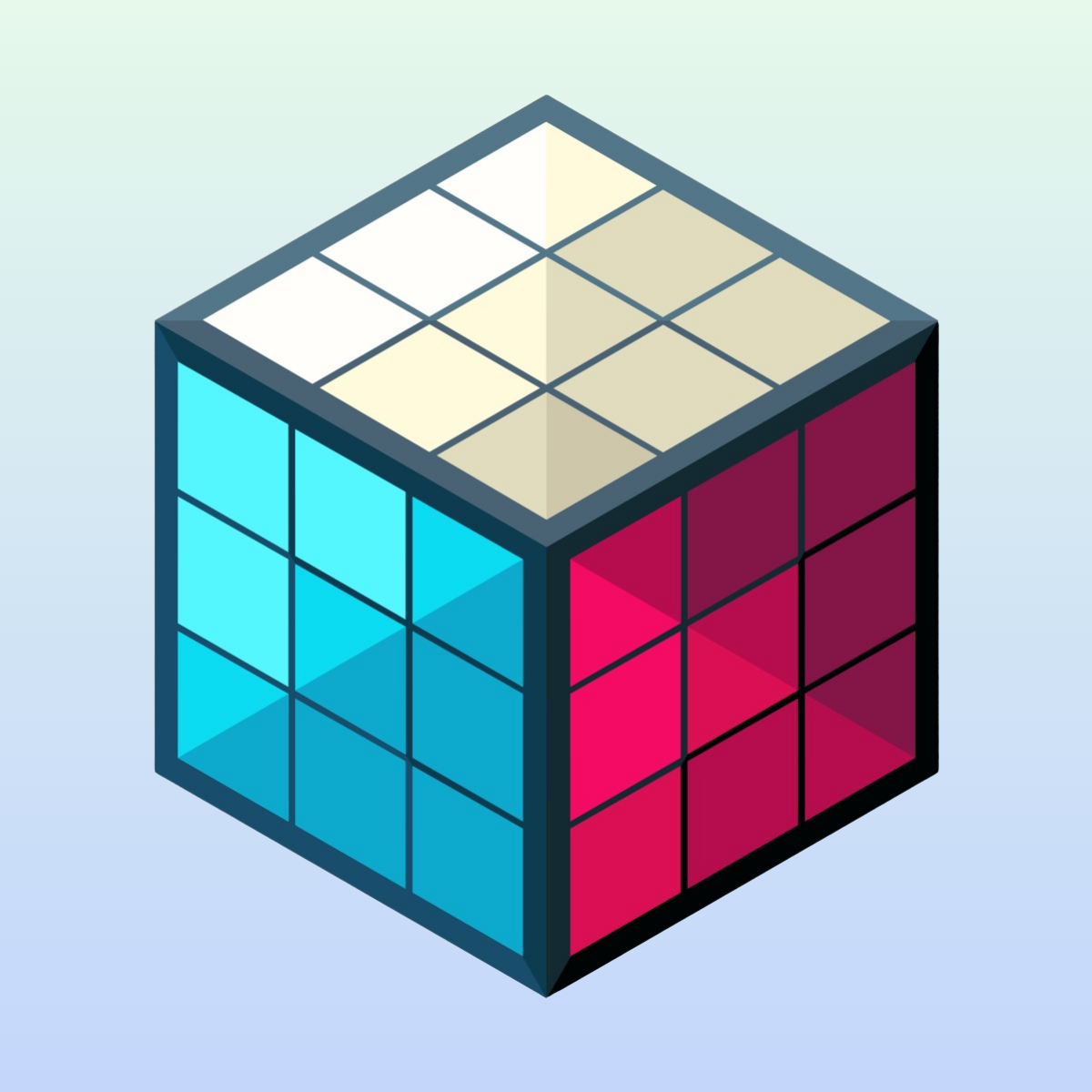
The solution is a row of image buttons that appears on each product page, right where a variant selector would normally sit. Each button shows a product image (or a custom thumbnail) with the option name underneath. The currently viewed product is highlighted. Click another button, and the customer lands on that product’s own page with its own photos, description, and pricing.
To the customer, it feels exactly like switching a variant. They see their options, they click one, they see the product. The difference is that behind the scenes, each option is a fully independent Shopify product with its own URL, its own gallery, and its own SEO.
On collection pages, the same swatches appear on product cards. A customer browsing your catalog can see at a glance that a product comes in multiple options. Hover over a swatch and the card image updates to preview that option. Click it and they go straight to the right product page.
This is not limited to images. You can use color circles for solid colors, text buttons for non-visual options like sizes or materials, or dropdown menus for groups with many options. But for the specific use case of showing product photos as variant buttons with names underneath, image swatches are exactly the right fit.
How to set it up with Rubik Combined Listings
Rubik Combined Listings connects separate Shopify products with visual swatches. No code editing, no theme modifications. The setup takes a few minutes.
1. Create a product group. Give it an option name like “Style”, “Color”, or “Scent”. This label appears above the swatches on your storefront.
2. Add your products. Pick the products that should be linked. If you have a handbag in blue, red, and green, add all three.
3. Choose image swatches as the display type. This shows each product’s image as the swatch button. The product’s option name appears below the image. Customers see a visual preview of each option before clicking.
4. Set option values. Each product gets a label (“Blue”, “Red”, “Green”) that displays under its image swatch. You can type these manually or use Magic Fill, which analyzes your product titles and images with AI and generates the labels and swatch colors automatically.
5. Save. Swatches appear on your storefront immediately. Every product in the group now shows image buttons linking to all the other products. No publishing step, no waiting for sync.
The app stores data using Shopify metaobjects with direct product references. Prices, stock status, and images stay current automatically. If you archive or mark a product as draft, it disappears from the swatch row without any manual cleanup.
Customizing how image swatches look
Image swatches should look like they belong in your theme. The visual settings editor gives you control over every detail:
Swatch size. Set the width and height of image buttons independently for desktop and mobile. Make them large enough to see the product clearly, or keep them compact for a minimal look.
Shape. Round, square, or anywhere in between using the border radius setting.
Active state. The currently selected swatch gets a distinct visual treatment. A thicker border, a different border color, a shadow, or a combination of these. Customers always know which option they are viewing.
Label position and styling. The option name under each image can be styled with your preferred font size, color, and weight. You control whether the label appears below the image, beside it, or not at all.
Hover effects. A subtle scale, border change, or opacity shift on hover gives customers a visual cue that the swatch is clickable.
If you prefer not to configure everything manually, style presets give you a polished swatch design in one click. And the AI visual assistant lets you describe what you want in plain language (“make the swatches bigger with a black border on the active one”) and applies the changes for you.
Why this setup is better for SEO than merging products
Some merchants try to solve this by merging their separate products into one product with variants. That technically creates a variant selector, but it destroys the SEO benefits you built by having separate products in the first place.
When you merge three products into one, you go from three indexed URLs to one. Three sets of targeted meta tags become one generic set. Three focused product pages with tailored descriptions become one page trying to represent everything at once.
Image swatches that link between separate products give you the best of both approaches. Customers get the seamless switching experience they expect from variants. Search engines get three distinct, well-optimized product pages. Each page has its own title, its own description, its own images, and its own URL. Each one can rank for its own keywords.
This matters even more for AI-powered shopping. When someone asks ChatGPT or Google’s AI to “recommend a blue leather handbag under $200,” the AI reads your product pages to find matches. A dedicated “Blue Leather Handbag” page with blue photos and a blue-focused description is a much stronger match than a generic “Leather Handbag” page where blue is one of three variant options buried in a dropdown.
Separate products give AI systems more entry points to discover and recommend your products. The swatches give your customers a way to navigate between them. You get both without compromising either.
Common questions
Does clicking a swatch reload the entire page? Yes, because each swatch links to a different product’s URL. The page loads fresh with that product’s own photos, description, price, and add-to-cart button. This is intentional: it keeps each product page fully independent for SEO and ensures the customer always sees accurate, up-to-date information.
Can I use custom images instead of the product’s featured image? Yes. You can upload a specific image for each swatch. This is useful when the product’s main photo does not work well at swatch size, or when you want a consistent look across all swatches (like cropped fabric close-ups instead of full product shots).
What happens when a product is out of stock? You control this in the app settings. Out-of-stock products can be hidden from the swatch row entirely, pushed to the end, shown with reduced opacity, or displayed with a strikethrough. Archived and draft products are always hidden automatically.
Does this work on collection pages too? Yes. Swatches appear on product cards in collection pages, search results, and any section that displays products. Customers can browse options without clicking into each product page.
Do I need Shopify Plus? No. Rubik Combined Listings works on all Shopify plans. Shopify’s own Combined Listings feature requires Shopify Plus ($2,300+/month). This app gives you visual swatches on any plan, starting with a free tier.
Does it work with my theme? The app works with all Shopify themes. Dawn, Prestige, Impulse, Impact, Focal, Palo Alto, Symmetry, Stiletto, Broadcast, and hundreds more. A built-in theme detection system ensures swatches appear in the right position for each theme’s layout.
Try it on a live store
Demo store: combinedlistings.rubikdemo.com. Browse collections, hover over image swatches on product cards, click through to product pages. Test on desktop and mobile to see how the layout adapts.
Video tutorial: Watch the setup walkthrough on YouTube
Install: Rubik Combined Listings on the Shopify App Store (free plan available, 5 product groups)
FAQ: Frequently Asked Questions
More from CraftShift: Fix Disconnected Color Products / Single vs. Separate Products Guide / Every Feature Explained