The Shopify variant picker is the single most important interactive element on a product page. It is where a shopper tells you what they actually want, and it is where a lot of stores quietly lose sales. The default picker that ships with most themes is a dropdown or a plain text button, and neither does a good job of showing a customer what they are about to buy.
This post compares every common swatch type you can use in place of the native dropdown. We cover color circles, squares, pills, text buttons, and image swatches, with honest pros and cons for each. If you are deciding how to present size, color, or material on your product page, this is the reference.
We will also look at conversion impact, theme compatibility, and when each swatch style is the right call. No theory for theory’s sake. Just the tradeoffs you need before you ship a change.
Table of contents
- Why the default Shopify variant picker underperforms
- Text button swatches
- Color circle swatches
- Square swatches
- Pill swatches
- Image swatches
- Conversion impact data
- Theme compatibility
- When to use which swatch type
- Customization via apps
- FAQ
Why the default Shopify variant picker underperforms
Out of the box, most Shopify themes render variants one of two ways. Either a dropdown, which hides every option behind a click, or a row of text buttons that says “Red” and “Blue” without showing red or blue.
Both are decisions made for the developer, not the shopper. A dropdown is the smallest possible UI element, and it is quick to code. A text button row is only slightly better. Neither tells the customer what the product actually looks like in each variant.
This matters because variant selection is not a navigation problem, it is a visual one. Shoppers want to see the color, see the size chart position, see the material. When the picker forces them to guess, they do one of three things. They abandon, they pick wrong and return, or they drop into the gallery and hunt for the right photo. All three hurt you.
If you want a deeper breakdown of variant image behavior on the product page, the complete guide to Shopify variant images on our sister site walks through the whole flow.
Text button swatches
A text button swatch is a rectangular button with the option name inside it. “Small”, “Medium”, “Large”. Click to select, selected state gets a border or fill.
Pros
- Cheapest to build. Every theme supports this natively.
- Works for any option type (size, material, length).
- Accessible by default if the theme uses real button elements.
Cons
- Zero visual signal for color or pattern.
- Long option names break the layout on mobile.
- Looks generic. No brand personality.
Text buttons are fine for size. They are the wrong answer for color and a poor answer for material.
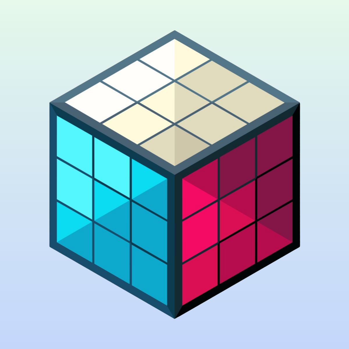
Color circle swatches
A round swatch filled with the variant color. Click to select, selected state usually gets a ring around it.
Pros
- Instant visual recognition. Shoppers see the color without clicking.
- Compact. You can fit 12+ colors in a single row on desktop.
- Classic pattern. Shoppers already know how it works.
Cons
- Fails for multi-color products. A circle cannot show a striped shirt.
- Fails for textured fabrics. A flat color hex does not capture denim.
- White swatches need a border or they disappear on white backgrounds.
If you need help picking the exact hex values for your color circles, the free swatch preview tool on craftshift lets you test shapes, sizes, and colors side by side before you commit to a design.
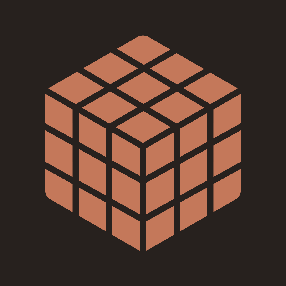
Square swatches
A square version of the color circle. Sometimes rounded corners, sometimes sharp.
Pros
- Slightly more surface area than a circle at the same visual weight.
- Rounded square (the “Apple rectangle”) feels modern and premium.
- Easier to fit a pattern or texture preview inside than a circle.
Cons
- Takes more grid space than circles.
- Sharp corners can feel dated depending on your brand.
- Same weakness for multi-color products as circles.
Squares are the quiet winner for premium fashion and home goods. The extra space reads as intentional.
Pill swatches
A pill is a horizontal rounded rectangle, usually containing text, sometimes text plus a color dot.
Pros
- Perfect for size options with label context (“Small” not just “S”).
- Can combine a color dot and a text label in one element.
- Visually balanced on rows with mixed-length labels.
Cons
- Takes more horizontal space than circles or squares.
- Can look crowded if you stack more than 6 on mobile.
- Less effective for pure color selection (the text label competes with the color).
Pills shine on size, fit (“Regular” vs “Slim”), and length (“30in” vs “32in”).
Image swatches
An image swatch uses a small thumbnail of the actual product photo in place of a color dot.
Pros
- Shows texture, pattern, and multi-color combinations accurately.
- No hex value guessing. Whatever is in the photo is what the shopper sees.
- Works for wood grain, fabric weaves, marble, and prints.
Cons
- Requires a tightly cropped, consistent photo per variant.
- Slightly heavier page weight (more images in the DOM).
- Wrong crop makes the swatch unreadable at small sizes.
Image swatches are the only honest answer for multi-color products. A floral print cannot be represented as “Pink”. The shopper needs to see the print.
Conversion impact data
The Baymard Institute has documented that 42% of top e-commerce sites still use text-only swatches where image swatches would help the shopper. This is a known, measurable gap.
General patterns from published CRO studies:
| Swatch type | Typical conversion lift vs dropdown |
|---|---|
| Text buttons | +3% to +8% |
| Color circles | +10% to +18% |
| Image swatches (when relevant) | +15% to +25% |
The lift depends heavily on how many variants you have and how visually differentiated they are. A black-shirt-only store gains little from color circles. A 30-color t-shirt store gains a lot.
For general conversion fundamentals, our Shopify product page optimization guide has more on ranking the levers by impact.
Theme compatibility
Most modern Shopify themes (Dawn, Sense, Craft, Studio, Ride, Taste, Crave) support color swatches natively through Shopify’s built-in variant option configuration in admin. You set an option type as “Color” and the theme renders circles.
The limitations start fast:
- Native support is color-only. You cannot use image swatches without code or an app.
- Shape is locked per theme. If your theme ships circles, you are stuck with circles.
- Size and position are theme-controlled. Small buttons on mobile are common.
- Selected state styling is theme-controlled. Some themes have weak contrast.
If contrast of the selected state is bothering you, the free contrast checker on craftshift will tell you if your active swatch state passes WCAG AA. A swatch that passes visual design review but fails accessibility is still broken.
For theme-specific swatch editing walkthroughs, we keep those on the Rubik Variant Images blog because that is where theme guides belong.
When to use which swatch type
Quick decision table:
| Option type | Best swatch |
|---|---|
| Solid colors (5 or fewer) | Color circles |
| Solid colors (6 to 15) | Color circles or rounded squares |
| Solid colors (15+) | Squares with a scrolling row |
| Multi-color, patterns, prints | Image swatches |
| Sizes (XS, S, M, L) | Text buttons or pills |
| Sizes with fit labels | Pills |
| Material (leather, canvas, suede) | Image swatches |
| Style (slim, regular, loose) | Pills |
| Length or dimensions | Text buttons |
Do not mix shapes inside the same option group. Pick one shape per option and stick to it. Mixing shapes reads as inconsistent.
You can mix across option groups. Color circles for color, pills for size, text buttons for length is a valid, tidy layout.
Customization via apps
Shopify’s native variant picker stops at color circles. Everything else (image swatches, custom shapes, custom borders, custom sizes, custom selected state) requires either theme code edits or an app.
A dedicated variant picker app gives you:
- Shape control (circle, square, pill, rounded square, button)
- Image swatches without touching theme code
- Border and hover state customization
- Size and spacing controls
- Accessible selected states out of the box
- Integration with variant image filtering (the picker also changes the gallery)
Rubik Variant Images is the app we build for exactly this job. It renders custom swatches on the product page and filters the gallery when a shopper picks a variant, so the picker and the images stay in sync. Metafield-based loading, no external API calls.
If you also need swatches on collection pages, that is a different product scope and lives in Rubik Combined Listings on our catalog structure site.
For broader Shopify picker education, our Shopify variant images guide and color swatch best practices posts cover adjacent ground.
FAQ
What is a variant picker in Shopify? A variant picker is the UI element on a product page where a shopper chooses a product option like color, size, or material. It can be a dropdown, text buttons, or swatches.
Are color swatches built into Shopify? Partially. Shopify supports color options in admin, and most modern themes render those as circle swatches. Image swatches, custom shapes, and advanced customization need a theme edit or an app.
Do color swatches actually increase conversion? Yes. Published studies consistently show that visual swatches outperform dropdowns, and image swatches outperform color circles when the product has patterns, textures, or multi-color designs.
Which Shopify themes support swatches natively? Dawn, Sense, Craft, Studio, Ride, Taste, Crave, and most Online Store 2.0 themes support color swatches out of the box. Older themes may need code or an app.
What is the difference between a color swatch and an image swatch? A color swatch is a flat shape filled with a hex color. An image swatch uses a real photo thumbnail, so it can show patterns, textures, and multi-color combinations.
Should I use square or circle swatches? Circles are the classic default and read as friendly. Rounded squares feel more premium and fit more surface area. Pick one and stay consistent across the product.
Can I mix swatch shapes on the same product? Across different option groups, yes. Color circles for color and pills for size is fine. Within the same option group, no. Mixing shapes looks unintentional.
Related reading
- Shopify variant images complete guide
- Shopify product page optimization
- Color swatch best practices
- Shopify variant images guide
- Swatch preview tool
- Contrast checker
Ready to ship better swatches?
The native picker is fine for a minimum viable store. If you are past that stage and want real swatches that match your brand and filter variant images correctly, install Rubik Variant Images. Free plan available, flat pricing, no Shopify plan tax.