Swatches come in more shapes and styles than most merchants realize. A small color circle is the default starting point, but it is far from the only option. The right Shopify swatch design depends on your product type, your brand aesthetic, and how much information a customer needs before clicking Add to Cart.
This post collects 20 swatch design ideas organized by category. Each one describes the design concept, explains which types of stores benefit most from it, and tells you how to achieve it using Rubik’s style presets and CSS variables. Think of this as a lookbook for your variant selectors.
In this post
- Solid color swatches (ideas 1-5)
- Image swatches (ideas 6-10)
- Button and pill swatches (ideas 11-14)
- Combined and mixed approaches (ideas 15-18)
- Creative ideas (19-20)
- How to apply these in Rubik
- Get started
- Frequently asked questions
- Related reading
Solid color swatches
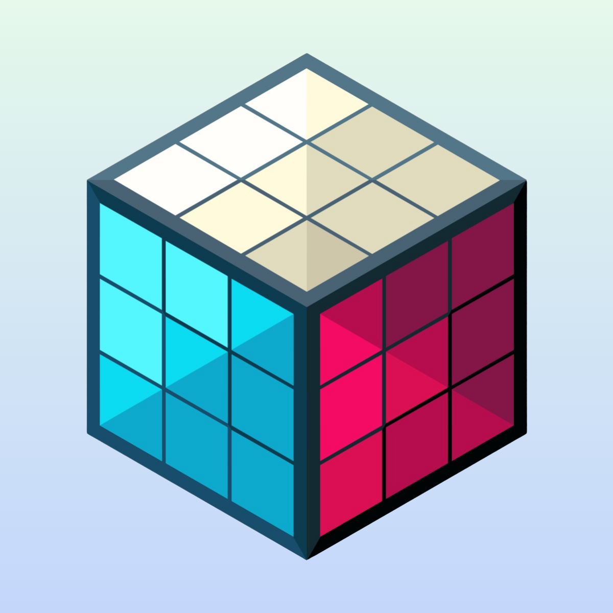
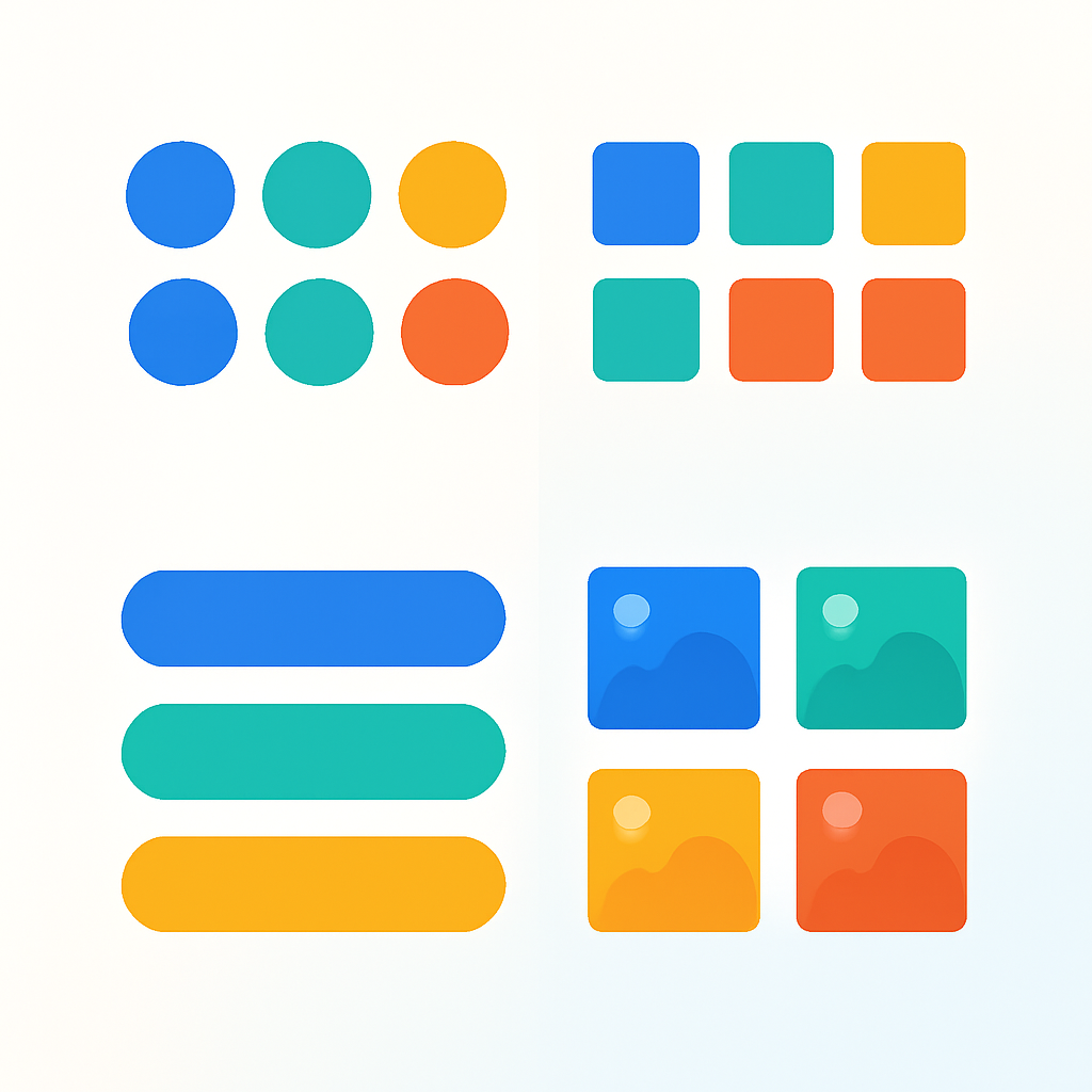
The most common swatch type. A filled shape that represents a single product color. Simple, fast-loading, and universally understood. These five variations show how much range exists within that basic concept.
1. Small circles with thin border
Compact color circles with a subtle 1px border in a neutral gray. The border keeps lighter colors like white and cream visible against light backgrounds. This is the go-to Shopify swatch design for fashion stores and minimalist brands where the swatches should not compete with product photography. In Rubik, start with a circle preset and set the swatch size small. The thin border comes from the --swatch-border-width CSS variable.
2. Large circles with thick selected border
Bigger circles, around 40-48px, with a bold 3px border that appears when a swatch is selected. The extra size makes these easy to tap on mobile without accidentally hitting the wrong color. Great for stores with a younger audience or any product page where you want the color options to feel prominent. In Rubik, increase --swatch-size and set --swatch-selected-border-width to 3px. A gap between the swatch fill and the outer border creates a clean ring effect.
3. Square color tiles
Sharp-cornered squares arranged in a tight grid. This design feels structured and works well for home decor, paint, and fabric stores where color selection is a serious decision rather than a quick tap. The grid layout naturally suggests a color palette. Set --swatch-border-radius to 0 in Rubik and reduce the gap between swatches to create the tile effect.
4. Rounded squares with shadow
A softened square shape with a slight drop shadow that lifts the swatch off the page. This gives a premium, almost physical feel, like a polished stone or button sitting on the surface. Jewelry stores, cosmetics brands, and luxury goods benefit from this added depth. Use a moderate --swatch-border-radius (around 6-8px) and add a box-shadow through Rubik’s custom CSS. The shadow should be subtle, not dramatic.
5. Color circle with tooltip on hover
A standard color circle that displays the color name in a small tooltip when customers hover over it. This is especially useful when your color names are descriptive (“Midnight Forest,” “Dusty Rose”) and help tell the brand story. It also solves accessibility concerns by ensuring the color name is always available. Rubik supports tooltips natively. Enable the tooltip setting and the color name from your variant option appears on hover.
Image swatches
When a flat color cannot communicate what a variant looks like, image swatches step in. They show a tiny product photo or texture swatch inside the selector. More information per pixel, at the cost of slightly more visual complexity. For a deeper comparison: image swatches vs color swatches.
6. Square product photo thumbnails
Small square thumbnails showing the actual product in each variant. Furniture stores, bag brands, and any store selling products with patterns or textures benefit from this approach. The customer sees the real product rather than an approximation. In Rubik, set the swatch type to image, use square shape with --swatch-border-radius at 0, and assign variant images to each option. The app pulls the image directly from your product photos.
7. Circular product photo crops
The same concept as square thumbnails, but cropped into circles. This gives a cleaner, more polished look that works well for fashion and apparel. The circular crop focuses the eye on the center of the image, so it works best when the key visual information (the fabric, the pattern) is center-framed. Set the swatch type to image and keep the default circle shape in Rubik.
8. Polaroid style with label below
An image swatch with a small text label underneath showing the variant name. This “polaroid” approach works for lifestyle brands where variant names carry meaning, like named fabric collections or artist collaborations. The image shows the look, the label gives it a name. Achieve this by enabling the swatch label setting in Rubik and positioning it below the swatch. Increase --swatch-size to give the image enough room to read clearly.
9. Large image swatches in a carousel
When you have many variants and each one looks distinctly different, large image swatches in a horizontally scrollable row let customers browse through them like a mini gallery. This works for high-detail products like rugs, wallpapers, or custom phone cases where every variant has a unique pattern. In Rubik, increase the swatch size significantly and the app automatically handles overflow with horizontal scrolling when the swatches exceed the container width.
10. Small image swatches in one row
Compact image thumbnails sized to fit in a single row without scrolling. Mobile-friendly and efficient. This works when you have 5-8 variants and want to show them all at once without any interaction required. Keep --swatch-size small (24-30px) and --swatch-gap tight. The images will be tiny, so this works best when the variants are visually distinct enough to read at small sizes.
Button and pill swatches
Not every variant option is a color. Sizes, materials, quantities, and subscription terms all need selectors too. Button and pill swatches handle these text-based options with style. For a comparison of swatches versus standard dropdowns: swatches vs dropdowns for color variants.
11. Text pills for size
Rounded pill-shaped buttons showing size labels like S, M, L, and XL. The pill shape feels tappable and modern, and the rounded corners distinguish these from standard rectangular buttons. This is the most common swatch design for size options in fashion stores. In Rubik, set the swatch type to button, apply a high --swatch-border-radius to create the pill shape, and the option value text appears automatically inside each pill.
12. Outlined buttons with hover fill
Buttons with a transparent background and a visible border that fills in with a solid color on hover. This creates a satisfying interactive feel and gives clear visual feedback. Good for stores that want a refined, interactive UI. In Rubik, set the default button background to transparent, set a border, then use --swatch-hover-background and --swatch-hover-color to define the fill state. The transition between states is smooth by default.
13. Pill with image and text combo
A wider pill that contains both a small image on the left and a text label on the right. Think of it as a compact product card inside a selector button. This works for material options (showing a fabric swatch next to the fabric name) or for products where both the visual and the name matter. This requires custom CSS in Rubik to arrange the image and text side by side within the swatch element, but the flexibility of CSS variables makes it achievable.
14. Square buttons with price display
Rectangular buttons that show both the option name and the price for that variant. Useful for products where different sizes or configurations have different prices, like candles (8oz / $24, 12oz / $32) or subscription boxes. The customer sees the price impact of each choice without selecting it first. Rubik’s button swatch type combined with the price display setting handles this. The price updates come from your Shopify variant data automatically.
Combined and mixed approaches
Real products often need more than one swatch type on the same page. A shirt might need color swatches for the Color option and pill buttons for the Size option. A store might want large swatches on the product page and compact ones on collection pages. These four ideas show how to mix and match. For more on using multiple swatch types together: the complete guide to Shopify color swatches.
15. Image swatches for Color, pills for Size
The most common mixed approach. The Color option gets image or color swatches that show what each variant looks like. The Size option gets text pill buttons because size is a text concept, not a visual one. This combination gives customers the right type of information for each decision. In Rubik, you configure the swatch type per option, so Color can be set to image while Size is set to button. Each option gets its own styling rules.
16. Color circles on product page, compact circles on product cards
Larger, more detailed swatches on the product page where the customer is making a final decision, and smaller, space-efficient swatches on collection page product cards where the goal is just to signal available colors. This two-tier approach keeps collection pages clean while giving the product page room to breathe. Rubik Variant Images handles the product page swatches, and Rubik Combined Listings handles collection page swatches. Each app has independent size controls.
17. Carousel swatches on product page, single-row on mobile
On desktop, swatches display in a multi-row grid or scrollable carousel that shows many options at once. On mobile, the same swatches collapse into a single scrollable row to conserve vertical space. This responsive approach makes sure the swatches adapt to the screen rather than forcing a one-size-fits-all layout. Rubik handles this automatically based on available container width. The swatches wrap or scroll depending on how many fit in the visible area.
18. Two-color split swatches for multi-toned products
A single swatch circle split into two colors to represent dual-tone products. A black-and-white sneaker, a navy-and-gold scarf, or a two-tone phone case. This communicates the color combination without requiring an image swatch. Rubik supports multiple split patterns: horizontal split, vertical split, and diagonal split in both directions. You define the two hex values per variant and choose the split style. More detail here: fixing color swatch accuracy.
Creative ideas
These two ideas push beyond standard presets and require some custom CSS. They are for merchants who want swatches that feel truly unique to their brand.
19. Swatches with gradient borders
A color swatch where the selected-state border is a gradient rather than a solid color. Picture a gold-to-rose-gold gradient ring around the active swatch. This small detail can elevate the perceived quality of the entire product page. It works especially well for beauty brands, premium accessories, and any store with a strong visual identity. In Rubik, use the custom CSS field to apply a gradient border using the border-image property or a pseudo-element technique. The Shadow DOM keeps this CSS scoped so it will not affect anything outside the swatches. For more CSS ideas: swatch CSS customization ideas.
20. Dropdown with color preview
A hybrid approach that keeps the dropdown format but adds a small color circle or image preview next to the selected value. The dropdown saves vertical space (useful for products with 30+ color options), and the color preview adds the visual context that plain dropdowns lack. This is a good compromise when you have too many variants for swatches to display cleanly but still want to show colors. In Rubik, set the display type to dropdown for the option and enable the color preview indicator. The preview circle appears inside the dropdown trigger, showing the currently selected color.
How to apply these in Rubik
Every idea above can be achieved with Rubik’s two Shopify apps. Here is how the customization system works.
Style presets
The fastest way to change your Shopify swatch design. Rubik Variant Images offers 11 presets for product page swatches. Rubik Combined Listings offers 8 presets for collection page swatches. Each preset is a complete design that controls shape, size, border style, selected-state indicator, and spacing. Pick a preset, preview it on your store, and you are done in under a minute. For a visual guide to every shape option: Shopify swatch shapes guide.
CSS variables
For fine-grained control, Rubik exposes 70+ CSS custom properties. You can control swatch size, border radius, gap, border color on hover, border color when selected, tooltip font size, transition duration, and dozens of other properties. Because the swatches render inside a Shadow DOM, your CSS changes are scoped and will not interfere with your theme. Your theme CSS will not accidentally override your swatch styles either. For customization ideas with code: customizing combined listing swatches.
AI visual settings assistant
If you know what you want your swatches to look like but are not comfortable writing CSS, the AI visual settings assistant can help. Describe the design you want in plain language, like “make the swatches larger rounded squares with a thick black border when selected.” The assistant translates that into the correct CSS variable values and applies them. It is the fastest path from an idea in this list to a live implementation on your store.
Get started
Both Rubik apps offer free plans so you can test any of these Shopify swatch design ideas on your store before committing. Install the one that matches your needs, pick a preset or start customizing, and see the result on your live store in minutes.
Rubik Variant Images handles product page swatches: color swatches, image swatches, button swatches, gallery filtering, and click-to-select variant images. Rubik Combined Listings handles collection page swatches and product grouping for stores that need swatches on product cards.
Frequently asked questions
How do I change the shape of my Shopify swatches?
The shape is controlled by the border-radius CSS property. A border-radius of 50% creates circles. A value of 0 creates squares. Values in between create rounded squares. In Rubik, you can select a shape preset or set the --swatch-border-radius CSS variable to any value you want.
Can I use different swatch styles for different options on the same product?
Yes. Most swatch apps, including Rubik, let you configure the swatch type per option. A product can have color circles for the Color option, image thumbnails for the Pattern option, and text pills for the Size option. Each option gets its own display type and styling rules.
Do I need to know CSS to customize swatch design?
Not necessarily. Rubik’s style presets cover the most popular Shopify swatch design patterns without any code. For further customization, the AI visual settings assistant lets you describe changes in plain language. CSS knowledge helps for advanced or highly specific designs, but it is not a requirement for most stores.
What is the best swatch size for mobile?
A minimum of 36px is a good starting point for tap targets on mobile. Smaller swatches lead to mis-taps and frustration. For stores with fewer color options (under 8), going up to 44-48px improves the mobile experience without taking up too much vertical space. Test on an actual phone rather than just resizing your browser window.
Related reading
- Shopify color swatches: the complete guide
- Swatches vs dropdowns for Shopify color variants
- How to fix inaccurate Shopify color swatches
- How Shopify color swatches increase sales
- Shopify collection page swatches guide
- Select variant by clicking an image on Shopify
- Variant image swatches and conversion rates
- Swatch CSS customization ideas
- Shopify swatch shapes guide
- Image swatches vs color swatches
- Customizing combined listing swatches