Dropdown menus are how most Shopify stores still handle color selection. A customer clicks a small arrow, reads a list of color names, picks one, and hopes it looks like what they imagined. It works. It has also been outdated for years. Shopify color swatches replace that entire flow with visual selectors that show customers what they are choosing before they choose it.
This guide covers every aspect of Shopify color swatches. What they are, the different types, where they appear on your store, how to add them, how to customize them, and which apps handle them best. If you sell products in multiple colors, this is the single reference you need.
In this post
- What are Shopify color swatches?
- Why swatches increase sales
- Four types of swatches
- Product page swatches
- Collection page swatches
- Shopify native swatches vs app-based swatches
- Customization options
- Where swatch color data comes from
- Two-color and gradient swatches
- Accessibility
- Common swatch problems and fixes
- Get started
- Video walkthrough
- Frequently asked questions
- Related reading
What are Shopify color swatches?
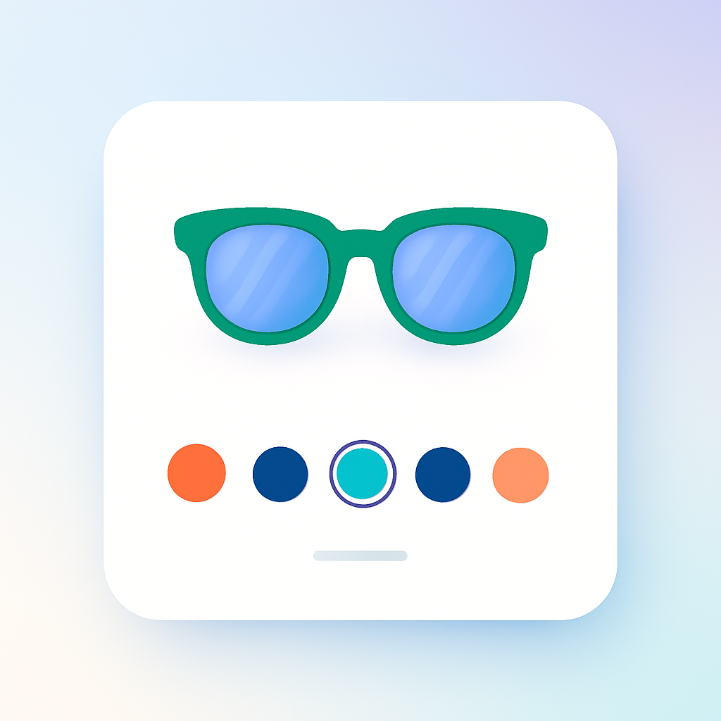
Shopify color swatches are visual variant selectors that replace the default dropdown menu on product pages and collection pages. Instead of reading a text list of color names, customers see the actual colors or product thumbnails. They click the one they want. The product image updates instantly.
A swatch can be a solid color circle, a small product photo, a text button, or a combination. The point is the same in every case: give customers a visual preview of each option so they can make faster, more confident decisions. If you sell a t-shirt in 8 colors, swatches show all 8 colors at once without requiring a single click.
Most Shopify themes still default to dropdown selectors. The shift to swatches requires either a theme that supports them natively (limited options exist) or a swatch app. We will cover both approaches in this guide.
Why swatches increase sales
The case for Shopify color swatches is not just about aesthetics. There is data behind it. Baymard Institute research on product page UX consistently shows that visual variant selectors reduce decision friction. When customers can see all options at a glance, they spend less time deciding and more time buying.
Here is what changes when you replace dropdowns with swatches:
- Customers see every color option without clicking. No hidden options, no scrolling through lists.
- Visual comparison happens instantly. A customer can scan 12 color options in under a second.
- Color names stop mattering. “Dusty Mauve” means nothing in a dropdown. A swatch shows the actual color.
- Fewer returns from mismatched expectations. Customers know what they are getting before adding to cart.
- Mobile shoppers benefit the most. Dropdowns on phones are clunky. Swatches are tap-friendly.
For a deeper look at the conversion impact, read our breakdown: variant image swatches and conversion rates. The short version is that visual selectors consistently outperform text-based selectors for any option where appearance matters.
Four types of swatches
Not all swatches are the same. There are four distinct types, and each one works best in different situations. Most stores use a mix depending on the product option.
Color circle swatches
The most common type. Small circles filled with a solid color. The customer sees a row of colored dots and taps the one they want. Clean, compact, universally understood. Works well for products with standard, easily recognizable colors. Less effective for subtle shades where “Sage” and “Olive” look nearly identical as tiny circles.
Color circle swatches pull their fill color from hex codes, metaobject definitions, or manually set values. Getting the color accurate matters. A swatch that shows bright red when the actual product is burgundy creates the same problem as a misleading color name. For accuracy tips: how to fix inaccurate Shopify color swatches.
Image swatches (product photo thumbnails)
Small thumbnail images showing the actual product in that variant. Instead of a red circle, the customer sees a tiny photo of the red jacket. This is the most informative swatch type. It works especially well for products where color alone does not tell the story: patterns, prints, textures, multi-color designs.
Image swatches can pull from multiple sources: the variant’s assigned product image, a custom uploaded image, a metafield image, or the first image assigned to that variant in the app. Rubik Variant Images uses the product photo as the image swatch source by default, giving customers a true preview of what they will get.
Button and pill swatches
Text labels displayed as clickable buttons or rounded pills. “Small,” “Medium,” “Large.” “Cotton,” “Linen,” “Silk.” These are technically swatches in that they replace the dropdown, but they are text-based rather than visual. They work best for non-visual options like size, material, or style where a color circle or image would not add value.
Button swatches still outperform dropdowns because all options are visible at once. The customer does not need to open a menu to see what sizes are available. That visibility alone reduces friction.
Dropdown (fallback)
The Shopify default. A select element with a list of text options. It hides all options until clicked. No visual preview. Useful as a fallback for options with many values (20+ sizes, for example) where a row of buttons would take up too much space. Not recommended for color.
Most well-optimized stores use a mix: image or color swatches for Color, button swatches for Size, and dropdowns only when the option list is exceptionally long. Full comparison: swatches vs dropdowns for Shopify color variants.
Product page swatches
The product page is where swatches matter most. This is where the customer commits to a specific variant and adds it to the cart. The variant selector needs to be clear, fast, and visually accurate.
Rubik Variant Images (5.0 rating, 343+ reviews) handles product page swatches. The app renders swatches inside a Shadow DOM container. This is a technical detail that matters: Shadow DOM means the swatch CSS is completely isolated from your theme’s CSS. No style conflicts. No layout shifts. The swatches look identical on every theme without custom CSS work.
Swatch types in Rubik Variant Images
RVI supports three swatch types per option, and you can mix them on the same product:
- Image swatch: Shows a product photo thumbnail. Best for Color on products with patterns, prints, or textures.
- Color swatch: Solid color circle (or dual-color for two-tone products). Best for Color on solid-color products.
- Text pill: Fallback text button. Best for Size, Material, or other non-visual options.
You can use different swatch types for different options on the same product. Color uses image swatches while Size uses text pills. The app supports this natively with its mixed swatch types feature. Details: mixed swatch types per option.
11 style presets
RVI includes 11 pre-built swatch style presets. Each preset controls the shape, size, border, spacing, and selected-state styling of the swatches. You pick a preset, and the swatches match your store’s look without writing CSS. If you need further customization, CSS variables let you fine-tune every detail. For CSS ideas: swatch CSS customization ideas.
Swatch tooltips
When enabled with the swatch_show_tooltip setting, hovering over a swatch shows the variant name. Useful when color circles alone are ambiguous. The customer hovers over a dark blue circle and sees “Navy” appear. No guessing.
Gallery filtering on variant select
Product page swatches do more than just look nice. When a customer clicks a color swatch in RVI, the product image gallery filters to show only the images assigned to that variant. The customer sees only the photos relevant to their selected color. No scrolling through 30 images to find the three that match. For more on this: select variant by clicking an image.
RVI works with 350+ Shopify themes and 7 page builders. It uses 8 different variant detection methods to handle the variations in how different themes implement galleries and selectors. See the RVI live demo store to see product page swatches in action.
Collection page swatches
Swatches on collection pages serve a different purpose. On the product page, swatches help the customer pick a variant. On the collection page, swatches help the customer preview what is available before clicking through. They show up on product cards, below the product title or image.
Rubik Combined Listings (5.0 rating, 21+ reviews) handles collection page swatches. RCL works with grouped products (combined listings) and shows swatches on product cards that let customers preview each color directly from the collection page.
Swatch types in Rubik Combined Listings
RCL supports four swatch types for collection page product cards:
- Color swatch: Solid color circles with optional two-color split.
- Image swatch: Product photo thumbnails with 7 different image sources to choose from.
- Button swatch: Text-based clickable labels.
- Dropdown: Select menu for product cards with many variants.
8 style presets
RCL includes 8 pre-built style presets specifically designed for collection page product cards. The presets control size, shape, spacing, and hover behavior. Pick one that matches your theme’s card design and you are done. For deeper control, 70+ CSS variables let you override any specific property.
Image swap on hover
When a customer hovers over a color swatch on a collection page product card, the product card image swaps to show that color. The customer does not need to click through to the product page to see what the blue version looks like. This preview behavior reduces clicks, increases engagement, and helps customers find the right product faster.
For a full breakdown of collection page swatch strategies: Shopify collection page color swatches. See the RCL live demo store to see collection page swatches in action.
Shopify native swatches vs app-based swatches
Shopify has started adding native swatch support to some themes. The Horizon theme, for example, includes basic color swatches. But native support is still limited in scope and flexibility compared to app-based solutions.
What native swatches offer
- Basic color circle swatches on product pages (select themes only).
- Color data pulled from metaobjects or variant option names.
- Styling limited to what the theme’s customizer exposes.
- No collection page swatches on product cards.
- No image swatches (product photo thumbnails).
- No mixed swatch types per option.
- No gallery filtering when selecting a variant.
What app-based swatches add
- Image swatches, color swatches, button swatches, and dropdowns on the same product.
- Collection page swatches with image swap on hover.
- Gallery filtering that shows only the selected variant’s images.
- Style presets (11 in RVI, 8 in RCL) and extensive CSS variable control.
- Shadow DOM isolation so theme CSS cannot break swatch styling.
- Two-color swatches for dual-tone products.
- AI visual settings assistant for configuration.
- Compatibility with 350+ themes and 7 page builders.
If your theme has built-in swatches and you only need basic color circles on the product page, native support might be enough. For anything beyond that, an app is the way to go. Read about the performance side of the decision: swatch apps and store speed performance.
Customization options
Swatches need to match your store’s design. Out-of-the-box swatches that look generic undermine the brand experience you have built. Both Rubik apps offer deep customization at multiple levels.
Style presets
The fastest path to good-looking Shopify color swatches. RVI offers 11 presets for product page swatches. RCL offers 8 presets for collection page swatches. Each preset is a complete design: shape (circle, square, rounded square), size, border style, selected-state indicator (outline, checkmark, scale), and spacing. Pick one, preview it, done.
CSS variables
RCL exposes 70+ CSS custom properties that control every visual aspect of the swatches. Swatch size, border radius, gap between swatches, border color on hover, border color when selected, tooltip font size, transition duration. If you can see it, you can change it with a CSS variable. No need to override theme styles or fight specificity battles.
Because the swatches render inside a Shadow DOM, your CSS changes are scoped and will not leak into the rest of your theme. And your theme’s CSS will not accidentally override your swatch styles. It is a clean separation that eliminates the most common cause of swatch styling issues.
For customization ideas and code examples: swatch CSS customization ideas. Also: customizing combined listing swatches.
AI visual settings assistant
RCL includes an AI visual settings assistant that helps you configure swatch appearance through a conversational interface. Instead of hunting through settings panels, you describe what you want: “make the swatches larger with a thicker border when selected.” The assistant translates that into the correct CSS variable values and applies them. Useful for merchants who are not comfortable writing CSS.
Where swatch color data comes from
Color swatches need to know what color to display. That data can come from several sources, depending on your setup.
- Hex codes: Manually set hex color values (like #FF5733) that map to each variant option value. Precise, but requires manual setup for every color in your catalog.
- Metaobjects: Shopify metaobjects let you define color values centrally. Create a “Color” metaobject type, add entries with color names and hex values, and reference them across products. This is Shopify’s recommended approach for native swatch support.
- Product images: For image swatches, the color data is the product image itself. The swatch shows a thumbnail of the variant’s assigned product photo. No hex codes needed.
- Custom images: Upload a custom swatch image (a fabric texture, a pattern close-up) instead of using the product photo or a solid color.
- Color name matching: Some apps automatically map common color names (“Red,” “Blue,” “Black”) to their corresponding hex values. Works for standard colors but fails for brand-specific names like “Midnight Blush.”
The accuracy of your swatch colors directly affects customer trust and return rates. A swatch that shows bright teal when the product is actually forest green will generate returns. Take the time to verify your color data. Full guide: fixing inaccurate Shopify color swatches.
Two-color and gradient swatches
Not every product variant is a single solid color. Two-tone shoes, gradient fabrics, color-blocked designs. A single-color swatch cannot represent these accurately. That is where two-color swatches come in.
Rubik Combined Listings supports two-color swatches with a primary and secondary color. You set both colors, and the swatch displays them split across the circle. Four split directions are available:
- Vertical split: Left half is color one, right half is color two.
- Horizontal split: Top half is color one, bottom half is color two.
- Diagonal split (top-left to bottom-right): A clean angled division.
- Diagonal split (top-right to bottom-left): The reverse angle.
Two-color swatches solve the problem of representing multi-color products without resorting to image swatches. A black-and-white sneaker shows a half-black, half-white swatch. A navy-and-gold tie shows the split clearly. Customers understand what they are getting without needing a product photo thumbnail.
For products with more complex patterns (florals, plaids, abstract prints), image swatches remain the better choice. But for clean two-tone products, dual-color swatches are more compact and visually cleaner than tiny thumbnails.
Accessibility
Shopify color swatches introduce accessibility challenges that dropdowns handle automatically. A dropdown is a native HTML select element with built-in keyboard navigation and screen reader support. Swatches are custom UI elements that need explicit accessibility work.
Good swatch implementations handle these requirements:
- ARIA labels: Each swatch needs an aria-label that describes the option value. A red color swatch should announce as “Red” to screen readers, not as an unlabeled button.
- Keyboard navigation: Customers must be able to navigate between swatches using Tab and arrow keys, and select a swatch with Enter or Space.
- Focus indicators: The currently focused swatch needs a visible outline that meets contrast requirements. This cannot be removed for aesthetic reasons.
- Screen reader announcements: When a swatch is selected, the screen reader should announce the selected value and the resulting changes (price change, availability status).
- Color-only information: Swatches must not rely solely on color to convey information. The color name should be available via tooltip or label for users who cannot distinguish colors.
The European Accessibility Act (EAA) makes these requirements legally binding for stores selling to EU customers starting in 2025. This is not optional. Read our full guide on the topic: European Accessibility Act and Shopify swatches. For WCAG-specific requirements: Shopify color swatches accessibility and WCAG.
Rubik’s Shadow DOM approach helps here. Since the swatches are rendered in a controlled environment, accessibility attributes are applied consistently regardless of what the theme does or does not provide. The app handles ARIA labels, keyboard navigation, and focus management out of the box.
Common swatch problems and fixes
Swatches are more complex than dropdowns. More things can go wrong. Here are the issues merchants run into most often and how to fix them.
Swatches not showing up
The app is installed, but no swatches appear on the product page. Common causes:
- The app embed or block is not enabled in the theme customizer. Most swatch apps require you to activate an app embed or add an app block to the product page template.
- The product does not have variants. Swatches only appear when there are options to select.
- Another app is controlling the variant selector and conflicting with the swatch app.
- A page builder is overriding the product form section where swatches inject.
Wrong swatch colors
The swatches appear, but the colors do not match the actual product. This happens when:
- Hex codes are incorrect or were auto-generated from color names without verification.
- Metaobject color values have not been updated after a product line refresh.
- The monitor calibration differs between where you set the colors and what the customer sees (less in your control, but worth noting).
Fix: verify hex codes against actual product photos. Use a color picker tool on the product image to extract the dominant color. For image swatches, this is not an issue since the swatch is the product photo itself.
Theme conflicts
Your theme’s CSS overrides swatch styles, causing broken layouts, wrong sizes, or missing borders. This is the most common issue with swatch apps that inject into the theme’s DOM. The theme applies its own styles to button and radio elements, and the swatches inherit those styles unintentionally.
This is exactly why Shadow DOM matters. Apps that render swatches inside Shadow DOM (like Rubik) are immune to theme CSS conflicts. The swatch styles are encapsulated. If you are using a swatch app without Shadow DOM isolation and experiencing style conflicts, you either need to write CSS overrides or switch to an app that uses Shadow DOM.
Swatches loading slowly
Swatches that load after the page content create a visible layout shift. The page renders with a dropdown, then swatches pop in a second later. This is a performance issue related to how the swatch app loads its JavaScript.
Look for apps that load efficiently and do not block page rendering. Performance comparison: swatch apps and store speed performance.
Get started
For product page swatches, Rubik Variant Images is free for one product. Install it, set up swatches on your most complex product, and see the result. Pricing: Free/$25/$50/$75 per month depending on product count. All plans include the full feature set.
For collection page swatches, Rubik Combined Listings is free for stores with up to 5 combined listing groups. Pricing: Free/$10/$30/$50 per month. Set up your first combined listing group and see swatches on your collection page product cards.
For tracking the impact of swatches on your store’s metrics: tracking swatch clicks in Google Analytics.
Video walkthrough
This video walks through setting up custom Shopify color swatches, from installation to styling.
Frequently asked questions
How do I add color swatches to my Shopify store?
Install a swatch app like Rubik Variant Images from the Shopify App Store. Enable the app embed in your theme customizer. The app will replace your theme’s default dropdown with visual swatches. For collection page swatches, install Rubik Combined Listings and set up your combined listing groups.
Does Shopify have built-in color swatches?
Some Shopify themes include basic native swatch support. The Horizon theme, for example, has built-in color swatches. But native support is limited to simple color circles on the product page. There are no image swatches, no collection page swatches, no gallery filtering, and limited customization. Most merchants use a swatch app for a complete solution.
What is the difference between color swatches and image swatches?
Color swatches show a solid fill color (like a red or blue circle). Image swatches show a small product photo thumbnail. Color swatches work well for solid-color products where the color is obvious. Image swatches work better for patterns, prints, textures, and products where a flat color does not tell the whole story.
Can I show swatches on collection pages in Shopify?
Not with Shopify’s native functionality. Collection page swatches require an app. Rubik Combined Listings adds swatches to product cards on collection pages, with image swap on hover so customers can preview each color without clicking through to the product page.
Do color swatches slow down my Shopify store?
It depends on the app. Well-built swatch apps load efficiently and add minimal overhead. Apps that use Shadow DOM (like Rubik) tend to perform well because they avoid the CSS recalculation overhead that comes from injecting styles into the theme’s DOM. Read our performance analysis: swatch apps and store speed.
How do I make my Shopify color swatches accessible?
Ensure swatches have proper ARIA labels, support keyboard navigation (Tab, arrow keys, Enter), display visible focus indicators, and do not rely on color alone to convey information. Tooltips showing color names help users who cannot distinguish colors. Apps with built-in accessibility features handle most of this automatically. Full guide: Shopify color swatches accessibility and WCAG.
Related reading
- Swatches vs dropdowns for Shopify color variants
- How to fix inaccurate Shopify color swatches
- Shopify color swatches accessibility and WCAG
- European Accessibility Act and Shopify swatches
- Variant image swatches and conversion rates
- Swatch apps and store speed performance
- Shopify variant images: the complete guide
- Select variant by clicking an image on Shopify
- Shopify variant image apps compared (2026)
- Shopify product page optimization checklist (2026)
- Mixed swatch types per option
- Collection page color swatches
- Customizing combined listing swatches
- Track swatch clicks in Google Analytics