Every Shopify merchant selling products in multiple colors, materials, or styles faces the same question: should you create one product with all the variants, or separate products for each option?
There is no universally right answer. The best setup depends on your catalog size, sales channels, SEO goals, and how you want customers (and AI shopping assistants) to discover your products. What works for a store selling 20 t-shirts differs from what works for one selling 2,000 industrial parts.
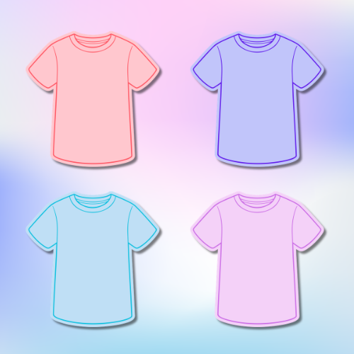
This guide walks through every setup option using a single example: a cotton t-shirt available in 4 colors (Red, Blue, Green, Black) and 3 sizes (S, M, L). That gives us 12 total combinations to work with. By the end, you will know exactly which approach fits your store and which tools make it work.
The four setup options
Option 1: One product, all variants
You create a single product called “Cotton T-Shirt” with two option axes: Color (Red, Blue, Green, Black) and Size (S, M, L). Shopify generates all 12 variant combinations automatically. Customers pick color and size from dropdown menus or swatches on one product page.
This is the most common setup for new stores. One page, one URL, one place to manage inventory. Simple.
Option 2: Split by color, sizes as variants
You create four separate products: “Cotton T-Shirt – Red”, “Cotton T-Shirt – Blue”, “Cotton T-Shirt – Green”, and “Cotton T-Shirt – Black”. Each has 3 size variants (S, M, L). Customers switch between colors using linked swatches that take them to the correct product page.
This is the most popular approach for apparel brands that want clean product pages with color-specific galleries and separate URLs for each color.
Option 3: Every combination as a separate product
You create 12 individual products: “Cotton T-Shirt – Red / S”, “Cotton T-Shirt – Red / M”, and so on. Each is a single-variant product with its own page, images, and description.
This is rarely practical. Managing 12 products for one t-shirt is tedious, and it gets worse as your catalog grows. It only makes sense if every single combination has unique content, photos, or pricing that cannot be handled through variants.
Option 4: Hybrid approaches
You split products along one axis and keep the other as variants. For example, if you sell the same t-shirt in cotton and polyester, you might create two products (“Cotton T-Shirt” and “Polyester T-Shirt”) with color and size as variants within each. Or split by color but combine materials as variants.
The rule of thumb: split along the axis that changes the product visually, and keep variants for the axis that does not (like size or quantity).
Quick comparison
Here is how each setup compares for our t-shirt example:
| Setup | Products | Variants each | Total URLs | Management effort |
|---|---|---|---|---|
| One product, all variants | 1 | 12 | 1 | Lowest |
| Split by color | 4 | 3 | 4 | Moderate |
| Every combination separate | 12 | 1 | 12 | Highest |
| Hybrid (split by material) | 2+ | Varies | 2+ | Moderate |
How each setup looks on your store
Product page experience
With one product and all variants, the product page shows every image for every color in a single gallery. A customer looking at the blue t-shirt still sees red, green, and black photos mixed in. Some themes let you associate images with specific variants, but many do not, and the result is a cluttered gallery that makes it harder for customers to focus on the option they want.
With separate products per color, each product page has its own gallery showing only that color. The blue t-shirt page shows three angles of a blue shirt. Nothing else. The page title, description, and meta tags can all be tailored to that specific color. The result is a cleaner, more focused shopping experience.
This is one of the biggest practical differences between the two approaches, and it matters more than most merchants realize. Product photography sells products. When a customer has to scroll past eight irrelevant photos to find the color they want, you lose engagement.
Collection and search results
In collection pages and search results, one product gets one card. Customers see a single “Cotton T-Shirt” tile. They have to click into the product page to discover all available colors.
With separate products, each color gets its own card in the collection. Customers can see at a glance that you offer the shirt in four colors. If a customer searches for “blue t-shirt,” the blue version appears directly in results.
For stores where visual variety drives purchases (fashion, home decor, accessories), showing each color as its own card in collections can significantly increase click-through rates.
Filtering and quick view
Shopify’s native collection filtering works best with separate products. When a customer filters by “Color: Blue,” separate products return a clean result. With a single product, the filter may or may not surface your t-shirt depending on how the theme handles variant-level filtering.
Quick view behavior also differs. With a single product, the quick view shows all variants and all images. With separate products, the quick view is focused on that specific color.
Google Shopping, Amazon, and marketplace feeds
Google Shopping
Google Merchant Center creates one Shopping listing per variant. With the single-product setup, your feed contains 12 entries all sharing the same product URL (differentiated by variant parameters). Google uses item_group_id to understand that these 12 listings belong together.
With separate products, each color is its own product in the feed with its own URL, title, and images. This gives you more control over how each listing appears in Google Shopping results. You can write “Blue Cotton T-Shirt” as the title instead of “Cotton T-Shirt – Blue / S.” Each listing links to a page showing only blue photos.
Both approaches work. But separate products let you optimize titles, descriptions, and images per color, which can improve click-through rates on Shopping ads.
Amazon, Facebook, and Instagram
Amazon’s catalog structure uses parent/child relationships that map naturally to Shopify’s single-product-with-variants model. If you sell on Amazon, keeping one product with all variants simplifies your sync.
Facebook and Instagram Shopping also work well with both approaches, but historically were designed around single products with variants. Most feed apps handle the conversion either way, but the single-product approach requires less configuration.
If marketplaces are your primary sales channel, the single-product setup creates the least friction with feed synchronization tools.
SEO: one URL or many?
Traditional SEO
With one product, all your backlinks, reviews, and domain authority concentrate on a single URL. That page ranks for “cotton t-shirt” and all related terms. You get one strong page instead of four that compete with each other.
With separate products, each color gets its own URL that can rank independently. “Blue cotton t-shirt” and “red cotton t-shirt” become separate ranking opportunities. You can write unique descriptions, set unique meta titles, and build links to specific colors. But you also split your authority across four pages.
The trade-off: concentrated authority on one broad term vs. multiple shots at longer, more specific terms. For most stores, the separate-product approach wins when customers actually search for specific colors or styles.
Structured data
With a single product, your page generates one Product schema with multiple Offer entries (one per variant). Search engines see this as one product available in multiple configurations.
With separate products, each page generates its own Product schema with its own name, image, description, and offers. Search engines treat each as a distinct product. This gives richer structured data per page and can result in more detailed rich snippets in search results.
For a deeper analysis of how separate products perform in AI recommendations and search, see our detailed guide: Why separate Shopify products rank better in AI recommendations and Google Shopping.
Agentic commerce: how AI recommends your products
This section matters more than most merchants realize. AI-powered shopping is not a future trend. It is happening right now.
How AI shopping actually works
ChatGPT, Google AI Overviews, and Perplexity are already recommending products to shoppers. When someone asks “recommend a blue cotton t-shirt under $30,” these AI systems pull information from multiple sources: product feeds, web crawls, structured data, and indexed page content.
The AI reads your product pages the same way a person would, but faster and with more attention to detail. It looks at the page title, the description, the images, the pricing, the structured data, and even the URL. Then it decides whether your product matches the shopper’s request.
This is fundamentally different from traditional search. Google Search matches keywords. AI shopping understands intent and context.
Why product structure matters for AI
When an AI system encounters your single “Cotton T-Shirt” product page, it needs to parse through a variant matrix to understand that you sell a blue version. The color is buried in a dropdown option, not prominently featured in the title, URL, or primary content.
When the AI encounters a dedicated “Blue Cotton T-Shirt” page, the match is immediate. The title says blue. The URL says blue. The images show blue. The description talks about blue. Every signal on the page confirms this is exactly what the shopper asked for.
AI systems are smart, but they are also processing millions of products. The product that makes the match obvious wins over the product that requires the AI to dig through variant data.
Three recommendation scenarios
Let’s see how this plays out with our t-shirt example.
Scenario 1: “Recommend a blue t-shirt under $30”
With a single product, the AI finds your “Cotton T-Shirt” page. It needs to identify that a blue variant exists, check that variant’s price, and extract the right image. Some AI systems do this well. Others skip the product because the title does not mention “blue” and move on to a competitor whose page title explicitly says “Blue Cotton T-Shirt.”
With separate products, your “Blue Cotton T-Shirt” page is a direct match. The title, description, images, and price all align with the query. The AI can recommend it confidently and link directly to the right page.
Scenario 2: “Compare cotton t-shirts in multiple colors”
With a single product, the AI has one page to work with. It can mention that the shirt comes in four colors, but it cannot show separate photos, prices, or availability for each color in a comparison format.
With separate products, the AI can pull all four pages and present them as distinct options. “Here are four cotton t-shirts: Red ($25), Blue ($25), Green ($28), and Black ($22).” Each with its own photo and link. This is a richer, more useful response for the shopper.
Scenario 3: “Find a gift for someone who likes green”
This is an intent-based query where the AI tries to match a preference. With a single product, the AI might not surface your t-shirt at all because “green” is not prominent on the page. With a separate “Green Cotton T-Shirt” product, the color is front and center, making it a strong match for the shopper’s request.
Why this matters now
ChatGPT’s shopping feature processes millions of queries daily. Google AI Overviews appear for a growing percentage of product searches. Perplexity’s shopping recommendations are gaining traction. These are not experimental features. They are where an increasing share of product discovery happens.
Merchants who structure their products for AI readability today are building an advantage that compounds over time. Every separate product page is another entry point for AI systems to discover and recommend your products.
This does not mean every store must use separate products. If you sell technical equipment with 50 configuration options, a single product page makes more sense. But if your products are visually distinct, with unique images and color-specific appeal, the separate-product approach gives AI systems more to work with.
The stores that will win in agentic commerce are the ones that make it easy for AI to understand, compare, and recommend their products. Product structure is one of the simplest ways to do that.
Which setup is right for your store?
There is no single best answer. But here is a framework to help you decide.
Choose one product with all variants when:
- Your variants are mostly size or quantity, not visually different
- You sell primarily through Amazon, Facebook, or other marketplaces
- You want the simplest possible inventory management
- Your customers do not search for specific colors or styles
Choose separate products when:
- Your variants are visually distinct (different colors, patterns, finishes)
- You want each color to rank in search for its own keywords
- You want each product page to have a clean, focused image gallery
- AI discoverability matters to you (it should)
- You want each color visible as its own card in collection pages
Choose a hybrid approach when:
- You have multiple visual axes (color and material, for example)
- You want to split by the axis customers care about most (usually color) while keeping less visual options (size) as variants
- You sell across multiple channels and need to balance AI readability with marketplace compatibility
For most apparel, footwear, and accessory stores, the sweet spot is separate products per color with sizes as variants. It gives you the best balance of clean product pages, SEO flexibility, and AI readability while keeping size management simple.
Making either setup work with the right tools
Both setups have a UX problem out of the box. Shopify does not natively solve the challenges of either approach. Here is what to use depending on which path you choose.
If you chose separate products: Rubik Combined Listings Swatch
The challenge with separate products is connecting them. Without a linking tool, customers who land on the blue t-shirt have no way to discover the red version without going back to the collection page.
Rubik Combined Listings Swatch solves this by linking separate products together with visual color swatches. Each product keeps its own URL, images, description, and SEO. Customers switch between colors with a single click. The swatch appears on both the product page and collection cards.
This gives you all the benefits of separate products (clean galleries, independent SEO, AI readability) with the seamless browsing experience of a single product. Works on all Shopify plans.
If you chose one product with all variants: Rubik Variant Images & Swatch
The challenge with a single product is the cluttered gallery. When a customer selects “Blue,” they still see red, green, and black photos in the image carousel.
Rubik Variant Images & Swatch fixes this by grouping images per variant and showing only the relevant photos when a variant is selected. It also replaces Shopify’s default dropdown selectors with visual color swatches. The app uses AI to automatically assign images to the right variants, saving you hours of manual work.
This keeps the simplicity of one product while giving customers a focused, clean browsing experience. The right photos for the right variant, every time.
Side-by-side comparison
| Factor | One product, all variants | Separate products per color |
|---|---|---|
| Management effort | Low: one product to update | Moderate: one product per color |
| Product images | All colors mixed in one gallery | Clean, color-specific galleries |
| Collection grid | One card for all colors | Each color gets its own card |
| Google Shopping | One product URL, multiple variants | Separate URLs with tailored titles |
| Amazon / Facebook | Natural parent/child mapping | Works, but needs feed configuration |
| SEO (broad terms) | Strong: concentrated authority | Split across pages |
| SEO (long-tail terms) | Limited: one URL for all colors | Strong: each color ranks independently |
| AI discoverability | AI must parse variant data | Each color is a clear, direct match |
| Option switching UX | Dropdowns or native swatches | Linked swatches between products |
| Unique content per color | Not possible (shared page) | Full control per product |
| Recommended app | Rubik Variant Images & Swatch | Rubik Combined Listings Swatch |
The bottom line
There is no wrong answer here, only the wrong answer for your situation. Both setups are valid, and both can be made to work well with the right tools.
If your variants are mostly non-visual (sizes, quantities), stick with one product and use Rubik Variant Images & Swatch to clean up the gallery and add visual swatches.
If your variants are visually distinct (colors, patterns, materials), create separate products and use Rubik Combined Listings Swatch to link them together with seamless swatches.
For most apparel and fashion stores, the most common approach is separate products per color with sizes as variants. It gives you the best of both worlds: clean product pages, independent SEO, AI readability, and simple size management.
Whichever setup you choose, make sure it works for your customers, your sales channels, and the future of product discovery. For a deeper look at how AI and Google Shopping favor separate products, read our guide: Why separate Shopify products rank better in AI recommendations and Google Shopping.
Not sure which combined listings app to use? We compared all 11 Shopify combined listings apps with 10+ reviews: The 11 best Shopify combined listings apps in 2026, compared.