You have separate products on Shopify that should be connected. Maybe it’s the same jacket in five colors. Maybe it’s a sofa in different fabrics. Maybe it’s a phone case in 30 designs. Whatever the product, the situation is the same: each color or style is its own listing in your Shopify admin, and your customers have no idea they’re related.
They browse your collection page and see five cards for what is essentially one jacket. They click into the navy version, decide they want black instead, go back to the collection, scroll around looking for it, maybe find it, maybe give up.
This guide covers how to group those separate products together and display them as color swatches (or image swatches, or buttons, or a dropdown) on a single product page. We’ll walk through the full setup, explain every feature worth knowing about, and link to the specific resources you’ll need along the way.
What Does It Mean to Group Products on Shopify?
Grouping products means taking multiple standalone Shopify product listings and presenting them as if they were options of one product. The customer sees a single product page with a row of clickable swatches. They pick a color, they land on that color’s product page with its own photos, price, description, and stock count.
From the customer’s perspective, it feels exactly like choosing a variant. From your backend, nothing changes. Each product keeps its own URL, its own inventory, its own analytics. The grouping only happens on the storefront through a visual swatch layer.
This is different from Shopify’s native variant system. With variants, all your options live under one product record. One URL, one description, one set of images shared across every option. With grouped products (also called combined listings), each option is fully independent.
Why would you want this instead of variants? A few common reasons, and we’ll get into each one.
Why Stores Use Separate Products Instead of Variants
The Variant Limit
Shopify raised the variant cap from 100 to 2,000 in February 2025. That sounds like plenty until you do the multiplication. A product with 15 colors, 10 sizes, and 3 materials creates 450 combinations. Add a fourth option like “Fit” or “Length” and you can’t, because Shopify still limits every product to 3 option categories. Period.
The 3-option ceiling is actually the bigger bottleneck for most stores. You can have 2,000 variants, sure, but only across 3 option types. If your product genuinely needs 4 or 5 attributes, you’re stuck.
The standard workaround: split along one option (usually the one with the most values, like fabric or color), create a separate product for each value, then reconnect them with swatches using a combined listings app.
For the full math breakdown on when and how the limit breaks, this guide on Shopify’s variant limit shows exactly where the numbers stop working.
Your Supplier Sends Them That Way
This is more common than people think. Wholesalers, ERP systems like NetSuite, print-on-demand services, and POS systems typically export each colorway as its own SKU. When you import that data into Shopify, each color becomes a separate product. Merging them into variants means reformatting every import, mapping SKUs manually, and repeating that process every time you restock. Nobody with a real inventory operation has time for that.
SEO
This is the reason that gets overlooked the most. When all your colors are variants under one product, Google sees one URL: yourstore.com/products/linen-blazer. Every color shares that single page. The query parameter ?variant=12345 gets ignored by search engines in most cases.
When each color is a separate product, you get distinct URLs:
yourstore.com/products/navy-linen-blazeryourstore.com/products/black-linen-blazeryourstore.com/products/cream-linen-blazer
Each page has its own title tag, its own meta description, its own image alt text. Google indexes them independently. When someone searches “navy linen blazer,” your dedicated page titled “Navy Linen Blazer” is a much stronger match than a generic “Linen Blazer” page.
We published a detailed analysis of how combined listings affect SEO that covers canonical tags, Google Shopping implications, and the internal linking benefits of swatch connections.
If you’re weighing the tradeoffs between variants and separate products more broadly, this comparison guide lays out when each approach makes sense.
The Three Ways to Link Products With Swatches
There are three paths, and they differ a lot in effort, cost, and flexibility.
Manual Metafield Linking
Shopify lets you create product metafields that reference other products. In theory, you could build a “Related Color Variants” metafield, link products to each other, and write custom Liquid code to render swatches on the storefront.
In practice, this is painful. Maintaining cross-references between hundreds of products turns into a full-time job. Every new color you add means updating metafields on every sibling product. And you need to write (or hire someone to write) the Liquid rendering code, handle mobile responsiveness, build out-of-stock styling, and fix it every time your theme updates.
Works for 10 products. Falls apart at 200.
Shopify’s Native Combined Listings App
Shopify launched this in 2024. It creates a new combined product type at the platform level. The integration is tight because it’s built into the admin.
The catch: it requires Shopify Plus. That’s $2,300 per month minimum. For most small and mid-sized stores, spending that much for a product grouping feature isn’t realistic.
The native app also has meaningful limitations. Basic swatch styling only, no image swatches, no two-tone color options, limited collection page support, no AI-assisted setup, and no way to style desktop and mobile independently.
We did a side-by-side comparison of the native app against every major third-party alternative if you want the full feature matrix.
Third-Party Combined Listings Apps
This is where most stores end up. Apps like Rubik Combined Listings use app embeds and JavaScript to render swatches on your existing product pages and collection grids. No Shopify Plus needed. Works on any plan including Basic.
The rest of this guide focuses on this approach, since it’s what 95% of stores will actually use.
Setting Up Combined Listings Step by Step
We’ll use Rubik Combined Listings for this walkthrough because it’s the app we built and know best. The general concepts transfer to other combined listings apps too.
Step 1: Install and Activate the App Embed
Grab Rubik Combined Listings from the Shopify App Store. After installing, you need to activate the app embed on your theme. This is the piece that loads the swatch component on your storefront. Skip this and nothing shows up.
On the app dashboard, you’ll see an App Embed Status section. Green badge means active. If it says inactive, click through and toggle it on. You can enable the embed on multiple themes independently, which is useful for testing on a draft theme before touching your live store.
Step 2: Select Your Theme Type
This is the step that trips up most people, and it’s the number one reason swatches end up in the wrong place or don’t appear at all.
Every Shopify theme structures its product page HTML differently. The app needs to know which theme you’re running so it can inject swatches in the correct position on product pages, collection grids, quick views, and search results.
Open the app embed settings and pick your theme. Dawn, Refresh, and every popular paid theme from the Shopify Theme Store are in the list. If swatches aren’t showing where you expect after setup, come back here first. Wrong theme type is almost always the cause.
Step 3: Create a Product Group
A product group is the core structure. It’s what ties your separate products together. You create a group and define two things:
Internal name. Just for your reference in the admin. Customers never see this.
Option name. What shows on the storefront. “Color,” “Material,” “Fabric,” “Style,” “Finish,” whatever fits your products.
Then you use Shopify’s product picker to select which products belong in the group. Each product in the group represents one swatch option.
Step 4: Set Option Values, Colors, and Images
For each product in the group, you configure three things:
Option value. The label that appears with the swatch. “Navy,” “Walnut,” “XL,” “Velvet.” This is what the customer reads.
Primary and secondary colors. The app has a built-in color picker with an eyedropper tool. You can point the eyedropper at the product image and it samples the dominant color directly. No guessing hex codes. If your product has two colors (like a shoe with a white sole and blue upper), you set both a primary and secondary color and the swatch renders as a two-tone split.
Custom swatch image. Optional. Upload any image you want as the swatch thumbnail instead of using a solid color. Useful for fabrics, patterns, textures, and wood grains where a flat color circle doesn’t tell the story.
Step 5: Use Magic Fill for Large Catalogs
If you have 30, 50, or 200 products to set up, doing all of the above manually takes forever. The Magic Fill feature fixes this.
Click one button and the app reads your product titles and analyzes your product images. It auto-fills the option values (“Navy,” “Black,” “Cream”) from the title text and assigns matching colors by sampling the product photos. What would take an hour of manual typing and color-picking happens in seconds.
Magic Fill works best when your product titles follow a consistent pattern like “Linen Blazer – Navy” or “Navy Linen Blazer.” If your naming is inconsistent, you might need to adjust a few values after Magic Fill runs, but it still saves the bulk of the work.
Step 6: Choose Your Swatch Type
Rubik offers four swatch types, and picking the right one matters more than people think. The wrong swatch type for your product category can actually be worse than a plain dropdown.
Image swatches. Show a product photo or custom texture as the swatch thumbnail. Best for fabrics, patterns, materials, wood finishes, and printed designs. Anywhere the visual difference between options can’t be captured by a solid color.
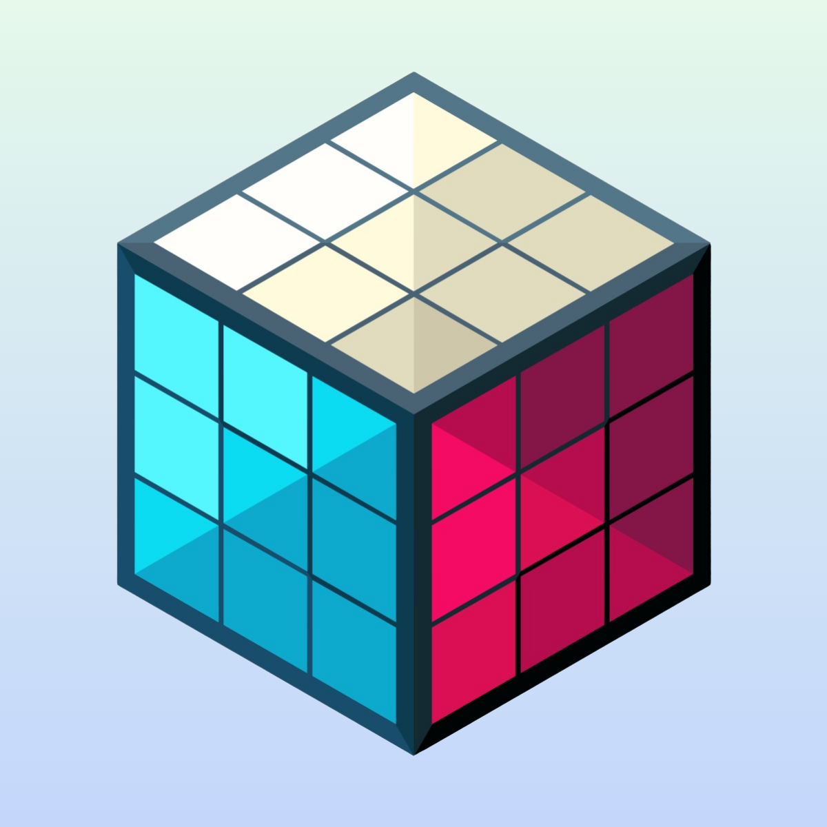
Color swatches. Small circles or squares filled with one or two solid colors. Best for products with distinct, solid colors. T-shirts, phone cases, accessories, paint. Two-tone color swatches support vertical, horizontal, and diagonal splits, which is unique to Rubik. Nobody else offers the two-tone option.
Button swatches. Text labels inside clickable buttons. Best for non-visual options like sizes, model names, pack quantities, and style names. “Regular,” “Slim,” “Tall.” Optionally include a small image inside the button.
Dropdown swatches. A native select menu. Best when you have a huge number of options (20+) and limited page space. Out-of-stock products automatically get a “(Sold out)” label appended.
For a deeper look at when to use which type, this post on displaying variants as swatches has a product-type reference table.
Step 7: Style With Presets (Then Customize)
You don’t have to build the visual design from scratch. Rubik includes 20+ style presets:
Square polaroid cards. Circle swatches. Rounded swatches. Carousel layouts with horizontal scrolling. Pill shapes with images inside. Buttons with price display underneath. Compact versions optimized for collection page grids.
Pick a preset that’s close to what you want, then fine-tune. You can adjust swatch size, spacing, border radius, selection indicator style, font sizes, and colors. There are separate settings for product page swatches and collection page swatches, and within each, separate settings for desktop and mobile.
That desktop/mobile split is something most other apps don’t offer. What looks good on a 1440p monitor is almost never right on an iPhone SE screen. Being able to set a 44px swatch for desktop and a 32px swatch for mobile without compromising either experience is a big deal.
If you want full control beyond presets, there are 70+ CSS custom properties (variables) you can override. And the app uses Shadow DOM for rendering, which means your theme’s CSS can’t accidentally break the swatch styles and vice versa.
Step 8: Enable Collection Page Swatches
This is the feature that transforms how your store feels to browse.
Without collection page swatches, a customer lands on your “Blazers” collection and sees five separate product cards for the same blazer in different colors. It’s cluttered. It wastes grid real estate. Customers might think you have a tiny catalog when you actually have hundreds of options.
With collection page swatches, each blazer shows as one card with small color indicators underneath. Hover over a swatch and the card image swaps to preview that color without leaving the page. Click it and you go to that product.
This is how Zara, H&M, and Nike display their products. There’s a reason every major retailer does it this way. It works.
Rubik places swatches directly on product cards in your collection grid. You can choose between the automatic app embed injection (works with any theme) or the manual app block placement (more precise control over where swatches sit within the card, tends to load faster on heavy grids).
We have a full guide on adding swatches to Shopify collection pages that covers mobile behavior, overflow indicators, and grid layout considerations.
Step 9: Configure Out-of-Stock Behavior
When a product in the group sells out, you have four options for how the swatch appears:
Hide it entirely. The swatch disappears. Simple, but customers don’t know the option exists.
Push to end. Available colors come first, sold-out ones move to the back of the row. Customers see what’s buyable first.
Show with reduced opacity. The swatch stays visible but fades out. You control the opacity from 0.1 (barely there) to 1.0 (normal). Signals “this exists but isn’t available right now.”
Show with strikethrough. A diagonal line crosses the swatch. Can be combined with reduced opacity. You pick the line color.
For dropdown swatches, out-of-stock products automatically show “(Sold out)” next to their name.
Step 10: Test on Mobile
Don’t skip this part. Actually pick up your phone and test. Not Chrome DevTools device simulation, your actual phone.
Check that swatches are large enough to tap without hitting the wrong one (Apple recommends 44x44px minimum touch targets). Confirm tapping a swatch updates the product image. Make sure the selected swatch has a clear visual indicator. Verify swatches don’t push the add-to-cart button below the fold. On collection pages, confirm the swatch row doesn’t break the grid.
Rubik has a “Copy desktop to mobile” shortcut if you want to start from your desktop design and adjust sizes down from there.
Advanced Features Most People Don’t Know About
Multiple Groups Per Product
A single product can belong to more than one group. A sofa that comes in different colors AND different fabrics can have a “Color” group and a separate “Fabric” group. Both swatch rows appear stacked on the product page. The Display Order setting controls which one shows first.
This effectively gives you unlimited option dimensions, bypassing Shopify’s 3-option ceiling entirely. Each group acts like an additional option without counting against any limit.
Swatch Categories Within a Group
Inside a single product group, you can organize swatches into subgroups. Under a “Color” option, you might create categories like “Warm Tones” and “Cool Tones.” When enabled, the storefront shows category headers above each subset of swatches, keeping a long list of 25+ colors organized and easy to scan.
Grid and Carousel Layouts
Beyond the standard grid (rows and columns), you can display swatches in a horizontal carousel with navigation arrows. The carousel is useful when you have many options but want to keep the page compact. Customers scroll sideways through the swatch row instead of seeing a tall block of color circles.
Per-Group Translation
If your store serves multiple languages, you can set translated option names and swatch labels per group. The “Color” header becomes “Couleur” for French visitors, and swatch labels translate accordingly. This is built into the group settings, not dependent on a separate translation app.
Swatch Click Analytics
For stores that want to track which swatches customers interact with, Rubik fires a JavaScript event (rcl_swatch_clicked) every time someone clicks a swatch. You can hook this into Google Analytics, Segment, or any event tracking system. Know which colors get clicked most, which get ignored, and make merchandising decisions with real data.
How This Works With Variant Image Filtering
If your separate products also have variants within them (like sizes), there’s a related problem worth solving at the same time.
Say your navy blazer product has sizes S through XL. Each size has its own set of product photos showing fit and measurements. Without image filtering, the customer selects “Medium” but still sees photos for every size jumbled together in the gallery.
Rubik Variant Images (5.0 stars, 323+ reviews, Built for Shopify badge) solves this. It assigns multiple images to each variant and filters the gallery when a variant is selected. Pick “Medium” and you only see the medium photos.
The two apps handle different problems:
- Rubik Combined Listings connects separate products with swatches (between-product navigation)
- Rubik Variant Images filters the image gallery per variant within a single product (within-product experience)
They’re built by the same team and designed to run side by side. A customer clicks through to the navy blazer via a combined listings swatch, then selects size “Medium,” and the gallery filters to show only the medium navy photos. The full flow feels seamless.
More details and a demo at rubikvariantimages.com. There’s also a blog post covering how combined listings and variant images work together in practice.
Real-World Use Cases
Fashion and Apparel
Split by color, keep sizes as native variants. Customer picks a color swatch, lands on that color’s product page, selects their size. Each color has its own product photos, its own URL for SEO (“navy-cotton-hoodie” ranks for that specific search), and its own inventory tracking.
Furniture and Home Decor
Split by fabric or material. A sofa in 20 fabrics would need 20 separate products, each with its own size variants. Image swatches work best here because customers need to see the actual texture, not just a color dot.
Jewelry
Split by metal type. Gold, silver, rose gold, platinum. Each metal has different pricing, different product photos showing the actual finish, and different care instructions. Color swatches with accurate metallic shades work well. The SEO benefit is strong here because people search specifically for “rose gold engagement ring,” not just “engagement ring.”
Electronics Accessories
Phone cases with 50 designs and 25 phone models. Split by design (50 products), keep phone model as a variant. Image swatches showing the design thumbnail let customers browse visually.
Print-on-Demand
Artists selling one design across t-shirts, hoodies, mugs, and posters. Each product type has fundamentally different attributes (sizes for clothing, dimensions for posters, no variants for mugs). Combined listings tie them together under one “Product Type” swatch row.
Troubleshooting Common Issues
If something isn’t working, here are the five things to check before contacting support.
Swatches not showing at all. App embed not activated. Go to Online Store, Themes, Customize, App Embeds, and toggle Rubik on. This is the single most common issue we see in support.
Swatches in the wrong position. Theme type set incorrectly. Open app settings, select the correct theme from the list. Every theme has a different DOM structure, and the app needs to know yours.
Clicking a swatch doesn’t change the image. The target product probably doesn’t have a featured image uploaded. The app pulls the product’s main image when someone clicks its swatch. No image means nothing to swap in.
Swatches look different on collection page vs. product page. This is expected behavior, not a bug. Rubik has separate styling panels for product pages and collection pages, each with their own desktop and mobile settings. Check that you’ve styled all four contexts.
Colors don’t match the product. Use the eyedropper tool on the actual product photo instead of guessing hex values. Or use Magic Fill to auto-detect colors from images.
For JavaScript conflicts, page builder compatibility issues (PageFly, GemPages, EComposer), and more obscure problems, the troubleshooting guide covers everything we’ve seen in support.
Does This Need Shopify Plus?
No. Rubik Combined Listings works on Shopify Basic ($39/month), Shopify ($105/month), Advanced ($399/month), and Plus ($2,300+/month).
Shopify’s own Combined Listings app does require Plus. But the third-party app gives you more swatch types, deeper customization, AI-assisted setup, collection page swatches with hover preview, desktop/mobile independent styling, and swatch categories. On a $39/month plan.
For a line-by-line feature comparison between the native app and Rubik, this post covers every difference. And if you just want the setup instructions for doing this without Plus, this guide walks through it.
What About the SEO Impact?
The short version: combined listings from separate products improve SEO for most stores.
Each product keeps its own URL, title tag, and meta description. Google can index each color or material independently. When someone searches a color-specific query, your dedicated page is a direct match.
The swatch links between products create natural internal linking. Every product page links to its siblings. Google follows those links and understands the relationship between the products. If one product earns backlinks, authority flows through the swatch links to all the siblings.
For Google Shopping, each product is its own feed entry with a color-specific title and matching thumbnail image. “Navy Linen Blazer” with a navy photo performs better in Shopping results for that query than a generic “Linen Blazer” entry that might display the wrong color.
And for AI-powered shopping assistants (ChatGPT, Google AI Overviews, Perplexity), standalone product pages with clear titles and structured data are easier to parse and recommend than variants buried inside a generic page.
The full SEO analysis, including canonical tag handling and review fragmentation, is in this dedicated post.
FAQ
Install a combined listings app like Rubik Combined Listings, activate the app embed, and create a product group. Select the products that belong together, set option values and swatch colors, pick a swatch type, and they’ll be connected on your storefront. Each product keeps its own URL and inventory.
A combined listings app adds color swatches to your product pages that link separate products together. When a customer clicks a swatch, they land on that product’s page. You can use color swatches, image swatches, button swatches, or dropdown menus depending on your product type.
Yes. Shopify’s native app requires Plus ($2,300+/month), but third-party apps work on any plan including Basic ($39/month). Rubik Combined Listings offers more features than the native app at a fraction of the cost.
They help. Each product keeps its own URL, title tag, and meta description. Google indexes each color or style independently, and the swatch links create internal linking between related products. Color-specific pages rank for color-specific searches that a single generic product page can’t target.
Rubik Combined Listings places swatches directly on product cards in your collection grid. Enable collection page swatches in the app settings, choose your swatch style, and they appear under each product card. Hovering over a swatch swaps the card image to preview that color.
Variants live under one product with one URL and shared data. Combined listings connect separate products that each have their own URL, images, description, and inventory. Combined listings give you the visual swatch experience of variants with the SEO and inventory benefits of separate products.
Yes. A product can belong to a “Color” group and a “Material” group simultaneously. Both swatch rows appear on the product page, and the Display Order setting controls which shows first.
Any Shopify Online Store 2.0 theme works, including Dawn, Refresh, and all major paid themes. Rubik detects your specific theme and adjusts swatch injection accordingly. Page builders like Instant, PageFly, GemPages, and EComposer are also supported.
There’s no hard cap. In practice, more than 30-40 swatches in a single row gets visually crowded. For large option sets, use swatch categories (“Warm Tones” / “Cool Tones”) or switch to a dropdown or carousel layout.
Nothing. Combined listings apps don’t modify your actual product data. They add a visual layer on top. Uninstalling removes the swatches, but your products, URLs, inventory, descriptions, and everything else stay exactly as they were.
Try It
The fastest way to understand how combined listings work is to see them in action. Browse the live demo store and click through the swatches on product pages and collection pages. Try it on your phone too.
When you’re ready to set up your own store:
- Install Rubik Combined Listings (free plan available)
- Activate the app embed on a draft theme to test safely
- Create one product group and pick a few products
- Use Magic Fill to auto-generate option values and colors
- Pick a swatch type and style preset
- Preview and go live
The knowledge base has step-by-step articles for every configuration option, and there’s a video tutorial on YouTube walking through the full setup from install to going live.
Useful Links: Rubik Combined Listings · Rubik Variant Images · Live Demo Store · Knowledge Base · YouTube Tutorial · RubikVariantImages.com · Shopify Theme Store · Shopify Variant Apps · Rubikify