A customer sees a bright red swatch on your product page. They click it. The product photo shows something closer to brick red. They order expecting bright red and receive brick red. Now you have either a return or a disappointed customer who does not come back.
Color mismatch between swatches and product photos is one of the most common and most preventable UX problems on Shopify stores. 22% of online returns happen because the item “looked different in person.” A swatch that does not match the product image makes that problem worse before the product even ships.
Here is why it happens and how to fix it.
In this post
- Why swatches and product photos do not match
- Color swatches vs image swatches: when to use each
- Fix 1: Use image swatches instead of color swatches
- Fix 2: Pick colors from your product photos
- Fix 3: Use dual-color swatches for two-tone products
- Fix 4: Let AI detect the swatch color
- Fix 5: Mix swatch types per option
- How to test color accuracy
- Frequently asked questions
- Related reading
Why swatches and product photos do not match
The core problem: a color swatch is a flat hex code rendered on screen. A product photo is a photograph affected by lighting, camera settings, background color, post-processing, and display calibration. The two almost never match perfectly.
Photography lighting
Studio lights shift how colors look in photos. Warm lights push blues toward teal. Cool lights push reds toward pink. A navy sweater photographed under warm studio lights looks different from the hex code #000080 (pure navy). The swatch shows one thing, the photo shows another. Both are technically “navy” but they do not look the same on screen.
Generic hex codes
Searching “navy blue hex code” gives you #000080. But your product is not generic navy. It is a specific shade that depends on the fabric, dye batch, and finish. Using a generic hex code from Google guarantees a mismatch. The swatch needs to match your specific product, not a textbook color.
Screen variation
Even with perfect hex codes, colors look different on different screens. An iPhone display, a budget laptop, and a calibrated desktop monitor all render the same hex code differently. You cannot control this, but you can minimize the gap between swatch and photo by sampling colors from the actual photo.
Patterns, textures, and prints
A solid hex code cannot represent a plaid pattern, a heathered fabric, a marble texture, or a floral print. If your “Forest Green” is actually a heathered mix of green and gray fibers, no single hex code will look right. This is where color swatches fundamentally fail and image swatches take over.
Color swatches vs image swatches: when to use each
There are two types of swatches, and choosing the right one solves most accuracy problems.
Color swatches are solid-color circles or squares. They work well for:
- True solid colors (black, white, pure red)
- Products where the color name is more important than the visual (phone cases, simple accessories)
- Stores with consistent, neutral product photography
Image swatches are small product photo thumbnails. They work better for:
- Patterns, prints, textures (plaid, floral, heathered)
- Colors that are hard to name or represent with one hex code (dusty rose, sage green, charcoal heather)
- Fashion, furniture, home decor where visual accuracy drives purchase decisions
- Stores where return rates from color mismatch are a problem
Image swatches eliminate the accuracy problem entirely. The swatch IS the product photo. There is no gap between what the swatch shows and what the product looks like because they are the same image.
Fix 1: Use image swatches instead of color swatches
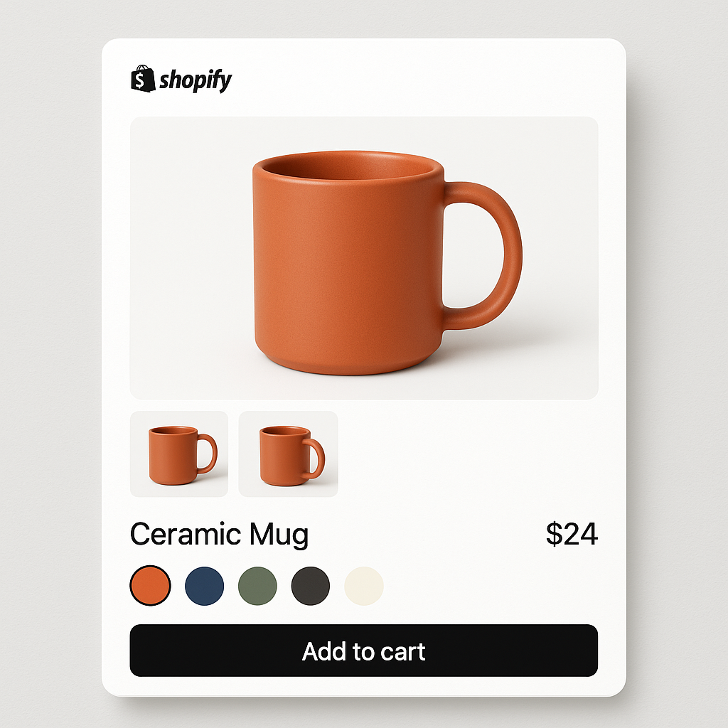
The simplest fix. Instead of picking a hex code, use a cropped product photo as the swatch. The customer sees a tiny photo of the actual product in that color. No hex codes. No color matching. No mismatch.
Rubik Variant Images supports image swatches out of the box. The app automatically uses the first image assigned to each variant as the swatch thumbnail. No manual cropping needed. If you have assigned 5 images to the Blue variant, the first one becomes the swatch.
This is the recommended approach for clothing, furniture, cosmetics, and any product where color accuracy matters. A merchant selling handmade ceramics with subtle glaze variations cannot represent those variations with a hex code. An image swatch shows the actual glaze.
Fix 2: Pick colors from your product photos
If you prefer color swatches (solid circles), do not use generic hex codes from Google. Sample the color directly from your product photo.
Rubik Variant Images includes a color picker with eyedropper tool. Open a product in the app, click the color swatch, and use the eyedropper to click directly on the product image. The app captures the exact hex code from that pixel. The swatch now matches the photo because the color came from the photo.
Pro tip: sample from the middle of a flat area of the product, not from edges, shadows, or highlights. The center of the chest on a t-shirt photo gives a truer color than the shoulder seam or collar shadow.
Fix 3: Use dual-color swatches for two-tone products
Some products have two dominant colors: a two-tone sneaker, a bag with contrast stitching, a jacket with different color lining. A single hex code cannot represent this.
Rubik supports dual-color swatches with configurable split direction: vertical (left/right), horizontal (top/bottom), or diagonal. Set a primary color and a secondary color, and the swatch shows both. This gives the customer a more accurate preview without needing an image swatch.
For Rubik Combined Listings users, dual-color swatches work on both product pages and collection page product cards.
Fix 4: Let AI detect the swatch color
Manually picking hex codes for 50 products is tedious. Two AI features can help:
Rubik Variant Images AI auto-assign analyzes product images and assigns them to the correct variant. While it primarily handles image-to-variant matching, it gives you correctly assigned images that can serve as image swatches.
Rubik Combined Listings Magic Fill goes a step further. It analyzes the product image and suggests both the option value name (“Navy Blue”) and the hex code (#1B2A4A) for the swatch color. It can even detect two-tone products and suggest a secondary color. You review and confirm before saving.
Both AI features sample from the actual product image, so the suggested colors are specific to your product, not generic.
Fix 5: Mix swatch types per option
Not every option needs the same swatch type. Color options benefit from image swatches or carefully matched color swatches. Size options (S, M, L, XL) work fine as pill buttons. Material options (cotton, linen, silk) might use texture image swatches.
Rubik Variant Images lets you mix swatch types on the same product. Color gets image swatches. Size gets pill buttons. Material gets whatever works best. This way you solve color accuracy for the option that needs it without overcomplicating the other options.
How to test color accuracy
After setting up your swatches, test them:
- Compare side by side. Open your product page and look at the swatch next to the product image. Do they feel like the same color? Not identical (impossible on screens) but recognizably the same.
- Check on mobile. Mobile screens render colors differently than desktop monitors. Pull up the product page on your phone.
- Ask someone else. You have been staring at these colors for hours. Fresh eyes catch mismatches you have stopped seeing.
- Check similar colors together. “Navy” and “Black” swatches need to look different enough that customers can tell them apart. “Tan” and “Cream” side by side should not look identical.
- Test after browser cache clears. Old cached CSS can show previous swatch colors. Open an incognito window to see the current state.
Watch It in Action
See how to set up custom swatch images and colors:
Frequently asked questions
Why do my Shopify color swatches not match the product color?
Three main reasons: you are using a generic hex code instead of sampling from your actual product photo, studio lighting shifts colors in photographs, and screens render the same hex code differently. The fix is either using image swatches (product photo thumbnails) or sampling hex codes directly from your product images with an eyedropper tool.
Should I use color swatches or image swatches?
Use image swatches for patterns, textures, prints, and any color that is hard to represent with a single hex code (dusty rose, sage green, heathered gray). Use color swatches for simple, well-known solid colors (black, white, true red). For most fashion and home decor stores, image swatches are the safer choice because they eliminate color mismatch entirely.
How do I pick the right hex code for my swatch?
Do not Google “navy blue hex code.” Instead, use an eyedropper tool to sample the color directly from your product photo. Rubik Variant Images includes an eyedropper in the color picker. Click on the flat center area of the product (not edges or shadows) for the truest color match.
Can I show two colors in one swatch?
Yes. Rubik supports dual-color swatches with vertical, horizontal, or diagonal splits. Set a primary and secondary color. This works for two-tone products like sneakers with contrast soles or bags with contrast stitching.
Can AI pick the swatch color for me?
Rubik Combined Listings has Magic Fill, which analyzes your product image and suggests the swatch color hex code automatically. It can detect two-tone products and suggest both primary and secondary colors. Rubik Variant Images AI auto-assign focuses on matching images to variants, and you can use those matched images as image swatches.