A customer lands on your product page. They see a dropdown that says “Color.” They click it. A list of text labels appears: “Ocean Blue,” “Charcoal Heather,” “Dusty Rose.” They pick one. The gallery stays the same, showing all 30 images from every color mixed together.
That customer just had to make a visual decision using text and then sort through irrelevant images to confirm their choice. This is how most Shopify stores work out of the box. And it costs real money.
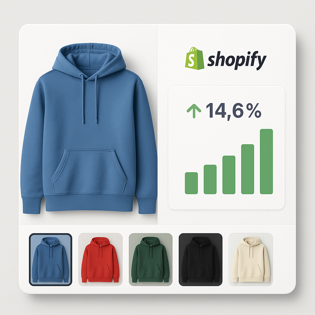
Replacing that dropdown with visual swatches, and filtering the gallery to show only the selected variant’s images, directly improves conversion rates. Here is the data.
In this post
- The numbers: what research tells us
- Why swatches outperform dropdowns
- How variant-specific images reduce returns
- The mobile gap
- Collection page swatches: the overlooked multiplier
- Image quality and conversion
- How to set this up on Shopify
- Frequently asked questions
- Related reading
The numbers: what research tells us
No single study covers “Shopify color swatches vs dropdown conversion.” But multiple data points from independent research all point in the same direction.
Visible options beat hidden menus: 14.6% lift
A MECLABS study tested radio buttons (visible options, like swatches) against dropdown menus. Radio buttons achieved an 11.73% order rate versus 10.69% for dropdowns. That is a 14.6% relative improvement at 92% statistical significance.
Why? Dropdowns look shorter, but they add friction. The customer cannot compare options without clicking first. Swatches and radio buttons remove that step entirely.
56% of customers look at images first
Baymard Institute research found that 56% of users explore product images as their very first action on a product page. Before reading the title. Before checking the price. They look at the photos.
If those photos show every color mixed together, the customer’s first impression is confusion. If the gallery shows only the images for the selected color, that first impression is clarity.
88% say product content drives purchase decisions
Salsify’s 2025 Consumer Research Report found that 88% of shoppers rate product content as “extremely” or “very important” in their purchase decision. 76% specifically call out high-quality images. 66% want at least 3 images per product.
Swatches are product content. A row of product thumbnails showing each color option gives the customer more information in less time than a list of color names.
33% leave if images are bad
The same Salsify research shows that 33% of shoppers will leave a product page entirely if it has no images or low-quality visuals. A gallery stuffed with 30 unfiltered images from every variant is not technically “no images,” but it creates a similar feeling: the customer cannot find what they need.
Why swatches outperform dropdowns
The data above explains the what. Here is the why.
Visual preview before commitment
A color swatch shows the actual color. An image swatch shows the actual product photo. The customer knows what they are getting before clicking. A dropdown label that says “Midnight Blue” could be anything from dark navy to near-black. The customer has to select it to find out. That extra step is friction, and friction kills conversions.
Side-by-side comparison
With swatches, all color options are visible at once. A customer deciding between three blues can see all three next to each other. With a dropdown, they have to remember what the first option looked like while checking the second. Human working memory is limited. Swatches work around that limitation.
Fewer clicks to purchase
Dropdown: click to open, scroll, click to select, dropdown closes. That is three interactions. Swatch: one tap. Each removed interaction compounds across your entire traffic. If you get 10,000 product page visits per month, even a small friction reduction adds up.
The discovery effect
Swatches make customers aware of options they did not know existed. A customer who came for the black t-shirt spots the sage green swatch and thinks “that looks interesting.” Dropdowns hide options. Swatches surface them. This is why some stores report higher average order values after switching to swatches.
How variant-specific images reduce returns
Conversion is only half the picture. Returns eat into your margin even faster than lost sales.
The return rate problem
Online return rates hit 16.9% in 2024 according to NRF data. That is roughly $890 billion in the US alone. For clothing, the rate climbs to 26%. The number one reason? “Looked different in person.” 22% of returns happen because the product did not match what the customer expected from the images.
If a customer orders “Forest Green” and receives something that looks more like olive, that is a return. If they scroll through a gallery of mixed-color images and buy the wrong one thinking it was a different variant, that is a return.
Variant image filtering fixes this
When the gallery shows only images for the selected variant, customers see exactly what they will receive. Five angles of that specific green. Not mixed with photos of the red, blue, and yellow versions. There is no ambiguity about which product is in the cart.
Shopify does not do this natively. You can assign one image per variant in Shopify admin, but that gives the customer a single photo. For products where color accuracy matters (clothing, furniture, home decor, cosmetics), one image is not enough. You need 3-5 images per color, filtered dynamically when the customer picks a variant.
Rubik Variant Images does exactly this. Assign multiple images per variant, and the gallery automatically shows only the matching images when a customer selects a color. No code edits. Works with 350+ Shopify themes.
The mobile gap
Mobile shoppers convert at roughly 1.2% versus 1.9% on desktop. Part of that gap is structural (smaller screens, more distractions). But part of it is UX friction, and variant selectors contribute.
Dropdowns are worse on mobile
On mobile, a dropdown opens as a native scrollable picker. The customer has to scroll through a list of text labels on a 6-inch screen, tapping tiny targets. If they accidentally tap the wrong one, they start over. Swatches with proper touch targets (44x44px minimum per WCAG guidelines) are significantly easier to interact with on phones.
57% of sites get mobile swatches wrong
Baymard Institute found that 57% of e-commerce sites fail to make all color swatches available in mobile product listings. That is more than half the market leaving money on the table. If your store gets this right, you are already ahead of most competitors.
Collection page swatches: the overlooked multiplier
Most conversion discussions focus on the product page. But customers often decide which product to click from collection pages. If your collection page shows only one color per product (typically the first image), customers who want a different color might never click through.
Baymard research shows that 54% of e-commerce sites do not dynamically update product thumbnails when a customer searches for a specific color. The product card shows a white shirt even though the customer searched for “blue shirts.”
Collection page swatches solve this. When a customer sees small color circles on each product card, they can browse the full color range without opening each product page individually. That means more products explored, more clicks, more add-to-carts.
For Shopify stores using separate products per color (common with print-on-demand, furniture, or stores that exceed the 100-variant limit), Rubik Combined Listings adds color swatches to both product pages and collection pages. Each swatch links to a different product, but to the customer it looks like a single product with color options.
Image quality and conversion
Swatches and variant filtering matter, but they cannot fix bad photos. The images themselves need to be good.
Larger images, higher conversion: 63% lift in one test
A CXL analysis found that increasing product image size by 28% led to a 63% increase in conversions. Mall.cz ran a similar test and measured a 9.46% increase in revenue from larger, higher-quality images.
How many images per product?
Research points to 5-6 minimum: front, back, close-up detail, scale reference, lifestyle shot. For products with multiple colors, that is 5-6 per color. A product with 8 colors needs roughly 40-48 images total, and the gallery needs to filter them by variant so the customer only sees the relevant 5-6 at any time.
Without variant image filtering, uploading 40 images creates a cluttered gallery where customers have to scroll past 35 irrelevant photos to find the ones that match their selection.
Professional vs. amateur photos
ConvertCart research found that professional product photos correspond to 33% higher conversions than amateur photos. High-quality photos perform 94% better than low-quality ones. This makes sense: if a customer is comparing your product against a competitor, the store with better images wins the trust battle.
How to set this up on Shopify
There are two separate improvements here, and they work best together.
Step 1: Replace dropdowns with visual swatches
Install Rubik Variant Images & Swatch from the Shopify App Store. It replaces the default dropdown with color circles, image thumbnails, or pill buttons depending on the option type. Color options get color swatches. Size options get pill buttons. You can mix swatch types per option on the same product.
The app works with 350+ Shopify themes and loads directly from metafields, so there are no external API calls slowing down your page. The swatches render inside Shadow DOM, which means your theme’s CSS cannot break the swatch layout.
Step 2: Assign multiple images per variant
In the Rubik app dashboard, open a product and assign 3-5 images to each variant. You can do this manually or use the AI auto-assign feature, which analyzes your product images and matches them to the correct variant automatically.
For stores with many products, the bulk assign feature matches images to variants using filename patterns. If your files are named “blue-front.jpg” and “blue-back.jpg,” the app maps them to the Blue variant in one click.
Once assigned, the product page gallery filters in real time. Customer selects Blue, gallery shows only blue images. Selects Red, gallery instantly switches. No page reload. Read the full setup guide for showing only selected variant images.
Step 3: Add swatches to collection pages (optional)
If you sell products where color browsing happens at the collection level (fashion, accessories, home goods), add color swatches to your product cards. For stores using separate products per color, Rubik Combined Listings connects them and shows swatches on both collection and product pages.
Watch It in Action
See how variant image filtering and swatches work on a live Shopify store:
Frequently asked questions
Do color swatches increase conversion rates on Shopify?
Yes. Research from MECLABS shows that visible selection options (the pattern swatches follow) outperform dropdown menus by 14.6% in order rate. Swatches reduce friction by showing all options at once instead of hiding them behind a click. They also give visual preview, which is especially important for color-driven purchases.
How many images should each variant have?
Aim for 5-6 images per variant: front, back, detail shot, scale reference, and lifestyle photo. More angles mean fewer surprises after delivery, which means fewer returns. Shopify natively supports only 1 image per variant, but apps like Rubik Variant Images let you assign multiple images per variant.
Do variant-specific images reduce product returns?
They help. 22% of online returns happen because the item “looked different in person.” When the gallery shows only the selected variant’s images (instead of all images from every color mixed together), customers get a clearer picture of what they are ordering. Clearer expectations mean fewer surprises and fewer returns.
Should I use image swatches or color swatches?
Use image swatches (product thumbnails) when colors have patterns, textures, or prints that a solid color circle cannot represent. Use color swatches for solid, well-known colors like black, white, red. Use pill buttons for non-visual options like size. With Rubik Variant Images, you can mix swatch types per option on the same product.
Does adding swatches slow down my Shopify store?
It depends on the app. Rubik Variant Images loads swatch data from Shopify metafields, which means the data loads with the page itself. There are no external API calls. The swatches render inside Shadow DOM for CSS isolation. This approach is faster than apps that fetch data from external servers after the page loads.
Related reading
- Swatches or dropdowns for Shopify color variants? What the data says
- Shopify product page optimization checklist for 2026
- How to show only the selected variant’s images on Shopify
- Shopify combined listings without Plus: every option explained
- How to optimize Shopify variant images for Google Shopping
- Shopify color swatches and accessibility: WCAG compliance