Your Shopify product page is where the purchase decision happens. The product image, the variant selector, the page speed, the mobile experience. Each element either moves the customer toward buying or gives them a reason to leave.
This checklist covers 15 things you can check and fix today. Some are quick wins (5 minutes). Some require an app. All of them directly affect whether a visitor becomes a buyer.
In this post
- Images (1-4)
- Swatches and variant selection (5-8)
- Page speed (9-11)
- SEO and AEO (12-14)
- Accessibility (15)
- Frequently asked questions
- Related reading
Images
1. Each variant shows only its own images
When a customer selects “Blue,” the gallery should show only blue product photos. Not all 40 images from every color. Shopify does not do this natively. You need an app like Rubik Variant Images that assigns multiple images per variant and filters the gallery in real time. Read how to show only selected variant images.
2. At least 5 images per product
Research suggests 5-6 images minimum: front, back, close-up detail, scale reference, and lifestyle shot. 67% of consumers rate image quality as “very important” for purchase decisions (Baymard Institute). More angles = fewer surprises = fewer returns.
3. Every image has descriptive alt text
Alt text helps with SEO, Google Images, Google Shopping feed quality, AI search visibility, and accessibility. Describe the product and variant specifically: “Navy blue cotton t-shirt, front view, relaxed fit” instead of “IMG_4521” or “product photo.” Keep alt text clean. No hashtags or functional data.
4. Images are optimized for speed
Use JPEG or WebP for product photos (smaller file sizes than PNG). Shopify auto-compresses and serves responsive sizes, but uploading at 2048x2048px gives the CDN enough data to work with. Avoid uploading images larger than 20MB.
Swatches and variant selection
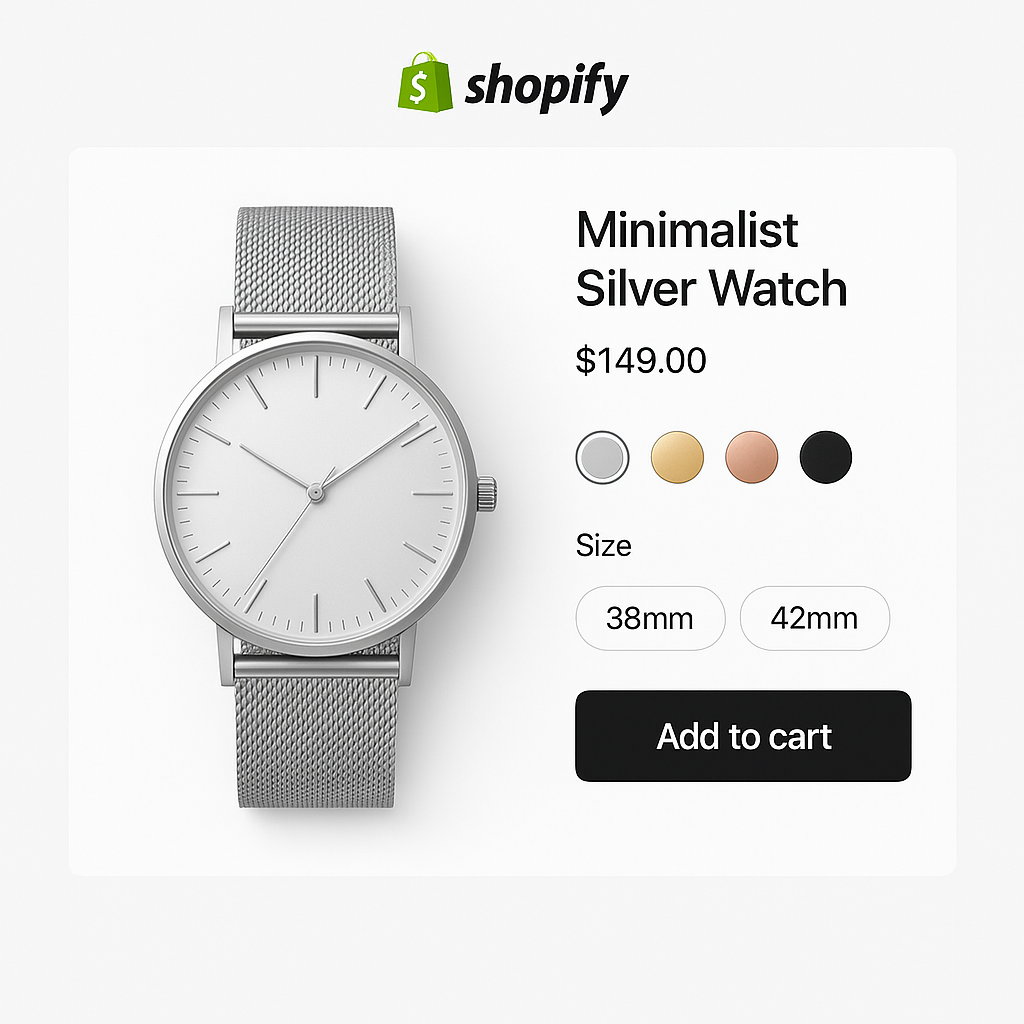
5. Visual swatches instead of dropdowns for color
85% of consumers say color is the primary reason they buy a product. A text dropdown that says “Forest Green” gives no visual preview. A color swatch or product thumbnail does. Swatches reduce clicks, improve mobile UX, and increase conversion. Read swatches vs dropdowns: what the data says.
6. Different swatch types per option
Color should use image or color swatches. Size should use pill buttons (“S”, “M”, “L”). Material can use texture thumbnails. One swatch type for everything is not ideal. Rubik Variant Images lets you mix swatch types per option on the same product.
7. Sold-out variants handled clearly
A customer clicks “Medium” and gets an error. Or “Medium” looks active but adds nothing to cart. Both are bad UX. Either cross out sold-out options visually, push them to the end of the swatch row, or hide them entirely. Make the status clear before the customer clicks.
8. Colors linked across separate products
If you sell the same product in multiple colors as separate listings, customers need a way to switch between them. Rubik Combined Listings adds color swatches linking separate products. Each product keeps its own URL and SEO while customers browse all colors from one page. Read combined listings without Plus.
Page speed
9. Core Web Vitals are passing
Check your product page at pagespeed.web.dev. All three Core Web Vitals should pass: LCP under 2.5s, INP under 200ms, CLS under 0.1. Google uses these for ranking. Each additional second of load time can drop conversion 7-20%.
10. Apps are not bloating the page
The average Shopify store runs 6-10 apps. Each adds JavaScript. Check which apps load on your product page (DevTools > Network tab). Remove unused apps. Look for apps that store data in metafields instead of making external API calls. Read do swatch apps slow down your store?
11. Lazy loading for below-the-fold images
Product thumbnails, related product images, and gallery images below the fold should use loading="lazy". This prevents them from loading until the customer scrolls to them, reducing initial page weight.
SEO and AEO
12. Specific product title with keywords
“Handmade Leather Messenger Bag, 15-inch, Brass Hardware, Cognac” ranks better than “Bag Style A.” Include product type, material, key feature, color, and brand. This also helps AI shopping assistants recommend your product. Read AEO for Shopify stores.
13. FAQ section with schema markup
Add a FAQ section to your product page with real customer questions. “Is this bag big enough for a 15-inch laptop?” “What type of leather?” Use FAQPage schema so AI systems and Google can extract answers directly. This improves both search snippets and AI citations.
14. Product feed sends the correct variant image
Check that every variant has the right image assigned in Shopify admin. This is what gets sent to Google Shopping. Wrong image = wrong Shopping result. For the cleanest feed, use separate products per color. Read optimize variant images for Google Shopping.
Accessibility
15. Variant selector is keyboard and screen reader accessible
Can a customer tab to your swatches and select with Enter? Does a screen reader announce each option? Are touch targets at least 44x44px? The European Accessibility Act (EAA) makes this a legal requirement for stores selling to EU customers. Most swatch apps do not include accessibility features. Rubik Variant Images and Rubik Combined Listings both include ARIA labels, keyboard navigation, and screen reader support. Read swatches and accessibility.
Watch It in Action
See Rubik Variant Images in action:
Frequently asked questions
How do I optimize my Shopify product page for conversions?
Focus on 5 areas: variant-specific images (show only the selected color), visual swatches (not dropdowns), page speed (Core Web Vitals passing), SEO (specific titles, FAQ schema, alt text), and accessibility (keyboard navigation, ARIA labels). The 15-point checklist above covers each one.
How many product images should I have?
At least 5-6 per variant: front, back, close-up, scale reference, and lifestyle shot. 67% of consumers rate image quality as very important for purchase decisions.
What page speed score should I aim for?
All three Core Web Vitals should pass: LCP under 2.5 seconds, INP under 200ms, CLS under 0.1. Check at pagespeed.web.dev. Each extra second can reduce conversion by 7-20%.
Should I use swatches or dropdowns for color?
Swatches for visual options (color, pattern, material). Dropdowns or pill buttons for non-visual options (size, length). 85% of consumers say color drives their purchase decision. Showing it visually removes a barrier.