More than 70% of Shopify traffic comes from mobile devices. Yet most stores show the exact same variant swatches on a 6-inch phone screen as they do on a 27-inch desktop monitor.

On desktop, 12 color swatches in a neat grid look great. On mobile, those same 12 swatches push the Add to Cart button below the fold. On collection pages it is even worse: product cards with two or three rows of swatches crowd out product images, prices, and everything else customers need to see.
The fix is not showing fewer swatches everywhere. It is showing the right swatches, in the right layout, for the device the customer is actually using.
Why mobile swatches need different treatment
A desktop product page has room. You can show a grid of color swatches with text labels, price differences, and plenty of spacing between each option. The customer uses a mouse cursor to click precisely on any swatch, no matter how small.
Mobile is a completely different context. Screen real estate is limited. Customers use their thumbs, not a mouse cursor. Swatches that are easy to click on desktop become frustrating tap targets on a phone. And collection pages, where customers are browsing quickly through dozens of products, have even less space per product card.
Browsing behavior is different too. Mobile shoppers scroll fast. They need quick visual signals. A wall of tiny swatches on a product card does not help them decide whether to tap through. A clean row of color dots with a “+5” indicator does.
Most Shopify themes do not account for any of this. They render swatches at the same size, in the same layout, regardless of device. The result is product pages that feel cramped on mobile and collection pages that look cluttered.
What mobile-optimized swatches actually look like
Good mobile swatch optimization is not just about making things smaller. It is about choosing the right display strategy for the device and context. Here are the specific techniques that make a difference.
One row with a “+N” overflow indicator
Instead of wrapping swatches into two or three rows on mobile, you can limit them to a single row. When there are more swatches than fit, a “+3” or “+5” indicator appears at the end. Customers tap it to reveal the rest.

This keeps product cards compact on collection pages. The customer sees there are more color options available without the card being dominated by swatch rows. On product pages it works well too: you get a clean first impression with the option to expand.
The overflow indicator adapts to the available width automatically. On a narrow phone screen, fewer swatches fit in the row, so the indicator shows a higher number. On a wider screen, more swatches fit before the cutoff.
Different swatch sizes for different contexts
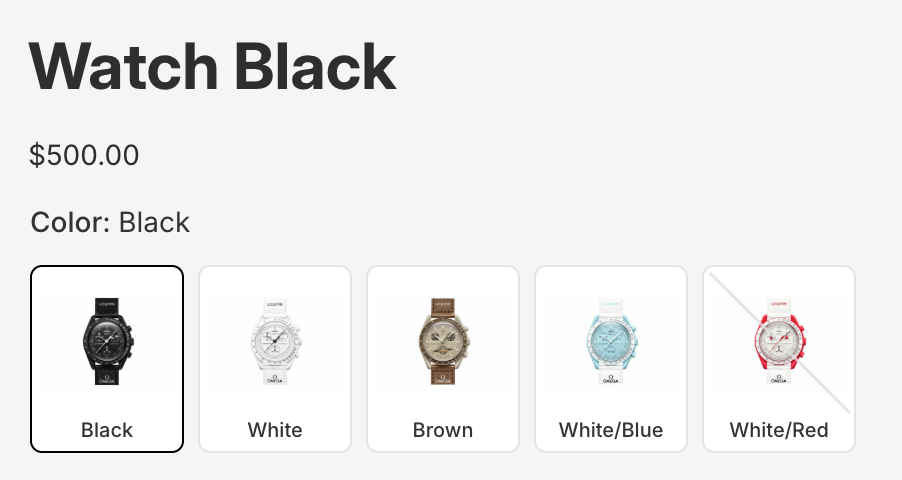
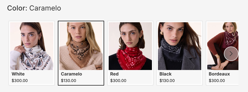
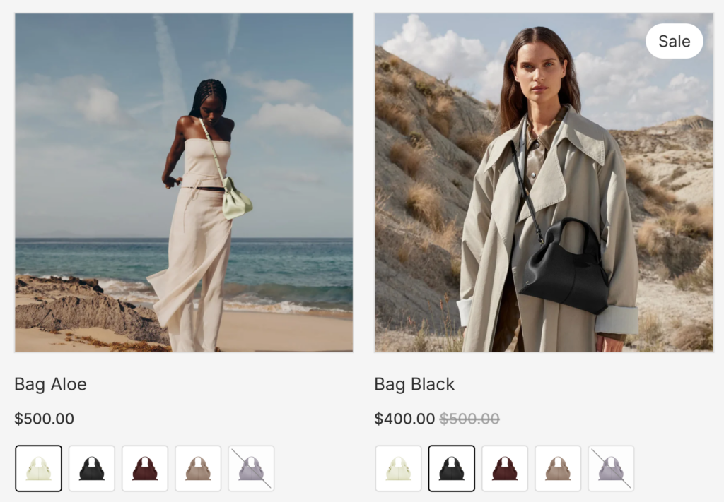
On a product page, the customer has already committed to looking at this product. Larger swatches (50-60px) make sense here because they are easier to tap and show more detail. You can even display product images inside each swatch so customers see what each color actually looks like on the product.
On a collection page product card, the goal is different. You want to signal “this product comes in multiple colors” without taking over the card. Smaller swatches (28-32px) with simple color fills work better here. They convey the information without competing with the product image and price.
Mobile and desktop can use different sizes too. You might want 60px swatches on a desktop product page but 48px on the same page on mobile, where the viewport is narrower.
Carousel mode
A horizontal scrollable carousel is a natural fit for mobile. Customers already swipe through image galleries, stories, and product carousels on their phones. Swatch carousels use the same interaction pattern.
Instead of wrapping into rows, swatches sit in a single scrollable line. The customer swipes left to see more options. Navigation arrows can appear on desktop for mouse users and optionally hide on mobile where swiping is intuitive.
Carousel mode works especially well for products with many options (10+ colors) where even a single row with an overflow indicator would feel cramped.
Simplified labels on mobile
On desktop, you might show text labels below each swatch (“Navy,” “Forest Green,” “Burgundy”), the option group title (“Color:”), and the currently selected value. On mobile, all of that text adds up fast.
Hiding text labels on mobile and showing only the color dots keeps things clean. The selected swatch name can still appear next to the group title (“Color: Navy”) without labeling every single swatch. Less clutter, same information.
Tap to preview, not navigate
Most swatch implementations on collection pages work like links: tap a color swatch, get redirected to that product page. On desktop with a mouse this is manageable. On mobile it is frustrating. The customer just wanted to see what the jacket looks like in blue. Instead they got pulled away from the collection page, waited for a new page to load, and lost their place in the grid.
A better approach: when a customer taps a swatch on a mobile product card, the card itself updates. The product image changes to show the tapped color. The title updates to reflect the selected variant. The price adjusts if it differs between colors. The customer stays on the collection page and can keep browsing.
This is how Rubik Combined Listings Swatch works by default on product cards. Tapping a swatch previews that variant right on the card without any page navigation. The customer can tap through several colors, compare how each one looks on the product, and only navigate to the product page when they find the color they want.
On desktop, this goes a step further with hover previews. As the customer moves their mouse over different swatches on a product card, the card image, title, and price change instantly to show each color. No clicking needed. The customer can visually scan through all available colors in seconds just by moving their cursor across the swatch row.
Both interactions reduce friction in a meaningful way. Fewer page loads, less back-and-forth navigation, and a smoother browsing experience overall. For stores with many color options per product, this makes a noticeable difference in how long customers stay on collection pages and how many products they explore before making a decision.
Product pages vs product cards: different jobs, different swatches
This is a distinction most merchants overlook. The swatches on your product page and the swatches on your collection page product cards serve completely different purposes.
Product page swatches are selection tools. The customer is on the product page, ready to choose a color and buy. These swatches should be large enough to tap easily, detailed enough to show what each option looks like, and complete enough to display every available color. Labels and prices are useful here.
Product card swatches are discovery signals. The customer is browsing a collection, scrolling through products. Card swatches need to communicate “this comes in multiple colors” at a glance, then get out of the way. Small, minimal, and limited to one row is the right approach here.
Showing the same large, labeled swatches on both product pages and product cards is like using the same font size for a headline and body text. It technically works, but it ignores the context.
Now multiply this by device. A product card on mobile is the most constrained context: smallest viewport, most items visible, least space per product. This is where optimization matters most. A product page on desktop is the most generous: plenty of room for large swatches, labels, and prices.
Four contexts, four designs
If you think about it, there are really four different contexts where swatches appear in your store:
- Product page on desktop: most room, customer is committed. Show everything: large swatches, labels, prices, product images in the swatch.
- Product page on mobile: less room, same intent. Slightly smaller swatches, maybe hide text labels, consider carousel for 10+ options.
- Product card on desktop: browsing context, moderate space. Small swatches in one row, no labels, simple color fills.
- Product card on mobile: most constrained context. Smallest swatches, one row, overflow indicator, no labels, lightest possible display.
Each of these contexts deserves its own swatch design. The layout, size, spacing, image type, label visibility, and display mode (grid vs carousel) should all be chosen for that specific context.
A product with 15 color options might show a scrollable carousel with product images on the desktop product page, a compact carousel without labels on mobile, a single row of 6 small color dots with “+9” on desktop product cards, and a single row of 4 dots with “+11” on mobile product cards. Same product, same colors, four different presentations optimized for each context.
How Rubik Combined Listings Swatch handles this
Rubik Combined Listings Swatch gives you independent control over all four contexts. Every visual setting (layout, swatch size, spacing, label visibility, image source, carousel vs grid) can be configured separately for product page desktop, product page mobile, product card desktop, and product card mobile.
Here is what you can set differently on mobile:
- Layout mode: grid or carousel, independently per context
- Swatch size: width, height, border radius, and spacing
- Row limiting: force swatches into one row with an automatic “+N” overflow indicator
- Max swatches: cap the number of visible swatches regardless of available space
- Label visibility: show or hide swatch names, group titles, selected values, and prices
- Image source: product photos, solid colors, diagonal color splits, or custom images
- Typography: font sizes, weights, and colors for every text element
The app detects the visitor’s device automatically and applies the correct settings. No CSS media queries to write, no theme code to edit. You configure the look you want for each context, and the app handles the rest.
The overflow indicator is smart about it too. When you limit swatches to one row, the app measures the actual available width on the customer’s screen and calculates how many swatches fit. The “+N” number updates dynamically based on the device width, not a fixed count.
You can also customize each product group independently. A t-shirt with 4 colors and a paint collection with 40 colors have very different needs on mobile. The t-shirt might show all colors in a simple row while the paint collection uses a carousel. Both are possible within the same store.
Install Rubik Combined Listings Swatch
The bottom line
Your mobile shoppers are the majority of your traffic. Showing them the same swatch layout designed for a desktop monitor is a missed opportunity.
The changes that make the biggest difference are straightforward: limit swatches to one row on product cards, use smaller sizes on mobile, switch to carousel mode for products with many options, and hide text labels where they add clutter without value.
The key insight is that product pages and product cards need different swatch designs, and desktop and mobile need different swatch designs. That gives you four contexts to optimize, and getting each one right means a better shopping experience for every customer on every device.