Product grid color swatches: Shopify UX that converts
Product grid color swatches are the little dots and squares on a collection page that tell a shopper, before they ever click, that the navy jacket also comes in olive and rust. Get them right and the grid does half your selling for you. Get them wrong and they become visual noise that slows the page, confuses the eye, and quietly kills clicks. We build swatch tooling for a living, so we see both versions every week.
Picture a store with 800 products, 12 colors on the bestselling tee, and a collection page that shows a single thumbnail per product. The shopper has no idea the color they want exists. They bounce. That bounce was avoidable. A row of swatches under each card would have caught it.
But more swatches isn’t automatically better. We’ve watched grids drown under 18 dots per card, and the conversion numbers were worse than showing none at all. So this post is about the craft: where swatches go, how many to show, what shape and contrast actually read on a phone, and the accessibility details most stores skip. This is what we see work.
One quick note on scope. There are two ways colors live in Shopify, and the right swatch approach depends on which one you have. We’ll cover both.
In this post
- Why product grid color swatches convert
- Where to place swatches on the card
- How many swatches should you show?
- Shape, size, and contrast that read on mobile
- Accessibility: aria labels and keyboard support
- Variants of one product vs separate products
- Frequently asked questions
- Related reading
Why product grid color swatches convert
Grid swatches convert because they move the color decision earlier, to the moment of highest intent, the moment the shopper is scanning. Instead of clicking into a product, discovering the color is wrong, and backing out, they pick the right color from the card and land on a page that already shows what they wanted. Fewer dead clicks. Fewer back-button bounces.
There’s a second effect that’s easy to miss. A swatch row signals choice. A card with five color dots reads as a richer product than the same card with none, even before the shopper interacts. It’s a tiny cue that says “this comes in your color.” For apparel, footwear, furniture, anything sold on aesthetics, that cue does real work.
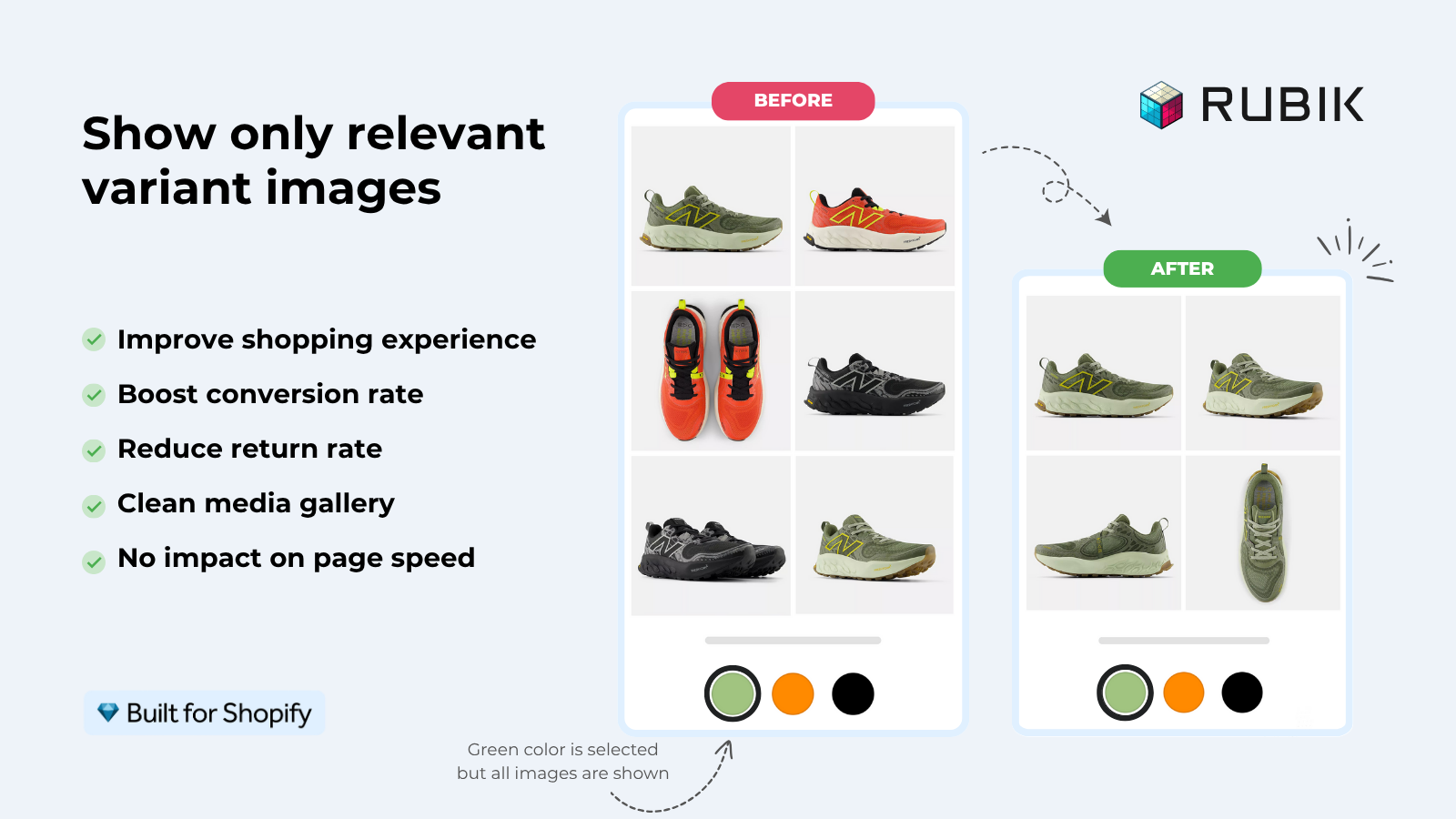
And the swap matters as much as the dots. When a shopper hovers or taps a swatch, the card image should change to that color right there. No reload, no guess. If you want the deeper mechanics of how Shopify variant media gets matched to options, we wrote that up in how Shopify variant images really work. The short version: the image swap is the payoff, the dot is just the trigger.
Where to place swatches on the card
Put swatches directly under the product image, above the title and price. That’s the placement we see win most often, because the eye is already on the image when a shopper is judging color, so the dots sit exactly where the decision happens. Below the price they get ignored. Over the image they fight the photo.
A few placement rules we’d defend:
- Left-align the swatch row to the card edge. Centered rows wander and break the scan line on a tall grid.
- Keep a consistent height for the row even when a product has zero or one color. Jumpy card heights make a grid feel broken.
- Don’t put swatches inside the image as an overlay. They block the product and tank tap accuracy on mobile.
- Give the active swatch a clear selected state (a ring or border), not just a faint shadow.
One opinion that gets pushback: hover-to-preview is a desktop nicety, not a mobile strategy. On phones there is no hover. So the tap has to do everything: switch the image and feel responsive. If your swatches only react to hover, half your traffic gets nothing. Design tap-first, then add hover as a bonus.
How many swatches should you show?
Show the colors that earn their space, usually four to six per card, and stop there. Past that point the row wraps, the card grows, and the grid turns into a wall of dots that nobody parses. We’ve seen stores cram 15 colors onto every card and wonder why the page felt heavy. It felt heavy because it was.
What about products with 20 colors? You have a real choice to make. Cap the visible swatches at a sensible number and let the product page carry the rest. We deliberately did not build a “+N more” overflow chip into our product card swatches, because in testing it pulled attention to the counter instead of the product, and the counter rarely got clicked anyway. Showing your strongest few colors beats teasing all of them.
By default our product card swatches show the first variant option only (typically color) to keep cards clean. That’s intentional. The grid is for browsing, not configuring. Size, material, and the long tail of options belong on the product page where there’s room to think.
Shape, size, and contrast that read on mobile
On the grid, smaller swatches than the product page, with a tap target of at least 44 pixels and a visible border on light colors, is the combination that reads cleanly on a phone. The dots can look small, but the hit area underneath them has to stay finger-sized, or thumbs miss and shoppers give up.
Shape matters less than people think, but it isn’t free. Here’s how we’d weigh the common options on a collection grid.
| Swatch shape | Best for | Watch out for |
|---|---|---|
| Circle | Color-led catalogs (apparel, beauty) | Light colors vanish without a border |
| Square | Pattern and texture swatches | Can feel boxy next to round product photos |
| Rounded square | A middle ground that suits most grids | Needs consistent corner radius across cards |
| Pill button (with label) | Few colors, named finishes | Eats horizontal space fast, wraps on mobile |
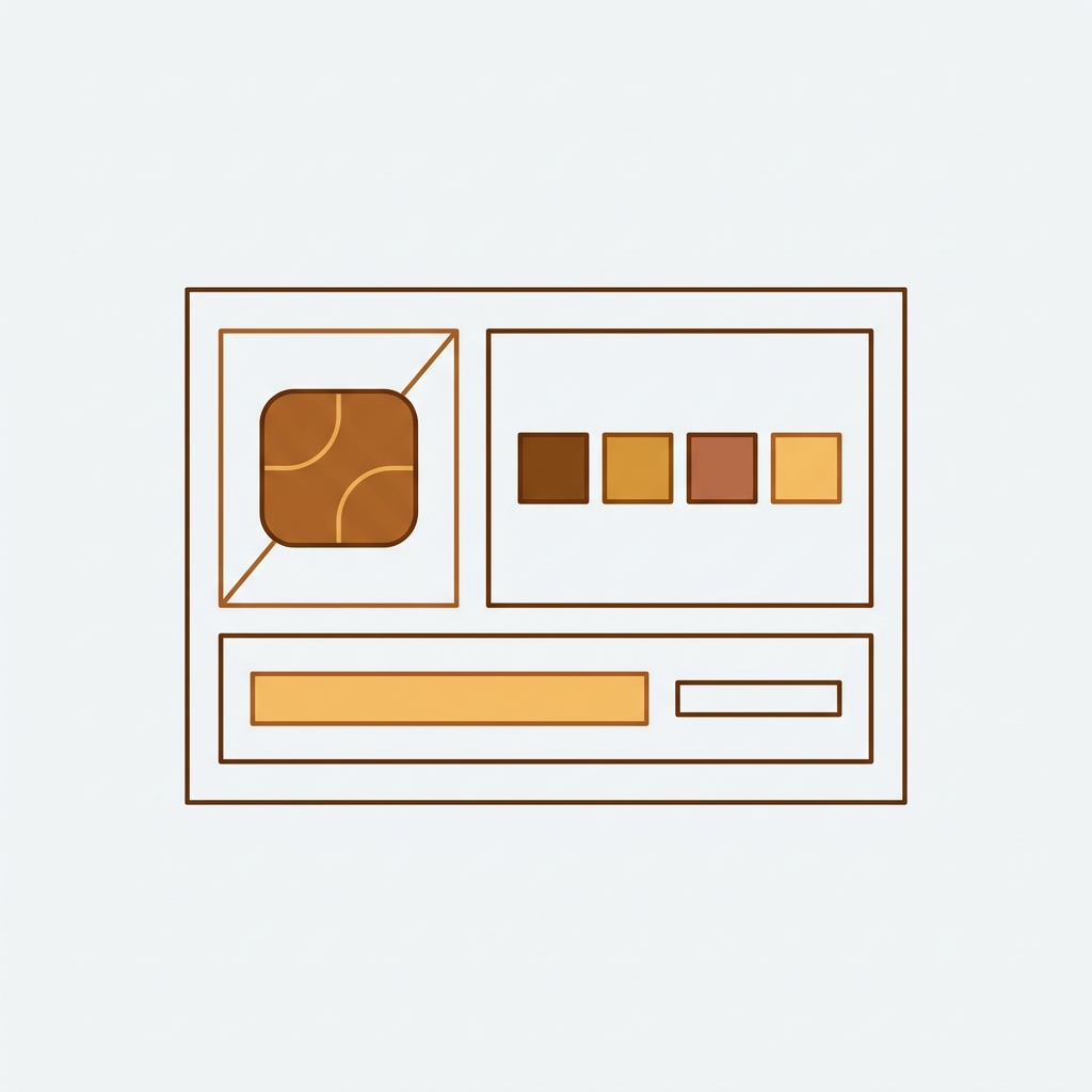
Contrast is the detail stores skip, and it’s the one that bites. A white swatch on a white card is invisible. So is pale grey on pale grey. Every swatch needs a thin border (a 1px ring around the dot) so light colors stay legible against any background. We render swatches in Shadow DOM specifically so a theme’s stylesheet can’t strip that border or recolor it by accident.
And patterns? Don’t fake them with a solid hex. A leopard print represented by tan defeats the purpose. Use an actual image swatch (a tiny crop of the fabric) so the dot tells the truth. If you’re choosing a tool, our roundup of the best Shopify color swatch app for 2026 compares which ones handle image swatches well.
Accessibility: aria labels and keyboard support
Accessible swatches need three things: a real accessible name on every swatch, keyboard focus, and a non-color selected state. Color alone can’t carry meaning, because a shopper using a screen reader or with color blindness needs the name and the state communicated in text and focus, not just a hue.
Concretely, here’s what a swatch should expose:
- An
aria-labelnaming the color, like “Olive green”, so screen readers announce something useful instead of “button”. - An
aria-pressedoraria-selectedstate so the active color is announced, not just shown. - A visible focus ring so keyboard users can see where they are, and Tab plus Enter has to actually switch the image.
- A selected indicator that isn’t color: a checkmark, a thicker ring, anything that survives a grayscale screenshot.
Why does so much swatch tooling ship without aria labels? It makes no sense. A swatch is a control, and controls need names. We built ours with ARIA roles and keyboard handling from the start, because retrofitting accessibility after launch is how you end up with a grid that looks fine and fails an audit. Plenty of merchants who ask us about compliance had no idea their old swatches were invisible to assistive tech.
“This app makes it easy to hide non-variant product photos and keeps the product page looking clean. It also helps to show clean custom swatches. Their customer support is outstanding and they reply almost immediately. They were able to fix a bug for me with minimal weight time.”
Anonymous merchant, 2026-02-18, Rubik Variant Images on the Shopify App Store
Variants of one product vs separate products
The right grid-swatch approach depends on whether your colors are variants of one product or separate products, because that single structural fact decides which tool fits. Most stores get this backwards and then wonder why the swatches won’t behave. So let’s settle it.
If each color is a variant of one product (one product page, many colors), you want swatches that swap the card image to that variant. Rubik Variant Images now does exactly this. As of our late-May 2026 release, the product card swatches feature shows variant swatches on collection pages, search results, and home page listings. Clicking a swatch swaps the card image, and can also update the card’s price and add-to-cart link if you turn that on. It’s off by default, so you opt in under Swatch settings, then style it under the Product Card tab. The whole thing is metafield-based with no external API calls, and it works natively on 177-plus themes including Dawn and Horizon.
If each color is a separate product (its own URL, its own title, its own images), you want Rubik Combined Listings instead. It links those separate products into one group and shows swatches across the collection page that jump between them. That structure is better for SEO (each color gets a unique, indexable URL) and it sidesteps Shopify’s 2,048-variant ceiling. We explain the trade-offs in the best Shopify combined listings app guide, and on the product side in our variant image app roundup.
| Situation | Use | Why |
|---|---|---|
| Colors are variants of one product | Rubik Variant Images (product card swatches) | Swaps the card image per variant, one URL |
| Each color is a separate product | Rubik Combined Listings | Unique URL per color, no variant cap, collection swatches |
| A mix of both across the catalog | Both apps together | Each tool handles the structure it fits |
Plenty of stores run both. For theme-specific setup, the team also wrote up adding collection page swatches in the Horizon theme, and if you sell apparel, our apparel app picks cover the full stack. Want the cross-site deep dives? Here’s how variant swatches work on collection page color swatches, and how separate-product swatches work in this collection page swatch display guide.
See it live on the Rubik Variant Images demo store, watch the tutorial video, or read the getting started guide. For separate-product setups, the Rubik Combined Listings demo and its docs show the grouped flow.
Frequently asked questions
Where should product grid color swatches go on the card?
Directly under the product image and above the title and price, left-aligned to the card edge. That keeps the swatches in the same spot where shoppers are already judging color. Avoid overlaying them on the image, which blocks the product and hurts tap accuracy on mobile.
How many swatches should I show per product card?
Four to six is the range we see work. Past that the row wraps, cards grow uneven, and the grid feels heavy. If a product has many colors, show your strongest few on the card and let the product page carry the full set.
Do swatches need accessibility labels?
Yes. Every swatch should have an aria-label naming the color, an announced selected state (aria-pressed or aria-selected), a visible keyboard focus ring, and a non-color selected indicator like a ring or checkmark. Color alone is not enough for screen readers or color-blind shoppers.
Can Rubik Variant Images show swatches on collection pages now?
Yes. Since the May 2026 product card swatches release, Rubik Variant Images shows variant swatches on product cards across collection pages, search, and home page listings. It is disabled by default, so you enable it under Swatch settings and style it under the Product Card tab.
Should I use variant swatches or separate-product swatches?
Use Rubik Variant Images when colors are variants of one product on a single URL. Use Rubik Combined Listings when each color is a separate product with its own URL, which is better for SEO and avoids Shopify’s variant limit. Many stores run both.
Related reading

Umid
Co-Founder at Craftshift