Reduce clicks to purchase with Shopify collection swatches

If you want to reduce clicks collection swatches are one of the fastest wins on a Shopify storefront, because they let a shopper choose a color right on the collection grid instead of clicking into a product, deciding it’s the wrong shade, and bouncing back out. Every one of those round trips is friction. And friction is where you lose sales.
Picture a store with 800 products in 12 colors each. A shopper lands on the collection page, sees one thumbnail per product, and has no idea the black tee also comes in olive, rust, and sand. So they click in. Wrong color. Back button. Next product. Click in again. That loop repeats across the whole grid, and most of it is wasted motion.
We build the Rubik apps, and this exact problem is why we shipped product card swatches in Rubik Variant Images. We also see it constantly in support: merchants ask how to get those little color dots onto the collection grid so people stop bouncing. There are two clean ways to do it, and they shorten the path in different ways.
This post walks through both, when to use which, and what actually happens to the click count. No fluff.
In this post
- The browse, click, back loop without swatches
- How collection swatches reduce clicks
- Route 1: product card swatches (variants of one product)
- Route 2: combined listings (separate products)
- Which route should you pick?
- How to set it up
- Frequently asked questions
- Related reading
The browse, click, back loop without swatches
Without swatches on the grid, a shopper has to open a product page just to learn what colors exist. That means at minimum two clicks (open, then back) per product they’re curious about, and a full page load each way. On a catalog with deep color ranges, that adds up fast.
Think about how people actually shop for apparel. They scan colors first, then style. If the grid hides every color but one, you’re forcing them to guess which products are worth opening. Most won’t bother. They’ll judge your whole catalog by the single thumbnail you happened to set as the featured image.
And the back button is brutal. Every bounce back to the collection page reloads the grid, often loses the shopper’s scroll position, and gives them a fresh chance to leave the site entirely. Why make people work that hard to find a color you already stock?
How collection swatches reduce clicks
Collection swatches reduce clicks by moving the color decision up to the grid, so the shopper picks before they commit to a page load. Instead of open, reject, back, open again, they hover or tap a dot, see the right image, and click into the product they actually want. One trip in, not five.
The mechanic is simple. Each product card shows small color dots. Clicking a dot swaps the card’s image to that color (and can update the price and the add-to-cart link too, if you want). Hovering previews the variant image. The shopper qualifies the product without ever leaving the grid.
Here’s the part most blogs get backwards: there isn’t one correct way to put swatches on a collection page. It depends on how your catalog is structured. If your colors are variants of a single product, you want one approach. If each color is its own product with its own URL, you want a different one. Get this wrong and you either fight Shopify’s variant limits or you tank your SEO. We’ll cover both routes next.
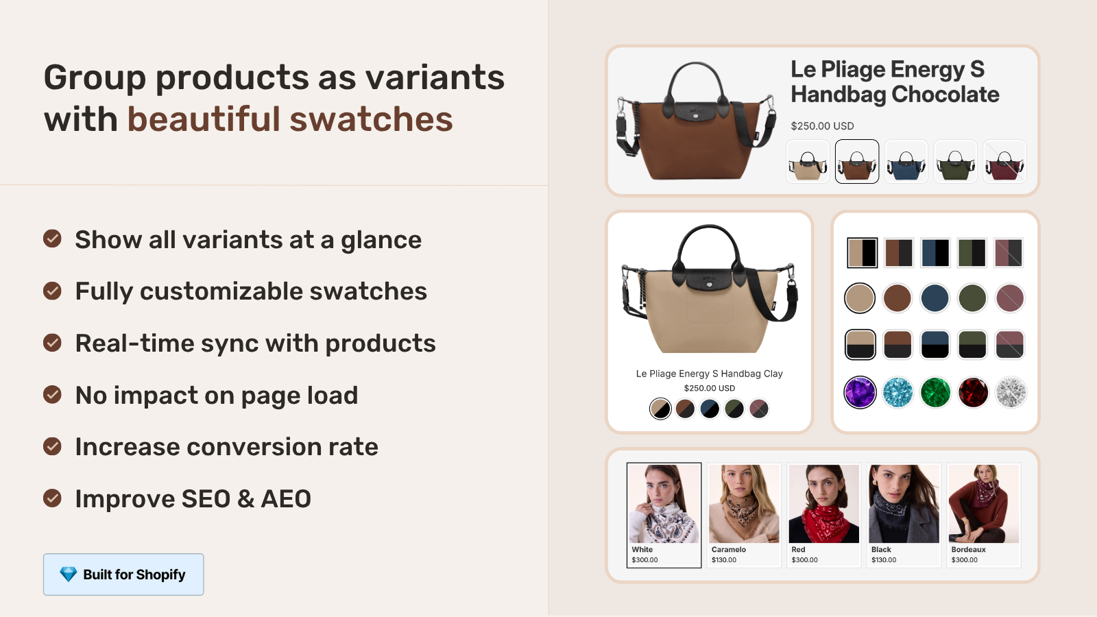
Route 1: product card swatches (variants of one product)
Use product card swatches when your colors are variants of one product. Rubik Variant Images shipped this in May 2026, and it shows variant swatches directly on product cards across collection pages, search results, and home page rows. Clicking a swatch swaps the card image, and can update the price and add-to-cart link too.
This was the missing half of the app for a long time. Rubik Variant Images used to handle only the product page, filtering the gallery so a shopper saw the matching photos after selecting a color. Now the same color logic reaches the grid. So a shopper sees the right photo on the collection page and the right photo on the product page, with no mismatch in between.
A few defaults worth knowing. By default the card shows the first option only (usually color) to keep things clean, swatch sizes are smaller on cards than on the product page, and desktop click-to-switch plus mobile tap-to-switch are both on out of the box. It’s metafield-based, no external API calls, and works natively on 177+ themes including Dawn and Horizon. Custom themes can be mapped by support if needed.
One thing to set expectations on: this is for the variants of a single product. If your black tee and olive tee are the same Shopify product with two color variants, this is your route. It does not link separate products together. For that, keep reading. (And if you want the deeper mechanics, our guide on how Shopify variant images really work covers the gallery side.)
“We’ve tried several solutions for managing variant images, but Rubik Variant Images stands out. It’s like giving our product pages a much-needed declutter. Customers now see only the images that match their selection, which has noticeably reduced the ‘Is this the right color?’ support queries. The setup was intuitive, and the results were instant. It’s one of those behind-the-scenes tools that quietly makes a big difference. Love it!”
Livspace Home, India, 2025-07-10, Rubik Variant Images on the Shopify App Store
Route 2: combined listings (separate products)
Use combined listings when each color is its own separate product with its own URL. Rubik Combined Listings links those separate products together and shows swatches on collection pages and product pages, so clicking a dot jumps the shopper straight to that color’s product page. Same click reduction, different catalog structure.
Why would you split colors into separate products at all? Three reasons that matter: each color gets its own URL and can rank in search, each color carries its own title and images, and you sidestep Shopify’s variant ceiling (2,048 variants per product with combined listings, far above the old 100 limit) without paying for Shopify Plus. For a large catalog, that structure indexes better and scales further.
Rubik Combined Listings offers four swatch types (visual image, button, pill, dropdown), real-time sync that hides out-of-stock, archived, and draft products, and AI Magic Fill that fills option values and hex colors for you. It’s also metafield-based with no external API calls. If you want the full picture, our writeup on combined listings explained goes deeper on the concept.
And yes, plenty of stores run both apps. Rubik Combined Listings handles the separate-product swatches on the grid, and Rubik Variant Images handles the per-variant gallery filtering once the shopper is on a page. They were built to sit side by side.
Which route should you pick?
Pick based on how your products are built in Shopify, not on which app sounds nicer. If a single product holds all the colors as variants, go with product card swatches. If each color is its own product, go with combined listings. Here’s the side by side.
| Question | Product card swatches (RVI) | Combined listings (RCL) |
|---|---|---|
| Catalog structure | One product, many color variants | Each color is a separate product |
| Swatch click goes to | Same card, swaps image (price, cart link optional) | That color’s own product page |
| Each color has own URL | No | Yes (better SEO) |
| Variant limit concern | Bound by Shopify variant caps | Bypasses the limit cleanly |
| Loading | Metafield-based, no external API calls | Metafield-based, no external API calls |
| Shopify Plus needed | No | No |
Quick gut check: do you want one product page per color, or one shared page with switchable variants? Want the SEO of unique URLs? Combined listings. Want the simplicity of a single product? Card swatches. Many apparel catalogs end up using both, and that’s fine. If you sell clothing specifically, our roundup of the best Shopify apps for apparel stores and the clothing and fashion app guide both touch on this decision.
How to set it up
Setup is short for both routes. You enable a toggle, pick a swatch style, and the swatches render on the grid. Here’s the order of operations for each.
For product card swatches in Rubik Variant Images:
- Open the Swatch settings page in the app.
- Turn on “Enable on product cards” (it’s off by default, so you opt in).
- Adjust the look under Swatch style, then the Product Card tab.
- Decide whether a click should also update the card’s price and add-to-cart link.
- Save, then check your collection page on desktop and mobile.
For combined listings, the flow is group, then style: create a group manually with the product picker or bulk by title pattern, tags, or metafield, then set the per-group visual settings. For a theme-specific walkthrough we keep a guide on adding collection page swatches in the Horizon theme. Three things drive most of the polish: swatch size, swatch shape, and whether you show one option or several.
Both apps support the major page builders too: Beae, EComposer, Foxify, GemPages, Instant, PageFly, and Replo. Shogun isn’t supported, so don’t count on it. If you’re still choosing tools, our best color swatch app guide and the best combined listings app comparison lay out the options.
“I use Rubik Combined Listings Along with Rubik Swatch. I went through, no exaggerating, 50 apps before I found what I needed. Theses guys are the real deal, and they will jump on chat and fix your problems ASAP. Definately reccomend.”
Parks Nerd, US, 2026-03-18, Rubik Combined Listings on the Shopify App Store
See the live demos for each route, watch the tutorial, or read the docs: Rubik Variant Images demo store, Rubik Combined Listings demo store, the Variant Images tutorial video, the Combined Listings tutorial video, the RVI getting started guide, and the RCL getting started guide.
Frequently asked questions
Does Rubik Variant Images work on collection pages now?
Yes. As of May 2026, Rubik Variant Images shows variant swatches on product cards across collection pages, search results, and other listing pages. Clicking a swatch swaps the card image and can update the price and add-to-cart link. The feature is off by default, so you enable it under Swatch settings.
How do collection swatches reduce clicks to purchase?
They move the color choice up to the grid. Instead of opening a product, finding the wrong color, and hitting back, a shopper hovers or taps a swatch, sees the right image right there, and clicks into the product they actually want. That cuts the browse, click, back loop down to a single trip in.
Can I use both routes at the same time?
Yes, and many stores do. Rubik Combined Listings handles swatches across separate products on the grid, while Rubik Variant Images handles per-variant card swatches and product page gallery filtering. They were designed to run side by side, and neither requires Shopify Plus.
Will collection swatches slow my store down?
Both apps are metafield-based with no external API calls, so the swatch data loads with the page itself rather than fetching from a third-party server. They render natively on 177+ themes including Dawn and Horizon, and custom themes can be mapped by support.
Which route is better for SEO?
Combined listings, if you want each color to rank on its own. Because each color is a separate product with its own URL, title, and images, search engines can index every color individually. Product card swatches keep colors as variants of one product, which is simpler to manage but shares a single URL.
Related reading

Umid
Co-Founder at Craftshift