Collection page swatches on mobile Shopify stores
Most stores get collection page swatches mobile shoppers can barely tap. The dots look fine on a desktop preview, then you load the same collection on a phone and the swatches are tiny, crammed against each other, and impossible to hit without zooming. More than half of your traffic is on a phone. So why does the swatch UI almost always get designed desktop-first?
Picture a store with 600 products, eight colors per item, and a collection grid that shows two products per row on mobile. Each product card has maybe 160 pixels of width to work with. Now try to fit eight color swatches under the title, a price, and an add-to-cart link inside that space. It falls apart fast.
We build two Shopify apps that put swatches on listing pages, so we spend a lot of time staring at mobile collection grids. This post is the stuff we actually changed in our defaults because of how small screens behave. Tap targets. Swatch counts. Render speed. The boring details that decide whether a shopper picks a color or bounces.
And here’s the part nobody tells you: there are two completely different ways to put swatches on a collection page, and they behave differently on mobile. One is for colors that are variants of a single product. The other is for colors that are separate products. Picking the wrong one is where most mobile swatch headaches start.
In this post
- Two routes for collection page swatches
- Tap targets: the 44px rule that everyone ignores
- Compact swatches without losing usability
- Performance: keep the grid fast on mobile data
- Both app routes work on mobile
- Setting it up the mobile-first way
- Frequently asked questions
- Related reading
Two routes for collection page swatches
There are two ways to show color swatches on a Shopify collection page, and which one you need depends on how your catalog is built. If each color is a variant of one product, you want product card swatches. If each color is a separate product with its own URL, you want grouped swatches that link those products together. Both render on mobile.
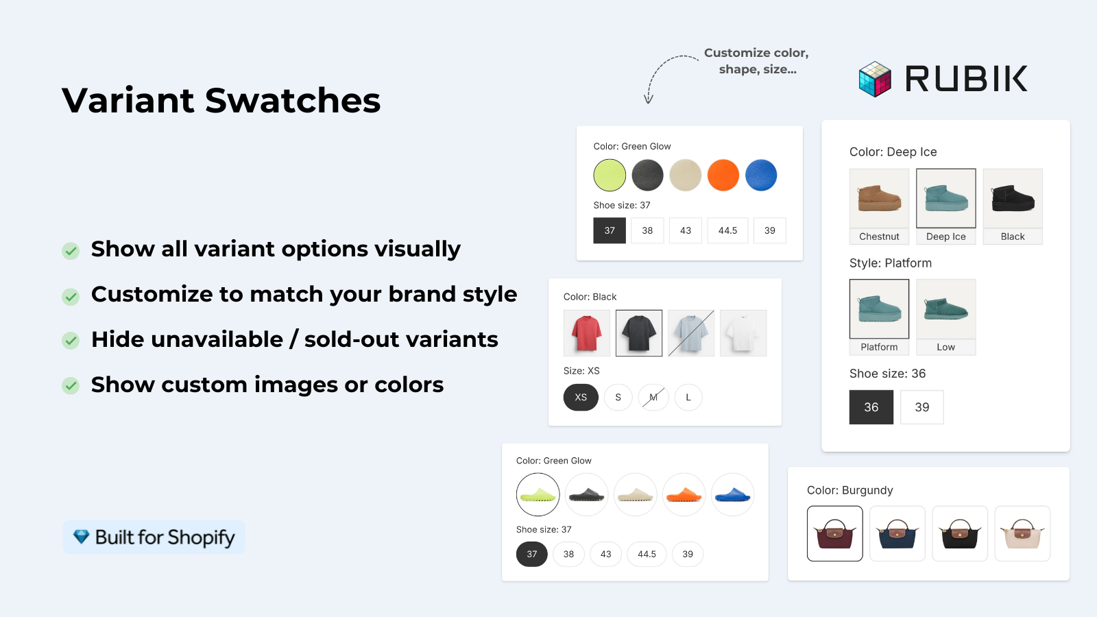
Route one: Rubik Variant Images now shows variant swatches directly on product cards across collection pages, search results, and the home page. Click a swatch and the card’s image swaps to that variant. You can also configure it to update the card’s price and add-to-cart link. This is for one product that has many color variants. (Yes, this is new. We shipped product card swatches on 2026-05-26, so the old line that Rubik Variant Images is “product page only” is outdated now.)
Route two: Rubik Combined Listings shows swatches across separate products that you group together, on both the collection page and the product page. Each color is its own product, its own URL, its own set of images. That structure is better for SEO and sidesteps Shopify’s variant ceiling. If you want the full reasoning on catalog structure, the combined listings explainer on rubikify.com goes deep.
| Question | Product card swatches (Rubik Variant Images) | Grouped swatches (Rubik Combined Listings) |
|---|---|---|
| Each color is… | a variant of one product | a separate product with its own URL |
| What a tap does on mobile | swaps the card image (and optionally price + cart link) | jumps to the grouped product’s page or switches it |
| SEO impact | one product URL | unique URL per color (stronger) |
| Variant limit relief | no | yes, gets past Shopify’s 100-variant-per-product limit |
| Loads via | metafields, no external API calls | metafields, no external API calls |
Tap targets: the 44px rule that everyone ignores
A swatch on mobile needs a touch target of at least 44 by 44 pixels, even if the visible dot is smaller. That number comes from Apple’s Human Interface Guidelines and it’s echoed by Google’s Material guidance at 48dp. The visible swatch can be small and clean. The tappable area around it should not be.
This is the single most common mistake we see. A designer shrinks the swatch to 14px so eight of them fit under a card title, and now the actual hit zone is 14px too. On a phone, a fingertip covers roughly 10mm. Miss by a couple pixels and the shopper taps the wrong color, or taps nothing, or taps through to the product page when they meant to preview. Frustrating. They leave.
The fix is padding, not size. Keep the dot small for a clean grid, but pad the clickable element so the touch target stays large. In our apps the mobile swatch styling is a separate tab from desktop, so you can set a generous tap area on phones without bloating the desktop layout. Why does Shopify not bake this into every theme by default? No idea. It should.
- Set the visible swatch to 18px to 24px on mobile cards.
- Pad the tappable wrapper so the hit area reaches 44px minimum.
- Add spacing between swatches so adjacent targets don’t overlap.
- Test on a real phone, not just the browser’s responsive mode.
Compact swatches without losing usability
The trick to compact collection page swatches mobile shoppers can still use is to show fewer of them, not smaller ones. A mobile card has no room for twelve colors. So show the first option only by default, keep the dots a touch smaller than the product page, and let the card stay clean. This is exactly how we set the Rubik Variant Images defaults.
Product card swatches in Rubik Variant Images default to the first variant option and smaller swatch sizes on cards than on the product page. That’s deliberate. A clean card converts better than a busy one. If a product has eight colors, the shopper does not need all eight competing for attention in a two-column grid. They need enough signal to tap through, then they get the full set on the product page.
What about overflow? You might expect a “show more” control. We didn’t build a “+N more” overflow UI on cards, and honestly we think most stores are better served by showing a sensible subset than by cramming a counter into a 160px card. If you genuinely need every color visible on the grid, that’s a signal you might want the combined listings route instead, where each color is its own card.
Hover behavior matters too, but only on desktop. On mobile there’s no hover. So our cards use tap-to-switch on phones (on by default) and click-to-switch with hover preview on desktop. Same swatches, different interaction model, because the input device is different. If you’ve ever seen a swatch UI that only responds to hover, you know how broken that feels on a phone. We see it in support more than you’d think.
Performance: keep the grid fast on mobile data
Swatches should never slow your collection page on mobile, and the way to guarantee that is to avoid external API calls entirely. Both Rubik apps load swatch data from Shopify metafields, which means the data comes with the page instead of being fetched from a third-party server over a phone’s flaky connection. No round trip. No render-blocking script waiting on someone else’s uptime.
This matters more on mobile than anywhere else. A desktop on office wifi forgives a slow swatch script. A phone on a 4G connection in a parking lot does not. Every extra network request on a collection page is a chance for the grid to jank, shift layout, or just stall. When swatches are metafield-based, they’re already in the document. They render with the rest of the card.
A few things we’d push every store to check on mobile collection pages:
- Watch your Largest Contentful Paint. Swatch images on cards should be sized, not full-resolution thumbnails scaled down.
- Avoid cumulative layout shift. Reserve space for the swatch row so it doesn’t push the price down after load.
- Don’t stack three swatch apps. Pick one route per catalog type and commit.
- If a tap swaps the card image, preload that variant image so the swap feels instant.
If you want the broader picture on how variant images load, we wrote up the mechanics in how Shopify variant images really work. It explains why metafield-based loading beats API-based loading on slow connections.
Both app routes work on mobile
Yes, both routes work on mobile out of the box, with mobile-specific tap behavior on by default. Whether you use product card swatches from Rubik Variant Images or grouped swatches from Rubik Combined Listings, the storefront rendering respects touch input and works natively across 177+ themes including Dawn and Horizon. Custom themes can be mapped by our support team.
Plenty of stores run both apps together, and on mobile they complement each other. Combined Listings puts the right separate products on the grid with swatches, and Variant Images handles the per-variant card image and the product page gallery once a shopper taps in. Each color keeps its own URL for SEO, and each variant shows the right photo. For apparel especially, that combo is hard to beat, which is why it shows up in our roundup of the best Shopify apps for apparel stores.
One more thing on styling. Rubik Combined Listings keeps separate visual settings for product card mobile versus product card desktop, so you can tune the swatch size and spacing for phones without touching the desktop look. Rubik Variant Images splits its product card styling into its own tab too. Use it. Phones are not small desktops.
“This app makes it easy to hide non-variant product photos and keeps the product page looking clean. It also helps to show clean custom swatches. Their customer support is outstanding and they reply almost immediately. They were able to fix a bug for me with minimal weight time.”
Anonymous merchant, 2026-02-18, Rubik Variant Images on the Shopify App Store
Setting it up the mobile-first way
Setup is opt-in, so nothing changes on your storefront until you turn it on. For product card swatches in Rubik Variant Images, open the Swatch settings page and flip on “Enable on product cards.” Styling for cards lives under the Swatch style menu in the Product Card tab. It’s disabled by default on purpose, because we’d rather you choose the behavior than have it appear unannounced.
Once it’s on, do this in order: set the mobile swatch size first, then the tap target padding, then the spacing, then test on a real phone. For the combined listings route, the bulk grouping tools (by title pattern, tags, or metafields) get your separate products linked fast, then you style the product card mobile variant. If you’re on the Horizon theme specifically, we have a focused walkthrough on adding collection page swatches to the Horizon theme.
Not sure which swatch app fits your store? Start with our comparison of the best Shopify color swatch apps for 2026, or if you specifically want variant image handling, the best Shopify variant image apps roundup. For collection-level linking, the best combined listings apps guide breaks down the real options.
You can also see both routes live before you commit. Read the collection page color swatch guide on rubikvariantimages.com for the variant route, and check the relevant docs and demo below.
See the Rubik Variant Images live demo store, the Rubik Combined Listings demo store, watch the tutorial video, or read the getting started guide (combined listings docs are at rubikswatch.com).
Frequently asked questions
Do collection page swatches work on mobile Shopify themes?
Yes. Both Rubik Variant Images product card swatches and Rubik Combined Listings grouped swatches render on mobile with tap-to-switch enabled by default. They work natively across 177+ themes including Dawn and Horizon, and custom themes can be mapped by support.
How big should a swatch tap target be on mobile?
At least 44 by 44 pixels, per Apple’s guidance, even if the visible swatch is smaller. Keep the dot small for a clean grid, but pad the tappable wrapper so a fingertip can hit it reliably. Add spacing so adjacent swatches don’t overlap.
Will swatches slow down my collection page on mobile?
They shouldn’t. Both Rubik apps are metafield-based with no external API calls, so swatch data loads with the page rather than waiting on a third-party server. That avoids the extra network requests that hurt most on slow mobile connections.
Should I use product card swatches or combined listings?
If each color is a variant of one product, use Rubik Variant Images product card swatches. If each color is a separate product with its own URL, use Rubik Combined Listings. Many stores run both: combined listings for grouping, variant images for per-variant photos.
Can I show fewer swatches on mobile to keep cards clean?
Yes. Rubik Variant Images shows the first variant option only by default and uses smaller swatch sizes on cards than on the product page. There is no “+N more” overflow control, so showing a sensible subset keeps a two-column mobile grid readable.
Related reading

Umid
Co-Founder at Craftshift