Collection swatches vs quick view on Shopify
The collection swatches vs quick view debate comes up every time a Shopify store grows past a few hundred products. Picture a collection page with 200 t-shirts, each sold in eight colors. A shopper scrolls. They want to see the olive version, not the default navy. Two patterns promise to help: tiny color swatches sitting on each product card, or a quick view popup that opens a mini product page without leaving the grid. Both are fine. Both are also misused constantly.
We build swatch and variant apps for a living, so we field this question a lot. And the honest answer is that these two patterns solve different problems. One is about previewing color. The other is about previewing the whole product. Treat them as interchangeable and you’ll bolt on the wrong one, slow your grid down, and annoy people on mobile.
So which wins? It depends on what your shopper is actually deciding in the grid. If the decision is “which color,” swatches crush quick view. If the decision is “is this even the right product,” quick view earns its keep. Most stores need a clear answer for their catalog, not a generic “do both” shrug.
This post breaks down when each one beats the other, the mobile traps nobody warns you about, and how the two can actually work together when you set them up right.
In this post
- What are collection swatches and quick view?
- Collection swatches vs quick view, side by side
- When collection swatches win
- When quick view wins
- The mobile problem with quick view
- Two kinds of collection swatches (this trips people up)
- How to use both together
- Frequently asked questions
- Related reading
What are collection swatches and quick view?
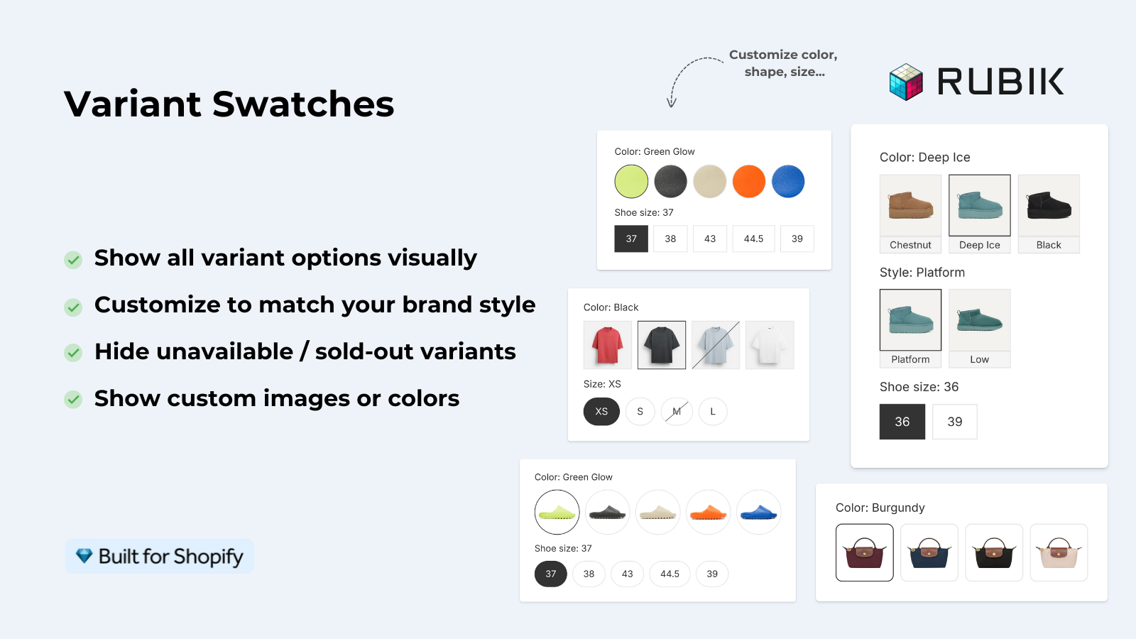
Collection swatches are small clickable color or image chips shown directly on a product card in the grid. Click one and the card’s image swaps to that variant, often updating the price and the add-to-cart link too. Quick view is a popup or drawer that opens a condensed product page over the grid, so a shopper can read details and add to cart without a full page load.
Swatches answer one question fast: what does this product look like in my color? They keep the shopper in the grid, scanning. Quick view answers a bigger question: do I want this product at all? It pulls them out of scanning mode and into a focused look at a single item.
That difference matters more than the visuals. Scanning behavior and deciding behavior are not the same mental mode, and the pattern you pick should match the one your shopper is in.
Collection swatches vs quick view, side by side
Here’s the short version before the long version. Swatches are lighter, faster, and built for color-led catalogs. Quick view carries more information but costs more in load weight and mobile friction. The table makes the tradeoffs obvious.
| Factor | Collection swatches | Quick view |
|---|---|---|
| Main job | Preview a variant’s color or image in place | Preview the whole product without leaving the grid |
| Best for | Apparel, accessories, anything color-led | Spec-heavy products, bundles, items needing description |
| Keeps shopper in grid | Yes, no interruption | Partly, opens an overlay |
| Mobile feel | Tap to switch, stays smooth | Popups feel cramped on small screens |
| Page weight | Light, metafield-based | Heavier, loads extra markup and scripts |
| Risk | Too many chips clutter the card | Slows the grid, can block scroll on mobile |
Notice the pattern. Swatches win on speed and scanning. Quick view wins on depth. Neither one is “better.” They answer different questions.
When collection swatches win
Swatches win whenever color or finish is the main thing a shopper is deciding in the grid. Apparel, shoes, bags, candles, paint, phone cases. If the product comes in a rainbow and the photo on the card only shows one option, you’re hiding inventory in plain sight. A shopper who wants red sees navy and scrolls past.
Three reasons swatches beat quick view for these catalogs:
- They keep the shopper scanning. No popup, no context switch, no back button.
- They surface variants you’d otherwise bury. Eight colors on one card means eight chances to catch an eye.
- They’re cheap to render. A good swatch system loads from metafields with no external API calls, so the grid stays fast.
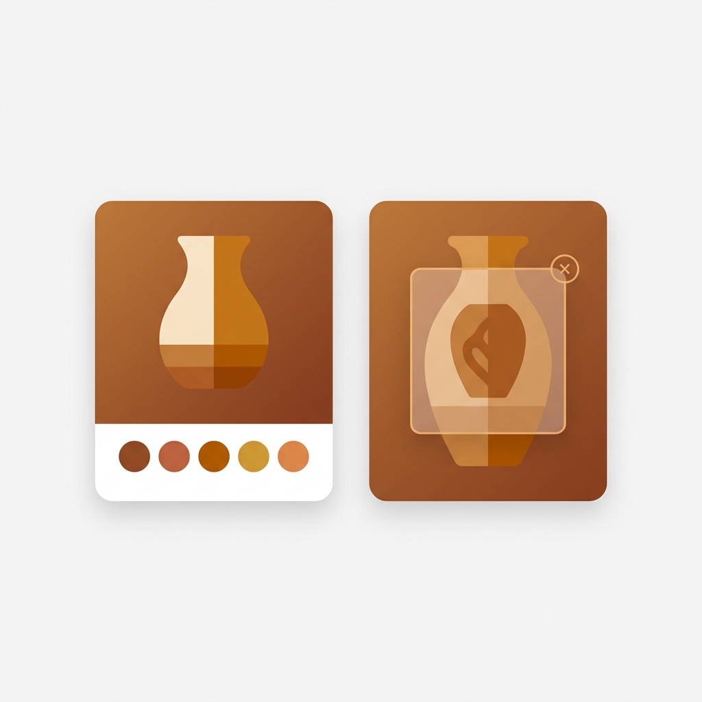
We built product card swatches into Rubik Variant Images for exactly this. Clicking a swatch on a card swaps the image, and you can let it update the price and the add-to-cart link too. Hovering previews the variant. By default it shows only the first option (color, usually) to keep cards clean, and it uses smaller chips on cards than on the product page. That last detail matters more than it sounds, because oversized chips on a card are the fastest way to wreck a tidy grid. Want the full breakdown of how variant media gets assigned? See how Shopify variant images really work.
One opinion, and we’ll defend it: most apparel stores reach for quick view when they actually needed swatches. They saw a popup on a competitor’s site and copied it. Then they wonder why mobile conversion didn’t move. The shopper never wanted a popup. They wanted to see the shirt in green.
“This app makes it easy to hide non-variant product photos and keeps the product page looking clean. It also helps to show clean custom swatches. Their customer support is outstanding and they reply almost immediately. They were able to fix a bug for me with minimal weight time.”
Anonymous merchant, 2026-02-18, Rubik Variant Images on the Shopify App Store
When quick view wins
Quick view wins when the buying decision needs more than a photo. Think spec-heavy products: electronics, supplements, furniture with dimensions, bundles with multiple components, or anything where the shopper needs to read before they commit. Color isn’t the question. Fit, specs, and details are.
In those cases a swatch chip does nothing useful. Nobody buys a standing desk based on a color dot. They want height range, weight capacity, and what’s in the box. Quick view lets them skim that without committing to a full page load and a back button trip. For a high-consideration catalog, that’s real value.
Quick view also helps when your grid is the main browse surface and product pages are sparse. If the product page itself is thin, a quick view that mirrors it won’t help much. But if you’ve got rich detail and a shopper comparing three items, the overlay saves them bouncing in and out. Use it where depth beats speed. Just know what you’re paying for it.
The mobile problem with quick view
Quick view’s biggest weakness shows up on phones, where most Shopify traffic lives. A popup that feels roomy on a 27-inch monitor turns into a cramped box on a 6-inch screen. Scroll gets trapped inside the overlay, the close button hides behind a thumb, and shoppers bail.
Why does this keep happening? Because most quick view setups are designed desktop-first and the mobile version is an afterthought. The overlay shrinks but the interaction model doesn’t adapt. You end up with a tiny modal trying to do a full product page’s job inside a phone viewport. It rarely works.
Swatches dodge this entirely. A tap-to-switch chip is native to touch. No overlay to trap scroll, no close button to miss. On mobile, swatches usually beat quick view on raw usability, full stop. If your traffic skews mobile (and whose doesn’t), weigh that hard before you ship a popup. For theme-specific setup, our guide on how to add collection page swatches on the Horizon theme walks through it.
Two kinds of collection swatches (this trips people up)
Before you add swatches to a collection page, know that there are two completely different kinds, and picking the wrong one will waste your time. One handles variants of a single product. The other links separate products together. They look identical on the page but the catalog structure behind them is different.
- Variant swatches on a card. When all your colors are variants of one product (one URL, one title), product card swatches from Rubik Variant Images switch the image, price, and add-to-cart link right on the card. Use this when color is a variant.
- Combined listing swatches. When each color is its own separate product (its own URL, its own title, its own images), you need Rubik Combined Listings to group those products and show swatches across them on the collection page. Use this when each color is a separate product.
- Why split products at all? Separate products give each color a unique URL and indexable page, which is better for SEO, and they sidestep Shopify’s variant ceiling without needing Plus.
So the real first question isn’t swatches vs quick view. It’s how your catalog is structured. Variants of one product? Reach for variant card swatches. Separate products per color? You want combined listings. Get this backwards and you’ll spend a weekend wiring up the wrong tool. If you’re weighing the catalog-structure side, our roundup of the best Shopify combined listings app for 2026 goes deeper, and there’s a fuller explainer on combined listings over on rubikify.com.
How to use both together
You don’t have to pick a single pattern for the whole store. Swatches and quick view can coexist when each one does the job it’s good at. Swatches handle color decisions in the grid. Quick view handles depth for products that need it. The trick is not stacking both on every card, because that’s clutter and load weight for no payoff.
A setup that works well in practice:
- Put swatches on color-led collections (apparel, accessories) so shoppers preview variants without leaving the grid.
- Reserve quick view for spec-heavy collections where reading beats looking.
- On color-led stores with separate products per color, run Rubik Combined Listings for the collection swatches and Rubik Variant Images for the product page (so the right photos show when a swatch is clicked).
- Test on a real phone, not just a browser resize. The mobile feel is where these patterns live or die.
Plenty of stores run both Rubik apps side by side for the color-led case: combined listings for the grid, variant images for the product page. Each color keeps its own URL and its own photos, and the shopper gets swatches everywhere. If you’re outfitting an apparel catalog, our list of the best Shopify apps for apparel stores covers the full stack, and the best Shopify color swatch app for 2026 roundup compares the swatch options directly. For the variant-image side specifically, there’s a deeper guide to collection page color swatches.
“I use Rubik Combined Listings Along with Rubik Swatch. I went through, no exaggerating, 50 apps before I found what I needed. Theses guys are the real deal, and they will jump on chat and fix your problems ASAP. Definately reccomend.”
Parks Nerd, US, 2026-03-18, Rubik Combined Listings on the Shopify App Store
See the live grid for yourself: the Rubik Variant Images demo store shows card swatches in action, the Rubik Combined Listings demo store shows grouped products with collection swatches, or read the getting started docs. Combined listings setup is in the RCL getting started guide.
Frequently asked questions
Are collection swatches better than quick view for conversion?
For color-led catalogs like apparel and accessories, swatches usually do more, because they let shoppers preview variants without leaving the grid. Quick view tends to help more for spec-heavy products where the shopper needs to read details before deciding. Match the pattern to the decision your shopper is making.
Can I use collection swatches and quick view at the same time?
Yes. Many stores use swatches on color-led collections and reserve quick view for collections with detailed specs. Avoid stacking both on every card, since that adds clutter and page weight without a clear benefit. Pick the right tool per collection.
Do collection swatches slow down my Shopify store?
A well-built swatch system loads from metafields with no external API calls, so the impact on grid speed is minimal. Quick view tends to be heavier because it loads extra markup and scripts for the overlay. If page speed is a concern, swatches are the lighter pattern.
What’s the difference between variant swatches and combined listing swatches?
Variant card swatches handle colors that are variants of one product (one URL), and Rubik Variant Images can show them on product cards. Combined listing swatches link separate products together (each color its own URL) and need Rubik Combined Listings. The right choice depends on how your catalog is structured.
Does quick view work well on mobile?
Quick view often struggles on mobile, where popups feel cramped and can trap scroll inside the overlay. Swatches use tap-to-switch, which is native to touch and avoids those problems. If your traffic skews mobile, test any quick view setup on a real phone before shipping it.
Related reading

Umid
Co-Founder at Craftshift