Shopify product gallery layouts: grid vs carousel vs stacked
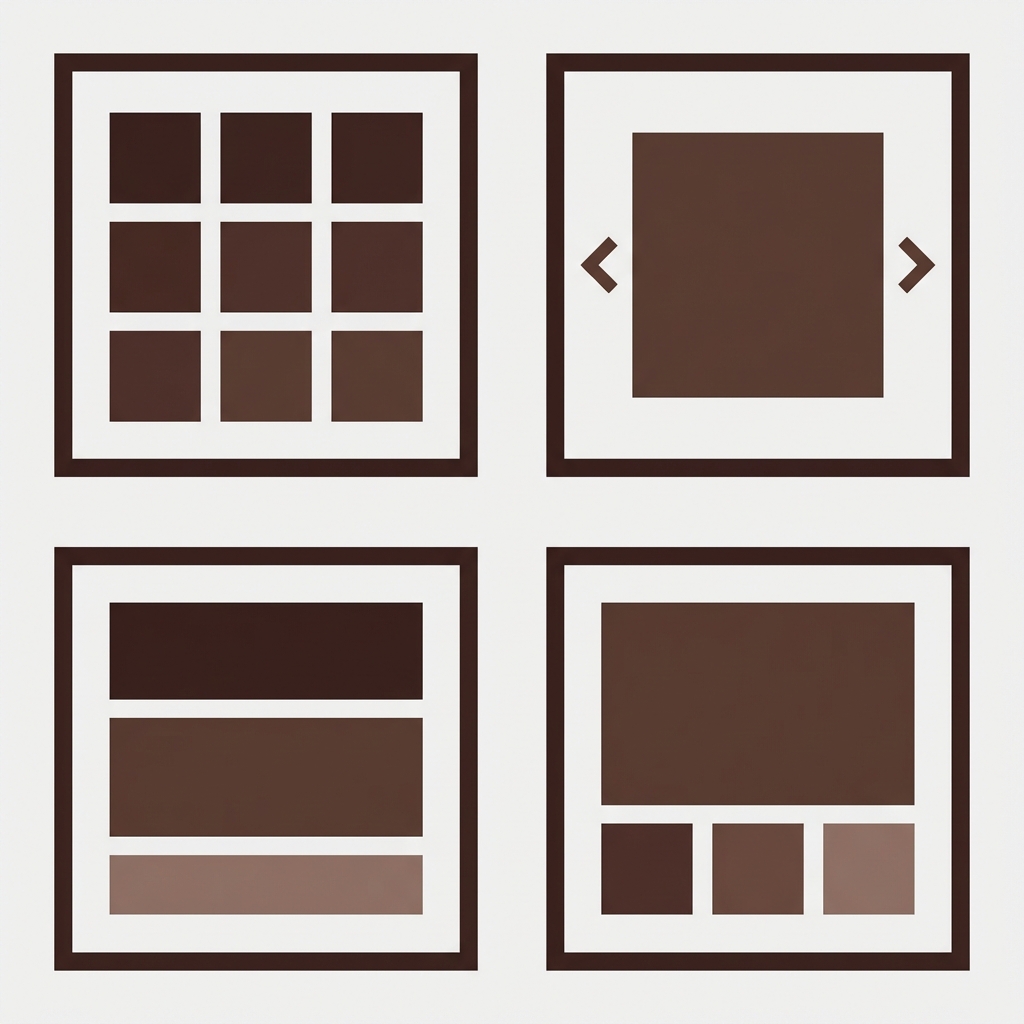
The gallery also comes in a few different layouts that affect how customers can view the product images. Some layouts show all of the images at once, some show them one at a time in a carousel, and some layouts show all of the images stacked vertically. Each gallery type works best for different types of products and product variations. Also, how variant images are filtered into the gallery affects how the gallery will look.
Most merchants stick with the gallery layout that their theme comes with without really comparing the options available to them. This guide outlines the relative merits and shortcomings of the most common layouts and explains how they can be used to show alternative color versions and to apply image filters.
In this post
- Grid layout
- Carousel / slider layout
- Stacked (scroll) layout
- Thumbnail strip layout
- Comparison table
- How variant image filtering works with each layout
- FAQ
Grid layout
Shows multiple images and organizes them in a grid, often in a 2 column format. All images are visible to the user without having to click or scroll on desktop. Clicking on an image will open it up in a lightbox or zoom view.
Best for: Products with 4 to 8 images. Gives customers a overall view of everything you have listed for a particular product. Also useful for clothing where customers can see front, back, details and lifestyle images all at once. This layout is the default for the Dawn theme.
Downsides: Does not scale well with 15+ images (the grid becomes very long). On mobile, the grid collapses to a single column, losing the “all at once” advantage. Images are displayed smaller than in a carousel, making fine detail harder to see without zooming.
Carousel / slider layout
One large image displayed at a time with navigation arrows or dots to move between images. Common in premium themes (Prestige, Impulse) and page builders.
Best for: Products where image quality is most important – Jewelry, Watches, Art, Etc. This format displays a single large image allowing the customer to see as much detail as possible without having to zoom. Also great for products with many images as this format can handle 20+ images in a carousel and the page does not become too long.
Upsides: Allowing customers to see and engage with multiple views and product lines in a single shot. Downsides: Customers only view one image at a time; to view all 8 images, customers must click through arrows or dots to view each subsequent photo. Some customers never click to the next photo. Looking at more images often means customers are more likely to convert on the image. The nature of a carousel, by definition, restricts customers from viewing multiple images per session.
Stacked (scroll) layout
All images are displayed vertically within a single column. All images are displayed one after the other. All images are scrollable, in that the customer can scroll down to view more images, rather than having to click or navigate through various sections of images.
Best for: Mobile-first stores. Instagram-trained customers are used to scrolling through content on their mobile devices. This format is great for lifestyle brands with editorial-style product photography. The stacked layout especially works well for apparel with lookbook-style images.
Downsides: Long pages with loads of content push the add-to-cart button far below the fold on desktop. galleries take up way too much real estate on the left side of the page while the right side has shorter content. Having a sticky add-to-cart bar does help with button visibility.
Thumbnail strip layout
Navigation control for viewing a series of related images. Often in the form of a previous and next navigation button, used to scroll through images, such as product images. Also referred to as a Previous/Next control or Image Navigator. Most layouts that incorporate image navigation include this feature across various e-commerce platforms.
Best for: General purpose. The fixed size header displays a large version of a image along with an index of all images on the page allowing your customers to scan the thumbnails and select the one they are interested in. This is a good general all purpose script and will work for any number of images. If you have a large number of images the user will need to scroll down to the thumbnails.
Downsides: Thumbnails are pretty small so hard to tell apart, especially when you have similar images for a product (the two slightly different angles of the same white shirt in this example look identical at 60px). On mobile you see a horizontal strip (that you have to scroll through) to browse through all the product images or the thumbnail strip is not displayed at all which is a shame for the user experience.
Comparison table
| Layout | Images visible | Image size | Mobile UX | Best for |
|---|---|---|---|---|
| Grid | All at once (2-col) | Medium | OK (becomes 1-col) | 4-8 images, apparel |
| Carousel | 1 at a time | Large | Good (swipe) | Detail products, many images |
| Stacked | All (scroll) | Large | Great (natural scroll) | Lifestyle, editorial, mobile-first |
| Thumbnail strip | 1 large + thumbnails | Large + small | OK (strip may hide) | General purpose, all product types |
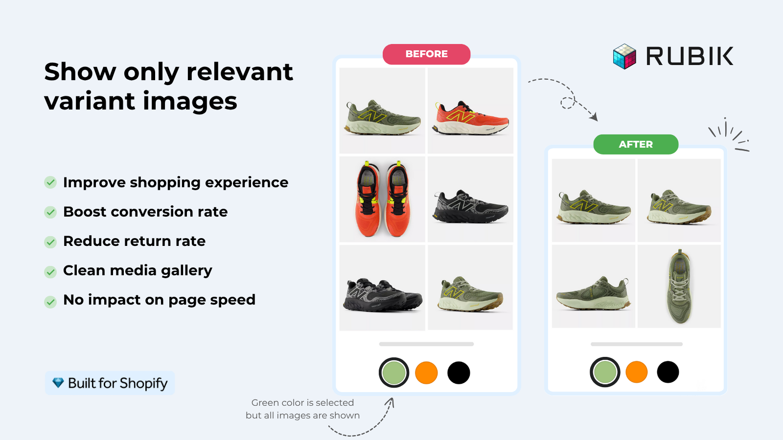
How variant image filtering works with each layout
When a customer selects a color swatch, variant image filtering hides images from other variants and shows only the selected variant’s photos. The appearance of the variant image filtered gallery depends on the selected gallery layout.
- Grid: The grid shrinks. If the product has 12 images but the selected variant has 4, the grid shows 4 images. This can leave empty space if the theme does not reflow the grid. Most themes handle this well.
- Carousel: The carousel shows fewer slides. Navigation dots or arrows decrease. The customer only cycles through the selected variant’s images. Clean and intuitive.
- Stacked: The page gets shorter. Fewer images to scroll through. The add-to-cart button moves closer to the fold. This is actually a UX improvement from filtering.
- Thumbnail strip: Thumbnails update to show only the selected variant’s images. The main image switches to the first image of the selected variant. The most familiar behavior for users.
Rubik Variant Images – Rubik Variant Images handles filtering across all four layout types. It works by hiding and showing image elements in the DOM rather than reloading the gallery, so the transition is instant regardless of layout. The app detects your theme’s gallery structure and adapts its filtering behavior accordingly.
For retailers using Rubik Combined Listings with separate products per color (ex: Blue, Red, Green), each product will have its own full gallery. Since the product galleries already allow for separate galleries per product, the gallery layout becomes unnecessary as you can simply display all images for that particular color.
“Thanks Rubik! This is now the best app I have for Shopify. It was so easy to set up and customize the design elements to match our site. You can’t imagine how messy our set was before this app! Now it’s perfect! Truly changed our store for the better and made my life a LOT easier.”
The Amma Shop, US, Rubik Variant Images on the Shopify App Store
Frequently asked questions
Which gallery layout is best for Shopify clothing stores?
Grid or stacked view widget for mobile-first fashion stores. Grid shows all angles at once or stacked as mobile scrolling is natural. For high-end fashion stores where image quality is paramount, the carousel widget shows the largest individual images.
Can I change the gallery layout on my Shopify theme?
Most OS 2.0 themes will give you 2 to 3 layout options for your product pages in the product page customizer (Customize > Product page > Media section). Some basic themes will only offer 1 option, however page builders like GemPages / PageFly will give you many more options if you’re using a page builder for your product content.
Does variant image filtering work with all gallery layouts?
Yes. Rubik Variant Images is a Retouch Category widget filter that will also apply the filter to Grid, Carousel, Stacked, and Thumbnail strip gallery styles.
How many product images should I display per variant?
4 to 6 per variation – front, back, details, scale/context shot and 1-2 lifestyle shots. As more images are added conversion rate increases up to around 8 images per variation and then starts to decline. Additional images beyond that will not bring further uplift. There are also images which are shared across all variations such as size chart and packaging shots.
Does gallery layout affect page speed?
Slightly.: Slightly. supports both Stacked and Grid layouts, which load all images at once. This can be painful for your users, but Slightly. supports lazy loading which can help alleviate the pain a bit. The Carousel layout loads only the first visible image and then lazily loads the rest on navigation. This means that for products with many images, the Carousel will be slightly faster on the initial page load.
Related reading

Umid
Co-Founder at Craftshift