How to change product image size on Shopify
Shopify doesn’t have an image size setting that applies globally. Product images are size’d by the Shopify theme, and this setting varies depending on the location within the store (product page gallery, collection thumbnails, cart, etc.) and the size at which images will display as featured images. One size setting does not affect all occurrences of product images.
This guide will go through each area where you can crop or shrink an image and explain how to modify the settings within the theme using the design settings, as well as modifying using CSS and/or Liquid.
In this post
- Changing image size via theme settings
- Product page gallery images
- Collection page thumbnails
- Controlling aspect ratio
- CSS size overrides
- Liquid image_url parameters
- FAQ
Changing image size via theme settings
Using custom image sizes on Shopify is very easy on most modern themes and you can do it straight from the Theme Customizer, without writing a single line of code.
Go to Online Store > Themes > Customize. Then navigate to the relevant section:
- Product page images: Click on the Product page template, then the “Product information” or “Media” section. Look for settings like “Image size”, “Image ratio”, or “Media width”.
- Collection page images: Click on the Collection page template, then the “Product grid” or “Product card” section. Look for “Image ratio” or “Card image size”.
- Featured product images: If your homepage has a featured product section, it has its own image size setting.
Depending on the theme there are a variety of options. Some themes like Dawn have options for “Adapt to image”, “Portrait”, “Square”, and “Wide”. Prestige allows you to set the width in specific pixels. Other themes only allow you to choose from certain ratios rather than specific pixel dimensions.
Product page gallery images
The gallery on the product page is where you’ll consider the image size most. This is the place where customers will be glancing over the images to get a sense of what your product looks like. The images need to be big enough for someone to see the details, but small enough so that they don’t push the variant select and add-to-cart button to the bottom of the page.
By default, the gallery takes up 50-60% of the page width on desktop and 100% on mobile with product details on the other side of the gallery on desktop. The pixel size of the image loaded will vary based on the Liquid code of the theme and the size of the customer’s screen.
Increasing the gallery size on desktop means looking for the option to increase the size of the gallery on the desktop version of your site in the theme’s product page customizer. Some themes will allow you to set the desktop gallery size in specific increments such as 50%, 60% or 70% etc. The wider the gallery, the wider the images will be and therefore more detail will be visible. However, as the gallery becomes wider, there will be less room to display additional product information to the right of the gallery.
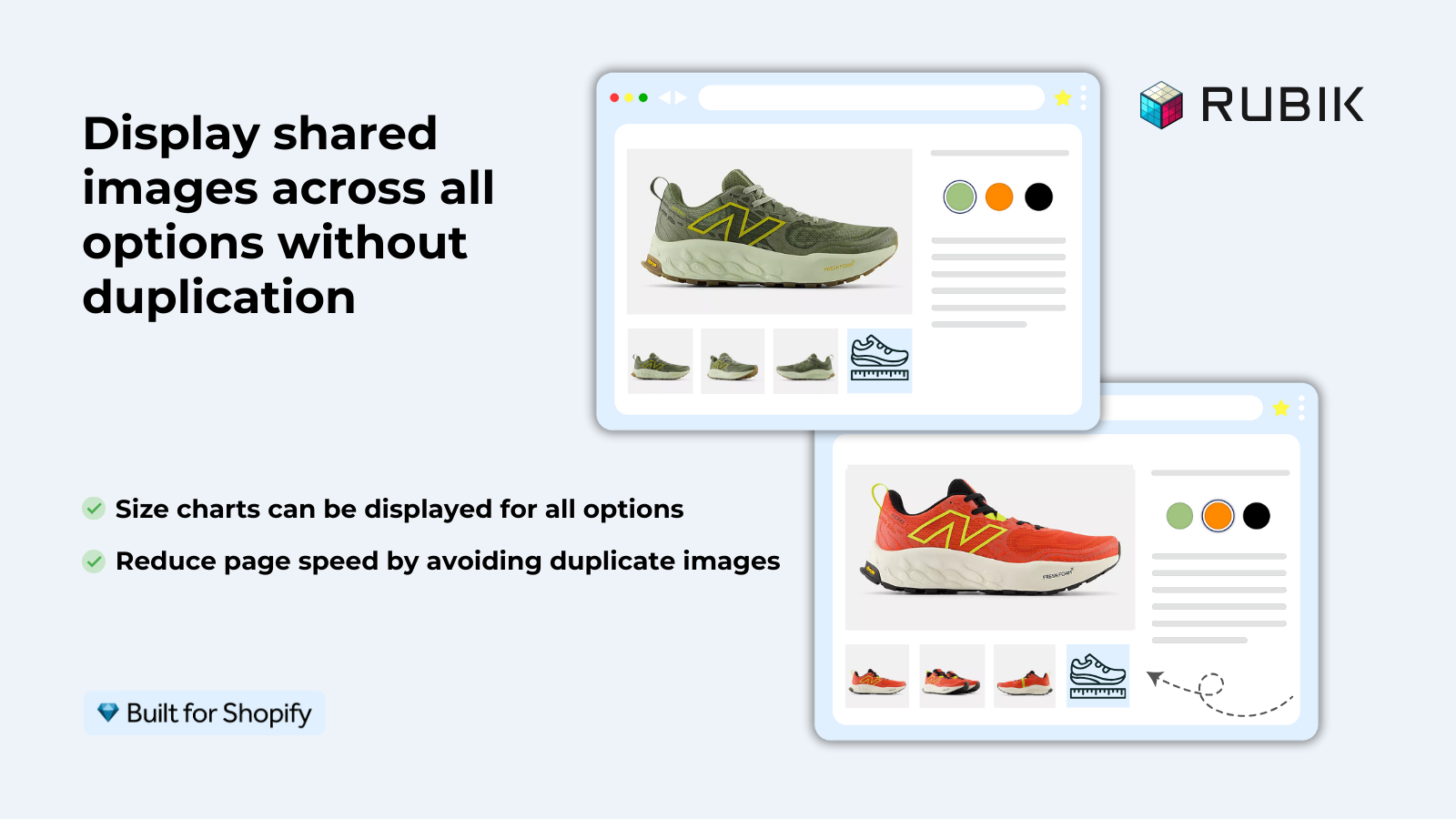
For the best gallery experience, Rubik Variant Images filters the gallery to show only the photos of the selected variant. This means you don’t have to wade through 30 irrelevant images to find the 5 or 6 photos of the product that you selected. The gallery is kept clean and pertinent to the variant you are interested in.
Collection page thumbnails
The product cards on the Collection page display a thumbnail of each product. There are two factors that control the size of the thumbnail: the number of columns in the grid and the aspect ratio setting.
- Fewer columns = larger thumbnails. A 3-column grid on desktop shows larger product images than a 4-column grid. Adjust in the collection page customizer under “Products per row” or “Columns”.
- Aspect ratio controls the height. “Square” (1:1) and “Portrait” (2:3 or 3:4) are most common for clothing. Portrait gives more vertical space for on-model shots. Square works for flat-lay product photos.
For stores that have grouped products, the display changes to one product image for the group, with color swatches displayed underneath the thumbnail. The thumbnail image updates to show the selected color when hovering over different swatch options.
Controlling aspect ratio
In design terms, the aspect ratio of an image is more important than the pixel dimensions. An image of dimensions 1000×500 (4:3 ratio) will look terrible if the theme requires an image of 300×300 pixels (1:1 ratio) as the image will either get cropped or letterboxed. Neither look good.
| Ratio | Best for | Shopify theme setting |
|---|---|---|
| 1:1 (Square) | Flat-lay, product-only shots | “Square” |
| 3:4 (Portrait) | On-model clothing, tall products | “Portrait” |
| 4:3 (Landscape) | Wide products, furniture | “Wide” or custom |
| Adapt | Mixed ratios across products | “Adapt to image” |
For stores with uncertain image ratios, “Adapt to image” is a safe choice. This option displays images at their full native ratio without cropping. There is a trade-off here in that collection pages will render with an uneven grid unless all product images are of a consistent ratio after upload.
CSS size overrides
If your theme doesn’t have the exact size you are looking for, you can always change it with CSS. To do this you would add the following code to the Custom CSS section in your Online Store > Themes > Customize > scroll to bottom > Custom CSS:
/* Make product gallery images larger */
.product__media-item img {
  max-width: 100%;
  height: auto;
}

/* Set collection thumbnail to exact height */
.card__media img {
  aspect-ratio: 3/4;
  object-fit: cover;
  width: 100%;
}

/* Increase product gallery max width */
.product__media-wrapper {
  max-width: 700px;
}
Replace the class names with your theme’s actual selectors (right-click > inspect element to find the class names). object-fit: cover crops the image and scales it to completely fill the object in width and height, but won’t distort the image. object-fit: contain fits the image inside the object width and height without cropping, but may result in some empty space within the object.
Liquid image_url parameters
For developers: The Liquid image_url filter on the Shopify tag determines what size image will be served by the CDN. The width of this size determines how high the resolution of the image will be. To change the size of the image served, modify the width parameter in the image tag accordingly.
{{ product.featured_image | image_url: width: 800 | image_tag }}

{%- comment -%} For retina, request 2x the display size {%- endcomment -%}
{{ product.featured_image | image_url: width: 1600 | image_tag }}

{%- comment -%} With srcset for responsive images {%- endcomment -%}
{{ product.featured_image | image_url: width: 800 | image_tag:
   srcset: '400,600,800,1200,1600' }}
Images look blurry. Check the width of images in your theme’s Liquid code. 400px wide at 800px = blurry. Bump up the width to match or exceed the output width, doubling up for retina.
See the live demo store or read the getting started guide.
Frequently asked questions
What is the recommended product image size for Shopify?
2048x2048px is recommended. This provides enough resolution for gallery display, zoom, and retina screens. Shopify accepts images up to 4472x4472px and 20MB per file.
Can I set different image sizes for desktop and mobile?
You cannot control this through the theme settings, but many themes (including the default one) use responsive srcset tags. That means the images will automatically serve different image sizes based on the screen width of your device. So, on a mobile device you will get to download and display a much smaller (faster downloading) image than you would on a desktop monitor, where you would download and display a much larger image.
Does changing image size affect page speed?
Yes. Big images are heavy and take time to load. You control the size each image is displayed in – use 800px for thumbnails in the gallery navigation, 1600px for zoom views, and 400px for collection cards. These sizes are served by Shopify’s Content Delivery Network (CDN) in the exact size you’ve requested, don’t attempt to serve 2048px versions of images everywhere thinking it will magically get bigger, it won’t.
Why do my images look different sizes across products?
Product images in the shop may have different aspect ratios such as square, portrait or landscape. The theme can choose to crop these to fit a uniform ratio such as square or to display at their full width with uneven spacing between them. It’s easier to look professional if you stick to one aspect ratio for all product images.
How do I make Shopify product images bigger on the product page?
Under the product page section in the theme customizer, look for “Media width” or “Desktop layout”. Boost the percentage to give more room to the gallery, or target the gallery container with CSS to set a larger max-width.
Related reading

Umid
Co-Founder at Craftshift