How to show color swatches for the Prestige theme on Shopify
Prestige is one of the most popular premium Shopify themes, especially among fashion and luxury brands. Unlike Dawn, Prestige actually ships with built-in color swatches. The problem is that the default configuration rarely matches what stores actually need. Swatches show up as tiny circles with auto-detected colors that do not match the real product, or they do not show up at all because the setup is not obvious.
This guide covers Prestige swatches – How to turn them on, change colors and sizes, upload images for custom textures and patterns and what to do if you are a Prestige store owner and experience some of the common issues with this type of store.
In this post
- Prestige native swatch support
- How to enable swatches in Prestige
- Setting custom swatch colors
- Using image swatches for patterns
- Customizing swatch size, shape, and borders
- Common Prestige swatch issues and fixes
- When to use an app instead
- FAQ
Prestige native swatch support
Prestige (by Maestrooo) has a built in colour swatch system. The theme can display color options as circles, as opposed to the standard dropdowns or text buttons. The swatches work on product pages, and with a bit of tweaking on the collection pages as well.
Prestige will automatically detect color names for a “Color” variant option if the standard color names are used and their corresponding values are the names of the actual colors. Most standard colors have names that Prestige recognizes and that are native to CSS, of the 150+ standard colors recognized by CSS, at least 150 will be automatically recognized in this format.
Where it breaks: custom color names. Instead of actual CSS color names like black or white, Prestige has used names like “Dusty Rose”, “Heathered Sage”, “Midnight Noir”. The fix is to have Prestige fall back to a neutral grey for any name it cannot map. This is the number one complaint from Prestige store owners about swatches.
How to enable swatches in Prestige
Prestige swatches are controlled through the theme customizer:
- Go to Online Store > Themes > Customize
- Navigate to Theme settings > Products (or Product page depending on Prestige version)
- Find the Color swatch or Variant display section
- Set the option type that should display as swatches (usually “Color”)
- Save
This setting name and location differs across the various Prestige versions (5.x, 6.x, 7.x). Look for “swatch” or “color” in your theme settings. Some of the older Prestige versions may have this setting located under the Product page setting instead.
Once enabled, any product with an option named “Color” (or whatever you configured) will display swatches instead of a dropdown. Options with other names (“Size”, “Material”) stay as dropdowns or buttons.
Setting custom swatch colors
For color names that Prestige cannot auto-detect, you have two options:
Option 1: Color metafields
Newer Prestige versions support color metafields. You’ll want to create a variant metafield of type Color, and then Prestige can read the hex value from it. This is the easiest approach to get colors in Prestige, and it will work with any number of custom colors without requiring and additional code.
Go to Settings > Custom data > Variants, create a metafield definition with type “Color”, and fill in the hex value for each variant. Prestige picks it up automatically.
Option 2: CSS color map
For older Prestige versions or if you prefer to keep metafields out of this, go with custom CSS
/* Custom Prestige swatch colors */
.color-swatch[data-value="Dusty Rose"] { background-color: #DCAE96; }
.color-swatch[data-value="Midnight Noir"] { background-color: #1a1a2e; }
.color-swatch[data-value="Heathered Sage"] { background-color: #9CAF88; }
.color-swatch[data-value="Champagne"] { background-color: #F7E7CE; }
.color-swatch[data-value="Espresso"] { background-color: #3C1414; }
Add this to Online Store > Themes > Customize > scroll to bottom > Custom CSS. The .color-swatch class is Prestige specific and needs to match the data-value of the exact variant option it is replacing (case sensitive). The data-value should match the exact variant option value.
Using image swatches for patterns
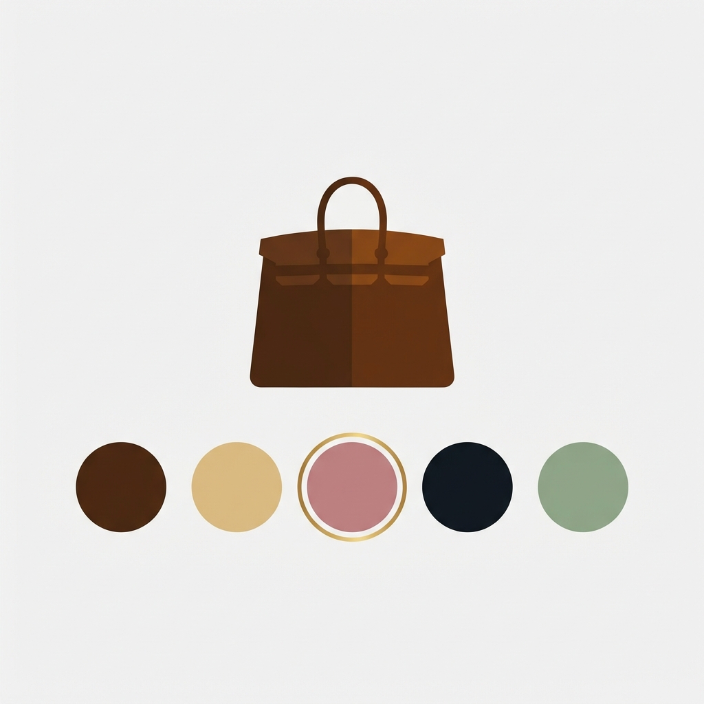
Flat color circles are easy enough to create for solid colors, but what about plaid, floral, marble, or wood grain? A single hex value can’t capture a pattern, so we stick with image swatches for those designs.
Prestige supports image swatches. Most themes will use the images for the product variant(s) in the product details page. Some Prestige versions will also display a cropped version of the images for the variant(s) as swatches when “Use variant image as swatch” option is checked in the theme settings.
If your Prestige version doesn’t support :hover styles natively, you can achieve similar effects with CSS.
/* Image swatch via CSS */
.color-swatch[data-value="Plaid"] {
background-image: url('https://cdn.shopify.com/s/files/.../plaid-swatch.jpg');
background-size: cover;
background-position: center;
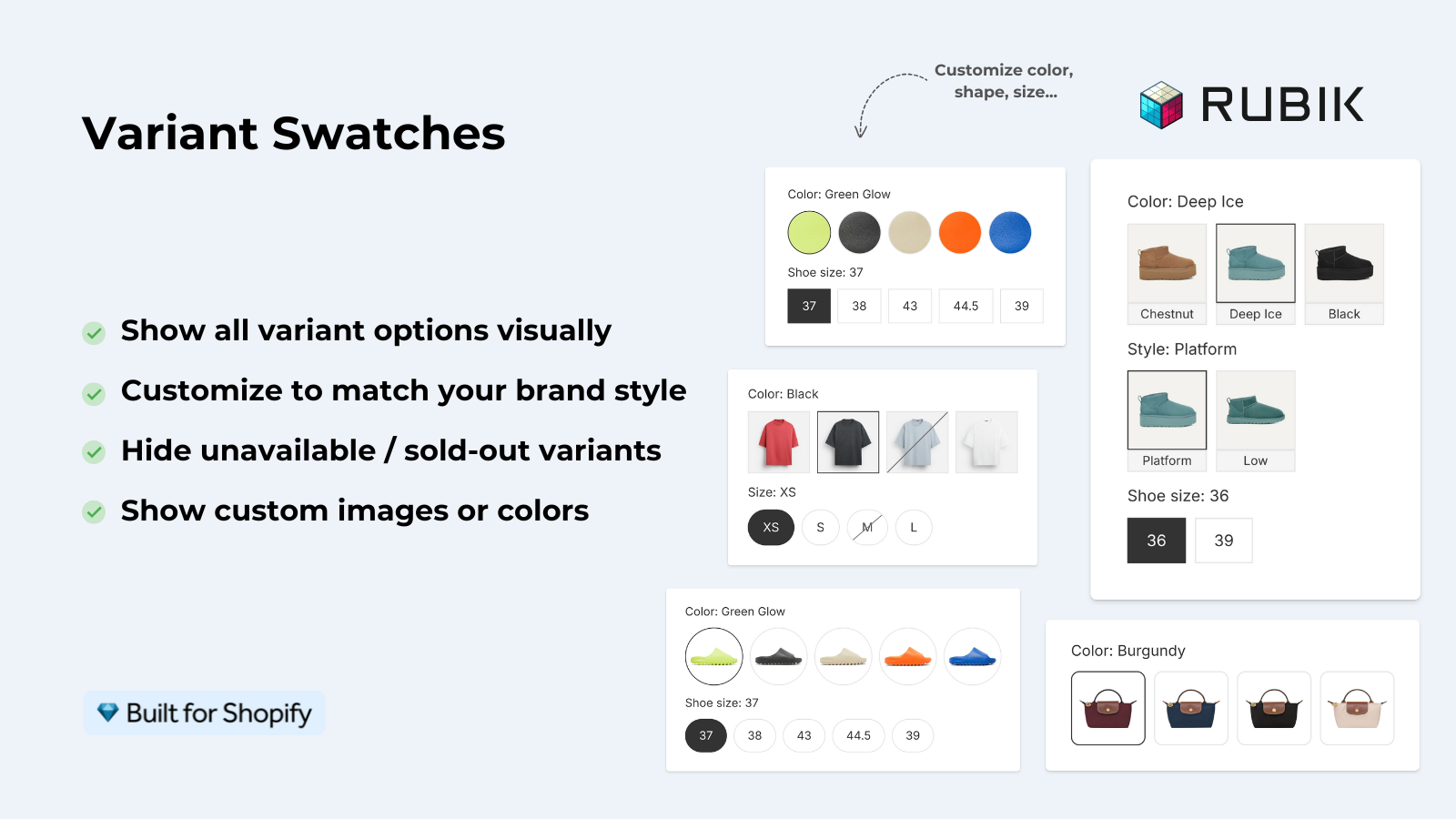
}The downside: You need to upload swatch images and host them on the Shopify CDN (using the Files feature within the admin) and then reference the file paths within the website’s CSS. For a store with 5 patterns this is no big deal. For 30+ patterns this can become quite time consuming. Apps such as Rubik Variant Images provide a way to include image swatches without the use of CSS and allows you to easily assign different images to each swatch within the app’s visual interface.
Customizing swatch size, shape, and borders
The default swatch size for Prestige Themes products is 30px circles, which we feel is perfect for most luxury brand designs, but could be too small for some stores and too large for others.
/* Larger swatches */
.color-swatch {
  width: 40px;
  height: 40px;
  min-width: 40px;
}

/* Selected state */
.color-swatch.is-selected {
  box-shadow: 0 0 0 2px #fff, 0 0 0 4px #000;
}

/* Rounded squares instead of circles */
.color-swatch {
  border-radius: 6px;
}
7 prestige uses .color-swatch as the main swatch class, and .is-selected to mark the active swatch. Some versions of prestige also use .is-active to mark the active swatch. Please check your version against an element in the component in your browser.
For full manipulation on styling such as hover effects, border variations and colour names see swatch styling tutorials or use Rubik Variant Images which has 100+ editable CSS variables controlled via an easy to use interface.
Common Prestige swatch issues and fixes
- Grey swatches for custom color names. Prestige cannot auto-detect non-CSS color names. Fix: add custom hex values via metafields or CSS (see Setting custom swatch colors above).
- Swatches not showing at all. Check that the option name in the theme settings matches your product option name exactly. “Color” and “Colour” are different. Also verify swatches are enabled in the theme customizer.
- Wrong image loads when swatch is clicked. This is an image assignment issue, not a Prestige issue. Verify each variant has the correct image assigned in the product editor. See our swatch conflict troubleshooting guide.
- White swatch invisible on white background. Add a border:
.color-swatch[data-value="White"] { border: 1.5px solid #ddd; } - Swatches on collection pages not working. Prestige collection swatches require separate configuration. Check theme settings under “Collection page” or “Product card”. If you need full collection page swatch control, Rubik Combined Listings works alongside Prestige for collection-level swatches.
- Swatches broke after theme update. Prestige updates occasionally change the swatch markup. Custom CSS targeting old class names may stop working. Re-inspect the swatch element after updates and adjust your selectors.
When to use an app instead
Prestige comes with a handful of swatches that cover basic variations such as solid color, auto-detection and active states. Older versions of Prestige do not include swatches with images and you can only customize the size of the button to certain degrees. Also, you cannot mix and match different swatch types such as having a solid color state and a pill state. The gallery of variants does not allow you to filter out image variants.
If you need these features, there are apps available that can quickly fill the gap. Rubik Variant Images is an app created specifically to enhance Prestige and allows for images in swatches, multiple swatch types in one area, variant images, and 100+ styles to make the images your own. Keep in mind when using this app that you will need to disable the native swatches in your theme settings to avoid swatch conflicts, and this app replaces the swatch picker.
“Hands Down the best customer support of all the variation/swatch apps I have used till date. The app does everything. From individual variant gallery to really detailed customizable swatch’s. All in a single app. Originally we used to use two different apps so this is so much more cost efficient for us.”
Bellissima Covers, India, Rubik Variant Images on the Shopify App Store
See the live demo store, watch the swatch customization tutorial, or read the getting started guide.
Frequently asked questions
Does the Prestige theme have built-in color swatches?
Prestatus in Prestige comes with an in-built swatch system that natively supports standard CSS color names, you can also add your own custom colours via metafields or CSS overrides.
Why are my Prestige swatches showing as grey?
Prestige currently cannot auto-detect custom color names like “Dusty Rose” or “Midnight Noir”. These are not valid CSS color names. Please manually enter the hex value for these colors via a color metafield on the product variant or via a CSS override targeting the class name of the data-value attribute in question.
Can I use image swatches on Prestige?
Newer Prestige versions may support variant image as swatch. Older versions do not. You can use CSS background-image as a workaround, or use Rubik Variant Images which adds full image swatch support to Prestige without code.
How do I change swatch size in Prestige?
Add custom CSS to target .color-swatch classes and set the width and height. By default 30px but common sizes are 32-44px depending on the number of color options for your product.
Can I show swatches on Prestige collection pages?
Prestige does have some collection page swatch support, but it is very version specific and not something I would recommend counting on. There is an Listing Combined Listings extension called Rubik Combined Listings that can work with Prestige to give you full collection page swatch control with separate desktop and mobile settings.
Should I disable Prestige native swatches if I use Rubik Variant Images?
Yes, running both methods creates duplicate pickers for the swatches. I had native swatches turned on in the Prestige theme settings, but that meant that I had an extra dropdown of swatches in the Color option, which wasn’t what I was going for. I would recommend turning off that feature and letting the program generate the swatches for you.
Related reading

Umid
Co-Founder at Craftshift