How to show custom swatch border styles on Shopify product pages
With most themes, the borders around Shopify swatches are standard fare, but only really enough to serve as a base for a better look. The default border looks alright, but eventually it may make your store look cheap compared to competition, especially if you’re competing against other stores selling similar products.
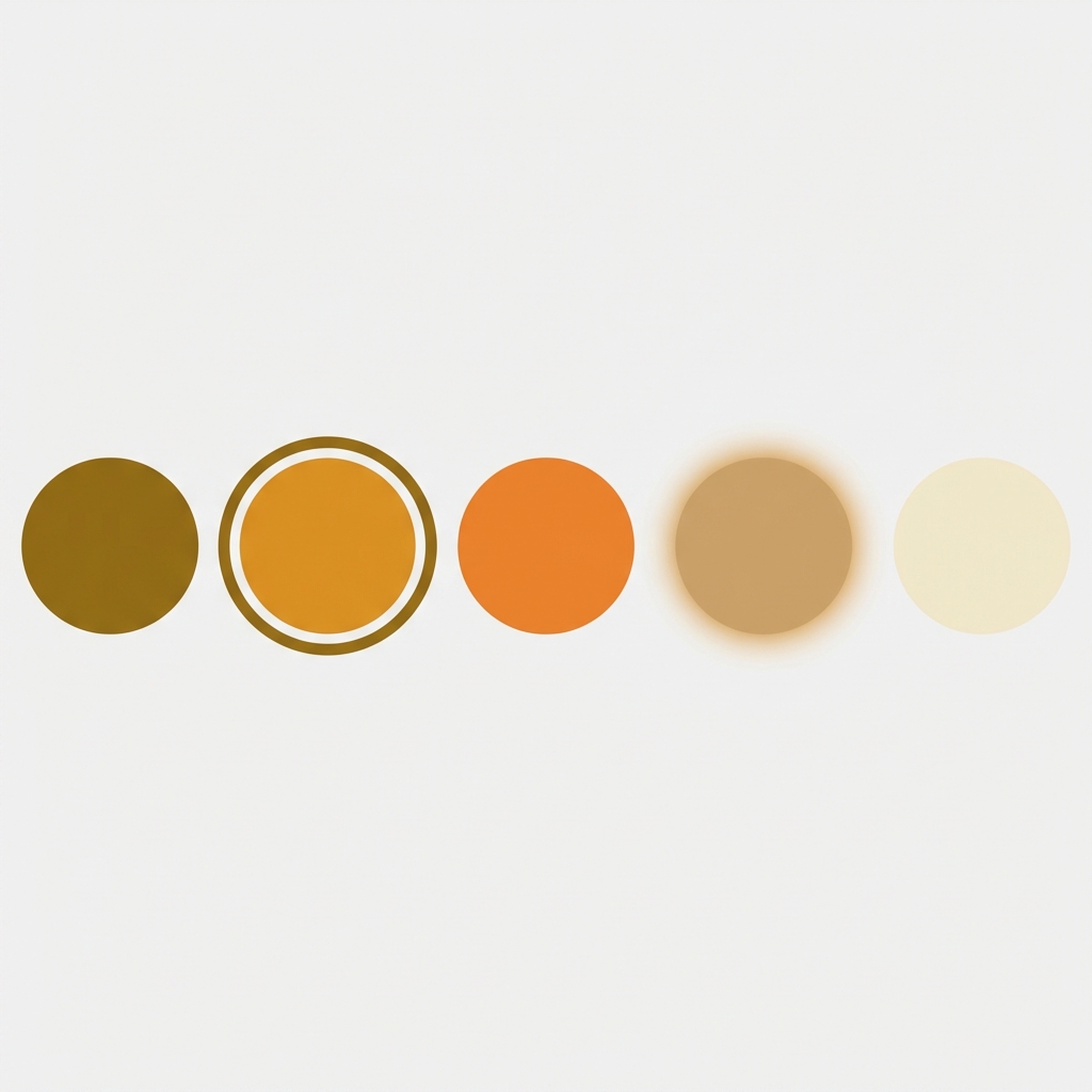
Details such as the border of your swatches have a profound effect on how customers perceive the selection state and the overall feedback they receive as they hover over products on your product pages. The thick black border shown above as the selected swatch draws attention to it and gives feedback to the customer in a very obvious manner. A 1px grey border also provides feedback but in a more subtle way. Both are great options for brands but the default is rarely, if ever, the best approach.
This guide covers all the border properties available for Shopify swatches including width, color, radius and style. Each border property is explained in detail with its corresponding customisable state including selected, hover and disabled. All of the provided CSS snippets can be copy and pasted directly into your Shopify theme.
In this post
- How swatch borders work in Shopify themes
- Changing swatch border width
- Changing swatch border color
- Changing swatch border radius (shape)
- Styling the selected swatch state
- Styling the hover state
- Styling sold-out swatches
- Using an app instead of custom CSS
- FAQ
How swatch borders work in Shopify themes
Most Shopify themes render variant options as either a dropdown or a swatch. Swatches are simply HTML elements (usually a span, label or button) styled with CSS. In this example the visible border is simply the border-width, border-color, border-style and border-radius CSS attributes.
The tricky part is finding the right CSS selector. Every theme uses different class names. Dawn uses .variant-input__label. Prestige uses .color-swatch. Impulse uses .swatch-element. There is no universal selector.
To find your selectors: right-click on a swatch and click “Inspect” to find the class name of the element. Then replace the placeholder CSS snippets below with that selector.
Changing swatch border width
This control changes the width of the swatch border. Most themes set this by default to 1px, but on a white background it can be hard to see. I set it to 2px and it looks much better.
Go to Online Store > Themes > Edit Code > Assets and open your theme’s main CSS file (often base.css or theme.css). Put the following code at the bottom of the file.
/* Default swatch border */
.variant-input__label {
  border-width: 2px;
  border-style: solid;
  border-color: #d0d0d0;
}

/* Selected swatch - thicker border */
.variant-input__label.is-active,
.variant-input__label[aria-checked="true"] {
  border-width: 3px;
  border-color: #000;
}
Change .variant-input__label to the swatch class in your theme. This color input uses swatches. The .is-active or [aria-checked=”true”] selector is used to style the currently selected swatch. Some themes use .selected, .active, or a data attribute instead of .is-active.
Increasing the border width can cause a layout jump because the swatch size increases by a pixel or two. This can be avoided by using box-sizing: border-box on the swatch or by using the outline property instead of border for the selected state, since the outline property does not affect the layout of an element.
Changing swatch border color
Border color is where brand identity comes in. A luxury jewelry store might want gold borders (#c9a96e). A streetwear brand might want pure black. A minimalist skincare store might want barely-there light grey (#e8e8e8).
/* Custom border color */
.variant-input__label {
  border-color: #e0e0e0;  /* light grey default */
}

.variant-input__label.is-active {
  border-color: #c9a96e;  /* gold for selected state */
}

.variant-input__label:hover {
  border-color: #999;     /* medium grey on hover */
}
For the white swatches (you’ll see swatches for “White” tagged colors), you should be able to see some sort of outline. A lot of themes fail in this regard as they set border: none as a default, and then your white swatches get absorbed into the white background. Have at least a light grey border as a default.
Why do so many great themes do such a simple thing wrong with invisible borders on white backgrounds? We see this problem more than any other with swatches in Shopify stores.
Changing swatch border radius (shape)
Border radius. Border radius controls circles, squares and rounded rectangles for your swatches. The most common shapes:
- Circle:
border-radius: 50%(most popular for color swatches) - Rounded square:
border-radius: 6pxor8px(modern, clean look) - Sharp square:
border-radius: 0(minimal, editorial feel) - Pill:
border-radius: 999pxon a wider-than-tall element (great for size swatches)
/* Circle swatches */
.variant-input__label {
  border-radius: 50%;
  width: 36px;
  height: 36px;
}

/* Rounded square swatches */
.variant-input__label {
  border-radius: 8px;
  width: 40px;
  height: 40px;
}

/* Pill-shaped size swatches */
.size-swatch {
  border-radius: 999px;
  padding: 6px 16px;
}
One approach that works for stores with multiple options in a row that have both color and size variations: use circles for the color swatches and pills for the size swatches. This helps to distinguish the two different types of options and allows for each row to have a clear call-out for sizes. Using different swatch types for different option types is a pattern that more stores should use.
Styling the selected swatch state
The selected state is the most important border to get right. It tells the customer which variant they have chosen. If the selected state is too subtle, customers second-guess their selection. If it is too aggressive, it looks cheap.
Three approaches that work well:
1. Thick border
.variant-input__label.is-active {
  border: 3px solid #000;
}
Simple, clear, universally understood. Works on every background color.
2. Offset outline (no layout shift)
.variant-input__label.is-active {
  outline: 2px solid #000;
  outline-offset: 3px;
}
Use 7 to create a “ring” effect around your swatches. This won’t increase the size of the swatches, but does make for a very premium look. The effect is often used in high-end Shopify themes, and is created internally by said themes. For users without the need to create a full theme from scratch, 7 is a solid fallback. It won’t cause any jumps in the layout and is easy to apply.
3. Box shadow ring
.variant-input__label.is-active {
  box-shadow: 0 0 0 2px #fff, 0 0 0 4px #000;
}
This creates a white space between swatch color and outer black border. Looks nice on light and dark swatches. Using double shadow to create swatches is one of those nice CSS tricks to create a lot of visual difference with just a little code. The white space becomes the inner shadow, and the black is the outer. Works pretty well.
Styling the hover state
Hover states allow customers to receive feedback about their selection before making the final click. Swatches with no hover state look static and unresponsive, often giving an interaction that feels dead.
/* Subtle hover effect */
.variant-input__label:hover {
  border-color: #666;
  transform: scale(1.08);
  transition: all 0.15s ease;
}

/* Or a shadow lift */
.variant-input__label:hover {
  box-shadow: 0 2px 8px rgba(0,0,0,0.15);
  transition: box-shadow 0.15s ease;
}
Keep all transition times under 200ms. Interactive elements should never feel laggy. Also make sure the hover state looks different than the :selected state so customers can tell which swatch is currently selected and which swatch they are hovering over.
On mobile you won’t have a hover state as touch devices go from click to selected state instantly. Therefore your selected state needs to be clear enough without the hover state as a intermediary. Test on an actual mobile device rather than just a browser’s responsive mode.
Styling sold-out swatches
Sold-out variants need their own visual treatment. The two most common approaches to handle sold out styles are to either duplicate the existing product node with a status set to ‘sold out’, or to update the initial product with an additional color variant to reflect its discontinued status.
- Diagonal line through the swatch (strikethrough effect)
- Reduced opacity (greyed out)
/* Diagonal strikethrough */
.variant-input__label.is-disabled {
  position: relative;
  opacity: 0.5;
  cursor: not-allowed;
}

.variant-input__label.is-disabled::after {
  content: '';
  position: absolute;
  top: 0;
  left: 0;
  right: 0;
  bottom: 0;
  background: linear-gradient(
    to top right,
    transparent 45%,
    #999 45%,
    #999 55%,
    transparent 55%
  );
}

/* Simple opacity reduction */
.variant-input__label.is-disabled {
  opacity: 0.3;
  pointer-events: none;
}
strikes out as better UX because it clearly indicates that the disabled option is a present option that is just not available instead of giving the impression that it could ever be available. Straight 50% opacity just looks like a rendering bug to customers. It’s better to indicate that a certain option is sold out without their even trying to activate it.
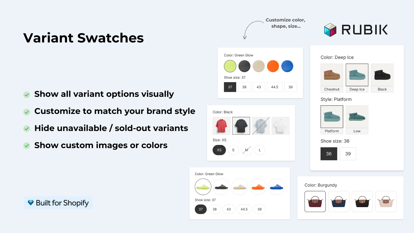
These swatches can become sold out and if you want to have full control over how they look (hide, strike-through, grey out or move to end of list), you can have it all done through a visual editor, no CSS required.
Using an app instead of custom CSS
Using Custom CSS to theme your store works, but has the draw back of having the potential to break with theme updates, having to apply the same CSS across mulitple stores, and having to debug for css specificity conflicts which no one wants to do.
Rubik Variant Images lets you control swatch styling using a visual settings editor with 100+ CSS variables. Adjust the border width, border color, border radius, the selected state, the hover state, swatch size, swatch spacing and swatch shape (circle, square, rounded, pill) without writing a single line of code. Three swatch types are supported and you can have different swatch types on one product. Image swatches, color swatches and pill buttons can be used individually or in combination.
For those stores that also want to display color swatches on the collection page (in addition to the product page), You can also customize the swatches on the collection page with separate desktop and mobile layouts with Rubik Combined Listings.
“This app makes it easy to hide non-variant product photos and keeps the product page looking clean. It also helps to show clean custom swatches. Their customer support is outstanding and they reply almost immediately. They were able to fix a bug for me with minimal weight time.”
Anonymous merchant, 2026-02-18, Rubik Variant Images on the Shopify App Store
Complete CSS example: all states together
Here is a full copy-paste snippet that covers default, hover, selected, and sold-out states. Replace the class names with your theme’s actual selectors:
/* === SWATCH BORDER STYLES === */

/* Base swatch */
.variant-input__label {
  border: 1.5px solid #d4d4d4;
  border-radius: 50%;
  width: 36px;
  height: 36px;
  cursor: pointer;
  transition: all 0.15s ease;
  box-sizing: border-box;
}

/* Hover */
.variant-input__label:hover:not(.is-disabled) {
  border-color: #888;
  transform: scale(1.1);
}

/* Selected - double ring effect */
.variant-input__label.is-active {
  box-shadow: 0 0 0 2px #fff, 0 0 0 4px #000;
  border-color: transparent;
}

/* Sold out */
.variant-input__label.is-disabled {
  opacity: 0.4;
  cursor: not-allowed;
  position: relative;
}

.variant-input__label.is-disabled::after {
  content: '';
  position: absolute;
  inset: 0;
  background: linear-gradient(
    to top right,
    transparent 45%, #aaa 45%,
    #aaa 55%, transparent 55%
  );
  border-radius: inherit;
}
This styling allows for a clear display with borders, smooth scaling on hover, a premium look for double-ring selected items, and a diagonal strikethrough for sold out items. Colors and sizes may be changed to match your brand.
link to live demo store, swatch customization tutorial, visual settings docs
Frequently asked questions
Can I use different border styles for color swatches and size swatches?
Yes. Use separate CSS selectors for different option types. Most themes allow you to specify options, and add a class or data attribute for the options (e.g. data-option=”Color” vs data-option=”Size”). Style each one individually. Circles for color and pills for size is a great combination.
Will custom swatch CSS break on theme updates?
It depends. If the theme changes its swatch class names, your CSS stops working. This is the main risk of custom CSS. Using an app like Rubik Variant Images avoids this because the app injects its own swatch elements that are independent of the theme’s markup.
How do I prevent layout shift when the selected swatch gets a thicker border?
Three options: use box-sizing: border-box so the border grows inward, use outline instead of border for the selected state (outlines don’t affect layout), or use box-shadow to create a ring effect without changing the element’s dimensions.
What border radius should I use for circular swatches?
Set border-radius: 50% and make sure that the width of the element is equal to its height. Using 50% with a different width and height will render an oval instead of a circle. Common sizes used for Circles include 28px, 32px, 36px and 40px. Small elements like toggle switches are typically 24px, but those are listed under Form Elements.
How do I style the swatch border for the Dawn theme specifically?
Dawn uses .variant-input__label for its variant picker elements, with the selected state being indicated by `input:checked + .variant-input__label` as it is hidden radio inputs paired with label elements. Add your CSS to the bottom of assets/base.css in your Dawn theme.
Can I add a tooltip that shows the color name on hover?
Yes, but it requires HTML changes, not just CSS. You need to add a title attribute or a custom tooltip element to each swatch. Some apps, including Rubik Variant Images, add tooltips automatically without theme code changes.
Related reading

Umid
Co-Founder at Craftshift