How to organize products with multiple color and size options on Shopify
Products with multiple variations i.e. products with options of color and size are the most common type of product found in apparel, accessories and home goods stores. A t-shirt for example may come in 8 colors with 5 sizes to offer. A cushion cover may come in 12 different fabrics with 3 sizes offered. A phone case may have 15 different designs to choose from and come in 4 different models. All of these variations need to be managed as separate inventory skus and each sku needs its own product image and space on the product page. Organizing all of these variations correctly from the get-go can save a lot of pain at 50 products and prevent disaster at 500.
This guide covers image variants and how you might organize and display those variants. It covers both organizing images per color and arranging your collection pages for easy selection. We also discuss how to determine whether to have a single product page or to split that out into different pages.
In this post
- Structuring your variant options
- Managing images per color
- Product page layout for color + size
- Collection page display
- When to split vs combine
- FAQ
Structuring your variant options
For products with color and size, the standard setup is two options:
- Option 1: Color (values: Red, Blue, Black, etc.)
- Option 2: Size (values: S, M, L, XL, etc.)
List Color and Size as variants, with Color as Option 1 and Size as Option 2. There are two reasons for this: first, the title of the variant option displays in the order of the options, so “Red / M” is preferred to “M / Red”. The second reason is that many themes display the options in the order of the first defined option first. Because Color is a more visual aspect of the product than Size, it should be displayed first.
Make sure all options in your catalog are referred to consistently across all products. This means using “Color” instead of “Colour” or “Shade”, and “Size” instead of “Dimensions” or “Sz”, etc. This will make it easier for filters on collection pages, Google Shopping feeds, and for the swatch apps to detect options.
If you chose an option to have a 3rd option, this is where that option goes. Please keep in mind that if you choose to have a third option (Material, Fit, and Style are common options to have a third option) it can quickly max out the 120 variant option. In many cases it is better to split by material instead.
Managing images per color
The biggest organizational challenge with color + size products is images.Sizes don’t need to be separated in images (a Medium and Large would look the same in a product image for example) but each color does. So front, back, details and lifestyle images for example need to be separated by color as well.
Three image management strategies:
- Manual assignment. Assign each image to its color variant one by one. Works for small catalogs (under 20 products). Painful beyond that.
- Bulk assign. Upload images in color order (all red photos, then blue, then green) and use position-based bulk assignment. Fast, no AI needed, works with generic filenames.
- AI auto-assign. Name files descriptively (“classic-tee-red-front.jpg”) and let AI match them to variants by filename and alt text. Best when image counts per color vary.
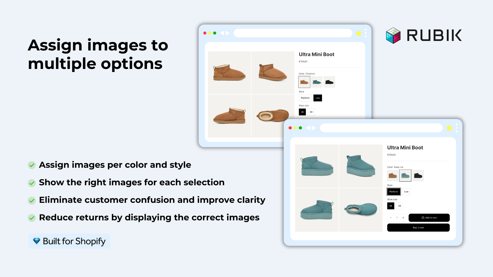
After assigning images to a Rubik Variant, you’ll love that variant image filtering (VIF) comes into play to keep your gallery organized. So, if someone selects the Blue option, you only see blue images, and NOT the usual mess of 40 images with a majority of mixed colors. Again, the assignment of images and filtering is handled by the Rubik Variant Images app, both bulk and AI style.
Product page layout for color + size
The ideal product page layout for color + size products:
- Color picker: Color swatches (not dropdown). Show all colors at once. Visual preview before clicking.
- Size picker: Buttons or pills (not dropdown for under 10 sizes). All sizes visible at once. Grey out sold-out sizes.
- Gallery: Filtered to show only the selected color’s images. 4 to 6 photos per color.
- Selected state: Clear visual indicator on the selected swatch and size button. Color name label showing which color is selected.
Rubik Variant Images supports this exact setup: color swatches for Option 1, pill buttons for Option 2, customizable sizes, and gallery filtering triggered by color selection. Size changes do not affect the gallery (because sizes look the same in photos).
Collection page display
On collection pages, products with many colors can clutter the grid if each color shows as a separate card. 8 colors x 50 products = 400 product cards. The collection becomes unusable.
Two approaches:
- One card per product with color swatches. Show one product card with small swatch dots under the thumbnail. The customer can preview each color by hovering over swatches without clicking into the product. This is what Rubik Combined Listings provides for grouped products.
- Collection filters. Let customers filter the collection by color using Shopify’s built-in filtering. This shows only products available in the selected color.
When to split vs combine
| Scenario | Recommendation |
|---|---|
| Same description, same price, same images style | One product with color + size variants |
| Different descriptions per color (leather vs fabric) | Separate products, grouped with Combined Listings |
| Very different pricing per color ($50 cotton vs $200 leather) | Separate products |
| Each color needs its own SEO page | Separate products |
| Hitting the variant limit (8+ colors x 10+ sizes x material) | Split by material, group with Combined Listings |
For stores selling clothing with standard colors and sizes, it is best to use one product per style with variants as opposed to splitting the product when not necessary. Products should be split when the variants have significantly different content, pricing or SEO strategies.
“Great app, great customer support: Farid the founder took care of my onboarding. The app is simply super efficient, everything variant and swatch related exists in there. Keep going guys!”
Bayte, US, 2026-03-24, Rubik Combined Listings on the Shopify App Store
Frequently asked questions
Should Color or Size be Option 1 on Shopify?
Color as Option 1. We positioned the color option first in the variant title and call out on the product details page to give the more visual and intuitive option greater emphasis to what would likely be the most important differing dimension for customers.
Do I need separate images for each size?
Usually no. A Medium and Large look the same in a flat-lay or on-model photo. Therefore we suggest providing 1 image per colour. However, for products where the size makes a significant difference to how the product looks (for example small bags vs oversized bags), we recommend providing an image per size.
How many colors is too many for one product?
There is no limit, but UX really begins to break down at about 15 to 20 colors *per product*. A very long row of swatches appears on product pages, the gallery accumulates an overly large number of images, and suddenly the product page becomes convoluted and difficult to shop. One possible fix for 20+ colors on a given product is to create color families (e.g. Blue & Green) and create individual products for each. For 20+ colors across *all* products on the site, create individual products with swatches.
Should I use swatches for Size too?
Buttons or pills are better for Size. Size values are text-based (“S”, “M”, “L”) and do not benefit from visual color preview. Swatches for Color, buttons for Size is the standard pattern for apparel stores.
How do I prevent the collection page from showing duplicate products for each color?
If you have different colors of one product, use Rubik Combined Listings to combine them. Instead of 8 separate product cards for 8 colors, you’ll see one product card with the colors listed below the product name. When using variants, the combined listings will display a separate card for each product.
Related reading

Umid
Co-Founder at Craftshift