How to change the variant picker on Shopify
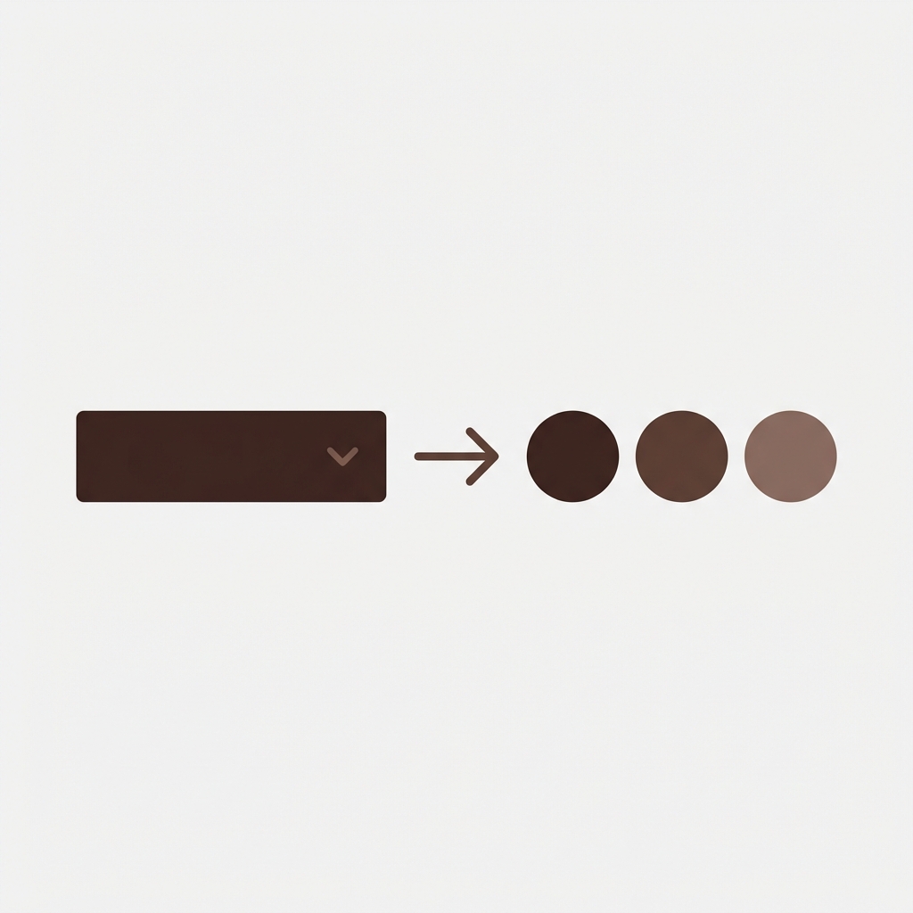
By default many Shopify themes will display the variant picker as either a dropdown select or as a series of pill-style buttons with corresponding text. For a color based store, these options are far from ideal. The standard dropdown won’t show all the options until they are expanded, meaning customers may miss out on colours that match their needs. Alternatively, the text button option will clearly state “Red” for example, but fail to show the colour to the customer, which can be confusing and increase the likelihood of a sale being lost. By swapping to visual swatches, image based swatches, or a combination of both (a mixed picker type) you can significantly improve the experience for your customers on the product page.
This guide covers all methods for changing the variant picker on Shopify, including changing it through the theme settings, through CSS, through the Liquid templates, and through apps.
In this post
- Variant picker types explained
- Method 1: Theme settings (no code)
- Method 2: CSS transformation
- Method 3: Liquid template editing
- Method 4: Using an app
- Mixing picker types per option
- FAQ
Variant picker types explained
| Picker type | What it looks like | Best for | Downsides |
|---|---|---|---|
| Dropdown | Select menu, click to expand | Many values (20+), secondary options | Hides options, extra click needed |
| Text buttons/pills | Clickable rectangles with text labels | Size, material, text-based options | No visual preview for colors |
| Color swatches | Colored circles or squares | Color options | Need custom hex per color name |
| Image swatches | Product photo crops as selectors | Patterns, textures, complex colors | Need image per option value |
We favor displaying color swatches for The Color option, text buttons or pills for the Size option, and using dropdowns only when you have 20+ options in a single field. This provides a familiar and visually interesting way to select colors, while keeping the size options organized and easy to read.
Method 1: Theme settings (no code)
Many of the newer Shopify themes allow you to swap out the standard dropdown variant picker for something else (if it’s enabled in the customizer):
- Go to Online Store > Themes > Customize
- Navigate to a product page
- Click on the Product information section
- Find the Variant picker or Product options setting
- Choose between “Dropdown”, “Pills/Buttons”, or “Color swatches” (if available)
Each theme comes with its own specific set of options. Many, including Dawn 14.0+, offer a color swatch option, while Prestige offers color swatches with auto-detection. Impulse and Horizon, however, offer a “swatches” option natively. Older themes will only have a dropdown menu and/or a buttons option.
If theme doesn’t have swatches option, you can either update buttons with CSS (Method 2), edit Liquid template (Method 3) or use app (Method 4) to change colors.
Method 2: CSS transformation
If your theme has buttons with variant picker text but no circles with color swatches, you can modify your buttons to look like colored circles instead. This will suppress the display of the button’s text and will replace the button’s border color with a background color instead.
/* Transform buttons into color swatches */
fieldset[data-option-name="Color"] .variant-input__label {
  font-size: 0;                /* hide text */
  width: 36px;
  height: 36px;
  min-width: 36px;
  border-radius: 50%;          /* circle shape */
  padding: 0;
  border: 2px solid #ddd;
  transition: all 0.15s ease;
}

/* Selected state */
fieldset[data-option-name="Color"] input:checked + .variant-input__label {
  box-shadow: 0 0 0 2px #fff, 0 0 0 4px #000;
  border-color: transparent;
}

/* Map each color */
fieldset[data-option-name="Color"] .variant-input__label[data-value="Red"] {
  background-color: #c0392b;
}
fieldset[data-option-name="Color"] .variant-input__label[data-value="Blue"] {
  background-color: #2980b9;
}
Add this to Customize > Custom CSS (bottom of customizer). Variant colors have a class of .variant-input__label. Replace .variant-input__label and data-option-name=”Color” with your theme’s actual selectors (you can right-click on the variant button to find them in Inspect).
Limitation: You need to set up a CSS rule for every color name. While this is no big deal for a 5 colour store, it does become very time consuming for 30+ colours across products. See our Dawn swatch guide for a step by step guide on this process.
Method 3: Liquid template editing
If you want to have more control, you should edit the variant picker template directly. For Dawn theme, this would be snippets/product-variant-picker.liquid. You can replace the default button with a or tag with the appropriate color and inline styles.
Template Tweaks are the most flexible but least durable method of customizing your store. Theme updates will overwrite all of your changes to this file, for the best results take a screenshot of any changes you made before applying theme updates and try to apply them after theme updates have been applied using the theme’s Custom CSS field for visual tweaks and the Liquid file for structural changes when necessary.
Method 4: Using an app
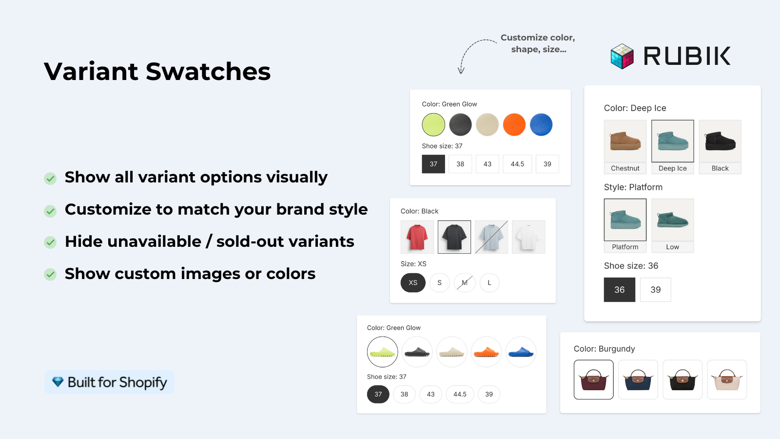
For stores that want to change the variant picker without writing code, and who want features beyond simple color circles, there is an app.
Rubik Variant Images replaces the Theme variant picker with a series of swatches. Circles, images and Pill buttons can be used with 100+ customisable variables for controlling the borders and sizes. Variant colour names appear as tooltips for the colour circles and the product sold out message appears for any unsellable variants. All variants in the gallery can also be filtered to show only the variants that you want to display. The product swatches work with all Themes and no changes are made to the Theme’s Liquid.
If you create separate products for different colours, on product pages and collection pages you’ll get swatches that link to the grouped products and on the product details compare page, prices and captions will be combined.
Mixing picker types per option
For stores with multiple option types, the most effective way to use variant pickers is to mix them together and use the best picker for each option type. Using a color swatch for the Color option, a pill for the Size option, and a dropdown for a third option with many values is a typical mix.
Most themes don’t support multiple types of picker simultaneously, because they apply one picker type to all options. You can try using CSS with :scopes (not easy) or there may be an app that supports different types of picker for individual options. RVI supports this functionality out of the box.
“This app is perfect. it is incredibly easy to set up and use. There are so many cool ways you can set up your variant images AND adjust your swatches. The youtube tutorials are super helpful. I got a bit stuck trying to set up one of my products and Zulf was super quick to respond and help. Definitely recommend it if you are reading this ;D”
Anonymous merchant, Rubik Variant Images on the Shopify App Store
Frequently asked questions
Can I change the Shopify variant picker from dropdown to swatches?
Yes. Three ways: first, if your theme has swatches, you can use those; secondly, you can style your buttons with CSS to resemble swatch variations; and thirdly, you can install an app such as Rubik Variant Images that changes the picker completely. The app method is probably the easiest and most powerful.
Which variant picker type converts best?
Swatches (rather than dropdowns) for colors because seeing all the colors at once is easier and you get instant feedback when hovering. Buttons/pills for sizes because one control is better than a dropdown for 3-4 options max. Dropdowns only when you have 20+ options for the same setting.
Can I use different picker types for different options?
Most free themes do not. Most paid themes do not either. But there are some apps and you can also use scoped CSS to do it per option name. Rubik Variant Images also has feature to show different swatch type like color, image, pill etc for different options of same product.
Will changing the variant picker break my theme?
CSS changes (Method 2) are safe and reversible. Liquid changes (Method 3) are susceptible to being overwritten by theme updates. App-based changes (Method 4) are theme-agnostic and will remain after updating the theme. If using an app for variant changes please disable the theme’s variant picker to avoid conflicts.
Does changing the variant picker affect page speed?
CSS changes have zero speed impact. Liquid changes have negligible impact. App-based pickers depend on the app, and may have significant speed impact or none at all. Metafield-based apps like Rubik Variant Images are similar to Metafields in that they add very little overhead since the app is using data that is already in Shopify’s page response.
Related reading

Umid
Co-Founder at Craftshift