Shopify variant picker types: dropdowns vs swatches vs buttons (2026)
Shopify gives you a dropdown selector for product variants by default. Every option, every product, same dropdown. Color? Dropdown. Size? Dropdown. Material? Dropdown. It technically works. A customer can open the menu, scroll through options, pick one. But “technically works” is a low bar for something that directly affects whether people buy your product.
The variant picker is the single interactive element between “browsing” and “adding to cart.” Getting this component right is critical because it is the last chance for a customer to visualize a product before adding it to the cart. If poorly executed, customers will leave site in frustration. If executed well, the path to purchase is greatly shortened from open dropdown, read text, try to imagine what Heathered Sage looks or feels like versus clicking the green circle and seeing a product rendered in green within 3 seconds versus 15 seconds.
This post goes through each of the variant picker types available on Shopify and explains when you should use them, as well as mixing them on the product page.
In this post
- The five variant picker types
- Side-by-side comparison
- When to use each type
- Mixing picker types on one product
- What Shopify supports natively vs what needs an app
- Setting up variant pickers with Rubik Variant Images
- FAQ
The five variant picker types
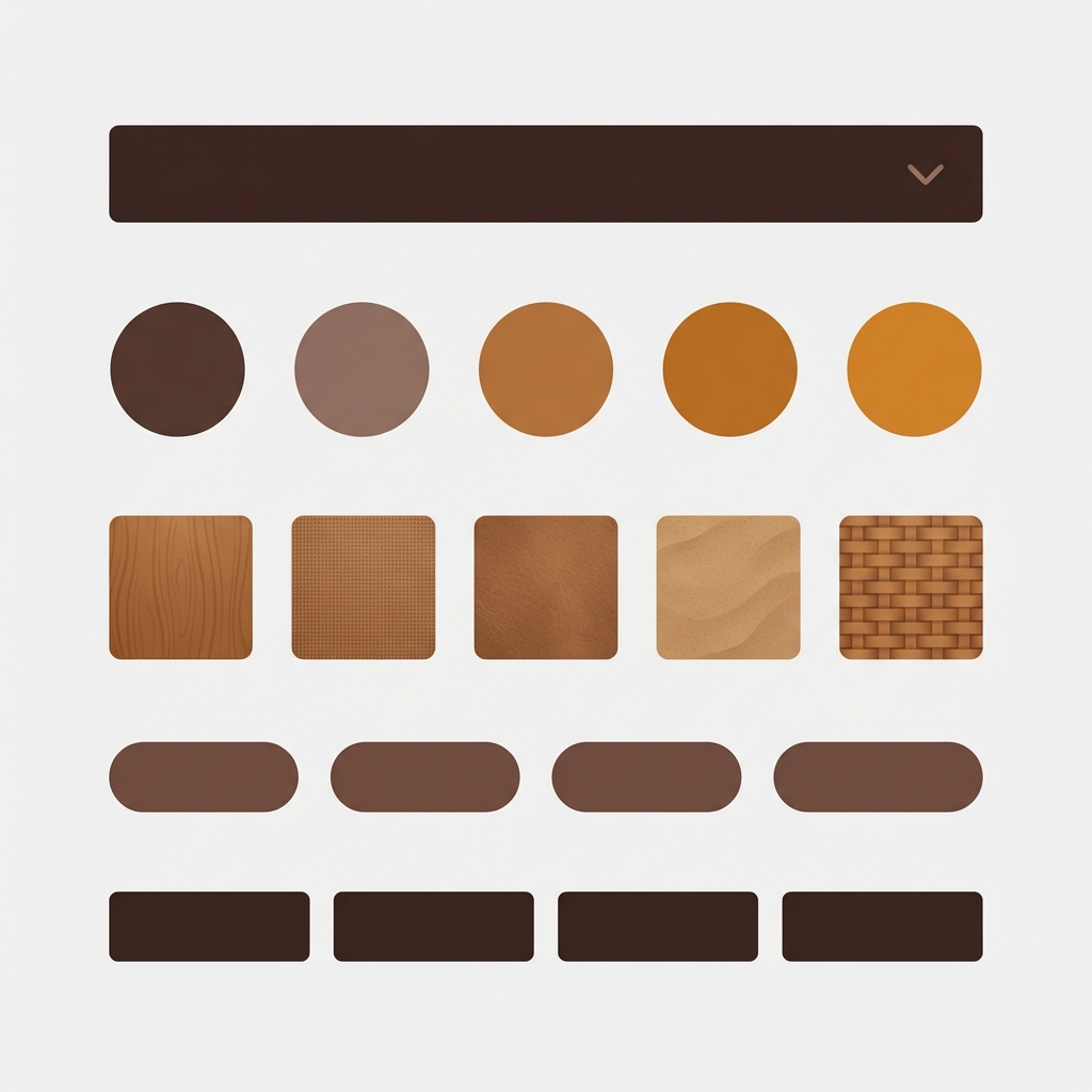
1. Dropdown (select menu). The most common widget. A collapsible menu that drops down when clicked. All items are text. Pretty compact when collapsed. You can’t preview the widgets within a dropdown, which may be a problem if you’re trying to design without interacting with your website.
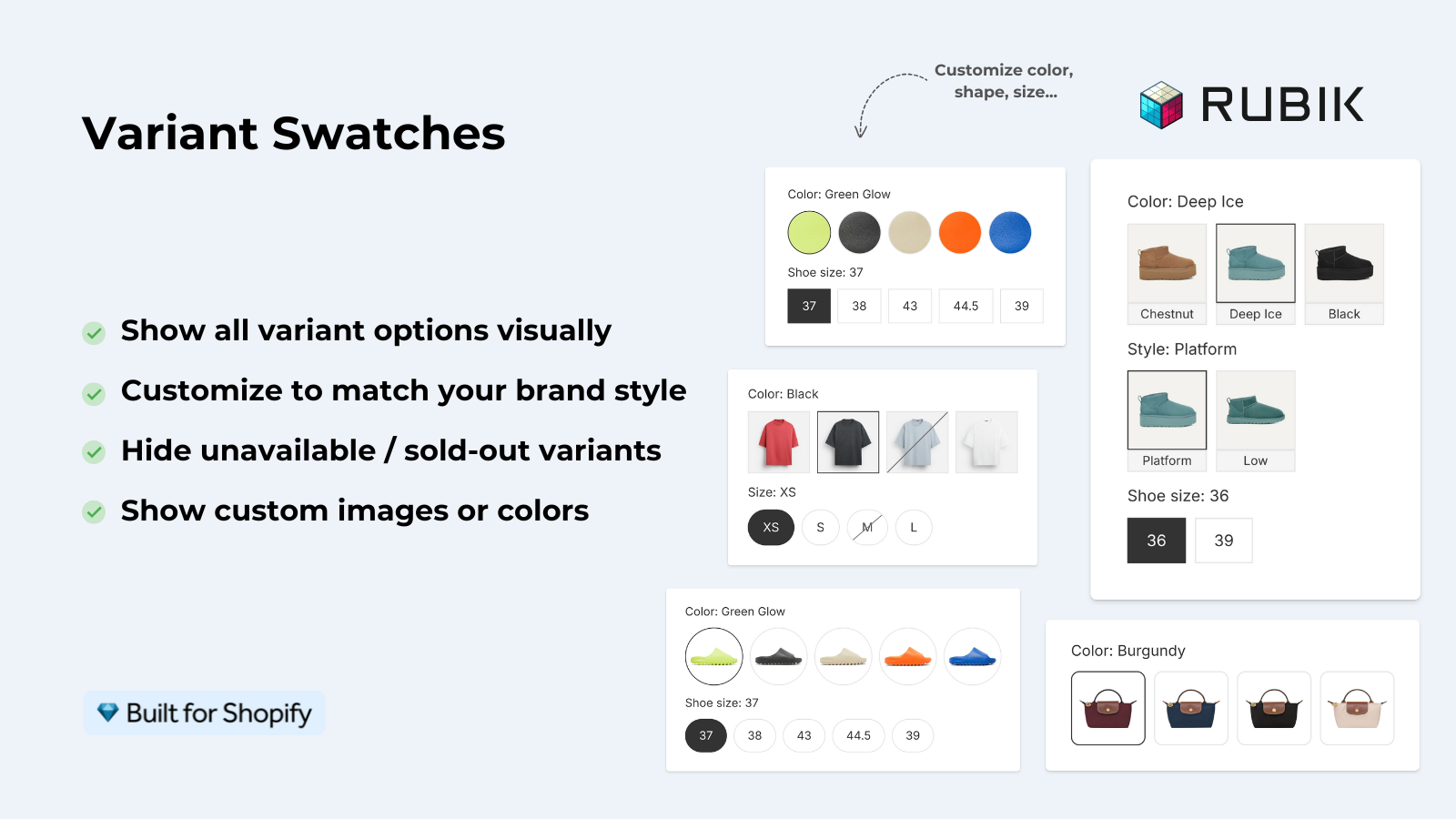
2. Color swatches. These are small colored circles or squares, displayed next to each other for the option’s different values, allowing customers to preview 12 different colors at a time. Upgrading color options from dropdowns is one of the most common changes people make. Each swatch is a small image containing the hex value of the color.
3. Image swatches. These are small cropped images that represent the swatch element of an option. Unlike the previous example where a flat red circle represented the “cotton” option, the image swatch could include a real image of cotton fabric. For product options where a hex color cannot effectively represent the visual, such as plaid, marble, wood grain, or a finished metal or wood edge, an image swatch is necessary. A wool option for example might include an image of wool fabric.
4. Pill buttons. Pill buttons are rounded rectangular buttons with text labels. “S”, “M”, “L”, “XL” each gets their own clickable pill. The width of the pill button adjusts to fit the length of the text. Pill buttons are better than dropdowns for short text options because all of the options are visible at once.
5. Text buttons (rectangular). Full-width or fixed-width rectangular buttons with text labels. Similar to pills but with sharper corners and more space for longer option names like “King Size” or “Brushed Antique Brass”. Works when you need to display full descriptive names.
Side-by-side comparison
| Picker type | Visual preview? | All options visible? | Best for | Worst for |
|---|---|---|---|---|
| Dropdown | No | No (hidden until opened) | Many options (50+), secondary options | Colors, textures, anything visual |
| Color swatch | Yes (hex color) | Yes | Solid colors | Patterns, textures, multi-color prints |
| Image swatch | Yes (product photo crop) | Yes | Patterns, textures, materials, complex colors | Simple solid colors (overkill) |
| Pill button | No (text only) | Yes | Sizes (S/M/L), short labels | Colors (no visual cue) |
| Text button | No (text only) | Yes | Long descriptive labels, named options | Colors, lots of options (takes too much space) |
A notable distinction between these options is how you can preview the selected choice. Options such as dropdowns and buttons typically only display text. For options where the appearance of the selection makes a difference (such as color, pattern, material, and finish), the swatch is generally a better choice. For options where the appearance does not matter (such as size, quantity, or subscription frequency), buttons and dropdowns will generally be the better choice.
When to use each type
Single biggest variant picker mistake: dropdowns for colors. This is the one case where “always swatches” applies. A customer choosing between Navy, Olive, and Burgundy wants to see the colors, not read them. So for solid colors, you include swatches for Navy, Olive, and Burgundy. For patterned or textured colors, you include an image swatch for those as well. The single biggest mistake we see with variant pickers on Shopify stores is treating colors differently than other options and providing a dropdown instead of swatches.
Size options: pills or buttons. Size is not visual, so a text label is fine (e.g. “Medium” looks exactly the same as “Large” in this photo). Pill buttons are suitable for very short sizes with typical letters (S, M, L, XL, XXL) whereas text buttons are better suited for describing sizes in words (“US 7 / EU 40”, “King Size”, “One Size Fits Most”).
Material/finish options: image swatches. Brushed Nickel, Polished Chrome, and Matte Black are all meaningfully different visually and a hex color cannot effectively capture the texture of brushed metal. Image swatches with close-up crops of the texture would be a better choice.
Named variants with 50+ options: dropdowns. Some products have Named variants with 50+ options, such as a furniture piece available in 80 fabrics or a custom print available in 200 fonts. When you have so many options that you would show them to customers as swatches or buttons, when you have a wall of choices, dropdowns are the way to go.
Subscription/quantity/style options: pills or dropdowns. For the “Monthly / Quarterly / Annual” option, individual pills are provided. For ” 1-pack / 3-pack / 6-pack”, individual pills are also used. Note that these are functional options and not aesthetically distinct (i.e. you cannot change the look of the pills).
Mixing picker types on one product
Most products have more than one option group. A t-shirt might have an options group for color and an options group for size. A sofa might have an options group for material, an options group for color, and an options group for leg style. A watch might have an options group for band material, an options group for case color, and an options group for face size. Each options group typically has different requirements.
The ideal setup mixes picker types per option:
| Product | Option 1 | Picker type | Option 2 | Picker type | Option 3 | Picker type |
|---|---|---|---|---|---|---|
| T-shirt | Color | Color swatch | Size | Pill button | ||
| Sofa | Fabric | Image swatch | Color | Color swatch | Leg style | Text button |
| Watch | Band | Image swatch | Case | Color swatch | Size | Pill button |
| Custom print | Font | Dropdown | Paper | Image swatch | Size | Pill button |
mixing native Shopify variant picker options is not currently possible. All options must be presented using the same type of picker (e.g. all dropdowns, or all image swatches) unless modified with custom jQuery code. Some themes include built-in support for swatches for color options (e.g. the swatch picker in the Shopify provided Horizon theme), but this does not allow you to mix swatches for Color and pills for Size on the same product.
What Shopify supports natively vs what needs an app
| Feature | Shopify native | Needs an app |
|---|---|---|
| Dropdown selector | Yes (default) | No |
| Color swatches (some themes) | Horizon, Dawn 15+, some premium themes | Most themes |
| Image swatches | No | Yes |
| Pill/text buttons | Some themes | Most themes |
| Mix picker types per option | No | Yes |
| Swatch shape customization | No (theme-defined) | Yes |
| Swatch size control | No (theme-defined) | Yes |
| Variant image filtering | Featured image only | Yes (full gallery filtering) |
There is a large divide between native features and app features. Native Shopify theme design includes lots of dropdowns, and some basic color swap drop downs in some themes. Everything else including type swapping, image swap drop downs, shape and size controls, gallery filtering etc need to be implemented via apps.
Setting up variant pickers with Rubik Variant Images
This component was created to generate variant images for a product with multiple picker types and customizable per option. For this example, color swatches and pill buttons for Size in the bottom left, and image swatches for Material in the bottom right. The visual settings panel was used to define the settings for the Color option and have them separate from the other option groups. Properties that can be controlled in the visual settings panel include shape, size, border, the selected state, hover state, and the tooltip.
In addition to the picker, the app will also filter the product gallery for a variant. This means that when you select the Navy swatch, only Navy photos will appear in the gallery. When you select the Red swatch, only Red photos will appear in the gallery. This is the other half of the experience that dropdowns miss completely – the picker isn’t just about selecting an option, it’s about seeing what that option looks like.
This extension is useful for stores that offer separate products for each color and want to display visual swatches on their collection pages, in addition to the “button”, “pill”, or “dropdown” swatch options already offered on product pages by Rubik Combined Listings. Together with the parent app, it provides all picker types in the store.
“This program makes my shop overall so much more professional and appealing to shoppers. I was looking for a way to manage variant level photos and hit a wall until I found this app. I strongly recommend this app if you are experiencing similar frustrations. It is very easy to use and I have had zero issues so far.”
Pun & Done, US, Rubik Variant Images on the Shopify App Store
See the live demo store, watch the swatch customization tutorial, or read the visual settings guide.
Frequently asked questions
What is the default variant picker on Shopify?
A dropdown (select menu). Every option on every product uses the same dropdown by default. Some newer themes like Horizon and Dawn 15+ offer native color swatches as an alternative for color options.
Can I use different picker types for different options on Shopify?
No. Shopify’s default interface for selecting variant options is to display all options the same type. This theme extension allows you to have different types of pickers for different option groups within the variant, such as swatches for Color and select boxes for Size.
Are color swatches better than dropdowns for conversion?
For color options. Swatches allow customers to view all the colors at the same time and see what the product will look like for each color. Dropdowns list out all the color names forcing customers to read them without getting a sense of what the actual color will look like. By reducing the “friction” or hesitation associated with selecting a color, swatches improve the shopping experience.
When should I use dropdowns instead of swatches?
When there are 50+ options (when there are a massive fabric catalog and font catalog to look through), When the option is not visual (When you have to choose subscription frequency or quantity for stitches), Or when the option names are long enough to be more informative than looking at a swatch.
What is the difference between color swatches and image swatches?
Color swatches show a flat hex color (a red circle for Red). Image swatches show a cropped product photo (the actual plaid, marble, or leather). Color swatches are solid colors, image swatches are patterns, textures, and materials.
Do variant picker types affect page speed?
Swatches have minimal impact on your page as they are small HTML elements that use tiny images (all images for swatches together weigh less than 10KB). Of course, from a purely technical point of view, a dropdown would probably be even smaller, but from a user experience perspective, the small increase in code size is far outweighed by the much greater visual enhancement that swatches bring.
Related reading

Umid
Co-Founder at Craftshift