How to change swatch size and shape on Shopify Horizon theme
Horizon variant swatches are circles of a fixed size. At first these seemed great for displaying different colors, especially for apparel with 15+ options, but they fall short. Also, for stores with very long option names (like Brushed Antique Brass or Distressed Walnut), the circles don’t really make sense; pills or buttons would be better.
In terms of Swatch design, the shape and size need to allow for as fast of a experience as possible for the customer to scan the different swatches and identify the one they want. A 24x24px circle with a plaid pattern is pointless. A 48x40px rounded square with a plaid pattern is clear. There is a big difference between what is that and that one. 20px makes a huge difference to the functionality of your product.
A quick note on what you can control natively in Horizon, what CSS will allow you to tweak somewhat, and what Rubik Variant Images gives you (everything).
In this post
- What Horizon controls natively
- CSS resizing (limited)
- Swatch shapes: circles, squares, pills, buttons
- Full control with Rubik Variant Images
- Swatch sizing guidelines by product type
- FAQ
What Horizon controls natively
There is no way to change the swatch size or shape in the theme editor. In the theme’s CSS, the swatches will render as circles of a certain size. You can choose which options the swatches will display (Color, Size, etc.) but you cannot change the size of the swatches or the shape of the swatches within the theme customizer.
This actually blows my mind. Swatch size would so easily be theme configurable (Dawn does it) and its absence is baffling considering that Horizon has none. Why does Shopify include color swatches but no size control is genuinely confusing.
CSS resizing (limited)
You can override swatch dimensions with custom CSS in the theme editor (Online Store > Themes > Customize > custom CSS section):
/* Make Horizon swatches larger */
.swatch-input__label {
  width: 44px;
  height: 44px;
  min-width: 44px;
  min-height: 44px;
}

/* Square shape instead of circle */
.swatch-input__label {
  border-radius: 4px;
}
CSS alone can handle changes to base size and box border radius; but cannot add different shapes (e.g. circles for Color, pills for Size) or product sizes; cannot turn swatches into images or textures of the correct resolution; cannot ever serve up two swatches that look different. Every swatch on every product page is treated as if it were an identical twin.
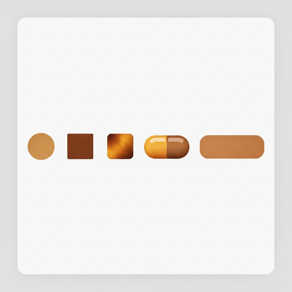
Swatch shapes: circles, squares, pills, buttons
Different product types call for different swatch shapes. Here is when each one works best:
| Shape | Best for | Why |
|---|---|---|
| Circle | Solid colors (Red, Blue, Black) | Compact, instantly recognizable as a color picker |
| Square / rounded square | Textures, patterns, image swatches | More surface area for texture detail |
| Pill | Short text options (S, M, L, XL) | Stretches horizontally to fit text width |
| Button | Long text options (“King Size”, “Brushed Nickel”) | Full text label, no guessing |
Mixing shapes across options on the same product (circles for Color, pills for Size) is not possible with the native picker or with CSS. Every swatch element has the same class, same styles, same shape. You would need separate CSS selectors per option group, but Horizon does not expose those in a nice way.
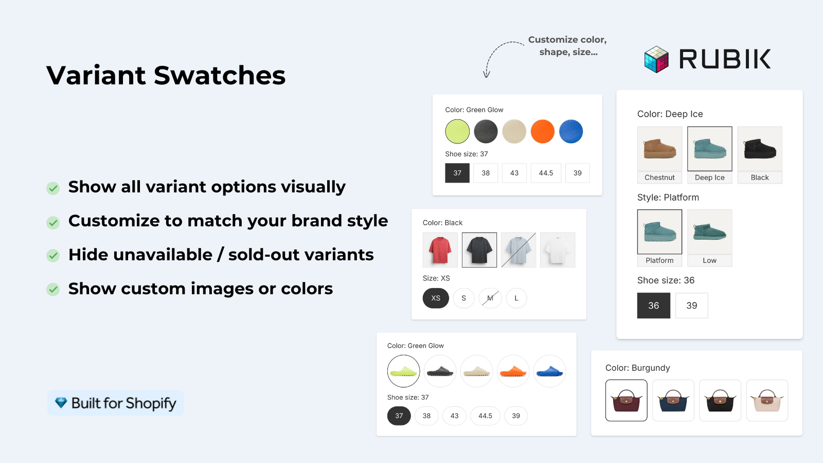
Full control with Rubik Variant Images
We created a visual settings panel in the Rubik Variant Images app specifically because merchants’ requests to see per-option swatch shapes and sizes. You have 5 shape options (circle, square, rounded square, pill, button) that you can set individually for each option group.
So Color gets 44px circles with image swatches. Size gets pill-shaped buttons with text labels. Material gets 52px rounded squares. All on the same product, all controlled from one visual editor with live preview. And no CSS editing or code is needed.
The setup on Horizon takes about 2 minutes:
- Install and enable Rubik Variant Images on Horizon (add the app block in theme customizer).
- Disable Horizon’s native swatches to prevent duplicate pickers.
- Open the visual settings panel in the app.
- Set swatch shape per option group (Color = circle, Size = pill, etc.).
- Adjust swatch size with the slider or enter a pixel value.
- Preview live, save.
The app uses Shadow DOM rendering, which means its CSS is completely isolated from Horizon’s theme CSS. No conflicts, no overrides leaking, no surprises when the theme updates. We tested this across 350+ themes and Horizon was one of the cleanest integrations.
Rubik Variant Images also has over 100 CSS variables for fine-grained styling: border width, selected state color, hover effect, spacing between swatches, tooltip style, and more. If the visual editor does not cover something specific, you can drop a single CSS variable override instead of fighting with theme selectors.
Swatch sizing guidelines by product type
Swatch size: What actually works | 4 real-world examples from stores using the Size Estimate app.
| Product type | Recommended swatch size | Shape |
|---|---|---|
| Apparel (solid colors) | 36px to 44px | Circle |
| Apparel (patterns/prints) | 44px to 52px | Rounded square |
| Jewelry / accessories | 32px to 40px | Circle |
| Furniture / home decor | 48px to 56px | Square |
| Size options (S, M, L) | Auto width, 36px height | Pill |
| Named options (text) | Auto width, 40px height | Button |
Reducing the size of the swatches helps keep the content above the fold and makes the option area less cluttered when there are 15+ variants. Large enough to clearly view the color or fabric, small enough to fit 10 to 12 swatches in two rows without scrolling.
For stores that display products using the Rubik Combined Listings feature to group products within a single Horizon collection page, the swatches for collection page display will have their own completely independent size and shape settings. For example, you might choose to display compact 28px circles on the size of the collection page view modifiers, and then display full 48px rounded squares on the details/product page for that same product. Different context, different sizing options.
“This app is perfect. it is incredibly easy to set up and use. There are so many cool ways you can set up your variant images AND adjust your swatches. The youtube tutorials are super helpful. I got a bit stuck trying to set up one of my products and Zulf was super quick to respond and help. Definitely recommend it if you are reading this ;D”
Anonymous merchant, Rubik Variant Images on the Shopify App Store
live demo — swatch customization tutorial — visual settings guide
Frequently asked questions
Can I change swatch size in Horizon without an app?
Only via custom CSS. Includes width, height and min-width overrides for the swatch class. These will affect ALL swatches, globally and you will have no control per individual option.
Can I use different swatch shapes for different options on Horizon?
No variant images are built in for Horizons. Every swatch defaults to one shape. With the Rubik Variant Images add-on, you can create circles for Color, pills for Size, and buttons for Material – all for the same product.
What swatch shapes does Rubik Variant Images support?
All checkbox shapes can be set to one of five different shapes (circle, square, rounded square, pill, or button), and for each option group, different shapes and sizes can be set.
How big should swatches be for image swatches?
44px minimum width and height. Image swatches (textures, patterns, fabric crops) require more real estate than solid color swatches. Below 40px, most textures become indistinguishable from unrecognizable grey noise.
Does changing swatch size affect Horizon theme performance?
No measurable impact. Swatch size is a CSS property change. Images can be made larger (e.g. 56px vs. 24px) for better readability with no noticeable impact. However, this will increase the thumbnail size by a few kilobytes per swatch (typically less than 5KB).
Related reading

Umid
Co-Founder at Craftshift