Shopify color and style swatches in separate rows
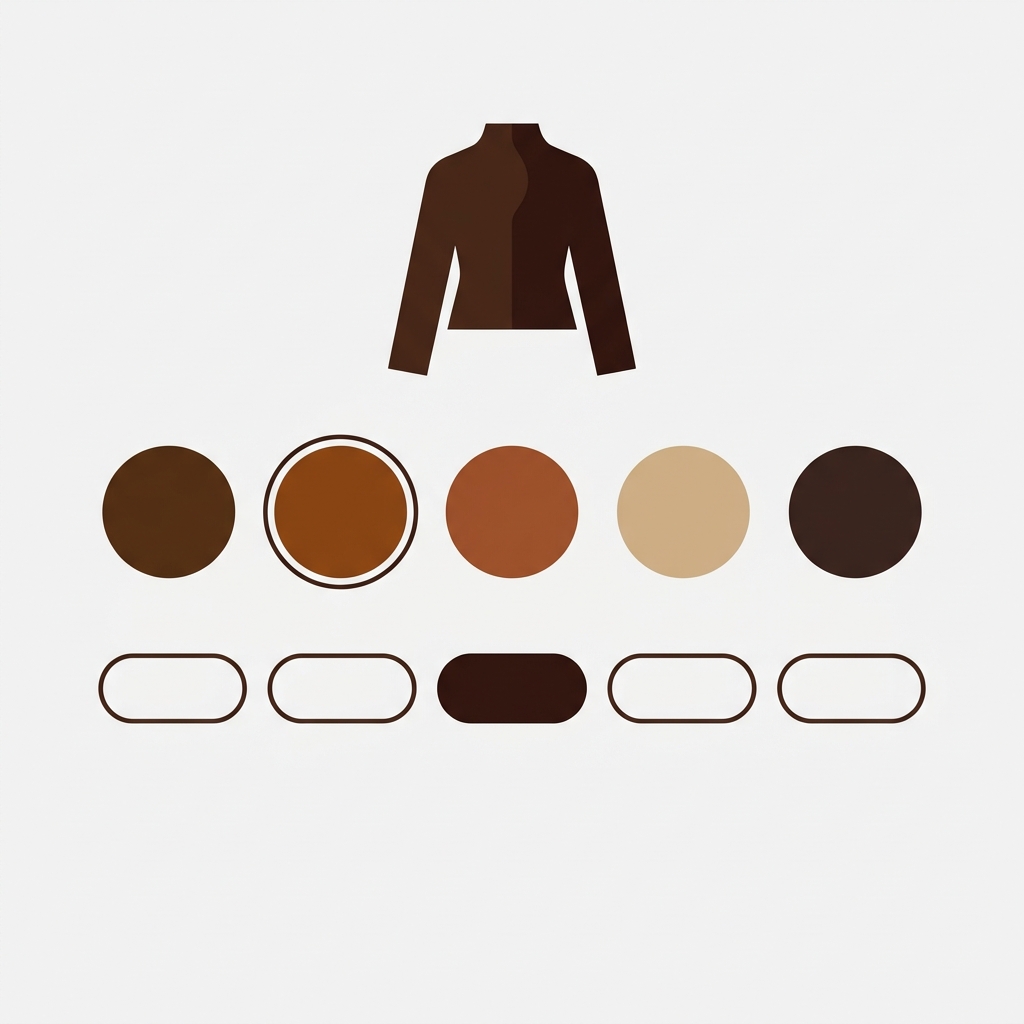
A pair of boots for sale comes in four colors (brown, black, yellow, green) and two styles (low and high). That is eight unique products. If you list them as separate products on Shopify (one SKU, one URL, one page per combination), how does a shopper move between them? A single row of color swatches is not enough, because the shopper also needs to pick a style. A single row of style buttons is not enough either, because the same shopper still wants to pick a color. You need two rows. One for color, one for style.
This is what Shopify color and style swatches need to look like when products are separate: one swatch row per option, both visible on the same product page. The same pattern applies to apparel (color and size), furniture (color and material), bags (color and style: tote, crossbody), jackets (color and length: short, long), candles (scent and jar size), and any catalog where each combination is its own Shopify product. Most swatch apps solve one option. Very few handle two or more cleanly. This post covers how to do it right.
We recommend Rubik Combined Listings for multi-option swatches on Shopify. It renders one row per option, keeps the rows in sync with each other, and hides any combination you do not sell. No theme code. Works on 350+ Shopify themes. If you are still deciding between native variants and separate products, start with the separate products vs variants decision guide. Once you have picked separate products, the rest of this post is for you.
In this post
- Why a single swatch row fails for color plus style
- How to set up color and style swatch rows
- The cross-filter: only real combinations show
- Different display order for product pages and cards
- Three or more options: color, size, material
- When to use color and style swatches this way
- Tutorial video
- Frequently asked questions
- Related reading
Why a single swatch row fails for color plus style
Shopify’s native variant model handles multiple options inside a single product. One product, three option dropdowns, done. Except when it is not. If each color should have its own URL for SEO, its own images, and its own reviews, you have to split the product into separate Shopify products. And once you split, the native variant selector no longer helps. Every separate product is an island.
A single swatch row can bridge colors. That is the common case most swatch apps solve. But the moment a second option is in play (style, size, material, fit), a single row stops working. A shopper on the brown low boot needs to pick a style AND a color. Two decisions. Two rows. And if the shopper switches from brown to green, the style row should re-check: is there a green low? A green high? If any combination is out of stock or simply not carried, the style row needs to reflect that immediately.
Rubik Combined Listings uses one product group per option. The app reads the option name from each group and renders it as the row label on the storefront. Color group becomes the Color row. Style group becomes the Style row. A product can belong to multiple groups at once, which is the whole trick: the brown low boot appears in the Color group (value: brown) AND in the Style group (value: low). Two group memberships, one product, two swatch rows on its page.
How to set up color and style swatch rows
Setup takes two groups for two options. For a boots catalog, one Color group and one Style group. Both groups contain the same set of products (every color-style combination that you sell).
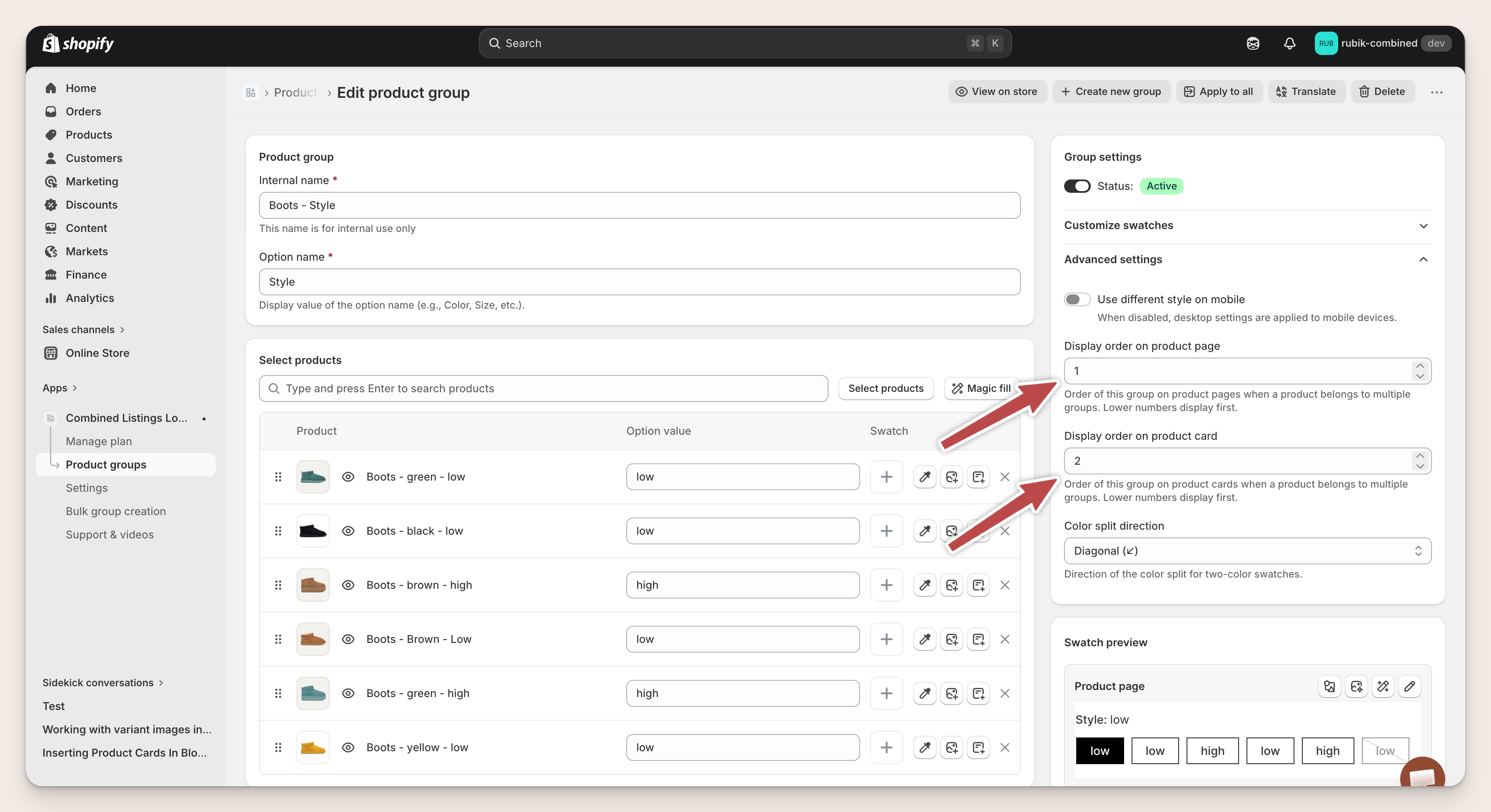
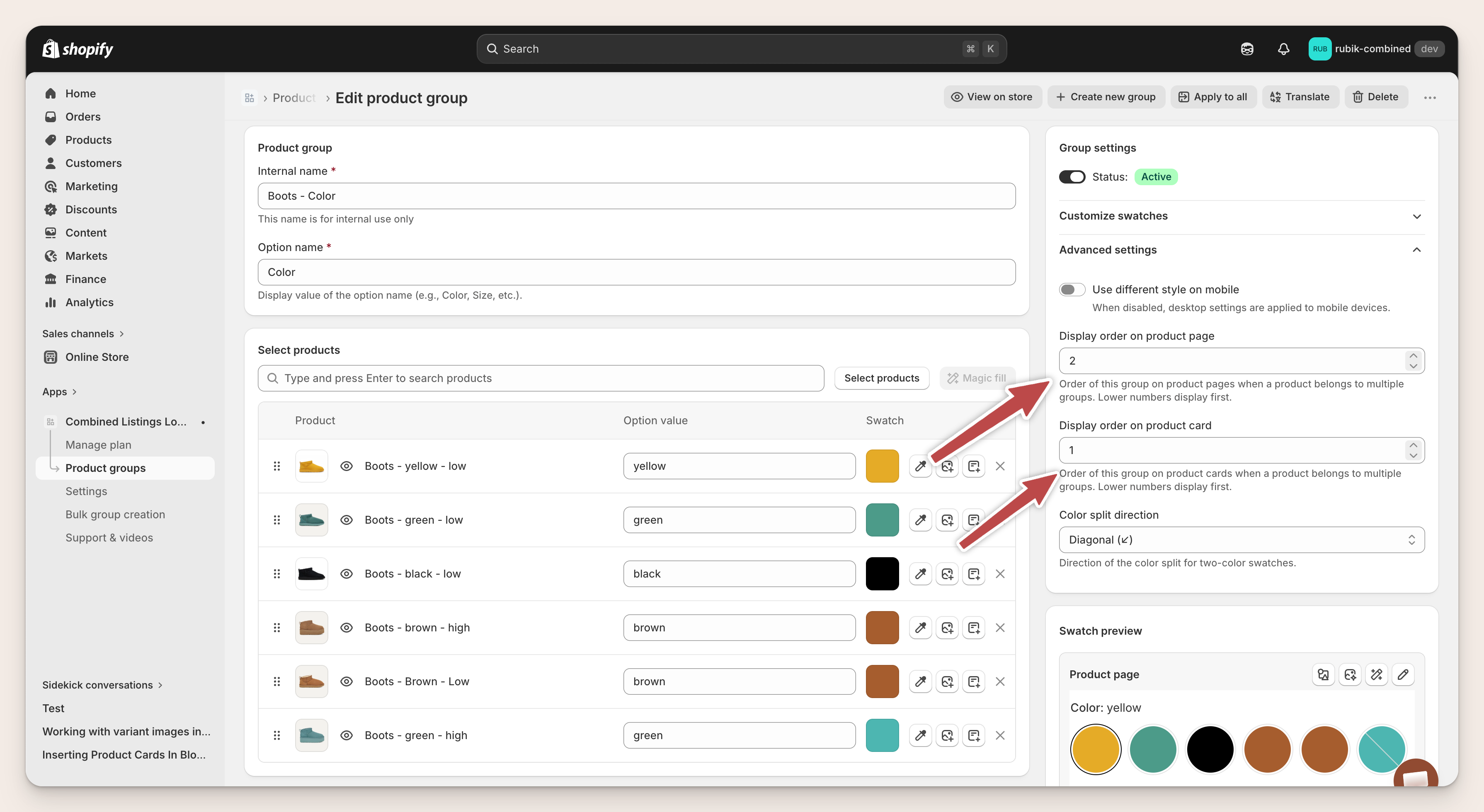
Step 1: Create the Color group
In Rubik Combined Listings, open Product groups and click Create new group. Set the Option name to Color. This single field becomes the row label on the storefront, so spell it the way you want shoppers to see it. Add all boot products. For each product, set a color value (brown, black, yellow, green) and a swatch color hex. A product with “brown” in its title gets the value brown and a #5C3317 swatch. Save.
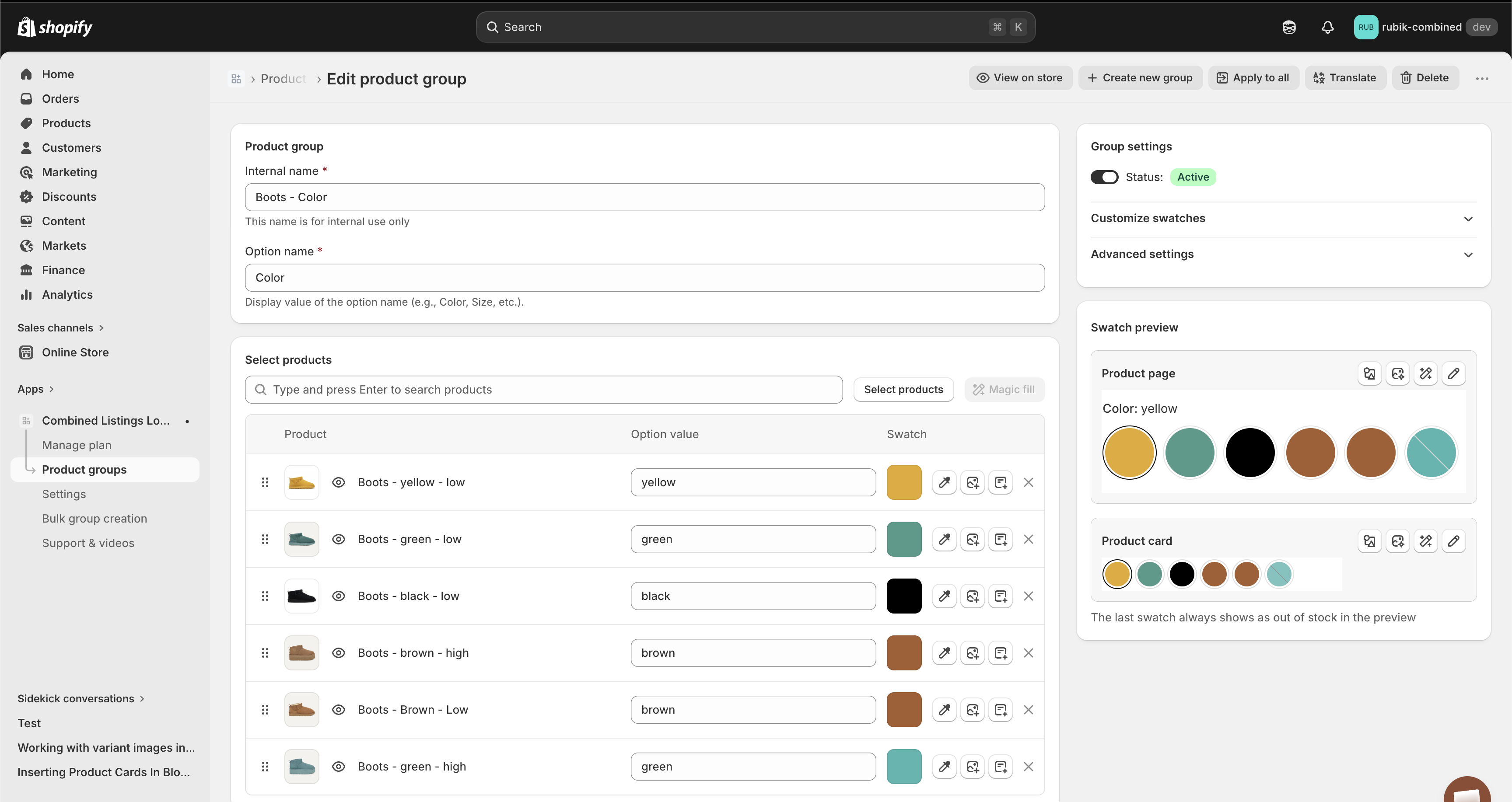
If your catalog has hundreds of products, manual entry is a waste. Use bulk group creation to parse color and style values out of product titles, tags, or metafields in one pass. A title pattern like “Ultra Mini Platform Boot Gray” is easy for the bulk tool to split on trailing words: the last two words carry color and style, the rest is the base product name.
Step 2: Create the Style group
Click Create new group again. Set the Option name to Style. Add the same boot products (yes, the same set you just added to the Color group). For each one, set a style value: low or high, ultra mini or ultra mini platform, short or tall (whatever the style dimension is in your catalog). Leave the swatch color empty. The app renders plain text or pill buttons instead of colored circles, which is the right choice for style.
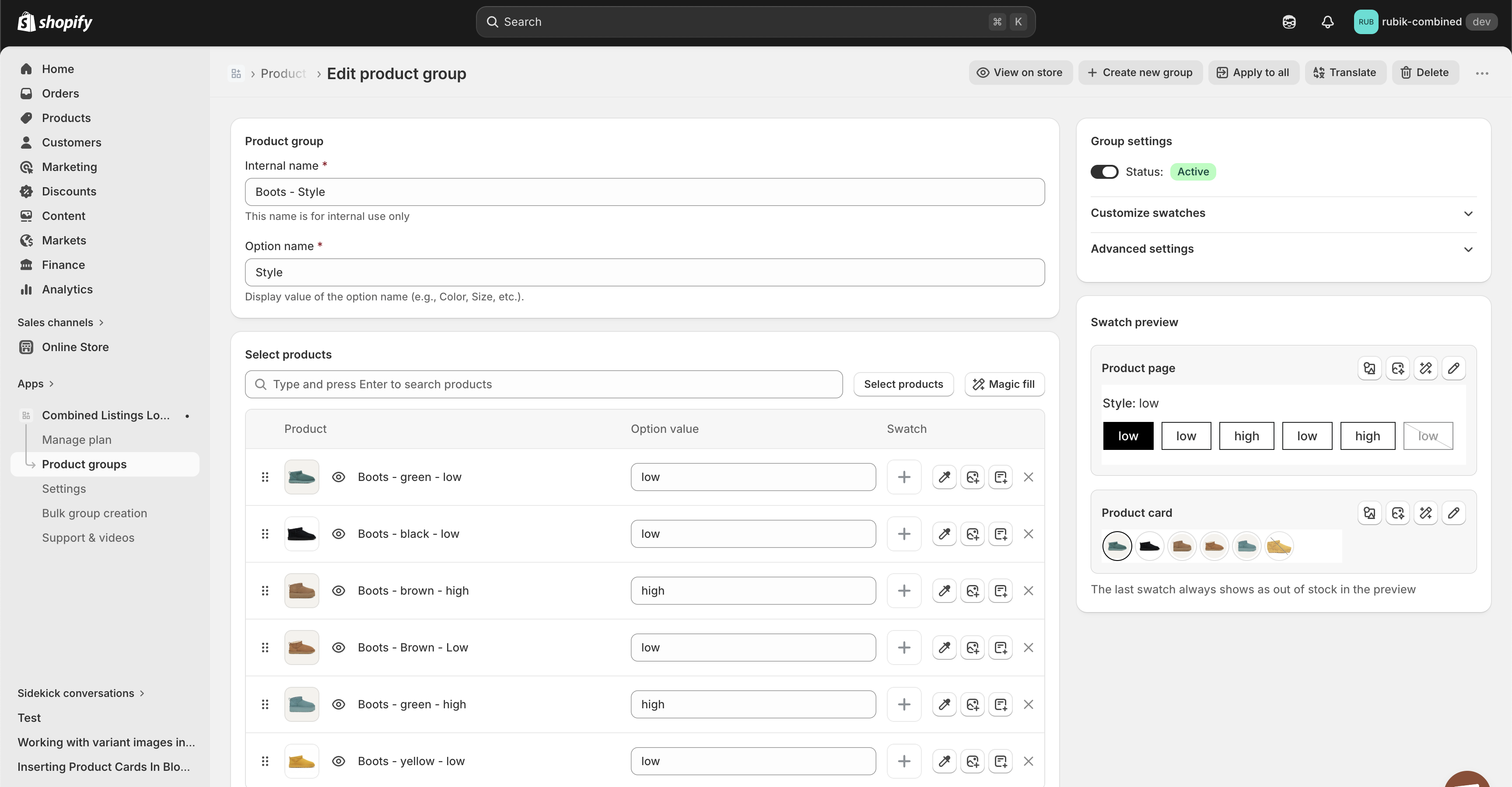
Tip: use the same spelling for the same value across products. Capitalization does not matter (Low and low resolve to the same value), but a typo like “lw” vs “low” creates two separate values and breaks the cross-filter. Run a quick sanity check on your values before saving.
Step 3: Open a product page
Once both groups are saved, open any boot product on your storefront. Two rows appear: Style on one row (text buttons), Color on another (colored circles). The current product’s style and color are highlighted as active. Click a swatch in the Style row and the shopper lands on the same color, different style. Click a swatch in the Color row and they land on the same style, different color. No theme edits. No Liquid. The app injects the rows via Shadow DOM, which keeps theme CSS from interfering.
The cross-filter: only real combinations show
Here is the part that sounds simple and is not. When a product belongs to two or more groups, the app has to decide which swatches on each row should be visible. The answer: only swatches that lead to combinations you actually sell.
Picture a shopper on the brown, low boot page. The Color row should only show colors that are available in the low style. The Style row should only show styles that are available in brown. If you do not sell yellow high, the yellow swatch disappears from the Color row while the shopper is on any high product. The moment they switch to low, yellow reappears. The rows stay in sync with the shopper’s current position at every step. This is what prevents the “product not found” experience that kills conversion on stores that split products by color.
Why does this matter? Because the alternative is letting shoppers click a swatch and land on a 404, or worse, an in-stock but wrong-color product. Both are conversion killers. The native Shopify variant selector cannot do this across separate products, because separate products are, by definition, not linked. Rubik Combined Listings adds the missing link, then applies the filter. For a visual of the filter on collection pages (where each product card also shows a single swatch row), see the collection page color swatches guide.
“This app is incredibly useful and very easy to use. It offers a wide range of customization options while still keeping the setup simple and intuitive. The categorization and grouping features are especially helpful for organizing products efficiently. The pricing is very reasonable for the value it provides. It has made managing combined listings much smoother for our store. Highly recommended for any Shopify merchant looking for flexibility without complexity.”
Art Masterclass USA, United States, March 2026, Rubik Combined Listings on the Shopify App Store
Different display order for product pages and cards
A product page shopper is different from a collection page shopper. The product page shopper has already picked a color. They got here by clicking a specific color on a collection card. What they want next is to try a different style in the same color. So on the product page, the Style row should appear first. Color second.
The collection page shopper is still browsing. They have not picked anything yet. What they want is a quick preview of the colors on offer. So on product cards, the Color row should appear first. And because product cards are tight on vertical space, only the first row renders. Putting Color first means cards show colors, which is usually the right call.
Every group has two display-order fields under Advanced settings: Display order on product page, and Display order on product card. Lower number displays first. For a typical color plus style setup:
| Group | Display order on product page | Display order on product card |
|---|---|---|
| Style | 1 (first) | 2 (second) |
| Color | 2 (second) | 1 (first) |
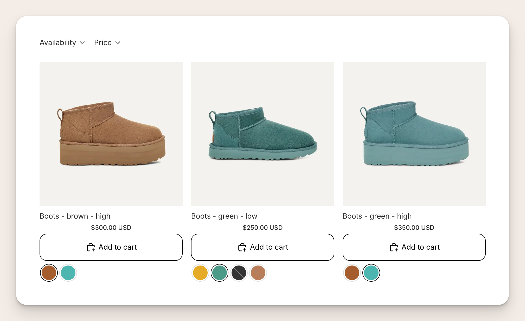
Result on a collection page: each card shows a single row of color swatches under the Add to cart button. The brown high and green high cards show only two color swatches each, because only two colors are available in the high style. The green low card shows all four colors, because every color is available in low. The shopper always sees what is real, never a color they cannot actually buy in the current style.
Three or more options: color, size, material
The two-group pattern scales. Three options? Create three groups. Four options? Four groups. Each one becomes its own row on the storefront. The cross-filter applies across all of them at once.
Example: a sofa brand sells by Color, Size, and Material. They create three groups. On any sofa product page, three rows appear: a Color row (swatch circles), a Size row (pill buttons: small, medium, large), and a Material row (text buttons: leather, fabric, velvet). If the shopper is on the brown, large, leather sofa, the Size row only shows sizes that exist in brown leather, the Color row only shows colors that exist in large leather, and the Material row only shows materials that exist in brown large. Every row is trimmed by the intersection of the other two.
A word of warning. With three or more options and many values per option, the combination space gets big fast. Color (10) x Size (5) x Material (3) is 150 potential combinations. You need 150 actual Shopify products if you want every combination sellable. Most catalogs do not carry every combination, and that is fine. The cross-filter hides the gaps, so shoppers never notice. What you do need is a title or metafield convention that makes it easy to identify which combination each product is. “Classic Sofa, Brown, Large, Leather” is easy to parse. “Classic Sofa 3” is not. For catalogs that have already hit the 100 variant ceiling, see the 2026 Shopify variant limit guide.
When to use color and style swatches this way
Color and style swatches as separate rows are the right call when three conditions meet:
- You sell each combination as its own Shopify product. Brown low and brown high are two separate products, not one product with a style variant. This is usually driven by SEO (each URL gets its own keywords), variant limits (Shopify caps variants at 100 on non-Plus), or editorial needs (different photography per style or size).
- Your catalog has two or more orthogonal options. Color and style. Color and size. Size and material. Scent and jar size. If you only have one option (just color, just size), a single swatch row is enough and you do not need multiple groups.
- Shoppers need to switch between options on the product page. If the product page is a dead-end decision point (one page, one buy button), you do not need swatches. But if shoppers frequently want to compare styles or colors before buying, a clickable swatch row saves them hops through collection pages.
Common catalogs that hit all three:
- Color and style: boots (low, high), bags (tote, crossbody), jackets (short, long).
- Color and size: t-shirts, shoes, and hats sold as a separate product for each color and each size.
- Color and material: sofas (leather, fabric), phone cases (silicone, leather), watch bands (metal, leather).
- Size and material: rugs, notebooks in different sizes and cover types.
- Scent and size: candles and perfumes in different scents and different jar or bottle sizes.
A deeper breakdown of the decision between native variants and separate products is in the separate products vs variants decision guide.
If your product page also needs to show the right images when a variant is selected inside a single Shopify product (the within-product case rather than the across-product case), that is a different job. Rubik Variant Images multi-option guide covers how to filter images per option combination inside one Shopify product. RCL handles the across-product case. RVI handles the within-product case. Many stores run both.
For the bigger picture of combined listings as a catalog strategy, see the combined listings explained guide on Rubikify.
Tutorial video
A short walkthrough of group creation, option names, and swatches on the storefront:
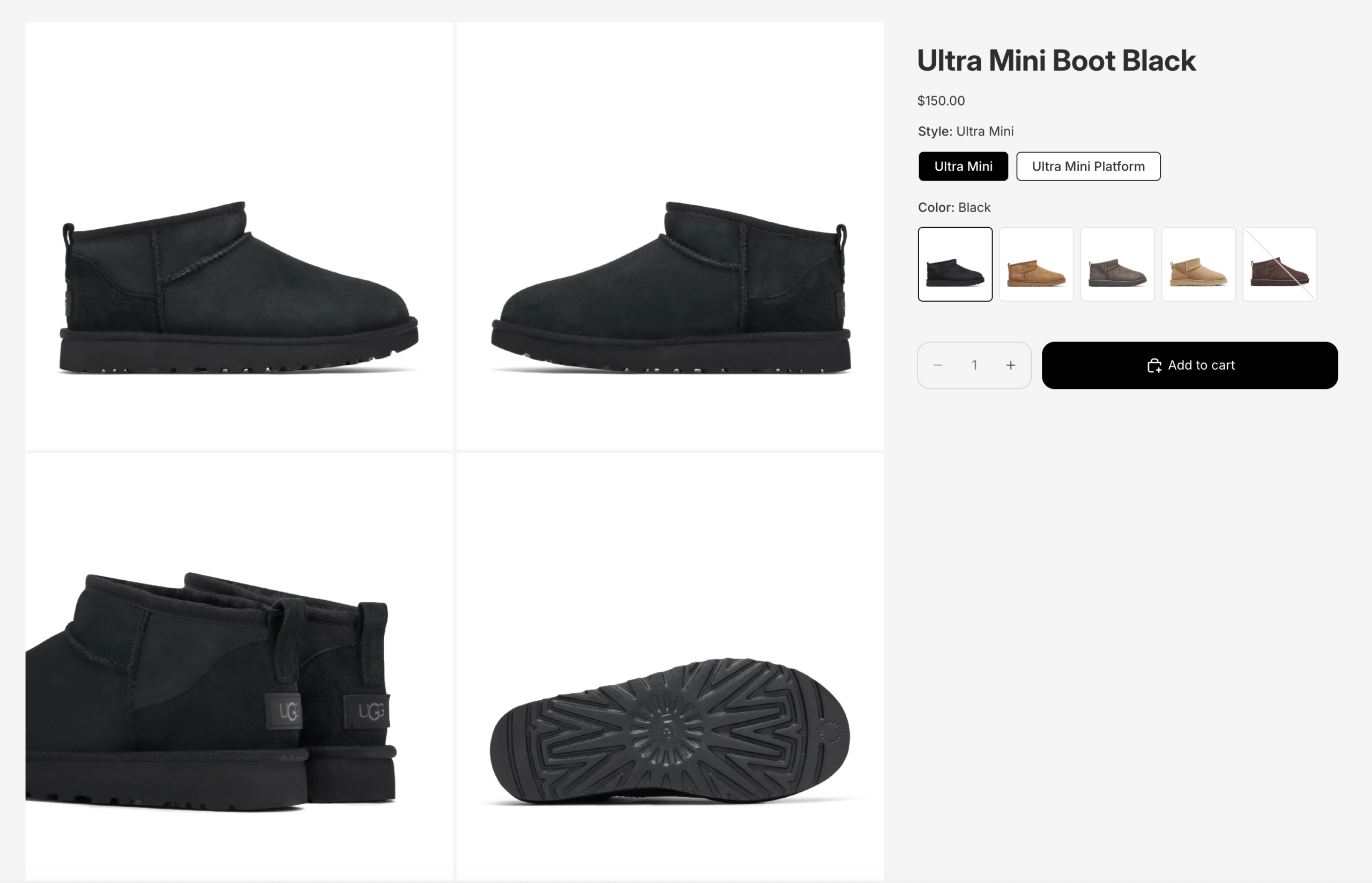
See it live on the Ultra Mini Boot demo, or read the full multi-option swatches documentation.
Frequently asked questions
Can a single Shopify product belong to two swatch groups at the same time?
Yes. That is how color and style swatches work when products are separate. The brown, low boot is in the Color group with value brown, and in the Style group with value low. Each group has its own Option name and its own value for that product. The app reads both memberships when rendering the product page and shows one row per group.
Do I need to use Shopify variants for color and style swatches?
No. Each combination is a separate Shopify product. That is the whole point of combined listings: it groups separate products into one shopping experience without merging them into a single product with variants. Each product keeps its own URL, images, price, inventory, and SEO. For the full tradeoff between the two approaches, read the separate products vs variants decision guide.
What if I do not sell every color and style combination?
Missing combinations are hidden automatically. If you do not sell yellow high, the yellow swatch disappears from the Color row while a shopper is on any high product. You do not need to configure anything. The cross-filter is on by default whenever a product belongs to two or more groups.
Can I use more than two options, like color, size, and material?
Yes. Create one group per option. Three groups render three rows on the storefront. Four groups render four rows. The cross-filter works across all of them, so every row only shows values that lead to a combination you actually sell.
Do I need to edit my Shopify theme or write code?
No. The app injects the swatches on product pages, collection pages, search results, and featured product sections without theme edits. It works on 350+ verified Shopify themes plus the main page builders (Beae, EComposer, Foxify, GemPages, Instant, PageFly, Replo). Creating the groups in the admin is all the setup that is needed.
Can I style each swatch row differently?
Yes. Every group has its own visual settings. A Color group can render as color circles. A Style group can render as text pill buttons or square buttons. Each row is independent, so you can mix swatch types on the same product page. For a broader look at swatch styling, see the Shopify color swatches complete guide.
How do color and style rows work on collection pages where space is tight?
Product cards show only one row to keep cards compact. The row that appears is the one with the lowest “Display order on product card” value, configured per group. Most stores put Color in that slot because colors are the quickest visual signal on a card. The style row then shows up once the shopper clicks in to the product page. For card-specific design, see the collection page swatches guide.
Related reading
- Separate products vs variants decision guide
- Shopify variant limit 2026
- Shopify color swatches complete guide
- Collection page swatches guide
- Bulk group products for color swatches
- Show variants separately on collection pages
- Shopify swatches vs dropdowns
- Rubik Variant Images: multi-option variant image filtering (Rubik Variant Images)
- Combined listings explained (Rubikify)

Umid
Co-Founder at Craftshift