How to add color swatches to Shopify Dawn theme
Dawn is the default Shopify theme and comes with all new Shopify websites. It’s very fast, comes with the latest Shopify features and is free to use. But, sadly, there’s a rather large gap in the lack of color swatches. Out of the box, Dawn shows all the options as plain text buttons; So, in the example above, ” Red” is a simple grey rectangle with the word “Red” inside it, not a nice little red circle.
Swatches are very useful for online apparel, accessory, home goods and cosmetics stores. Text links are not enough for these types of products because customers need to see the color.
3 Ways to add Color Swatches to Dawn This guide will explore 3 different ways to accomplish adding color swatches to Dawn. Using custom Liquid and CSS to accomplish this task, utilizing Shopify’s color filter feature, and using a dedicated app to add color swatches to Dawn will all be looked at in terms of setup time, maintenance and flexibility.
In this post
- What Dawn gives you by default
- Method 1: Custom Liquid + CSS
- Method 2: Shopify color filter swatch
- Method 3: Using Rubik Variant Images
- Which method to choose
- Common issues with Dawn swatches
- FAQ
What Dawn gives you by default
This code is located in snippets/product-variant-picker.liquid. It depends on the theme settings for 2 different pickers.
- Dropdown: A
<select>element. Compact but hides all options until clicked. - Buttons: Clickable
<label>elements with text inside. All options visible at once.
Neither option shows actual colors. The button variant is the closest to swatches, but it is still just text in a box. To get color circles, you need to either modify these elements with CSS or replace them entirely.
Dawn uses class variant-input__label for the button-style picker. This is the class that will be used to target the picker in all of the methods below.
Method 1: Custom Liquid + CSS
This method hides the text inside Dawn’s variant buttons and replaces them with colored backgrounds. It works without changing any Liquid files if you only need basic named CSS colors.
Step 1: Set variant picker to buttons
In your Shopify admin, go to Online Store > Themes > Customize > Product page section > Product information block. Find the variant picker and set it to “Pills” (the button style, not dropdown).
Step 2: Add CSS to transform buttons into swatches
Go to Online Store > Themes > Edit Code > Assets > base.css and add this at the bottom:
/* Hide text, show color circle */
fieldset[data-option-name="Color"] .variant-input__label {
  font-size: 0;
  width: 36px;
  height: 36px;
  min-width: 36px;
  border-radius: 50%;
  padding: 0;
  border: 2px solid #ddd;
  cursor: pointer;
  transition: all 0.15s ease;
}

/* Selected state */
fieldset[data-option-name="Color"] input:checked + .variant-input__label {
  box-shadow: 0 0 0 2px #fff, 0 0 0 4px #000;
  border-color: transparent;
}

/* Hover */
fieldset[data-option-name="Color"] .variant-input__label:hover {
  transform: scale(1.1);
}

/* Color mapping - add your colors */
fieldset[data-option-name="Color"] .variant-input__label[data-value="Red"] { background-color: #c0392b; }
fieldset[data-option-name="Color"] .variant-input__label[data-value="Blue"] { background-color: #2980b9; }
fieldset[data-option-name="Color"] .variant-input__label[data-value="Green"] { background-color: #27ae60; }
fieldset[data-option-name="Color"] .variant-input__label[data-value="Black"] { background-color: #2c3e50; }
fieldset[data-option-name="Color"] .variant-input__label[data-value="White"] { background-color: #fff; border-color: #ccc; }
Change “Color” to the name of your options, this code targets only the “Color” option, leaving “Size” and other options as normal text buttons. Make sure to replace the option name with the actual name as it appears in your product admin, and make sure it is case-sensitive.
This has limitations, as you would need to write out CSS rules for every individual colour name (ie. ” Red”, “Ocean Blue”, “Dusty Rose”, “Heathered Charcoal”, etc.) Which is no problem for someone who has 5 colours, but can become very time consuming for someone with 50 different colours spanned across products.
Alternative: Liquid-based color mapping
Instead of duplicating HTML, modify snippets/product-variant-picker.liquid to render the labels with inline styles and, for the label element, use a color map as its background color:
{%- liquid
  assign color_map = 'Red:#c0392b,Blue:#2980b9,Green:#27ae60,Black:#2c3e50,White:#ffffff' | split: ','
  assign bg_color = '#ccc'
  for entry in color_map
    assign parts = entry | split: ':'
    if parts[0] == value
      assign bg_color = parts[1]
      break
    endif
  endfor
-%}

<label style="background-color: {{ bg_color }}; font-size: 0;"
       class="variant-input__label"
       for="{{ option.name }}-{{ value | handle }}">
  {{ value }}
</label>
This is better than pure CSS because the color map lives in one place in the Liquid code. Adding a new color means adding one entry to the comma-separated string, rather than having to find and update the appropriate stylesheet. However, you will still have to add to the color map manually.
Method 2: Shopify color filter swatch
Shopify added a “swatch” option to the color filter in collection pages in 2024. A few merchants have tried using the swatch filter option for product image swatches but they can be used for limited scenarios only. Swatch filter is intended for collection pages for easier filtering of products. Swatch variant picker is a separate function that exists on product pages and cannot be replaced.
If you are on the latest version of Dawn 14.0, you will actually find a new “Color swatch” option under the “Variant picker” dropdown in your theme settings > Customize > Product page > Product information. On the latest version of Dawn, you can actually find this option under your theme settings, so you will not need a custom code for it. Make sure you are on the latest version of Dawn by going to Customize > Theme > Actions > Upgrade. Then, go back to Customize > Product page > Product information > Variant picker. You should see “Color swatch”, “Dropdown”, and “Pills” options. Select “Color swatch” to enable it.
If you do not see this option, your Dawn version is older. Update Dawn to the latest version through Online Store > Themes > Update (back up your theme first by duplicating your theme).
Method 3: Using Rubik Variant Images
If you don’t want to mess with the code or need more than color circles (image swatches, custom borders, swatch styles, color name tooltips, etc. how variants of an item that are sold out could be indicated), an app would probably be the easiest way to customize.
Rubik Variant Images is a simple theme modification that enables use of Rubik Collection as a Rubik variant. It comes pre-configured to work, simply replacing the regular text buttons with swatch pickers and switching gallery mode to variant images, so you only see to see the images for the currently selected variant in the gallery. No Liquid code editing is required. Configuration involves unchecking a few boxes, selecting the swatch shape and size, and that takes about two minutes.
Things you can’t do with custom CSS: have products automatically recognize the background color from variant names, show image swatches (product photo crops as swatches), support pill-text swatches, have mix types of swatches per collection option, filter through variant images, and over 100 variables that can be changed using a simple visual interface to customize the look of your collection renderer.
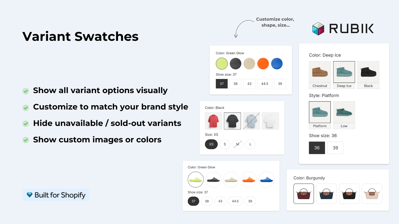
For stores that also display swatches on the Dawn collections page linked to individual products in a separate listing, you can display swatch collections on the collection page.
Which method to choose
| Method | Setup time | Maintenance | Features | Best for |
|---|---|---|---|---|
| CSS only | 15 min | High (manual color map) | Basic color circles | Stores with 5-10 named colors |
| Liquid + CSS | 30 min | Medium | Color circles + fallback | Developers comfortable with Liquid |
| Dawn 14.0+ native | 2 min | None | Basic color swatches | Stores on latest Dawn |
| Rubik Variant Images | 2 min | None | Full swatch suite + image filtering | Stores wanting no-code + advanced features |
CSS is great for circles with a small color palette, but for images, different swatch types, or variant image filtering, an app is a better solution. Try native for Dawn 14.0+ first.
“This app is perfect. it is incredibly easy to set up and use. There are so many cool ways you can set up your variant images AND adjust your swatches. The youtube tutorials are super helpful. I got a bit stuck trying to set up one of my products and Zulf was super quick to respond and help. Definitely recommend it if you are reading this ;D”
Anonymous merchant, Rubik Variant Images on the Shopify App Store
Common issues with Dawn swatches
- White swatch invisible on white background. Always add a light grey border to the default state. White swatches without borders disappear.
- Option name case sensitivity.
data-option-name="Color"anddata-option-name="color"are different selectors. Check your product admin for the exact casing. - Swatches affecting Size option too. If your CSS targets all
.variant-input__labelwithout filtering by option name, Size buttons also become circles. Use thefieldset[data-option-name="Color"]selector to scope it. - Theme update resets changes. Dawn updates can overwrite your CSS edits in
base.css. Use a separate CSS file or the theme’s “Custom CSS” field in the customizer to avoid this. - Sold-out swatches still clickable. Dawn does not visually distinguish sold-out variants well. Add a disabled state style with reduced opacity or a strikethrough effect.
See the live demo store, watch the swatch setup tutorial, read the getting started guide.
Frequently asked questions
Does the Dawn theme support color swatches natively?
This feature was added in Dawn 14.0+ and requires custom coding or an app if you’re on an older theme version. Check your theme version in Online Store > Themes. If you’re on an older version consider updating to the latest theme. 14.0 has many improvements and is pretty easy to update (if you have a paid theme, the online upgrade in the admin is very smooth and easy). On Dawn 14.0 you’ll also notice the product variants now display as a “Color swatch”.
Can I add image swatches to Dawn (not just color circles)?
This isn’t limited to CSS for the look of the swatches. For Image swatches you need to set a background-image on each swatch. This could be done in your theme’s Liquid code to output image urls for the swatches, or you can use an app for it. The big plus for Rubik Variant Images is that it supports Image swatches on the Dawn theme without having to modify your theme’s Liquid code.
Will adding swatches to Dawn slow down my store?
CSS-only swatches add zero weight to the HTML. Liquid changes add weight and have slightly more processing overhead than a regular embedded image but should still be fine. App-based swatches obviously depend on the app itself but in the case of Rubik Variant Images the app functionality is used to load swatches via metafields – this shouldn’t have any measurable impact on your page speed.
How do I add swatches for only the Color option, not Size?
Use fieldset[data-option-name=”Color”] as your CSS selector to only style the Color option. This means the Size, Material and other options will render as basic text buttons. Please make sure that the option name (in this case “Color”) exactly matches how it is named in your Shopify admin. Capitals count.
Can I show the selected color name next to the swatch on Dawn?
At Dawn you get to see the value of the option already in the option header, i.e. “Color: Red” instead of just “Red”. Color names can then be shown under each swatch in the section view in the shop. This has to be edited in the Liquid template of your shop theme though, or you can use an app that adds tooltip labels.
Will a Dawn theme update break my custom swatches?
If you make changes to base.css, your changes can get overwritten on theme update. Use Customize > scroll to the bottom > Custom CSS instead. Liquid updates won’t overwrite your files, but possible changes to the liquid code you’re targeting could happen if there is a significant change in how the theme is structured. For extra safekeeping, always make a copy of the theme before updating.
Related reading

Umid
Co-Founder at Craftshift