How to change the add-to-cart button color when a variant is selected on Shopify
Picture a store selling sneakers in 14 colorways. Each one has its own identity, its own vibe. But the add-to-cart button? Same default green for all of them. A “Fire Red” variant sitting next to a dull green button just looks off. And it is off.
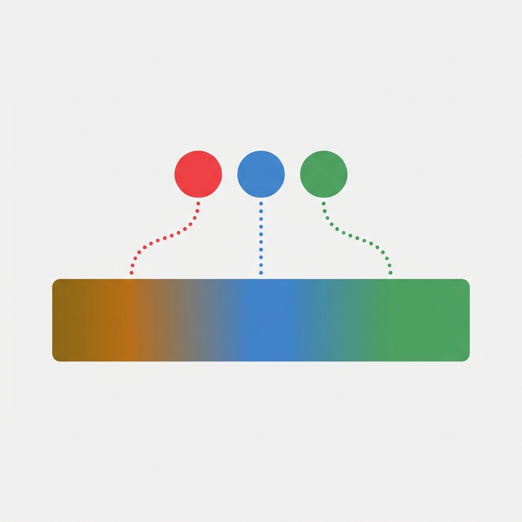
Keeping the colour of the add to cart with the variant colour is another neat little tweak on the product page. It ensures that the last colour customers saw is the one on the button. It helps to maintain consistency and draws attention to the call to action at the moment the customer is going to click it. Most people don’t think of this little trick.
Shopify doesn’t offer this feature natively – not even close. But it can be achieved with a few lines of JavaScript or CSS in about 10 minutes. Here are three different approaches, from completely code-free to completely custom, and a rundown of the most common mistakes.
In this post
- Why change the button color per variant?
- Method 1: JavaScript variant change listener
- Method 2: CSS custom properties with Liquid
- Method 3: Theme app blocks and apps
- Color mapping strategies
- Common mistakes to avoid
- FAQ
Why change the button color per variant?
The add-to-cart button is the most important element on the product page, the pivot point from browsing to buying. Selecting colour Ocean Blue from the drop down looks to be correctly recognised by the site, yet the add to cart button on that page remains default green. The site feels like it has been uploaded but not fully configured.
Three reasons this matters more than you think:
- Visual reinforcement. The button color matching the selected variant confirms the shopper’s choice. It says “yes, you picked blue, and we are ready to add blue to your cart.”
- Attention anchor. A color shift on the button pulls the eye back to the CTA after the customer has been scrolling through images and descriptions. That micro-moment of re-engagement matters.
- Brand polish. Stores selling color-heavy products (apparel, accessories, home decor) look significantly more polished when the entire page responds to the variant selection. Not just the images. Not just the color swatches. Everything.
This does not move the needle in terms of conversion in every single store, but for those locations where color IS the product (paint, fabric, phone cases, etc.) this is a real differentiator between competitors who tend to ignore color in their naming conventions.
Method 1: JavaScript variant change listener
This is probably your best bet. It works with almost every theme and you listen for when the variant changes and update the style of the button accordingly.
Go to Online Store > Themes > Edit Code and open theme’s main JavaScript file (usually it’s called ‘theme.js’ or global.js). Paste the code at the end of file.
document.addEventListener('DOMContentLoaded', function() {
  // Map your variant option values to hex colors
  const colorMap = {
    'Red': '#c0392b',
    'Ocean Blue': '#2980b9',
    'Forest Green': '#27ae60',
    'Midnight Black': '#2c3e50',
    'Sunset Orange': '#e67e22',
    'Lavender': '#8e44ad'
  };

  const form = document.querySelector('form[action="/cart/add"]');
  if (!form) return;

  form.addEventListener('change', function() {
    // Find the selected color option
    const selects = form.querySelectorAll('select, input[type="radio"]:checked');
    selects.forEach(function(el) {
      const value = el.value || el.textContent;
      if (colorMap[value]) {
        const btn = form.querySelector('[type="submit"], .product-form__submit');
        if (btn) {
          btn.style.backgroundColor = colorMap[value];
          btn.style.borderColor = colorMap[value];
          btn.style.transition = 'background-color 0.3s ease';
        }
      }
    });
  });
});
Replace the colorMap values with your actual variant option names and hex codes. The option names must match exactly (case-sensitive) what appears in your Shopify admin under Product > Variants.
This is the best way because it will work no matter how you have your theme set up to render the variant picker, as swatches or as a dropdown. This event listener will catch the change either way.
Dawn theme variant
Note: If you’re on the Dawn theme (or any theme built on Shopify’s reference architecture), the variant change event fires differently. See why and the adjusted approach since Dawn uses a custom element called variant-selects.
document.addEventListener('variant:change', function(event) {
  const variant = event.detail.variant;
  if (!variant) return;

  const colorOption = variant.options.find(opt =>
    Object.keys(colorMap).includes(opt)
  );

  if (colorOption && colorMap[colorOption]) {
    const btn = document.querySelector('.product-form__submit');
    if (btn) {
      btn.style.backgroundColor = colorMap[colorOption];
      btn.style.borderColor = colorMap[colorOption];
    }
  }
});
Some themes dispatch variant:change, others dispatch change on the form. If one works, but not the other, try using both. Most tutorials online give a single snippet, assuming that every theme behaves the same, which they don’t.
Method 2: CSS custom properties with Liquid
This method is more elegant but requires Liquid template editing. The idea: set a CSS custom property on page load based on the default variant, then update it via JavaScript when the variant changes.
In your product template (usually sections/main-product.liquid or templates/product.liquid), add this inside the product form section:
{%- assign color_option = product.selected_or_first_available_variant.option1 -%}
{%- case color_option -%}
  {%- when 'Red' -%}
    {%- assign btn_color = '#c0392b' -%}
  {%- when 'Blue' -%}
    {%- assign btn_color = '#2980b9' -%}
  {%- when 'Green' -%}
    {%- assign btn_color = '#27ae60' -%}
  {%- else -%}
    {%- assign btn_color = '#000000' -%}
{%- endcase -%}

<style>
  .product-form__submit {
    --btn-bg: {{ btn_color }};
    background-color: var(--btn-bg);
    border-color: var(--btn-bg);
    transition: background-color 0.3s ease;
  }
</style>
This code takes care of rendering the select drop down on first load. Liquid is a server side compiler, meaning that it only compiles initially, so we also need the JavaScript to update the –btn-bg custom property when the user changes the variant. We’ll add this in conjunction with the event listener from Method 1, but this time we’ll update the custom property instead of setting the style.backgroundColor directly:
btn.style.setProperty('--btn-bg', colorMap[value]);Why do we need CSS custom properties for hover/focus/disabled states in theme CSS? Why not just use inline styles for those states for the higher level of control we need? Why can’t direct inline styles override everything? Because CSS works that way, and custom properties don’t break the cascade.
Method 3: theme app blocks and apps
Not into code editing? No worries. Some product page optimization apps allow you to customize the visual without having to actually edit your theme files, and can adjust the look on a per variant basis.
Rubik Variant Images gives you fine-grained control over the variant picker appearance, including swatch types, custom colors, image swatches, and sold-out variant display. While it does not directly change the add-to-cart button color, it handles the broader variant display experience so well that the button color becomes one less thing to worry about manually.
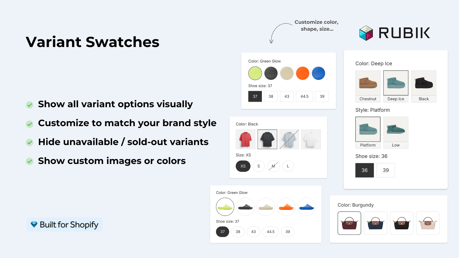
We need the full variant UX for some stores (image filtering per variant, click-to-select on thumbnails, custom swatch shapes and borders) which is handled beautifully by apps like Rubik for those cases. For our particular button, we only needed to add one little bit of custom js to render the additional color option. Here’s how it looks.
And if you sell products where each color is actually a separate product (separate SKUs, separate inventory), Rubik Combined Listings groups them together with swatches on collection pages.
Color mapping strategies
The hardest part of this whole trick wasn’t figuring out the code. It was deciding what color to change the button to. Here are three methods that I have used in practice for choosing a color:
1. Exact color match
The button turns into the variant color. So if you’ve set up a “Red” variant, the button will turn red. It’s pretty straightforward. Unfortunately, this doesn’t work as well for light colors. A white or light yellow button with white text? It’s unreadable. Therefore, you should always do contrast checks for every color variant you’ve set up.
2. Tinted/darkened match
Use the variant color, but make it a touch darker (about 20-30%) for the button. This maintains color association without making the callout unreadable. A light pink turns into a deep rose, pale blue turns into medium navy. This is what most well-designed stores do.
3. Complementary accent
Instead of matching the product with the variant, try to select a colour that will actually compliment it. In the example to the left, I have used an orange product with a deep teal button. On the right, the purple product has a golden button. More work to setup but the results are a lot more impressive and are suitable for higher end stores only.
No matter what method you choose to test, you should test it on real products, not in a code editor. You should test it on your product page, on a mobile site, with all the product images next to the CTA. Colors and code look dramatically different than they do in a text editor.
Common mistakes to avoid
After seeing dozens of stores attempt this, here are the pitfalls that come up again and again:
- Forgetting the disabled state. When a variant is sold out, most themes disable the button and change its appearance. Your color-change code might override the disabled styling, making a sold-out variant look available. Always check for the
disabledattribute before applying colors. - Ignoring text contrast. A yellow button with white text is invisible. Use dark text on light buttons and light text on dark buttons. The WCAG contrast ratio should be at least 4.5:1.
- Hardcoding colors per product. If you have 200 products with different color options, maintaining a static color map per product is a nightmare. Use variant metafields to store the hex code, then read it dynamically. This is where variant metafields really pay off.
- Not handling the initial load. If the page loads with a pre-selected variant, your JavaScript might not fire until the customer changes the selection. Set the initial button color on page load, not just on change.
- Breaking sticky add-to-cart. Many themes have a sticky/floating add-to-cart bar. Your code targets the main button but misses the sticky one. Query both selectors.
Scaling with variant metafields
For large stores, hardcoding a colour map is not practical. Instead store a hex value in a variant metafield and then read it on the frontend.
Go to Settings > Custom data > Variants in your Shopify admin and add a metafield with name: custom/button_color, value: type: Single-line text. Then add a value for each variant (e.g. the hex value #c0392b).
On the frontend, expose the metafield in your product JSON:
// In your Liquid template, output variant metafields as JSON
<script>
  const variantColors = {
    {%- for variant in product.variants -%}
      "{{ variant.id }}": "{{ variant.metafields.custom.button_color | default: '#000000' }}"
      {%- unless forloop.last -%},{%- endunless -%}
    {%- endfor -%}
  };
</script>
Then in your JavaScript, instead of matching option names, match variant IDs:
form.addEventListener('change', function() {
  const variantId = form.querySelector('[name="id"]').value;
  const color = variantColors[variantId];
  if (color) {
    btn.style.backgroundColor = color;
    btn.style.borderColor = color;
  }
});
The logic can be duplicated to any number of products / variants. For example, if you added a new product with pink variants you would simply update the metafield – no need to go back through code to make the change.
“This app is perfect. it is incredibly easy to set up and use. There are so many cool ways you can set up your variant images AND adjust your swatches. The youtube tutorials are super helpful. I got a bit stuck trying to set up one of my products and Zulf was super quick to respond and help. Definitely recommend it if you are reading this ;D”
Anonymous merchant, Rubik Variant Images on the Shopify App Store
Accessibility: do not rely on color alone
Buttons with different variants look different. If the only way that the color of your buttons indicates which variant they are, that’s an accessibility problem. About 8% of men have some form of color vision deficiency, which would make them unable to tell the difference between variants like Green and Red.
The color of the button should be an afterthought and not serve as the primary indicator of which swatch is in the selected, swatched, or hover state. The button color simply adds depth to your design, and should never be confused with the visual state of the swatches.
Ensure a minimum contrast between button text and button background and check against a contrast checker before deployment.
Testing your implementation
Before you call it done, run through this checklist:
- Select each variant. Does the button color update? Does it transition smoothly?
- Reload the page with a specific variant pre-selected via URL (e.g.,
?variant=12345). Does the button load with the correct color? - Check a sold-out variant. Does the button stay disabled/greyed out, or does your code override the disabled state?
- Test on mobile. Seriously. The sticky add-to-cart bar, the smaller viewport, the touch interactions. All different.
- Test with a screen reader or keyboard navigation. Can users still tell which variant is selected without seeing the button color?
Make sure that any broken features that were left out for the launch are fixed prior to launch. A broken add-to-cart experience is much worse than a default-colored one.
See the live demo store, watch the swatch customization tutorial, or read the getting started guide.
Frequently asked questions
Does Shopify have a built-in setting for this?
Shopify doesn’t natively allow you to change the color of the add-to-cart button per product variant without implementing custom code (JavaScript, Liquid, CSS) or using a third-party app. Most Shopify themes don’t have any options to change add-to-cart button color, but some of the more premium themes do offer limited options to change add to cart buttons via their theme settings; but full customization per variant is still rare.
Will this slow down my store?
The provided JavaScript is very small (under 1KB of code) and would only be executed on the actual product page. So there would be no real performance impact and no additional external requests. It’s basically a no-brainer. CSS custom properties are even smaller.
Does this work with color swatches and dropdown pickers?
Yes, Method 1 using a JavaScript event listener works for both swatches and dropdowns as it attaches itself to the form change event, and is therefore irrelevant to how the variant is changed.
What about products with size and color options?
When creating a product with multiple option types such as Color and Size, make sure that only the color option is mapped to the button. In this color map example, only the color values “Red”, “Blue”, etc. have entries. Values for the Size option such as “Small” or “XL” won’t match anything in the color map and will therefore be ignored.
Can I animate the color transition?
Yes. Add transition: background-color 0.3s ease to the CSS of the button, or include it in the JavaScript in Method 1. A smooth transition from one colour to another is achieved instead of a sharp change. Keep it below 0.5 seconds though as anything longer will look slow.
Will a theme update break this customization?
If you use CSS selectors to style your Call to Action buttons, possibly after the next theme update your buttons won’t render properly on your product pages, unless you incorporated a data layer with the metafield approach previously described. The data layer won’t be affected by changes to the presentation layer and therefore will still work. After any theme update, test the product pages of your products.
How do I handle products where variants are not colors?
If your variants are different sizes, different materials, etc., then this trick won’t apply to you. For non-color variants, you can keep the button simple with a brand color and focus on making the picker itself unique and custom.
Related reading

Umid
Co-Founder at Craftshift