Do variants on collection pages boost sales?
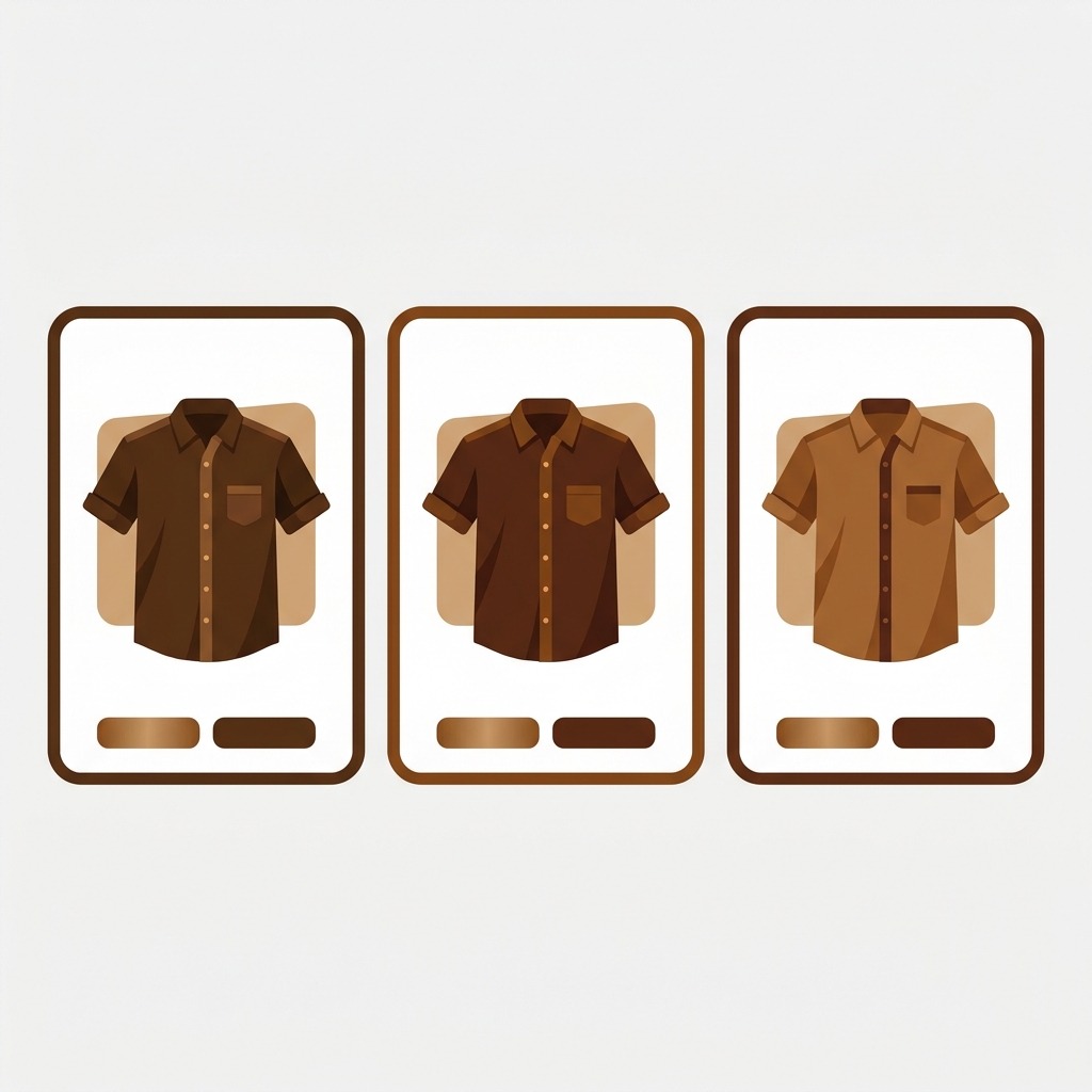
Variants on collection pages are the difference between a shopper finding the exact version they want and giving up in the grid. Picture a collection of 40 jackets. One comes in sage green, the color this particular shopper has been after for a month. On a standard Shopify collection page, that jacket shows up as a single card with one photo, usually whatever the default color is. The shopper scans, sees no sage green anywhere, and assumes you don’t carry it. You do. They just couldn’t see it.
That gap between what you stock and what shoppers can actually see is where sales quietly leak out. Showing each variant as its own card closes it. The app that does the splitting is Stamp Show Variants Collection, and on the product page it pairs a separate image set to every variant so the gallery matches whatever color got clicked.
This post is about what that does to sales, and why it works. Short version: people buy what they can find. Let’s look at the psychology, the practical wins, the app that handles it, and one honest alternative if your catalog is built differently.
In this post
- Do variants on collection pages boost sales?
- Why one card per product loses the sale
- How separate variant cards make buying easier
- Stamp Show Variants Collection: what it does
- Every variant card needs its own image
- Frequently asked questions
- Related reading
Do variants on collection pages boost sales?
Yes, for one reason: findability. A shopper who wants the sage green version can see it in the grid instead of guessing which card hides it, so fewer give up before the click. Stamp Show Variants Collection splits each variant onto its own card.
It is not magic, and it is not a fit for every catalog (more on that below). But for stores where color drives the buying decision (apparel, furniture, cosmetics, accessories), making each color visible at the browse stage is one of the highest-impact merchandising changes you can make. Shoppers who never scroll into a product page can’t buy from it.
Why one card per product loses the sale
Shopify’s default behavior on collection pages is one card per product. A t-shirt with 12 color variants is one card, one image. That made sense when catalogs were small. For a modern apparel store, it is the single biggest merchandising mistake on the collection page, and most themes still do it out of the box.
Here is the problem in plain terms. Browsing shoppers filter by color in their head before they filter with your sidebar. They are looking for a specific shade. If the grid shows one card with the wrong color on it, three things happen: they misjudge your range, they skip products they would have bought, and they bounce to a competitor whose grid shows the color they wanted. Doing this by hand across a big catalog is not realistic, which is why Stamp Show Variants Collection turns each color variant into its own collection card automatically. It has a 5.0 rating across 144 reviews and carries the Built for Shopify badge.
Why does Shopify still default a 12-color product to a single card in the grid? For apparel it makes no sense. The information a shopper needs to decide is exactly the information the default hides. This is one of the most common things we hear from merchants: the store carries the color, the shopper just never saw it.
How separate variant cards make buying easier
Splitting variants onto their own cards does more than look tidy. It removes friction at four specific points in the path to purchase.
- Findability. The shopper sees the exact color in the grid. No clicking in, checking the swatch, clicking back out, repeating.
- Fewer clicks to the right page. They land on the product already set to the color they clicked, not the default one. That is one less decision and one less mismatch.
- Honest pricing. Each card can show that variant’s own price instead of a vague “from” range, so there are no surprises at the product page.
- No dead ends. Sold-out colors can be hidden from the grid, so shoppers don’t fall in love with a card that leads to an out-of-stock badge.
Each of those is a small thing. Stacked together, across every browsing session, they move the needle. If you want to put a number on it for your own store, run your current sessions and average order value through our free conversion rate calculator, then re-measure a month after the change. And if the collection page is where you suspect the leak is, the product page grader will flag the weak spots downstream too.
The collection page gets them to the right product. The product page has to keep the promise. This is where swatches earn their keep, and it is worth reading our take on whether collection page swatches help SEO and how to display variant swatches on collection pages cleanly.
Stamp Show Variants Collection: what it does
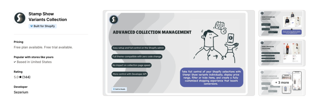
Stamp Show Variants Collection, built by Sezerium, focuses on the collection and search pages. It takes the variants inside a Shopify product and shows them as separate cards, or as variant swatches with a picker, without changing how the product is stored in your admin. You keep one product with its variants; Stamp changes how it appears when people browse.
What it does on collection pages:
- Variant splitting: each variant appears as its own card, or as a swatch picker on the card
- Individual pricing: shows the specific variant’s price instead of a range
- Hide out-of-stock: keeps sold-out variants off the grid automatically
- Smart sorting: order variants per collection by sales performance or stock, plus best-seller and featured sections
- Extras: promo card placements and infinite scroll
Pricing runs from a free Build plan up through Eco ($4/month), Standard ($12/month), and Advanced ($24/month), so a small store can test the idea before paying anything.
Every variant card needs its own image
Here is the part that gets skipped, and it decides whether any of this works. A separate card per color is only useful if each variant actually has the right image attached. Split a product into 12 cards where 9 of them show the same default photo, and you have made the grid busier without making it clearer. The whole benefit was findability. Wrong images kill it.
On a small catalog you assign those images by hand. On a few hundred products with a dozen colors each, that is thousands of image assignments, and you redo them every time a new colorway lands. This is exactly why we built Smart Bulk Image Upload to push images onto the right products in bulk. It pulls from Google Drive or Dropbox and matches each image to a product or variant by SKU, barcode, title, or metafield, so getting a correct photo onto every variant stops being a weekend job. It is free to start and 5.0-star rated across 94 reviews.
Then the two halves line up: Smart Bulk Image Upload gets the images onto the products, and Stamp shows the right one per card on the collection page. Run your library through the free image audit first if you are not sure which products are missing variant photos.
Frequently asked questions
Which app should I use to show variants on Shopify collection pages?
If your colors already live inside one product, Stamp Show Variants Collection splits them into separate cards without restructuring anything.
Does showing variants separately actually increase sales?
For color, material and shape leaded catalogs, yes, because it fixes findability. Shoppers who can see the exact color in the grid are more likely to click the right product and less likely to assume you don’t stock it. The effect is largest for apparel, furniture, cosmetics, and accessories.
Will separate variant cards create duplicate content problems?
Stamp displays variants from a single product, so there is still one product URL underneath.
Do Stamp and Cs – Smart Bulk Image Upload work together?
Yes. Stamp and Smart Bulk Image Upload are compatible apps, and they run on different stages: Stamp on collection and search pages, Smart Bulk Image Upload on the product creation stage. There is no conflict and no shared configuration. Install and set up each one independently.
How do I get an image onto every variant without doing it by hand?
Smart Bulk Image Upload pulls images from Google Drive or Dropbox and matches them to products or variants by SKU, barcode, title, or metafield. That gets a correct image onto each variant in bulk, which is the prerequisite for variant cards to look right on the collection page.
Should I split by color or by size on collection pages?
Color, almost always. Color changes how the product looks, so a separate card per color helps the shopper. Size, material, and other non-visual options look identical in photos, so splitting by them just clutters the grid with duplicate-looking cards.
Related reading
- How to Bulk Upload Product Images on Shopify (Step-by-Step Guide)
- How to export product images from Shopify?
- New Shopify Collection Page Features in Stamp: Sections, Promo Card and Smart Sort
- Magento to Shopify migration guide: complete 2026 walkthrough
- Best Shopify email marketing apps 2026: Klaviyo vs Omnisend vs Mailchimp vs Privy
- How to Increase Shopify Sales Performance: 4 Tips That Actually Work
Before variant cards can help anyone, every variant needs its own image. Get them all in place in bulk, then let Stamp and Smart Bulk Image Upload take care.

Ozkan Oz
http://craftshift.comCo-Founder @ Craftshift