Fix Shopify variant image aspect ratio and cropping
A mismatched variant image aspect ratio is why your product gallery jumps, crops a model’s head off, or drops grey letterbox bars around half your photos. Shopify does not normalize ratios for you. So when one variant is a clean 1:1 square and the next is a tall 4:5 portrait from a different supplier, the theme has to make a choice on the fly, and that choice usually looks wrong.
Picture a store with 12 colors of one hoodie. Six photos came from the manufacturer as squares. Six you shot yourself in portrait. Click through the swatches and the whole layout shifts every time, sometimes by a hundred pixels or more. Customers notice. It reads as sloppy even when the products are great.
This is fixable, and it is not your theme’s fault (mostly). The real fix happens in two places: at the source, where you control what ratio every image ships in, and at the display layer, where a variant image app keeps the swap clean and the thumbnails uniform. Let’s get into both.
In this post
- Why variant image aspect ratios break in Shopify
- Cropping vs letterboxing: what object-fit actually does
- Pick one ratio and stick to it
- Fix at the source: shoot, export, and bulk resize
- Fix at the display layer with a variant image app
- Swatch shape and size control so thumbnails stay even
- Frequently asked questions
Why variant image aspect ratios break in Shopify
Shopify stores whatever pixels you upload and never resizes them to a shared aspect ratio. There is no setting that says “make every product photo 4:5.” The platform keeps your original dimensions, serves them through its CDN, and hands the rendering job entirely to your theme. That is the root of the problem.
Three things stack up to cause the mess:
- Shopify does not normalize ratios. Upload a 2000×2000 square and a 1600×2000 portrait into the same product, and both stay exactly as they are. No auto-crop, no auto-pad.
- Themes set their own crop rules. Dawn, Horizon, Prestige, Impulse, they each decide how the image media slot behaves. Some force a fixed ratio with CSS and crop the overflow. Others let the image set its own height, so the gallery resizes per photo.
- Mixed source ratios from suppliers. Manufacturer photos, dropship feeds, your own phone shots, stock images. They almost never match. One vendor ships 1:1, another ships 3:4, a third ships something weird like 5:7.
Why does Shopify leave this to the theme? Because cropping is a design decision, and Shopify can’t know whether you want the top of a shoe in frame or the heel. Fair enough. But it means the burden lands on you, and most merchants don’t find out until a customer asks why the photos “bounce around.”

Cropping vs letterboxing: what object-fit actually does
When a theme has to fit a non-matching image into a fixed slot, it uses a CSS property called object-fit, and the value it picks decides whether you get cropping or letterboxing. Two values matter here, and they behave in opposite ways.
| object-fit value | What it does | The downside |
|---|---|---|
cover | Fills the whole slot, scales up, crops the overflow | Heads, feet, and product edges get cut off |
contain | Fits the entire image inside, scales down, pads the gaps | Grey or white letterbox bars on the sides or top |
So a portrait photo dropped into a square slot set to cover gets its top and bottom sliced. The same photo in a slot set to contain sits in the middle with empty bars left and right. Neither is good. Both come straight from the ratio mismatch.
Here’s the part that frustrates me: you can’t fix this reliably with CSS alone if your images are all different ratios. You can force every slot to a fixed height, sure, but then half your catalog gets cropped and the other half gets padded. The math only works when the images themselves share a ratio. Which is exactly why the durable fix starts upstream.
If your photos also look soft after Shopify processes them, that’s a separate issue worth reading up on. We covered the causes in our guide on fixing blurry Shopify product images, and the two problems often show up together.
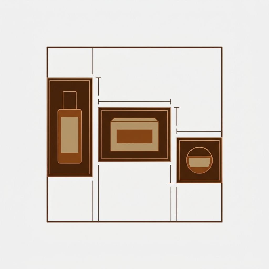
Pick one ratio and stick to it
The single best thing you can do is commit to one aspect ratio for every product photo in your store. One ratio. Across all variants, all products, all suppliers. Once the inputs match, cropping and letterboxing both disappear, because there’s nothing left to crop or pad.
Which ratio? Two solid defaults:
- 1:1 (square). The safest, most flexible choice. Works in galleries, collection grids, and product cards without drama. If you sell a mix of categories, go square.
- 4:5 (portrait). Taller frame, more vertical real estate on mobile, great for apparel and anything worn or held. Instagram-friendly too. Just be consistent about it everywhere.
My honest take? Most stores should pick 1:1 unless they’re apparel-heavy, in which case 4:5 wins on mobile. What you should not do is mix them, or let “whatever the supplier sent” be your ratio. That’s how you end up with the jumping gallery in the first place. For the full breakdown of recommended dimensions, our Shopify product image size guide lists exact pixel targets per use case.
Fix at the source: shoot, export, and bulk resize
Fixing the ratio at the source means every image arrives in Shopify already matching, so the theme never has to guess. There are three stages, and you’ll touch all three eventually.
Shoot to a consistent frame
If you control the camera, lock the frame. Set your camera or phone to the target ratio, keep the product centered with room around it, and use the same distance and background for every variant. Consistency here saves hours of cropping later. Same lighting helps too, because color-accurate variant photos cut down on returns.
Export at one ratio
When you export from Lightroom, Photoshop, Canva, or whatever you use, set a fixed export size that matches your chosen ratio. For 1:1 that might be 2048×2048. For 4:5, something like 1600×2000. Pad or crop intentionally in the editor where you can see the result, not by accident in the browser. This is also where you should compress, so files stay light.
Bulk resize what’s already uploaded
Got a few thousand images already live in the wrong ratios? You’re not re-shooting those. Batch them instead. Run them through a bulk resize that pads or crops to a single canvas, then re-upload. We walk through the exact tools and steps in how to bulk resize images in Shopify, and it’s the fastest path for an existing catalog. If you just need slot dimensions adjusted theme-side, the post on changing product image size in Shopify covers that angle too.
One warning. Padding a portrait photo to a square canvas adds white space, and cropping a square to portrait removes content. Decide which trade-off you can live with per product type. For flat-lay product shots, padding is usually invisible. For models or lifestyle shots, crop carefully so you don’t behead anyone.
Fix at the display layer with a variant image app
Even with matched ratios at the source, the variant swap itself can still feel janky if the gallery shows every photo for every variant. That’s where a variant image app earns its keep: it filters the gallery so only the selected variant’s media shows, which means the swap is clean and predictable instead of scrolling through a mixed pile.
Rubik Variant Images does exactly this. Pick the red hoodie, see only the red hoodie’s photos. Pick blue, the gallery swaps to blue. Because you’ve already standardized the ratio at the source, every one of those filtered images lines up, and the gallery height stays put through the whole click-through. No jump. It supports images, videos, and 3D models per variant, so the rule holds across all your media types, not just stills.
A nice side effect: you don’t duplicate images across variants. The app uses shared images, so one photo can belong to several variants without you uploading it five times. That keeps your media library lean and your page weight down. We built it metafield-based with no external API calls, so the filtering loads with the page rather than waiting on a third-party server. If you want the deeper how-to on the filtering itself, the team wrote it up over on showing only the selected variant’s images.
“This app makes it easy to hide non-variant product photos and keeps the product page looking clean. It also helps to show clean custom swatches. Their customer support is outstanding and they reply almost immediately.”
Anonymous merchant, February 2026, Rubik Variant Images on the Shopify App Store
And if your problem is bigger than one product’s variants, say you’ve split each color into its own separate product for SEO, that’s a different tool. You’d want to make separate products act like variants so they group together with swatches. Each product keeps its own clean, consistent image set, and the grouping handles the switching.
Swatch shape and size control so thumbnails stay even
Ratio mismatch doesn’t only wreck the main gallery. It wrecks your swatch thumbnails too. If you use image swatches and the source photos are different ratios, the little swatch tiles come out uneven, some squished, some boxy. Then your option selector looks ragged even though the products are fine.
The fix is to control the swatch container shape independently. Rubik Variant Images gives you three swatch types you can mix per option: image swatches, color swatches, and pill buttons. The shapes available are circle, square, rounded square, pill, and button. Because the swatch container holds a fixed shape, your thumbnails render uniform regardless of what’s behind them.
- Circle or square image swatches: the container crops the image to a consistent shape, so every tile matches even if the source photos don’t.
- Color swatches: skip images entirely for color options. A solid hex swatch is always perfectly even, no ratio to worry about.
- Pill buttons: best for sizes or materials where a text label reads cleaner than a thumbnail.
Honestly, for color options I’d reach for color swatches over image swatches nine times out of ten. They sidestep the whole ratio question, load lighter, and look sharp on every screen. Save image swatches for when the customer genuinely needs to see a pattern or texture. There’s a wider set of dos and don’ts in our Shopify product image best practices rundown.
Want to see it first? Check the live variant images demo store, watch the tutorial video, or read the getting started guide.
Frequently asked questions
Why is my variant image aspect ratio inconsistent in Shopify?
Shopify keeps your original image dimensions and never normalizes them to a shared ratio. When variants come from different sources (some square, some portrait), the theme renders each at its own ratio, so the gallery jumps and thumbnails look uneven. Fix it by standardizing every photo to one ratio before upload.
What aspect ratio should I use for Shopify product images?
Use 1:1 (square) for the most flexibility across galleries, grids, and cards, or 4:5 (portrait) if you sell apparel and want more height on mobile. The exact ratio matters less than picking one and applying it to every product and every variant consistently.
Why does my Shopify theme crop my product photos?
Your theme uses the CSS object-fit cover value to fill a fixed image slot, which scales the photo up and crops whatever overflows. If your images don’t match the slot’s ratio, the crop cuts off heads or product edges. Matching your image ratio to the slot stops the cropping.
How do I stop the product gallery from jumping when I switch variants?
The gallery jumps because consecutive variant images have different heights. First standardize all variant photos to one aspect ratio, then use a variant image app like Rubik Variant Images to filter the gallery to only the selected variant’s media. With matched ratios and filtering, the gallery height stays fixed through every swap.
Can I fix mixed aspect ratios without re-shooting everything?
Yes. Bulk resize your existing images to a single canvas size that pads or crops them to one ratio, then re-upload to Shopify. This handles a whole catalog at once without new photography. Use padding for flat-lay shots and careful cropping for model or lifestyle photos.
Do image swatches need to be the same ratio as my product photos?
No, because the swatch container controls the shape. Rubik Variant Images offers circle, square, rounded square, pill, and button shapes, so image swatches crop to a uniform tile no matter the source ratio. For color options, color swatches sidestep the issue entirely with solid hex tiles.
Does cropping product images hurt Shopify page speed?
CSS cropping with object-fit doesn’t shrink the file, so an oversized image still downloads at full weight even when cropped on screen. Resize and compress at the source instead, and use shared images across variants (as Rubik Variant Images does) so you aren’t uploading the same photo multiple times.
Related reading
- Shopify product image size guide (2026)
- How to bulk resize images in Shopify
- Fix blurry product images on Shopify
- Show only the selected variant’s images
- Make separate products act like variants
Standardize the ratio once, let the app handle the swap, and the jumping gallery becomes a problem you never think about again. Start with your worst offender: the product with the most colors.

Umid
Co-Founder at Craftshift