A/B testing ideas for Shopify product pages
Most Shopify store owners change their product page based on gut feeling. “The button should be green.” “Let’s add a countdown timer to the product page.” “Swatches look better than dropdowns.” Maybe some of these decisions are good for you and your Shopify store, but without any actual testing and data to back up your design decisions, you are guessing. And guessing means you are probably making your page worse while thinking you’re improving it.
A/B testing removes the guessing from the experimentation process by showing users version A of the experience some of the time and version B of the experience the rest of the time. However most stores aren’t experimenting at all, and of those that are, they test low-impact changes (button colors) instead of high-impact ones (variant picker types, image count, gallery filtering).
This guide outlines 15 potential A/B tests to do on your Shopify product pages, with an estimate of how much each one will boost conversions. Each potential test is outlined with a brief explanation of what you should test, why it’s important, and what’s a win.
In this post
- How to A/B test on Shopify
- High-impact tests (test these first)
- Medium-impact tests
- Low-impact tests (skip unless you are out of ideas)
- FAQ
How to A/B test on Shopify
Shopify does not natively support A/B testing and third-party tools must be utilized to achieve the same functionality. The most common tool to accomplish A/B testing with Shopify is Google Optimize (and while this service has been discontinued, other tools like VWO, Convert, and ABTasty fill a similar function) or Shopify apps (for example Neat A/B Testing or Intelligems) that offer A/B testing capabilities within the admin dashboard. The method of split testing with Shopify also includes the functionality to use alternate templates. With alternate templates, a single product can be assigned multiple templates allowing for its various forms to be tracked in analytics and compared against each other to determine performance.
For the template-based approach: Make two product templates and test two different layouts. Assign the different templates to the same product and drive the same traffic to both versions. Measure the add-to-cart rate and conversion rate on both variants over a 2 to 4 week period. This isn’t as clean as using a full-fledged A/B testing suite, but it is free and can work fine for making large layout changes to test.
High-impact tests (test these first)
1. Swatches vs dropdowns for color selection
Replace color dropdown with color swatches. This is consistently one of the highest-impact changes on product pages for stores with color variants. Swatches display all of the available colors upfront, users can see what they look like without selecting, and the process is reduced from 2 clicks (click dropdown + select color) to 1 click (select swatch).
Expected impact: 5-15% boost in add-to-cart for clients with swatch images. More for clients with color options. Test: Load app on one of your templates with existing image swatches. Test against default dropdowns on your second template.
2. Number of product images (4 vs 8)
Testing showing 4 images per product versus 8 images per product. Adding more images gives customers more information about the product and gives them confidence that they are selecting the correct item. However, on mobile, there is a cost of having customers scroll further before reaching the add-to-cart button. This cost typically should be balanced against the benefits for customers viewing product on desktop. The optimal number of images will vary based on the type of product and the overall shopping experience.
Expected impact: 3-10%More images benefit fashion and jewelry stores. Simple products might not need as many (e.g. mug, phone case).
3. Variant image filtering on vs off
Test product images are viewable across all variants, as opposed to only being viewable for the selected variant. Allowing images to be viewed across all variants vs filtering them so only images for the selected variant are shown.
Expected impact: 5 to 12% for stores with 10+ images, less for stores with 3 to 4 images. More images mean bigger win from filtering.
4. Sticky add-to-cart on mobile
Test a floating add-to-cart bar at the bottom of the screen on mobile vs having the default add to cart button that scrolls with the content on mobile. You can see how having the bar stick to the bottom of the screen can always keep that CTA right in front of the customer’s face.
This tweak can potentially up mobile conversions by 3-8%. On desktop it has virtually zero impact because you can usually see the submit button without having to scroll. 99% of responsive themes allow you to toggle this feature in the settings.
5. Return policy placement
Visual test demonstrating a one line return policy summary immediately below the add-to-cart button as opposed to burying it in a separate section of the site. This design addresses the top purchase objection at the moment that matters most.
Expected impact: 2-7% – higher for apparel retailers (the fit concern is the number one objection) and for higher priced merchandise.
Medium-impact tests
6. Swatch size (28px vs 40px)
Increasing swatch size improves visibility and makes it easier to click on, while decreasing it saves real estate. Test both approaches to see which resonates better with sales in the form of add-to-cart rates. The answer will vary depending on the number of colors offered and how important accuracy is to your customers.
7. Color name labels vs no labels
Testing showing color names under swatches vs just swatches. Showing color names reduces the chance of someone selecting the wrong color (should reduce returns) and is helpful to colorblind people. But it does add some visual clutter and in this case, vertical space.
8. Image zoom on hover vs click
Some themes choose to zoom on the hover (on desktop only) while others choose to zoom on a click to view the zoom modal. Hover zoom is much faster than click zoom but probably neither is as desirable as being able to click and hold to scroll. Test both options to see which one your customers prefer.
9. Compare-at price display
This test compares two versions of a product: one that includes the compare at price line struck through, and another that simply displays the current price. The compare-at price can be an effective anchor to convey value; but overuse can make it innoxious. The challenge here is to determine if shoppers even notice it.
10. Tabbed description vs full description
Test organizing the product description in tabs (Description, Specs, Care, Shipping) vs displaying all of the information at once. tabs are space-efficient but bury information behind clicks. a full display of information can be overwhelming, especially on a small product page. this approach is more useful when there is variant-specific description information that should appear differently for different variants.
Low-impact tests (skip unless you are out of ideas)
- 11. Button color. Red vs green vs black. The classic A/B test that everyone wants to run. Impact is almost always under 1%. Your time is better spent elsewhere.
- 12. Button text. “Add to Cart” vs “Buy Now” vs “Add to Bag”. Marginal differences at best. The button location and size matter far more than the label.
- 13. Font changes. Serif vs sans-serif. Unless the font is genuinely hard to read, this has no measurable conversion impact.
- 14. Product title format. “Classic Tee (10 Colors)” vs “Classic Tee”. Minimal impact on product page conversion (the customer already clicked through).
- 15. Social sharing buttons. Nobody uses them. Adding or removing them has zero measurable impact on conversion. They just take up space.
Use Rubik Variant Images to enhance display of different variants on the product page without having to run an A/B test first. Display color variations as a swatch, filter by variant, and even customize the look of the swatches on the product page. The addition of swatches, filtering, and swatch styling are the three most positive changes made to the product page of the hundreds of stores using this app. If you want to test on a real store first, install and compare to your default theme on a custom template.
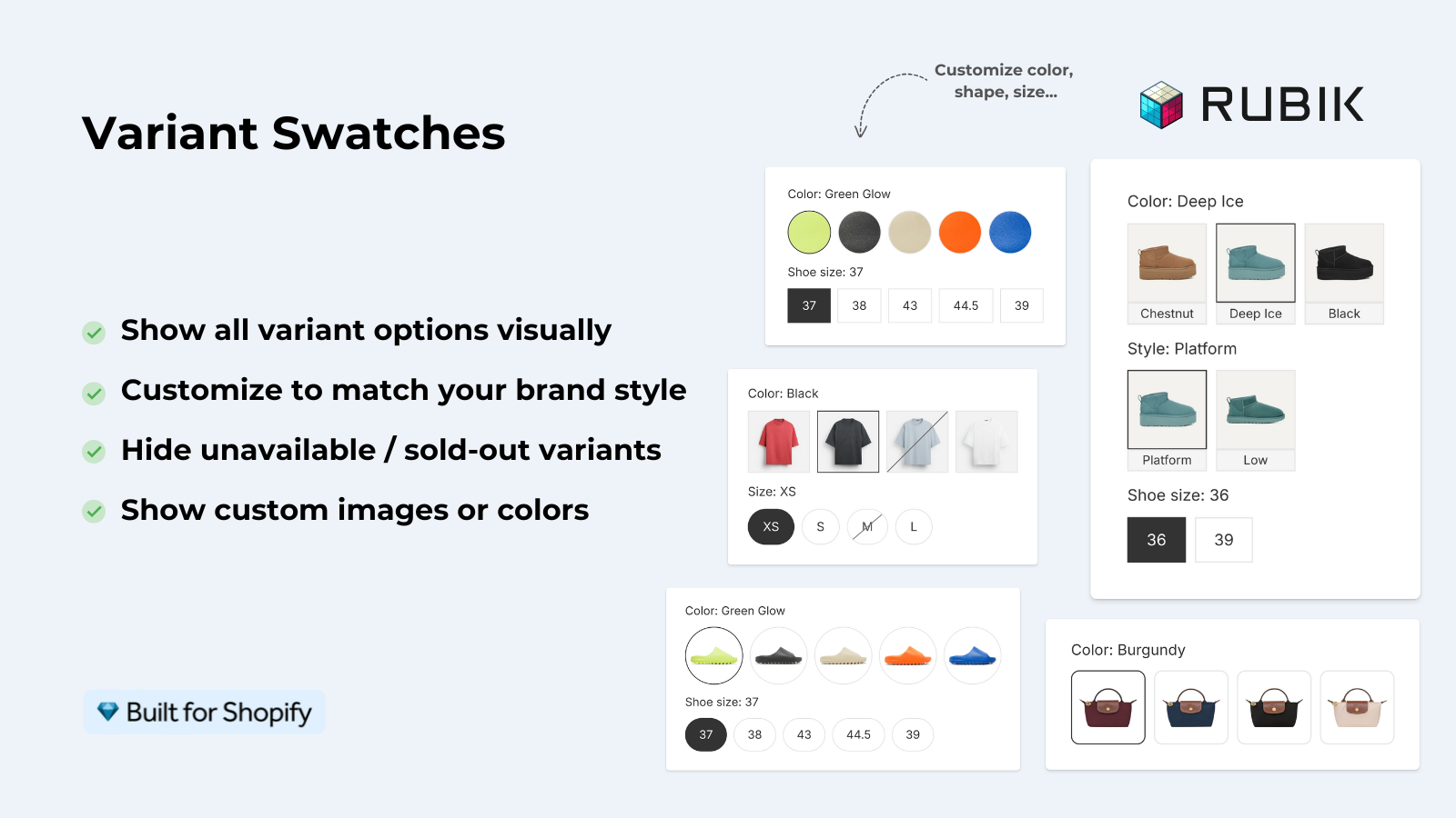
For stores that sell color variants as separate products, it will also create swatches on your collection pages so customers can view the different colors before navigating to the specific product page.
“Hands Down the best customer support of all the variation/swatch apps I have used till date. The app does everything. From individual variant gallery to really detailed customizable swatch’s. All in a single app. Originally we used to use two different apps so this is so much more cost efficient for us.”
Bellissima Covers, India, Rubik Variant Images on the Shopify App Store
Frequently asked questions
Does Shopify have built-in A/B testing?
You would need to use a third party product for this (VWO, Convert, Neat A/B Testing, Intelligems etc). Alternatively, you could use Shopify’s alternate product templates to create alternate layouts and compare the analytics manually.
How long should I run an A/B test on Shopify?
Time Minimum 2 weeks but ideally 4 weeks. There need to be enough visitors to reach statistical significance (typically 1,000+) to ensure you’re basing your decisions off real patterns, not random fluke.
What is the highest-impact A/B test for a clothing store?
Switch from “color” dropdown to actually show all color swatches. Single most impactful change for apparel product pages. Expect 5-15% jump in add-to-cart rates.
Should I test one change at a time or multiple?
One change at a time for clean results. Swatch type, image count, and button placement are all interrelated. Therefore, test each individually rather than all at once. Unless you have very high traffic (50,000+ monthly visitors), and a tool to run multivariate tests, it is unlikely that you will know what generated any increases, as well as decreases, in conversion rates.
Is A/B testing worth it for small Shopify stores?
Only if you have enough traffic to reach statistical significance. With fewer than 5,000 monthly visitors, most tests on your store will not produce reliable results in a reasonable timeframe. Instead, apply known best practices to your small store, such as swatches over dropdowns, 5+ images, and a sticky CTA on mobile.
Related reading

Umid
Co-Founder at Craftshift