How to set up Shopify color swatches for accessories (watches, bags, jewelry)
Accessory stores face a different swatch challenge than general apparel stores. A flat color circle (like the one shown to the left) is fine for communicating the color of a plain red t-shirt. But what do you do with “Rose Gold” watch finish, “Pebbled Cognac” leather, or “Emerald Cut Diamond” jewelry? Flat color circles just aren’t sufficient for these types of products. You may need to use an image swatch or find some other creative way to communicate the unique details of different accessories within your zoomed-out product view.
This guide covers swatch setup for the accessory market. Learn how to set up metal finishes, leather materials, gemstone colors and multi-material products including watches, bags, jewelry, sunglasses, belts and any product where the “color” is actually the material or finish.
In this post
- Why accessories need different swatch approaches
- Image swatches for textures and finishes
- Metal finish swatches (gold, silver, rose gold)
- Leather and fabric texture swatches
- Gemstone and stone color swatches
- Multi-material products
- FAQ
Why accessories need different swatch approaches
Standard color swatches (flat colored circles) are fine for simple option colors. However, for accessories, the “color” is usually more complex. The color of stainless steel is not just a color, it has directional lines in the metal finish. Leather pebble has texture. Rose gold has a metallic sheen. Emerald gemstones have facets and depth. A flat hex circle does not communicate any of these qualities.
Flat swatches for accessories look similar for all finishes. As a result, customers can’t tell “Silver” from “Brushed Nickel” from “Platinum”. They order based on the name of the product, receive the product, like the look, but then return the product because they mistook it for a different finish. Better representation of variants can help to avoid these returns.
Image swatches for textures and finishes
Image swatches use a cropped version of a product image or texture sample instead of a flat colour. Customers will see the actual material of your product when using swatch picker.
How to create image swatches:
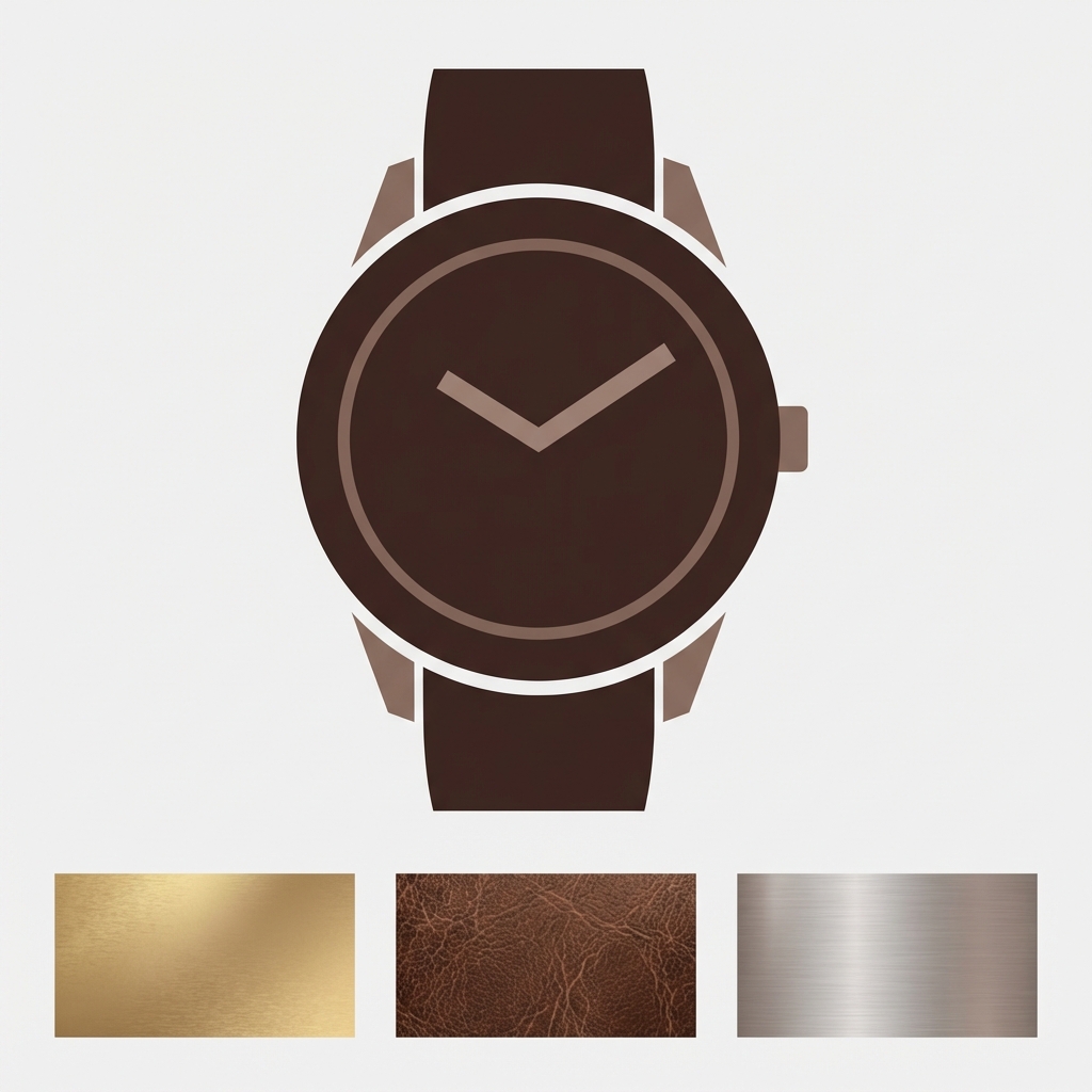
- Crop a detail photo. Take a close-up of the actual product material (leather grain, metal surface, fabric weave). Crop to a square at 100x100px minimum (200x200px for retina).
- Keep lighting consistent. All swatch images should have the same lighting and white balance. Inconsistent lighting makes “Silver” look different from “Platinum” even when they are actually different materials.
- Upload as swatch images. In Rubik Variant Images, you can set each swatch to use a custom image instead of a flat color. Upload the texture crop and assign it to the corresponding option value.
Make the image swatches a bit larger than the regular color swatches to allow the texture to show up well. For accessories, something between 44-52px is a good size. A 28px texture swatch is too small to tell that it is leather and smooth.
Metal finish swatches (gold, silver, rose gold)
Most product swatch accessory challenges involve metal finishes. When a consumer sees the word “Gold” they typically expect a Yellow Gold color however gold can also come in Champagne Gold, Brushed Gold or Antique Gold finish varieties. Each of these looks drastically different.
Two approaches:
- Custom hex values. If the metals are distinct enough in color (yellow gold #D4AF37, rose gold #B76E79, silver #C0C0C0, black #1a1a1a), custom hex swatches work. Set the exact hex in the app instead of relying on CSS color name matching.
- Image swatches. For finishes that differ in texture more than color (polished vs brushed vs matte), use image swatches. A photo of brushed gold shows the directional grain that a flat gold circle cannot.
Always include text next to metal finish swatches. 14K Yellow Gold and Gold Plated look similar in swatch, but are different products at different prices – and thus deserve clearly labeled differences.
Leather and fabric texture swatches
Leather comes in many textures. Some leather textures, such as pebbled or smooth, cannot be represented by flat colors. Others, like croc-embossed, suede or canvas/nylon can be represented, but images are the best way to show these differences in the swatch picker.
For large bag stores with 10+ different leather textures, consider displaying information in pill buttons (text labels) in addition to image swatches. An example of this would be “Pebbled Cognac” displayed as a pill button instead of a tiny 36px image swatch for customers to strain their eyes to see.
Gemstone and stone color swatches
Gemstone colors have considerable depth that cannot be accurately portrayed by a flat swatch. An emerald, for example, is not just green- it also has the qualities of transparency, faceting and refracted light. Therefore, for jewelry stores, it is best to use image swatches with close-up photos of the actual gemstone.
For simulated or synthetic stones where the color is more uniform, custom hex swatches with precise color matching work well. The key is matching the hex to the actual stone color, not a generic “green” for emerald.
Multi-material products
Many product accessories combine two different materials. For example the strap of a watch is made of leather and the case is made of metal. Similarly the body of a bag is made of leather and the buckles etc are made of metal. The variant for such products could be something like “variant between two combinations of two materials”. For example “Brown Leather / Gold Hardware” vs “Black Leather / Silver Hardware”.
For these products the variant is better to represent the product as a complete image swatch rather than an individual material swatch. The swatch is a cropped view of the full product (the brown leather with gold hardware together) so customers can see the specific combination of materials for a given variant.
If the materials are independent options (choose strap material + choose case finish separately)), then each option would get its own swatch row. Rubik Variant Images allows for different swatch types per option – in this case image swatches for the strap material and color circles for the case finish – all within the same product page. Filters on the gallery will then display only images that correspond to the chosen version of the two options.
For stores where each material combination is a separate product (with different photos, and different pricing), display all material options with swatches on collection and product pages.
“This app has been incredibly easy to use and the support is fantastic. They answered my questions quickly and solved all the issues I had. As a small business, not having a ‘gotcha’ and actually getting to use the product without having to sign up for an annoying subscription to start for a sub-par product is refreshing.”
Dementia Aide, US, Rubik Variant Images on the Shopify App Store
Frequently asked questions
Should I use color swatches or image swatches for metal finishes?
If metals have different colors (yellow and silver for example) custom hex swatches need to be created. If metals have different textures (shiny, brushed, matte) image swatches should be used. For high-end brands like AW Shanks it looks more professional to use image swatches.
What size should image swatches be for accessories?
44-52px. Textile swatches are bigger than regular swatches because they contain more texture. The regular height is larger than standard color swatches. Please upload swatch images at 2x display pixel height (100px for 50px swatch) for high resolution look.
Can I mix image swatches and color swatches on the same product?
Yes. You can have mixed swatch types per option. For example you could have images for one option (strap material) and color circles for another option (case color) all on the same product page.
How do I create consistent swatch images for accessories?
Photo all the materials under the same light (natural or artificial). Crop all swatches to a square form. Use the same amount of zoom on all the swatches. Slightly off swatches are okay but inconsistent lighting (or any other aspect) on swatches looks unprofessional.
Do image swatches affect page speed?
Minimally, each swatch image is 100x100px for high visual accuracy and comes out to under 10KB per image. 20 images add less than 200KB to your page, which is negligible, especially when served from Shopify’s CDN. The gain in accuracy far outweighs the minimal impact on site speed.
Related reading

Umid
Co-Founder at Craftshift