Anatomy of a high-converting Shopify product page
Most Shopify product pages are fully functional – display the product, list the price, allow for adding the product to cart etc. But a high converting product page is more than that – each element is designed, optimised for size and position to further reduce the amount of friction between a customer wanting a product and them actually purchasing the product.
The difference between a 1% conversion rate on a product page and a 3% one is not about adding new functionality. All the elements that are currently displayed on product pages are already perfect. What matters is that every image gallery, variant picker, price display, trust indicator, and call to action is optimally displayed. Most stores have at least 3 elements that actively reduce their conversion rate without knowing it.
This guide outlines each element of a Shopify product page, what you should be doing with each section, how most stores mess up, and what are the key differences between top performing stores.
In this post
- 1. Image gallery
- 2. Variant picker
- 3. Price and discount display
- 4. Add-to-cart button
- 5. Trust signals
- 6. Product description
- 7. Mobile-specific UX
- Quick checklist
- FAQ
1. Image gallery
The image gallery is the centrepiece of the page. Customers cannot touch or try on the product. As a result, your product images have to enable customers to assess the garment’s quality, colour, size and overall fit – and fail here can kill conversions entirely before any other element on the page has a chance to let you down.
What high-converting galleries have:
- 5 to 8 images per product minimum. Front, back, detail close-up, scale reference (product in hand or on body), lifestyle shot, packaging. Stores with 1 or 2 photos per product leave money on the table.
- Variant-specific images. When a customer selects “Blue”, the gallery should show only blue product photos. Showing all 30 images regardless of selected color is confusing. Rubik Variant Images handles this by filtering the gallery to show only the selected variant’s images.
- Zoom on hover or tap. Customers want to inspect fabric texture, stitching quality, and small details. If they cannot zoom, they assume the worst.
- Consistent aspect ratio. Mixed portrait and landscape images in the same gallery create visual jank. Pick one ratio (1:1 or 3:4) and stick with it across all products.
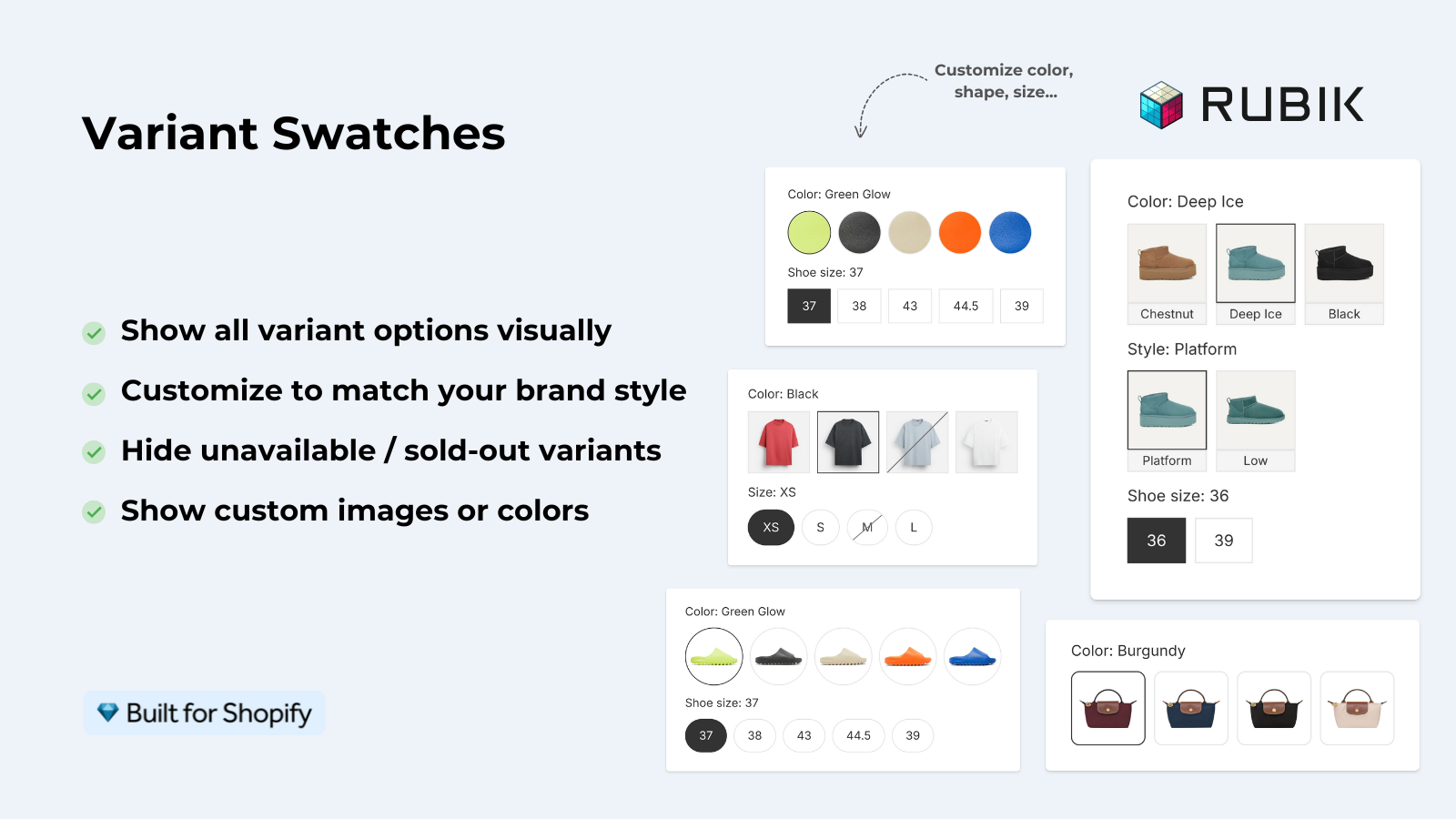
2. Variant picker
The variant picker is where most product pages without optimisation lose conversions. A dropdown that buries all the colour options. Tiny swatches that are hard to tap and differentiate on larger products. No visual state for the currently selected option. All of these elements can be easily optimised to improve the conversion rate of your product pages.
What works:
- Color swatches instead of dropdowns. Swatches show all options at once. The customer sees the full color range without clicking anything. Multiple studies confirm swatches outperform dropdowns for color options.
- Clear selected state. The currently selected swatch needs a strong visual indicator: a thick border, offset outline, or box-shadow ring. Subtle highlights get missed.
- Color name labels. “Navy” and “Black” look identical as small circles. A text label removes ambiguity and reduces wrong-color purchases (which means fewer returns).
- Sold-out handling. Grey out unavailable variants instead of hiding them. Hiding makes customers think you do not offer that option at all. Greying out with a strikethrough or reduced opacity communicates “exists but currently unavailable.”
- Appropriate swatch sizing. Big enough to see the color clearly (32px minimum), small enough to not overwhelm the page when you have 15+ options.
3. Price and discount display
Price positioning and formatting affect perceived value more than the actual number. Two things matter:
- Show the compare-at price. If the product is on sale, show the original price with a strikethrough next to the current price. The visual comparison anchors the value. “$49.99
$69.99” converts better than just “$49.99”. - Update price on variant change. If different variants have different prices (XL costs more than S), the displayed price must update instantly when the customer changes the selection. A static price that does not reflect the selected variant creates a trust issue at checkout.
4. Add-to-cart button
Make this call-to-action prominent enough to be viewed by potential customers without having to scroll (on desktop and mobile versions). If your customer has to scroll past your product description to find the ‘buy’ button, chances are that you’ll lose out on those impulsive purchases.
Elements that increase CTA effectiveness:
- High contrast color. The button should be the most visually dominant element in its section. Dark button on light background, or a bold brand color. Some stores even change the button color to match the selected variant.
- Sticky add-to-cart on mobile. A floating bar at the bottom of the screen that stays visible as the customer scrolls through descriptions and reviews. Most modern themes support this.
- Disabled state when variant is not selected. If the customer has not chosen a size, the button should be disabled with text like “Select a size”. Do not let them add an incomplete selection to cart.
5. Trust signals
Trust signals are important because they reduce purchase anxiety – specifically, they alleviate concerns your customer will have when they are about to submit their credit card information (i.e., concerns about the quality of the product, the legitimacy of your store, and return possibilities).
- Reviews with photos. Star ratings are good. Written reviews are better. Reviews with customer photos are best. They prove real people bought and liked the product.
- Return policy summary. A one-line return policy near the add-to-cart button (“Free returns within 30 days”) removes the biggest objection: “What if it does not fit?”
- Shipping info. “Free shipping over $50” or “Ships in 2 business days” near the CTA. Do not make customers hunt for shipping details on a separate page.
- Payment badges. Visa, Mastercard, PayPal, Shop Pay icons near the checkout button. Familiar logos build trust instantly.
6. Product description
Description examples that address customer objections. ” 100% organic cotton” is a feature. Soft enough to sleep in, durable enough for 200 washes is a benefit.
Also consider the organisation of the product content. Most customers don’t wish to read through a wall of text, break up the content using relevant tabs or accordions such as “Description”, “Specifications” and “Care Instructions” / “Shipping”. For products with different variants that have different specs, then using metafields to provide a per-variant description ensures that the description reads correctly when the customer selects a different variant.
7. Mobile-specific UX
Over 70% of Shopify traffic comes from a mobile device and if you don’t optimize your product pages for a 375px screen you are letting down the majority of your visitors.
Mobile-specific considerations:
- Swipeable image gallery. Horizontal swipe between images, not a vertical thumbnail strip. Pinch-to-zoom should work natively.
- Tap targets at least 44px. Swatches, buttons, and links need to be large enough to tap without mis-hitting the adjacent element.
- Above-the-fold priority. On mobile, the first screen should show: product image, title, price, and variant picker. Everything else (description, reviews, related products) lives below.
- Sticky CTA. A floating add-to-cart bar at the bottom of the screen. The customer should never be more than one tap away from buying.
For stores where a particular colour is a separate product within the listing, Rubik Combined Listings gives you a mobile-optimised layout with separate desktop and mobile settings for viewing swatches – size, spacing, and how they’re displayed.
Quick checklist
- 5+ images per product, variant-filtered
- Color swatches (not dropdowns) with clear selected state
- Price updates on variant change
- Add-to-cart visible without scrolling
- Sticky CTA on mobile
- Return policy near CTA
- Reviews with customer photos
- Structured description (tabs or accordion)
- 44px minimum tap targets on mobile
- Zoom on product images
“This app is perfect. it is incredibly easy to set up and use. There are so many cool ways you can set up your variant images AND adjust your swatches. The youtube tutorials are super helpful. I got a bit stuck trying to set up one of my products and Zulf was super quick to respond and help. Definitely recommend it if you are reading this ;D”
Anonymous merchant, Rubik Variant Images on the Shopify App Store
See the live demo store, watch the variant images demo, or read the getting started guide.
Frequently asked questions
What is the most important element on a Shopify product page for conversions?
The image gallery. The image gallery is likely the most viewed section of your product after your customers read the product description. Customers are browsing your online store to see what your product look like. By showcasing high quality images of the product from various angles, with close-ups that can be magnified online by customers, you can better enable customers to imagine the product and choose the correct variant of your product, especially if you offer five colors. The variant picker is a strong second to the gallery in this case.
Should I use swatches or dropdowns for variant selection?
Swatches for color options ALWAYS. It provides immediate visual feedback and lists all options. Dropdowns hide options and force customers to read text for options where text description is unnecessary, and are slightly better than buttons or pills for size.
How many product images should I have per product?
MIN 5 FOR VARIANT: Front/Back/Detail/Scale/ Lifestyle + On Model for Apparel. As a general rule, the more images the better, up to around 8 images per variant. After that the returns diminish rapidly.
Does a sticky add-to-cart button actually improve conversions?
On mobile, yes. A sticky CTA keeps the buy button visible as customers scroll through long descriptions and reviews. It removes the friction of scrolling back up to add to cart. Most themes support sticky add-to-cart through theme settings.
What trust signals should I add near the add-to-cart button?
Return policy, shipping info (cost and delivery time), and payment method icons. These solve some of the major customer concerns and objections before they contact the retailer.
Related reading

Umid
Co-Founder at Craftshift