How to display color names under swatches on Shopify
Swatches without labels for color options is frustrating. A dark circle might be Black, Charcoal, Onyx, Midnight, or Graphite. Until you select the option, you have no idea what it is. On a store with 10+ colors, this is a dealbreaker.
Displaying color names under (or beside) your swatches is an easy fix to this problem. Your shoppers will be able to see the swatch color as well as the name, pick the correct one, and move on to checkout.
Shopify themes usually don’t display color names by default. Some display the color name of the selected color above the swatch row, but none show the color name of individual swatches. In this guide we’ll look at 4 different ways to add color labels. Using Liquid code, color labels can be added above or below the swatches. Color labels can also be added using CSS-only tooltips or through theme settings. Also covered are apps that can add color labels to your Shopify product pages.
In this post
- Why show color names under swatches?
- Method 1: Liquid code (permanent labels)
- Method 2: CSS tooltip on hover
- Method 3: Show selected color name dynamically
- Method 4: Using an app
- Design considerations
- FAQ
Why show color names under swatches?
Three reasons this is not just a “nice to have”:
- Accessibility. About 8% of men have some form of color vision deficiency. A red swatch and a green swatch can look identical to them. The text label is the only way they can distinguish between variants. Without labels, you are locking out a meaningful segment of your customers.
- Similar colors. “Navy” vs “Royal Blue” vs “Cobalt” are three very different colors that look nearly identical as small circles on a screen. The name removes all ambiguity. This matters most for fashion and home decor stores where color precision drives purchase decisions.
- Customer confidence. When a customer adds “Sage Green” to cart and sees that name throughout the flow (swatch label, cart line item, confirmation email), they trust the purchase. An unnamed color circle gives no such confidence.
Showing color names in the product text helps with SEO. The text tags get indexed and can help your product pages rank for a bunch of long-tail color searches (i.e. “sage green linen curtains”, “midnight blue wool coat”, etc.).
Method 1: Liquid code (permanent labels)
This method adds a visible text label below each swatch that is always shown, not just on hover. It requires editing your theme’s Liquid templates.
Go to Online Store > Themes > Edit Code Locate the file that renders your variant picker. For Dawn this is snippets/product-variant-picker.liquid, for other themes look for files containing “variant”, “swatch”, or “option” in their name.
With each color option, find the loop and then add a span below the swatch element
{%- for value in option.values -%}
  <div class="swatch-with-label">
    <!-- existing swatch element here -->
    <input type="radio" name="option-{{ option.name }}" value="{{ value }}" ...>
    <label class="variant-input__label" style="background-color: {{ value | downcase }}"></label>

    <!-- ADD THIS: color name label -->
    <span class="swatch-label">{{ value }}</span>
  </div>
{%- endfor -%}
Then add the CSS to style the label:
.swatch-with-label {
  display: flex;
  flex-direction: column;
  align-items: center;
  gap: 4px;
}

.swatch-label {
  font-size: 11px;
  color: #666;
  text-align: center;
  max-width: 48px;
  overflow: hidden;
  text-overflow: ellipsis;
  white-space: nowrap;
}
Using max-width and text-overflow: ellipsis with “ellipsis” prevents the color names from displaying longer than the swatch and prevents them from breaking down to overly long lines such as “Mediterranean Sunset Gold”. “Burnt Sienna” for example will display normally. Set the max-width to roughly the same width as your color swatches.
One downside of permanent labels: they take up vertical space. With 12 color options in two rows, the labels add about 30px of height per row. On mobile, that can push important content further down. Consider whether labels-on-hover (Method 2) might be better for your layout.
Method 2: CSS tooltip on hover
Permanent labels can feel cluttered. The color names are hidden inside the swatches, and are visible only when you hover over a swatch with your mouse.
Using HTML title attribute (Requires Liquid change
<label class="variant-input__label"
       style="background-color: {{ value | downcase }}"
       title="{{ value }}">
</label>
This gives you a native browser tooltip. It works, but it looks ugly (small, grey, delayed). For a styled tooltip, use CSS:
/* Swatch container needs relative positioning */
.variant-input {
  position: relative;
}

/* Tooltip */
.variant-input__label::after {
  content: attr(data-tooltip);
  position: absolute;
  bottom: -28px;
  left: 50%;
  transform: translateX(-50%);
  background: #333;
  color: #fff;
  font-size: 11px;
  padding: 3px 8px;
  border-radius: 4px;
  white-space: nowrap;
  opacity: 0;
  pointer-events: none;
  transition: opacity 0.15s ease;
}

.variant-input__label:hover::after {
  opacity: 1;
}
You’ll also need to add a data-tooltip attribute to each swatch in your Liquid template.
<label class="variant-input__label"
       data-tooltip="{{ value }}"
       style="background-color: {{ value | downcase }}">
</label>
Tooltip approach has one major downfall: They don’t work on mobile. There is no such thing as a hover on touch devices and users get blanked. If you have more than 60% mobile traffic (you probably do) then using simple hover-only labels is probably a wasted effort.
Method 3: Show selected color name dynamically
Instead of labeling every swatch some stores simply show the name of the currently selected color next to the option header (e.g. “Color: Sage Green”) and update the field text live as the customer selects a different swatch.
Many Shopify themes already do this. Check your product page. If you see something like “Color: Black” above the swatch row that changes when you select a different swatch, your theme already supports it.
If it does not, here is the Liquid + JavaScript approach:
<!-- In your product template, add a label element -->
<p class="option-header">
  Color: <span id="selected-color-name">
    {{ product.selected_or_first_available_variant.option1 }}
  </span>
</p>
// JavaScript to update the label on variant change
document.querySelectorAll('.variant-input__label').forEach(function(swatch) {
swatch.addEventListener('click', function() {
var colorName = this.getAttribute('data-value')
|| this.getAttribute('title')
|| this.textContent.trim();
document.getElementById('selected-color-name').textContent = colorName;
});
});The most space efficient method of swatch labeling is to simply use a single line of text for the label, rather than having a separate label under each swatch. Unfortunately, this method suffers from the same problem as the others for swatches that are not currently selected, requiring the customer to have to click on each swatch to determine its name. It is most useful as a complement to other swatch labeling methods, not as a replacement.
Method 4: Using an app
If editing a Liquid template is not your kind of fun (or you worry updates to the theme might break your labels later), an app is a good way to go.
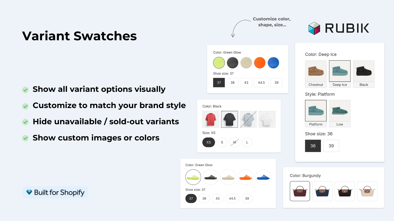
Rubik Variant Images automatically generates a swatch picker with tooltips and option header for the variant names. All you have to do is hover over each swatch to reveal the name. The name of the selected color will also be displayed in the option header, no need to edit Liquid. 3 swatch styles, and over 100 customizable CSS variables. You can easily change the label style to match the typography and “feel” of your store, without needing to edit Liquid or make and publication for new themes.
When products that would normally be separate listings are grouped together in a Rubik Combined Listings collection, the swatches on the collection page will also display color names on hover. This is particularly useful for stores that organize products by color.
“This app is perfect. it is incredibly easy to set up and use. There are so many cool ways you can set up your variant images AND adjust your swatches. The youtube tutorials are super helpful. I got a bit stuck trying to set up one of my products and Zulf was super quick to respond and help. Definitely recommend it if you are reading this ;D”
Anonymous merchant, Rubik Variant Images on the Shopify App Store
Design considerations
A few things to keep in mind when adding color labels:
- Font size matters. Labels should be smaller than your body text (10px to 12px). They are supplementary information, not primary content. Too large and they compete with the swatch itself.
- Truncation is necessary. Color names like “Burnt Sienna” or “Heathered Charcoal Grey” are long. Set a
max-widthon labels and usetext-overflow: ellipsis. The full name can appear on hover or in the selected color header. - Alignment. Center-align labels under circular swatches. Left-align them under square or rectangular swatches. Misaligned labels look sloppy.
- Color of the label text. Use a muted grey (#666 or #888), not black. The label should be readable but should not visually compete with the swatch border or the product title.
- Mobile layout. On mobile, permanent labels under swatches often cause text overlap when swatches wrap to a second row. Test with your most variant-heavy product on a 375px screen width. If labels overlap, switch to tooltip-only on mobile using a media query.
See the live demo store, watch the swatch customization tutorial, or read the visual settings docs.
Frequently asked questions
Does Shopify show color names under swatches by default?
No. Most Shopify themes show a selected color name above the swatch row (like “Color: Black”), but they do not display individual labels under each swatch. You need custom code or an app to add per-swatch labels.
Should I use permanent labels or hover tooltips?
Depending on your layout and the percentage of mobile traffic you receive, permanent labels may be a better approach for accessibility purposes, especially on mobile devices that do not support hover. However, if you find that more than 60% of your traffic is mobile, then using permanent labels or a “selected name” approach may be a better option as they do simplify the view and reduce clutter for users of mobile devices. Tooltips are a good solution when you want to keep your interface clean but provide some sort of additional information to users.
Will color labels affect page speed?
Even 20 text labels add virtually no weight to the page, as 20 text labels equal less than 1KB of HTML (and the CSS to style them is similarly minimal). There is zero performance concern here.
How do I add color names to the Dawn theme?
In Dawn, edit snippets/product.liquid or product-template.liquid and add the Liquid in Method 1 above after the label for each variant. Then style it with CSS in assets/base.css. The Liquid in Method 1 above has been modified slightly to work in Dawn.
Can I show color names only for the Color option, not Size?
Yes. For the labels in the code above, you can have the Liquid code check the option name. For example, you could have it display “Color:” but not “Size:” or “Material:”. To do this, you would add the following code around the label for color: {%- if option.name == ‘Color’ -%}. Most themes will pass the name of the option to the template so you can check it that way.
Do color name labels help with SEO?
Slightly. The text labels get indexed by search engines, which can help with long-tail color queries. A product page that includes visible text like “Sage Green”, “Dusty Rose”, and “Midnight Blue” has a better chance of ranking for color-specific searches than one with unnamed swatches.
Related reading

Umid
Co-Founder at Craftshift