How to change swatch image size on Shopify
Shopify swatch size is one of those settings that themes get wrong more often than they get right. Too small and customers will have trouble telling your navy from your black, too large and on a small mobile screen your 6 swatches will take up half the screen. Typically the default swatch size for most Shopify themes is somewhere around 28-32px, which is fine for stores that have 3 or 4 variants, but as your variants swell to 8, 12 or 20 swatches on a single product, that default size is just not enough.
When displaying different variations of an item, choosing the size of swatches is not simply a aesthetic decision; it can also affect how quickly a customer can identify the variant of a product that they wish to purchase. On mobile, displaying larger swatches of colour will provide the customer with morecolour information and make it easier to select individual swatches. On desktop view, displaying smaller swatches can be useful if you have a large number of variations and need to keep the product information page concise.
These tips explain how to modify the dimensions of swatches (including how to modify the aspect ratio), how to treat image swatches differently than color swatches, how to scale swatches for mobile devices, and the space between swatches.
In this post
- Default swatch sizes across popular themes
- Changing swatch size with CSS
- Sizing image swatches vs color swatches
- Mobile swatch sizing
- Swatch spacing and gap
- Common sizing mistakes
- Using an app for swatch sizing
- FAQ
Default swatch sizes across popular themes
Before you start changing everything, it’s a good idea to find out how big your swatches are. Here are the default swatch sizes for the most common Shopify themes!
| Theme | Default swatch size | Shape |
|---|---|---|
| Dawn | 44px (button style) | Rounded rectangle |
| Prestige | 30px | Circle |
| Impulse | 34px | Circle |
| Broadcast | 28px | Circle |
| Horizon | 32px | Rounded square |
Dawn is the outlier here. It does not render traditional color swatches by default. It uses button-style variant pickers that are 44px tall but wider (text-based). If you want actual color circles in Dawn, you need custom code or an app like Rubik Variant Images.
Changing swatch size with CSS
The simplest approach is CSS. Go to Online Store > Themes > Edit Code > Assets and open your main CSS file. Add these styles at the bottom:
/* Color swatches - 40px circles */
.variant-input__label {
  width: 40px;
  height: 40px;
  min-width: 40px;
  min-height: 40px;
  border-radius: 50%;
  box-sizing: border-box;
}
Replace .variant-input__label with your theme’s swatch class (right-click a swatch > Inspect Element and find the class name there) The min-width and min-height attributes are there to prevent the swatch from appearing smaller than the desired size when flexboxed or in a grid.
For square or rounded swatches, change the border-radius:
/* Rounded square swatches - 44px */
.variant-input__label {
  width: 44px;
  height: 44px;
  min-width: 44px;
  border-radius: 8px;
  box-sizing: border-box;
}
A question that comes up often: what is the “right” size? There is no single answer, but here are some guidelines based on how many variants the product has:
- 3 to 5 variants: 40px to 48px works well. Enough room to show color detail without overwhelming the page.
- 6 to 12 variants: 32px to 36px keeps things tight. Two rows on desktop, three on mobile.
- 13+ variants: 28px to 32px. Any larger and the swatch section dominates the page. Consider whether all variants need to be visible at once or if some can be grouped.
Sizing image swatches vs color swatches
Swatches that contain an image of a product (e.g. a design on fabric, etc) need to be sized differently than swatches with flat colors. The image above is a 28px circle filled with a solid blue color – totally readable. The next image is a 28px circle showing a plaid fabric pattern – totally unreadable.
Image swatches should be larger than 44px. Ideally 48px to 56px is a good starting point. Some stores go even larger (64px) for items such as fabric or material swatches where the pattern or texture details need to be easily identifiable.
/* Larger image swatches */
.variant-input__label--image {
  width: 52px;
  height: 52px;
  min-width: 52px;
  border-radius: 6px;
  background-size: cover;
  background-position: center;
}

/* Regular color swatches stay smaller */
.variant-input__label--color {
  width: 36px;
  height: 36px;
  min-width: 36px;
  border-radius: 50%;
}
Each theme doesn’t necessarily make a distinction between image swatches and color swatches in their CSS classes, so you may need to target these elements separately, especially where products have both color and image swatches.
Mobile swatch sizing
Most modern CSS grid systems break when they hit a width of about 375px. A 48px swatch looks great on a 1440px desktop screen, but on a 375px mobile screen, six 48px swatches with gaps between them overflow the container and either wrap badly or require horizontal scrolling.
Use a media query to scale swatches down on smaller screens:
/* Desktop */
.variant-input__label {
  width: 44px;
  height: 44px;
}

/* Tablet */
@media (max-width: 768px) {
  .variant-input__label {
    width: 36px;
    height: 36px;
  }
}

/* Mobile */
@media (max-width: 480px) {
  .variant-input__label {
    width: 32px;
    height: 32px;
  }
}
There is a minimum size that a tap target can be on mobile sites and apps according to Apple’s Human Interface Guidelines (44px by 44px) and Google’s Material Design (48px by 48px). If your swatches are any smaller, customers are going to mis-tap on your site or app. The fix for this is to keep your visual swatch size at 32px, but then add a padding of 12px of transparent space to the swatch to allow for the larger tap area.
/* Small visual swatch, large tap target */
.variant-input__label {
  width: 32px;
  height: 32px;
  padding: 6px;           /* adds 12px total = 44px tap area */
  background-clip: content-box;
  box-sizing: content-box;
}
This trick ensures that swatches look pretty small but are easily interactive – the tint tap area is outside of the borders and thus better accessible to tap.
Swatch spacing and gap
Swatch size and swatch color swatch spacing go hand in hand. In the example above, we used a small swatch size and a 2px gap between swatches to give it a unified, solid feeling. Conversely, you could use a larger swatch size with 12px spacing between swatches, to make it more individual. The decision comes down to aesthetics.
/* Swatch container with gap */
.variant-input-wrapper {
  display: flex;
  flex-wrap: wrap;
  gap: 8px;
}

/* Tighter spacing */
.variant-input-wrapper.tight {
  gap: 4px;
}

/* Spacious layout */
.variant-input-wrapper.spacious {
  gap: 12px;
}
If using margin to generate spacing on your theme, individual swatch items will need to have their margins overridden. Note that applying a left margin to the last item in a swatch will cause spacing on the right of the swatch to be uneven. Using the gap property is preferred as it automatically ensures proper spacing on all sides.
Common sizing mistakes
- Setting width but not height. If you only set
width: 40pxwithout a matchingheight: 40px, the swatch can become an oval or collapse to zero height depending on the theme’s flexbox rules. Always set both. - Forgetting box-sizing. With
box-sizing: content-box(the default), a 40px swatch with a 2px border actually renders at 44px. Withbox-sizing: border-box, the border is included in the 40px. Pick one and be consistent. - Same size for all swatch types. Color swatches, image swatches, and size/text swatches have different readability requirements. Image swatches need more space. Size labels need width flexibility. Using one size for everything is lazy and it shows.
- Not testing with many variants. Your CSS looks perfect with 4 swatches. Add 16 and suddenly they overflow the container, wrap into 4 rows, and push the add-to-cart button below the fold. Always test with your most variant-heavy product.
- Ignoring the selected state border. A thicker border on the selected swatch increases the element’s rendered size by a few pixels, causing layout shift. Use
box-shadoworoutlinefor the selected indicator instead.
Using an app for swatch sizing
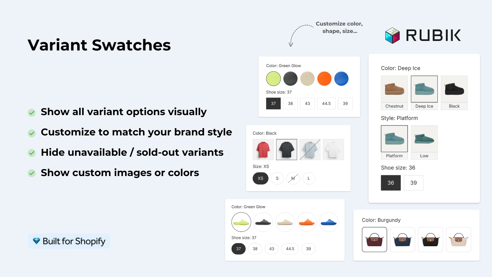
If you do not want to maintain custom CSS (or if your theme makes it difficult to target swatch elements), Rubik Variant Images provides a visual settings editor where you can set swatch width, height, border radius, spacing, and shape without code. It supports three swatch types (image, color, pill) and lets you mix them across different options on the same product.
For retailers who want swatches sized on collection pages, Rubik Combined Listings gives you collection level swatch sizing set on both the desktop and mobile settings.
“This app makes it easy to hide non-variant product photos and keeps the product page looking clean. It also helps to show clean custom swatches. Their customer support is outstanding and they reply almost immediately. They were able to fix a bug for me with minimal weight time.”
Anonymous merchant, 2026-02-18, Rubik Variant Images on the Shopify App Store
See the live demo store, watch the swatch customization tutorial, or read the visual settings docs.
Frequently asked questions
What is the best swatch size for Shopify?
Circles can be whatever size is appropriate for your store, there is no universal best size. For 3-5 colors, I find 40x48px circles to be a good size. For 6-12 colors, 32x36px keeps the swatch section looking clean. For 13+ colors, keeping the size down to 28x32px helps to keep the swatch section from dominating the page. For image swatches (such as pattern product images), a good size would be 44x56px so that you can see the pattern details.
How do I make swatches bigger on mobile?
Use CSS media queries to set different sizes per breakpoint (remember Apple says the minimum size for a “tappable” item is 44×44 pixels). Make the swatch a bit smaller, and then add some padding made of color so that the cursor doesn’t have to tap on such a small space.
Can I set different sizes for color and size swatches?
Theme variants can differentiate between type of option (e.g. target color swatches versus size and text swatches) and use separate sizes for each. If your theme does not use separate CSS classes for option types, you can tell apps like Rubik Variant Images to use separate sizes for option types. So one size for target color swatches and a different size for size/text swatches.
Why do my swatches look blurry?
When using image swatches, the resolution of the source image makes a difference. An image that is 50px x 50px is very blurry in a swatch that is 100px wide, whereas an image that is 100px x 100px is very clear. This is because Retina displays render normal width images poorly, so it’s recommended to use 2x-size images as swatches. For color swatches, blurry text is often caused by subpixel rendering which happens with odd-pixel dimensions. Using even numbers (32, 36, 40px etc) helps to avoid this issue.
How do I change swatch size in the Dawn theme?
Dawn does not support swatches out of the box and instead uses variant buttons that are text. To get circles, you would need to add some Liquid and CSS or a app to enable swatches. If you do happen to have some swatches already in Dawn, you can target the class .variant-input__label with your size CSS and apply the necessary styles to it in assets/base.css.
Will changing swatch size affect page speed?
Change CSS for product swatch dimensions has zero impact on page load time. The only impact that image swatches could have on page load time is if you use very large swatch images (over 200px) for products with many variants. The additional file size of very large swatch images can really start to add up. Try to keep the file size of image swatches under 100KB.
Related reading

Umid
Co-Founder at Craftshift