How to make Shopify variant swatches match your dark theme store with one click
If your Shopify theme uses a dark background, you have probably noticed something annoying. Most variant swatch apps default to white backgrounds and dark text, so when you drop their swatches into a dark store they look like bright sticky notes pasted on top of your design. Selected borders glow black against your dark surface, dropdowns blast white, and the whole component fights the rest of your page.
Fixing this by hand is more painful than it sounds. The new Apply dark mode colors button in Rubik Combined Listings Swatch restyles every relevant color across every swatch context in a single click.
Why dark themed stores hit this wall
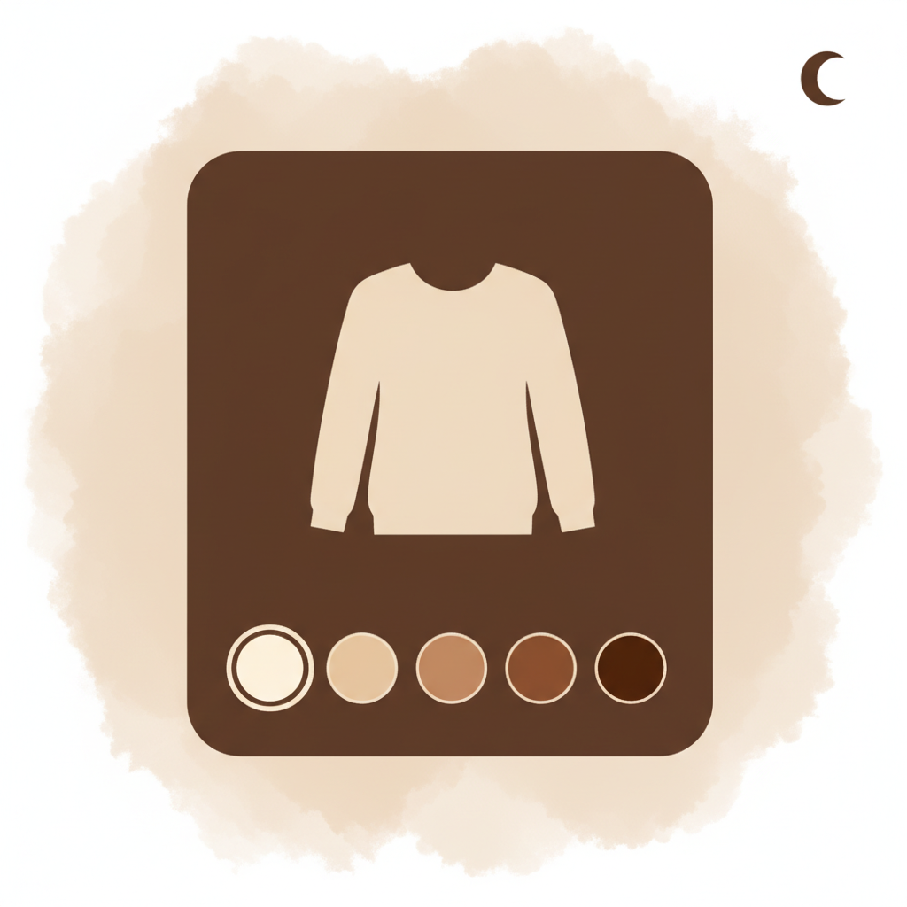
A typical color swatch component has many more color settings than you might expect. Just on the swatch widget alone there are around 20 separate color fields: swatch border, selected border, button background, button text, hover background, dropdown background, dropdown text, label color, price color, out of stock line, and more.
Now multiply by four. Rubik Combined Listings Swatch lets you style desktop and mobile separately, and product page and product card separately. That is four independent contexts: desktop product page, desktop product card, mobile product page, mobile product card. To match a dark theme by hand you would need to adjust roughly 80 color values, then keep them in sync if you ever tweak the design later.
Most merchants give up halfway and either ship swatches that clash with their theme, or stick with the app’s default light styling and accept the visual mismatch.
What Apply dark mode colors does
The button lives inside the Edit popover next to each swatch preview section in your group editor. Click it once and all four contexts get restyled at the same time. Here is what changes.
- All swatch surfaces (button background, dropdown background, info background) get set to
#1F1F21. This is the surface tone used by most popular dark Shopify themes, so swatches blend into your page instead of floating above it. - All readable text (button text, dropdown text, swatch label, selected value, price) gets set to
#C6C6C7, a soft light grey that reads cleanly on a dark surface without the harshness of pure white. - Borders pick up
#2D2F38, one notch lighter than the background, so they remain visible without screaming. - Selected and hover states use the right contrasts so customers can still tell at a glance which swatch is active.
- Out of stock crossed lines are dimmed to a muted grey so they remain visible without dominating the swatch.
What it deliberately does not change:
- Product image backgrounds. Most product photos are shot on a white background, and a dark frame around them looks worse than the slight contrast of leaving them as is. You can override this manually if your photography is already on a dark background.
- Layout, spacing, swatch sizes, aspect ratios, border widths. None of these are dark theme concerns, so the button leaves them untouched.
How to use it
- Open any product group in edit mode.
- In the swatch preview area, click the Edit button on any of the four sections (Desktop product page, Desktop product card, Mobile product page, Mobile product card). It does not matter which one you pick, the action applies to all four.
- Click Apply dark mode colors at the bottom of the popover.
- Use the moon toggle in the swatch preview area to flip the preview between a light and a dark background and confirm the swatches read well on your real theme surface.
- Hit Save.
One detail that catches some merchants by surprise: if you already have unsaved changes in the group editor, the button is disabled. This is intentional. We do not want the dark mode transform stacked on top of half finished edits, because it makes it impossible to cleanly revert. Save or discard whatever you were working on first, then run the dark mode shortcut as its own clean change. If you do not like the result, the SaveBar gives you a one click discard.
See it in action
What if the colors do not perfectly match my theme
The defaults are tuned for the most common dark Shopify themes. The background tone #1F1F21 sits very close to what Dawn-derived dark themes, Impulse Dark, Symmetry Dark and Prestige Dark use as their main page surface, and the light grey text reads cleanly on all of them.
If your theme uses a different dark surface (a true black, a deep navy, an off black warm tone), you do not have to start over. After applying dark mode colors, open Edit styles and tweak the few fields that need adjusting. You will be starting from a 95% correct dark palette instead of inverting 80 fields by hand. The most common follow up tweak is the swatch background to nudge it a few hex points warmer or cooler.
Who this is for
If your store falls into any of these categories, this shortcut is going to save you a meaningful amount of time:
- Premium fashion or streetwear stores running a dark theme to push the product photography forward
- Electronics, audio gear and gaming peripherals stores where dark themes are the category default
- Beauty and skincare brands using dark surfaces for a luxury feel
- Stores that recently switched to a dark theme and discovered every variant selector now looks broken
- Anyone running A or B tests between light and dark theme variants and wanting their swatches to follow each variant cleanly
Try it on your store
If you already use Rubik Combined Listings Swatch, the button is in your existing groups today. Just open one and click Edit on any swatch preview section.
If you are new to the app, you can install it from the Shopify App Store or play with the demo store first to see what the swatches look like before installing.

Farid Movsumov
https://x.com/faridmovsumovFounder of Craftshift